The network for creativity
Join 1.25M professional creatives like you
Connect with clients, get discovered, and run your business 100% commission-free
Creatives on Contra have earned over $150M and we are just getting started
Back to feedPost

Redesigned the Formula 1 website with two goals side by side: sharpen the visual hierarchy and content clarity, and build accessibility into the core experience rather than treating it as an afterthought.
The original site leaned hard into visual stimulation and content density but lost clarity in the process :especially the standings page, where data density overpowered readability. I rebuilt the information hierarchy with a monochromatic base, bold typography, and stronger spacing so key content stood out without losing F1's high-energy, cinematic feel. Standings were restructured into a clear Teams/Drivers/Points format that's far easier to scan.
The bigger focus was accessibility as a built-in system, not a toggle bolted on after: dedicated modes for Protanopia and Achromatopsia color blindness, a motion toggle for users with vestibular sensitivity, and a dyslexia-friendly typography system (Poppins) for better readability. Solo project, 1 month, using Figma and Photoshop.

The network for creativity
Join 1.25M professional creatives like you
Connect with clients, get discovered, and run your business 100% commission-free
Creatives on Contra have earned over $150M and we are just getting started
Trending
retrofuturism
Share your favorite designs from the past exploring the distant future. Or your own take on the aesthetic 🚀
halftone
Dots. Texture. Grain. Let's see your designs using the halftone technique.

Midjourney
Creatives are showing off what they're making with Midjourney.
colorgrade
Video editors sound off: How do you enhance the mood of your video in color grading?
Related posts

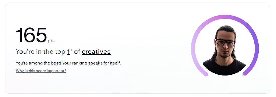
Contra just told me I'm in the top 1% of creatives on the platform.
Cool badge. Doesn't build anything on its own.
What actually moved the needle wasn't chasing the score — it was going back through old proposals and noticing I was writing to sound impressive instead of answering the actual technical problem in the brief. Once I started solving the thing nobody explicitly asked but clearly needed, everything got sharper. The ranking followed, not the other way around.
Currently building in Framer — SaaS, real estate, and brand sites with real interaction design. If your brief has a hard technical problem buried in it, that's usually where I do my best work.



A quick look at the Bright Logistics identity in motion.
The goal was to build more than a logo. We created a visual system that could move comfortably across social, apparel, digital touchpoints, photography, and everything the brand might need as it grows.
Simple enough to stay recognizable. Flexible enough to keep things interesting.
One of my favorite parts of branding is seeing all the individual pieces start to feel like one world.


Just smooth Animation..🔥

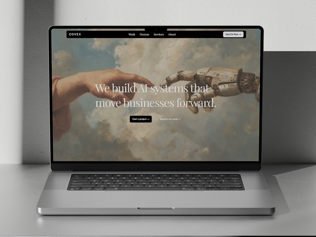
COVEX is live ✦
A new Framer template for AI agencies and modern tech teams.

The muted cover sells the retro feel right away. I’d test this laptop mockup against a clean full-page crop, because the headline is small enough that it takes a second to read in the feed.