The network for creativity
Join 1.25M professional creatives like you
Connect with clients, get discovered, and run your business 100% commission-free
Creatives on Contra have earned over $150M and we are just getting started
Back to feedPost

Fiiguu | Product Design & Mobile Engineering
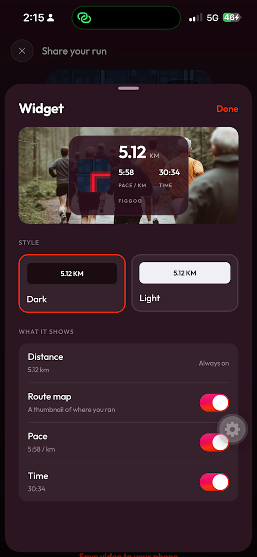
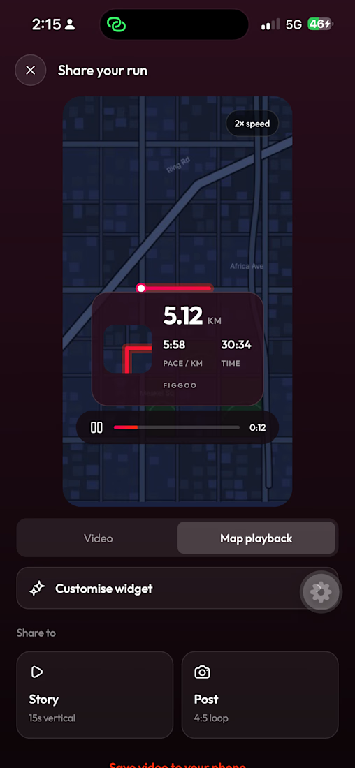
Product design and native mobile engineering for a group running app — turning social pressure into a commitment device, built for low-end Android in Ethiopia.
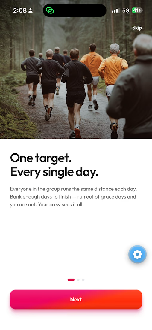
You and four friends agree to run every morning. By day three, two of them have stopped.
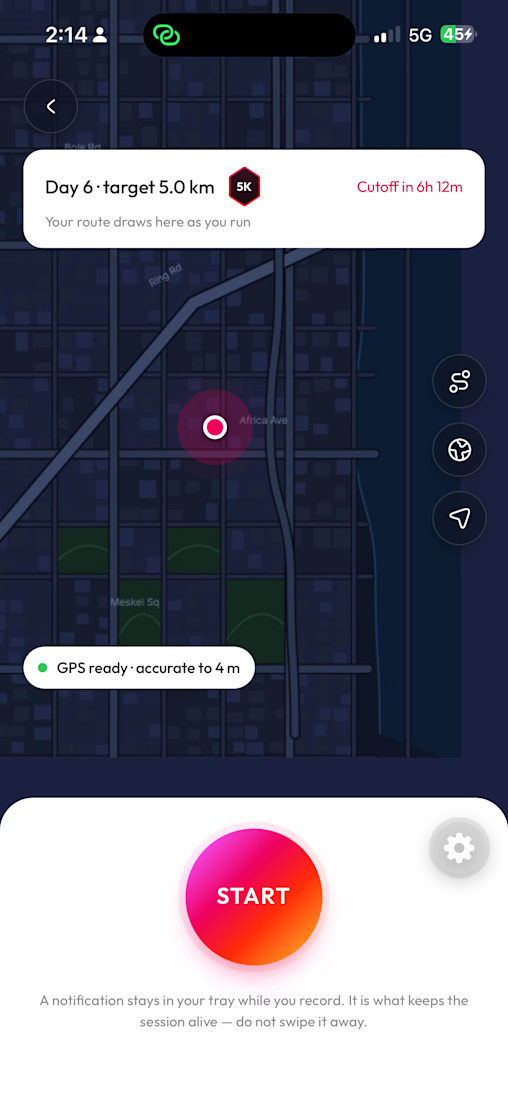
Fiiguu makes that harder to do. A group sets a challenge together — a distance, a number of days, and how many of those days you have to hit. Everyone puts in a stake. Miss too many days and you're out, and your stake goes to whoever is still standing.
The money isn't the reward. It's the thing that gets your shoes on at 6am when you don't want to.
Build a product where money is at stake but nothing about it feels like gambling — in a market where every sports betting licence was revoked, on phones that aggressively kill background apps, for users on expensive mobile data.
My role covered product decisions, the rule system, the native recording engine, and design direction across the app.


The network for creativity
Join 1.25M professional creatives like you
Connect with clients, get discovered, and run your business 100% commission-free
Creatives on Contra have earned over $150M and we are just getting started





Related posts

love this

LUMIXA — Gaming Controller Product Landing Page 🎮⚡
LUMIXA is a futuristic product landing page concept created for a premium gaming controller built around precision, performance, and immersive play.
The goal was to make the product itself the center of the experience while...
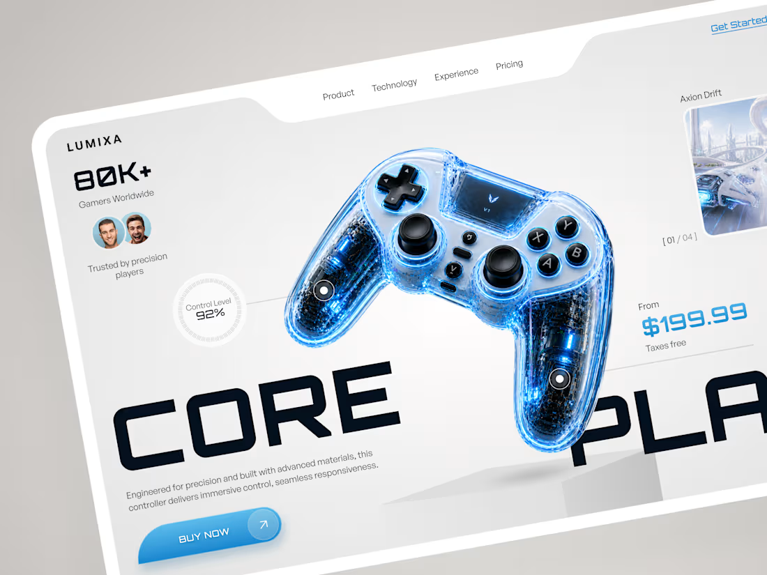
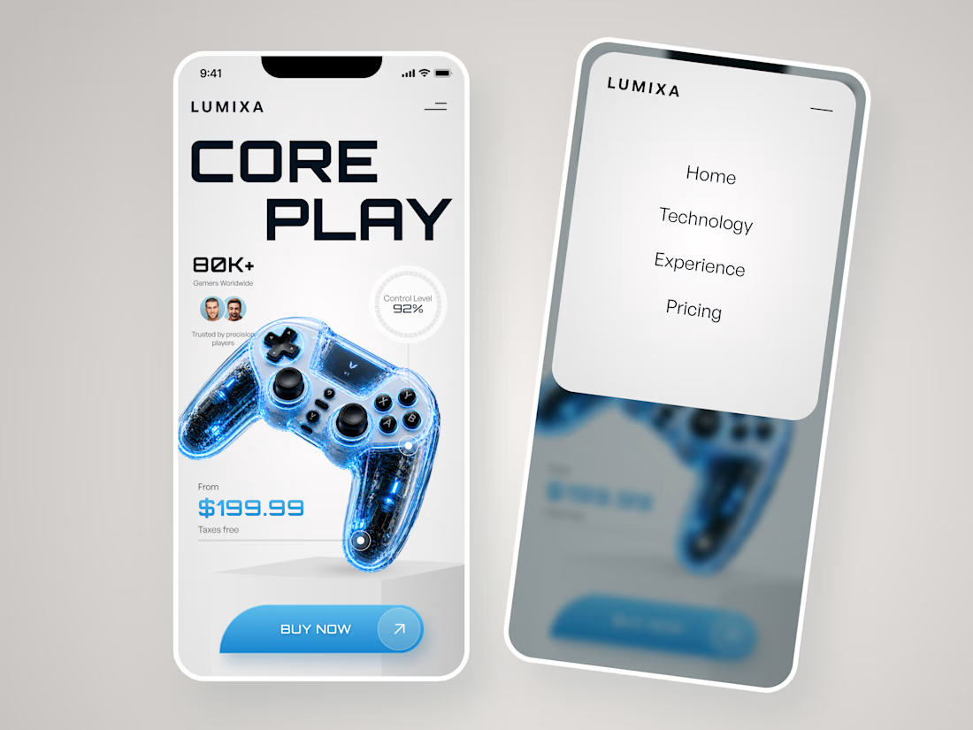
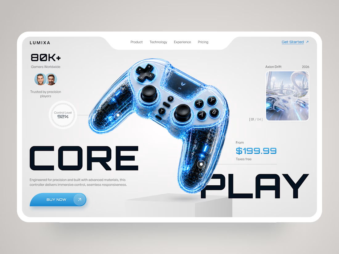

The product is clearly the hero here the clean layout and futuristic visuals make the controller stand out really well.

Contra Community Post
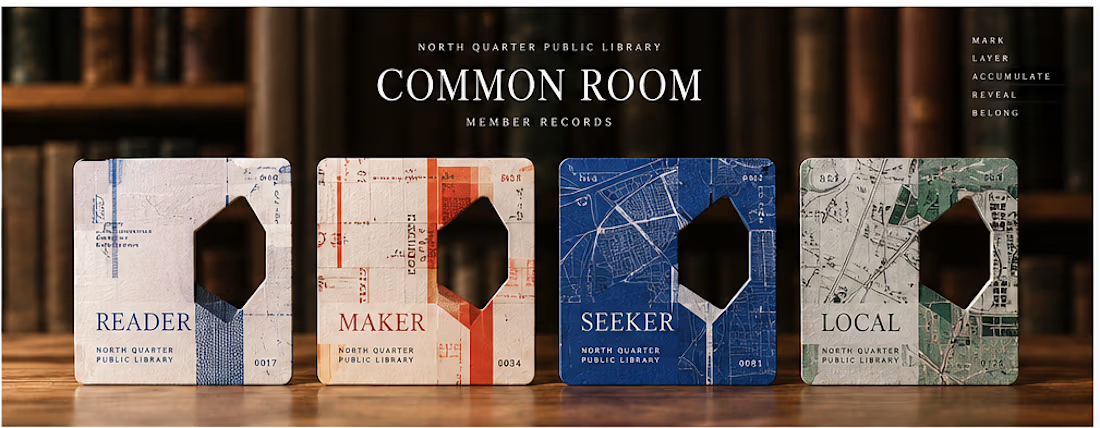
Day 17/30: COMMON ROOM
What if a library card could reveal belonging instead of simply proving access?
I built COMMON ROOM, a speculative membership system for the fictional North Quarter Public Library.
Instead of asking members to choose an identity or complete a personality quiz, the system lets their actual behavior inside the library leave the evidence.
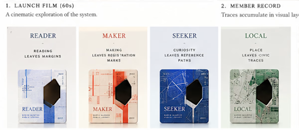
Read in the Stacks → leave a margin.
Make in the Workshop → leave a registration mark.
Follow a question through the Index → leave a reference path.
Explore the Quarter → leave a civic trace.
Those traces gradually build a unique Member Record.
The card remembers in layers. Its physical Accession Aperture later becomes a lens into hidden library memory, and completed cards can optionally become part of a Living Collection that begins to reveal the shape of the neighborhood itself.
The project eventually became a system about:
BEHAVIOR → EVIDENCE → OBJECT → MEMORY → COMMUNITY
And the line that defined the whole thing:
You don’t receive a card. You accumulate one.
I also built the launch film around the same visual logic instead of doing a traditional product walkthrough using the card’s traces, layers and aperture as the motion language.
Would love feedback on one thing in particular:
Does the relationship between behavior, the physical card, and belonging read clearly without needing the concept explained first?
Day 17 of my 30 Days of Real Business Problems challenge.
#ProductDesign #InteractionDesign #CreativeDevelopment #DesignEngineering #MotionDesign #CreativeCoding #ThreeJS #Remotion

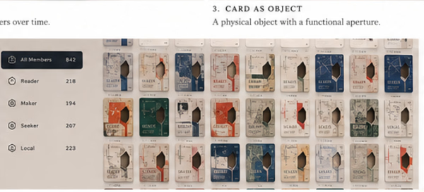


what inspired the maker and seeker split?

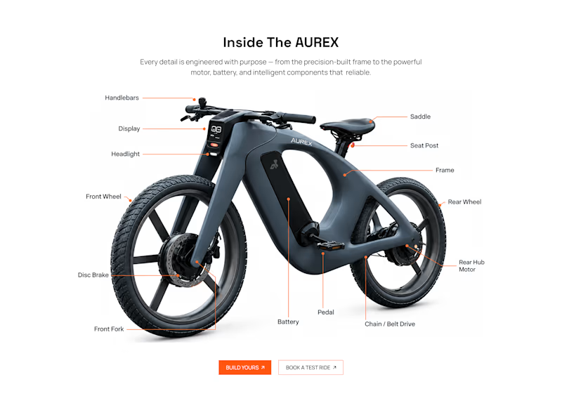
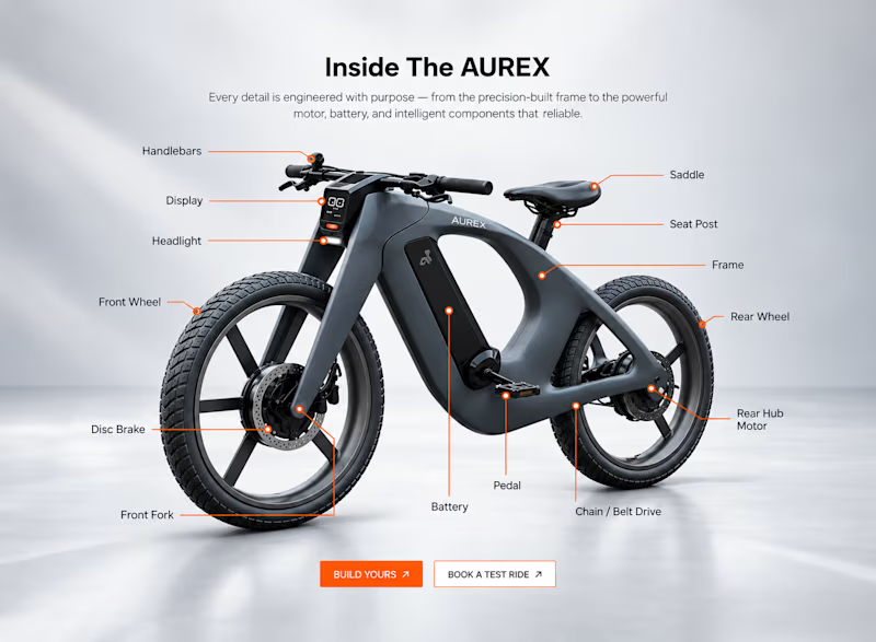
Light or refined - which E-Bike product breakdown section design would you choose?
Two concepts for the same AUREX e-bike. Same product, same components, two different presentation styles:
A - Soft Studio: subtle gray depth, larger product focus, and a more premium visual feel.
B - Clean Minimal: bright white background, tighter spacing, and a more technical editorial layout.
Which direction feels stronger for a premium e-bike brand and why?


5 voted
31%
11 voted
69%
16 votes
Closed

A feels more premium to me. The soft gray depth and bigger product focus make the bike feel like something special. B is great for specs, but A sells the feeling