The network for creativity
Join 1.25M professional creatives like you
Connect with clients, get discovered, and run your business 100% commission-free
Creatives on Contra have earned over $150M and we are just getting started
Back to feedPost
Most AI landing pages look good, but don’t communicate fast enough.
I designed this AI landing page concept for Final Round AI with one goal in mind. Make the value clear in seconds. The hero leads with a direct outcome instead of vague AI buzzwords. One strong CTA reduces decision friction. Social proof appears early to build trust before doubt sets in.
The layout flows intentionally from benefit to proof to explanation and back to action. Spacing and hierarchy guide attention instead of overwhelming it.
If you’re building in AI or SaaS and want sharper conversion-focused design, I’m open to collaborating.
Strong thinking here 👏 Making the value clear instantly is such an underrated skill in landing page design.
The network for creativity
Join 1.25M professional creatives like you
Connect with clients, get discovered, and run your business 100% commission-free
Creatives on Contra have earned over $150M and we are just getting started
Related posts
Nick (@nickbakeddesign) just shared with @Daniel G Bright and I how he uses AI to think like a dev, design better products, and close higher‑quality clients, while staying tiny on purpose.
New UnContrad episode is live now for indie designers, studio owners, and creators serious about playing the long game.
Watch Full Episode below ↓
Day 6/180 of my 6-month Framer challenge🚀 Working on the first template.
It's harder than I expected to build products while delivering client work.
Still managed to push the hero section forward today.✌🏻
wow nice work
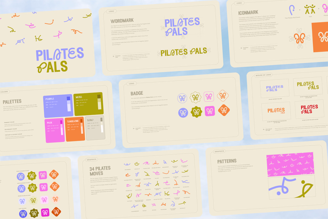
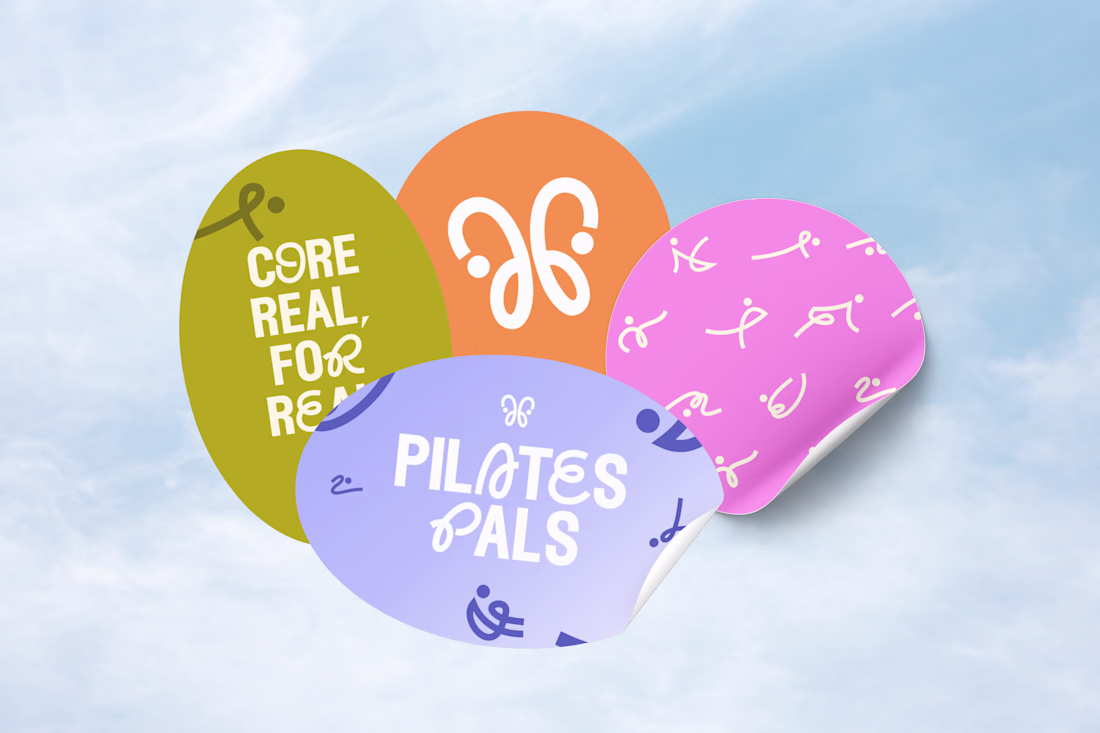
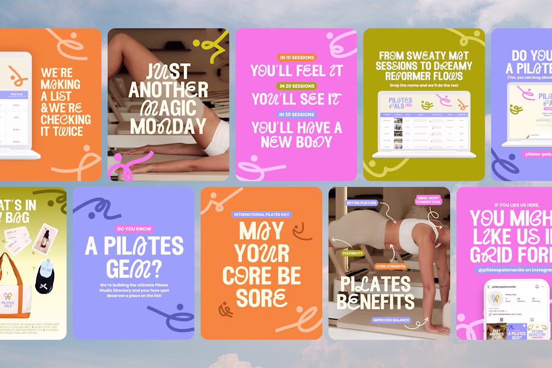
What started as friends scheduling weekend classes somehow evolved into a community that partners with studios and hosts events.
Naturally, I couldn't resist giving it a brand identity 🥴
Here's the visual system I created for Pilates Pals, inspired by movement, connection, and making fitness feel a little less intimidating.
the branding, the posts, the logo, the deck. soo good
Trending
Claude
Claude has entered the design space. How are you using Claude Design?
Contra University
Learn from expert creatives how to earn more using next-gen AI tools.
creativeaiflow
Creative AI workflows are evolving. What tools do you use, and what are their strengths and weaknesses?
freelancerlife
Freelancer life is wins, pivots, and everything in between. What’s yours right now?