The network for creativity
Join 1.25M professional creatives like you
Connect with clients, get discovered, and run your business 100% commission-free
Creatives on Contra have earned over $150M and we are just getting started
Back to feedPost

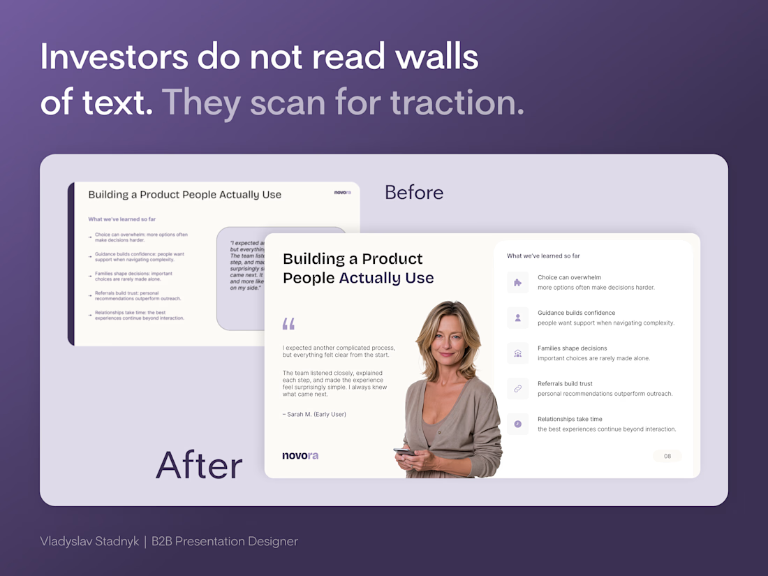
Founders cram every customer quote onto one slide to prove they did the research.
But a wall of text does not prove traction.
It proves you lack focus.
Investors do not read paragraphs during a pitch. They scan layouts.
Look at the "Before" slide in the image. It has a massive grey box of text sitting next to five dense bullet points. If an investor has to squint to read your user feedback, they will simply tune out.
A founder brought me a deck full of slides exactly like this. We completely rebuilt the hierarchy.
The Visual Anchor Framework:
📍 The Human Element - Replace generic text boxes with a real face. A photo anchors the quote and builds instant empathy.
📍 Iconographic Scannability - Turn dense bullet points into spaced items with clean icons. The eye processes shapes faster than sentences.
📍 Ruthless Whitespace - Give the content room to breathe. Cramped slides signal a cluttered business model.
Start here: open your current deck and find the slide with the most text.
Force yourself to cut the word count in half. Build the new layout around one single focal point.
When I design these layouts in Figma, I lock the grid structure. Then I export the file to PowerPoint so the founder can update the quotes later without breaking the aesthetic.


The network for creativity
Join 1.25M professional creatives like you
Connect with clients, get discovered, and run your business 100% commission-free
Creatives on Contra have earned over $150M and we are just getting started




Related posts


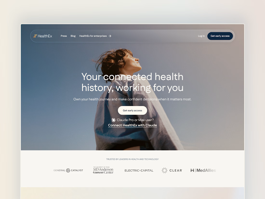
Project back from December 2025: Secret City designed the HealthEx website and hired me to build it in Framer.
P.S. they've gone through several site restructures since then (so it looks different from my snapshots), but it goes to show how easy Framer makes it for clients to manage and update their site independently.


Awesome😍

Meriot Netherlands-based product designer portfolio
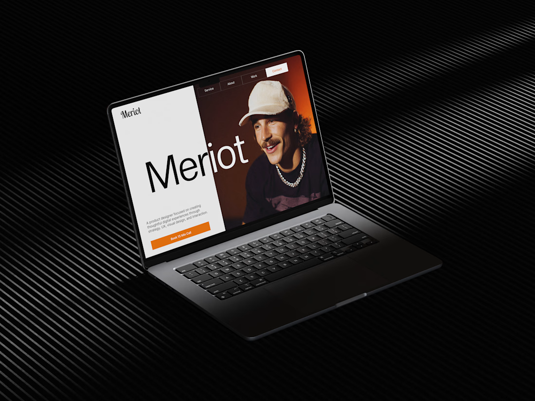
I explored a portfolio website for Meriot, a product designer based in the Netherlands who wanted a digital presence that felt more personal, editorial, and design-focused.
The challenge was to avoid the typical portfolio formula and create something that communicates personality within the first few seconds.
The direction
→ Bold editorial typography
→ Strong personal photography
→ Minimal black-and-white foundation
→ Warm orange accent for CTAs
→ Simple, structured navigation
→ Clear positioning as a product designer
→ A portfolio experience that feels like a personal brand
The idea was to make the website feel confident without being complicated.
Rather than leading with a long introduction, the hero immediately communicates who Meriot is, what he does, and where the visitor should go next.

Nice design broooo

Neuraly - AI Data Analytics Platform
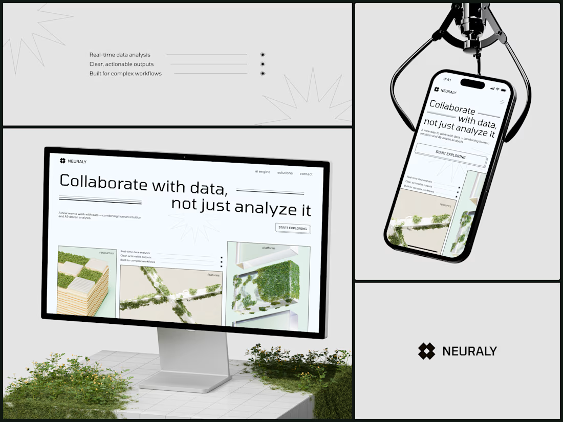
The headline says "Collaborate with data, not just analyze it" and the entire visual system is reinforcing that exact position. Data isn't cold infrastructure you feed queries into. It's something alive that grows when humans interact with it. The moss on architecture is literally that metaphor made visual: natural intelligence layered on top of built systems.
#AIDesign #WebDesign #B2BTech #BrandDesign #EditorialDesign
This one looks quite great honestly