The network for creativity
Join 1.25M professional creatives like you
Connect with clients, get discovered, and run your business 100% commission-free
Creatives on Contra have earned over $150M and we are just getting started
Back to feedPost
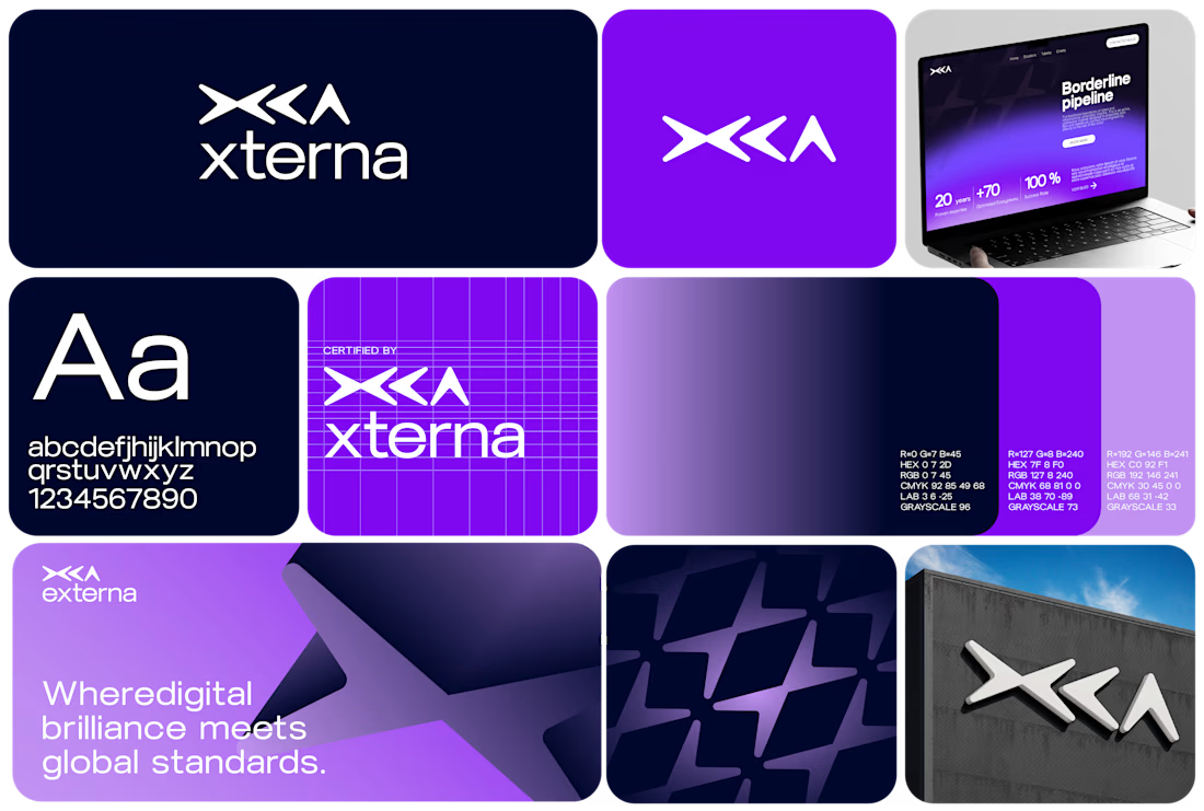
Xterna - Identity Concept Exploration
Industry: Technology & Digital Infrastructure
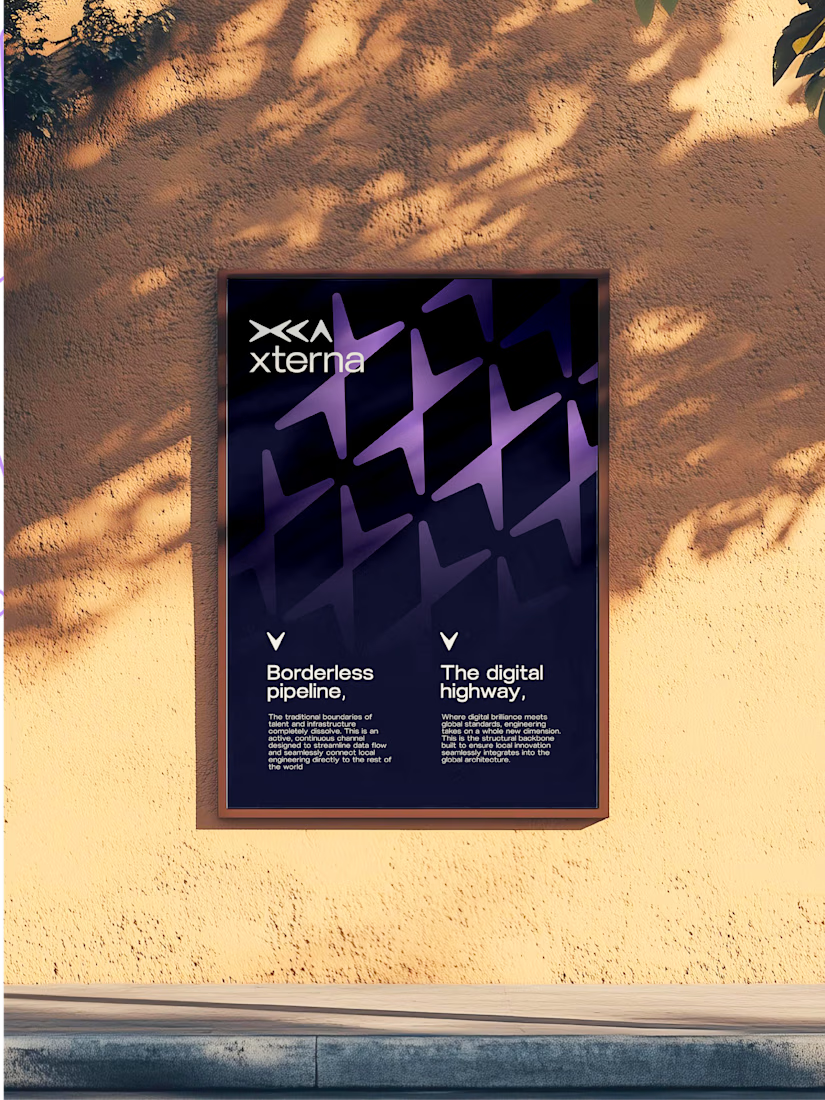
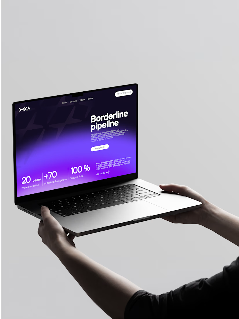
Just a casual design exploration using some unselected logo drafts. The concept behind Xterna revolves around the idea of a digital highway plugging software into a fast global network and externalizing it.
The layout focuses on an abstract geometric mark broken down into three pillars:
X: The structural intersection of code and networks.
C: An open loop representing global sharing and distribution.
A: An upward peak for scaling to the top.
An exercise in clean typography, grid alignment, and high-contrast digital layouts.





Thank uou Samuel

Looks incredibly polished..... Welldone
Really appreciate 🤙🏽

The X-C-A breakdown is a nice touch. Breaking the mark into three symbolic pillars like that gives it real conceptual weight, not just an aesthetic exercise. The purple on navy reads very confidently at large scale too.
You just said it ! Good conceptual weight !
The network for creativity
Join 1.25M professional creatives like you
Connect with clients, get discovered, and run your business 100% commission-free
Creatives on Contra have earned over $150M and we are just getting started





Related posts





Rejected logo concepts 2026 - Which one did you like the most?


The C-shaped mark is my pick. The notched outline stays readable even when it gets small. Did the rejections come down to concept, or to how they held up at tiny sizes?

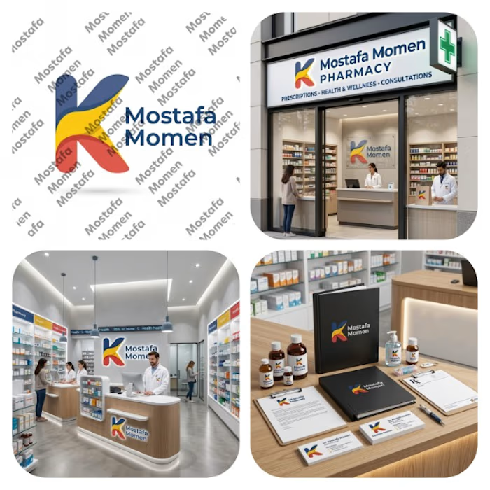
That's my pharmacy logo design it was special by it's color palette and smooth shapes
This design focus on (professionalism, trust, authenticity, showing business identity)
This design is special because it's color palette can be used in the business itself from furniture notes it will be suitable on them
Thanks for everyone who support me ❤️