The network for creativity
Join 1.25M professional creatives like you
Connect with clients, get discovered, and run your business 100% commission-free
Creatives on Contra have earned over $150M and we are just getting started
Back to feedPost
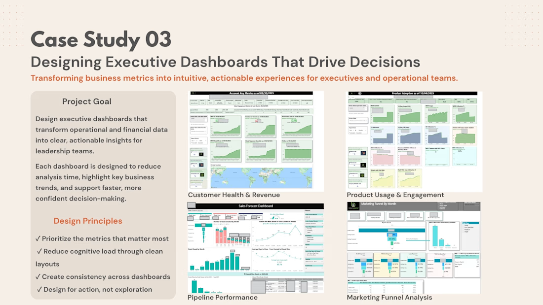
Executive Analytics & Decision Dashboards
I design executive dashboards that turn complex operational, customer, sales, and marketing data into clear, actionable decision tools.
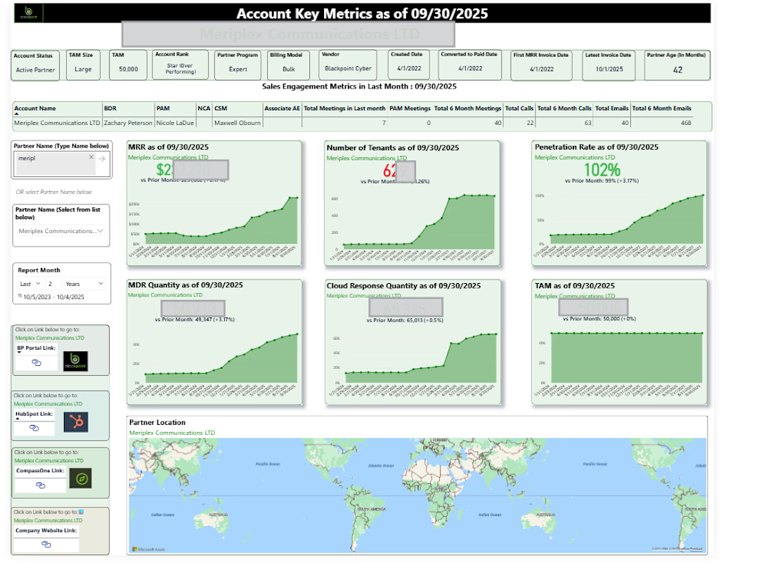
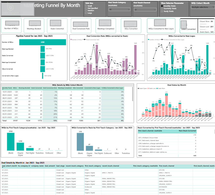
This project brings together dashboards I built for real business use cases - from customer health and product adoption to sales forecasting, pipeline performance, and marketing funnel analytics.
The goal across each experience was the same: prioritize the metrics that matter, reduce cognitive load, and make it easy for leaders to understand what’s happening and where action is needed.
My role: Analytics Strategy · Dashboard Design · Data Visualization · Executive Reporting · Business Intelligence


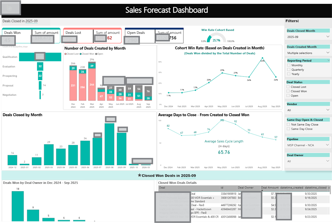

Strong framing: an executive dashboard earns its keep only when each view is tied to a decision. One addition I’ve found useful is placing decision thresholds or guardrails beside the KPIs—what triggers investigation versus action—so leaders don’t have to infer meaning from movement alone. Nice collection.

Completely agree. Without thresholds or targets, KPIs can be hard to interpret, and the next logical question is usually: “OK, I’m seeing these metrics, but so what? Is this good or bad, and what should I do next?”
In this case, some of the targets were still being reset and...
The network for creativity
Join 1.25M professional creatives like you
Connect with clients, get discovered, and run your business 100% commission-free
Creatives on Contra have earned over $150M and we are just getting started

Challenges
View all


Related posts

Animated Fintech UI for pie showing portfolio performance, Investment income, Investment advisory, and smart advisory features through interactive financial visualization
A motion exploration for Pie, bringing key wealth-management features to life through animated UI components.
The concept explores how portfolio performance, investment income, investment advisory, and smart advisory can be presented in a clear and engaging way while keeping the overall experience simple and premium.
A look at how motion can make financial products feel more intuitive, modern, and easier to understand.


The motion-led charts make a dense wealth-management story feel approachable; the distinct panels give each metric room to breathe while still reading as one system.

Keystone - HR Management Platform
Employee list screens are the homework assignment of SaaS design. A table is a table is a table. Nobody's winning an award for this view and that's exactly why it matters.
The restraint here is the point. No colored tags, no status badges fighting for attention, no dashboard widgets crammed into the sidebar. Just the data, breathing in a dark container with enough row spacing that your eyes don't blur at record five.
That split between a bold brand identity and a restrained product UI is one of the hardest things to get right in B2B SaaS.
#SaaS #DashboardDesign #DarkUI #B2BTech #ProductDesign
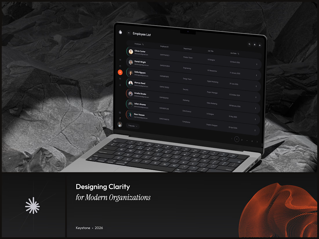

"A table is a table" is the harder argument to make internally than the design itself - most teams would've shipped colored status tags just to have something to show in a review.

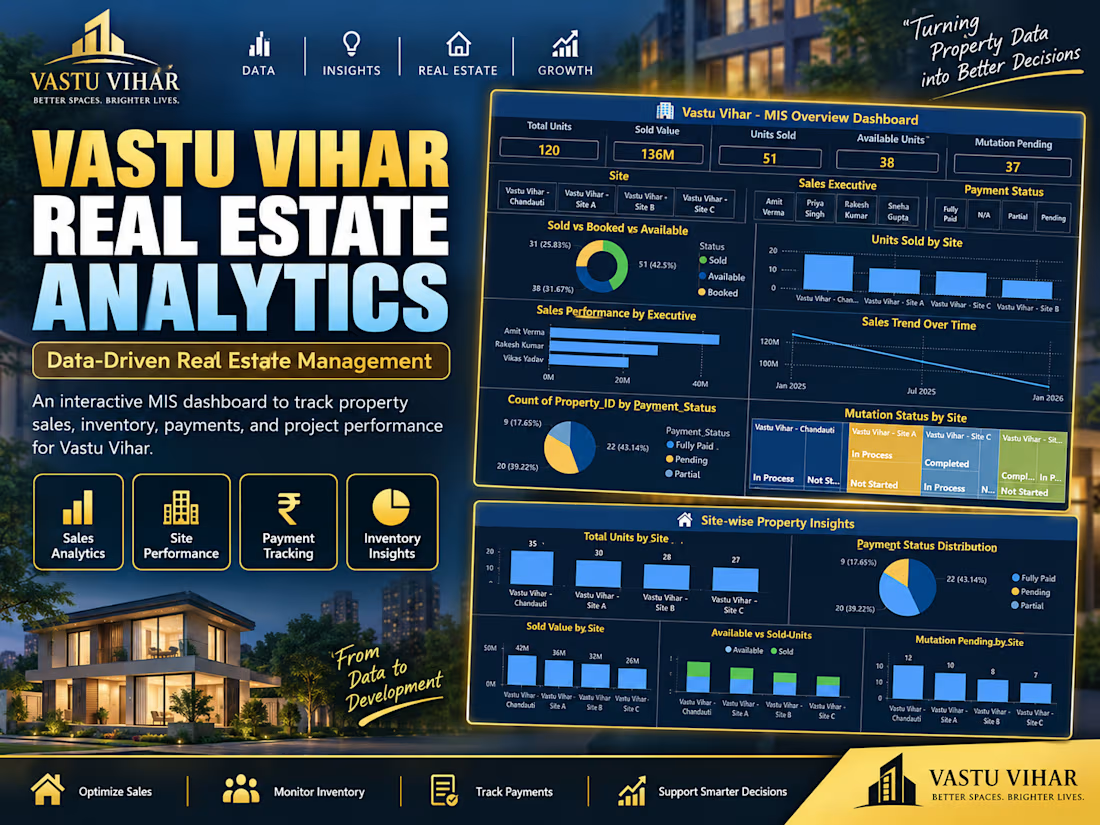
Turning property data into better decisions 🏠📊 Built a full MIS dashboard for a real estate business — tracking 120 units across 4 sites, ₹13.6Cr in sales, payment status, and mutation progress, all in one Power BI view. Excel + Power BI + data modeling. #DataAnalytics #PowerBI #RealEstateAnalytics #Excel #DashboardDesign