The network for creativity
Join 1.25M professional creatives like you
Connect with clients, get discovered, and run your business 100% commission-free
Creatives on Contra have earned over $150M and we are just getting started
Back to feedPost

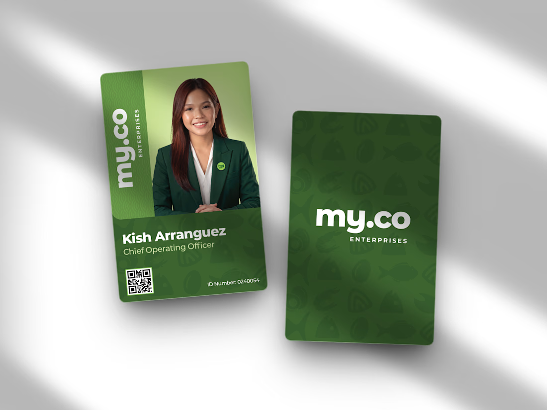
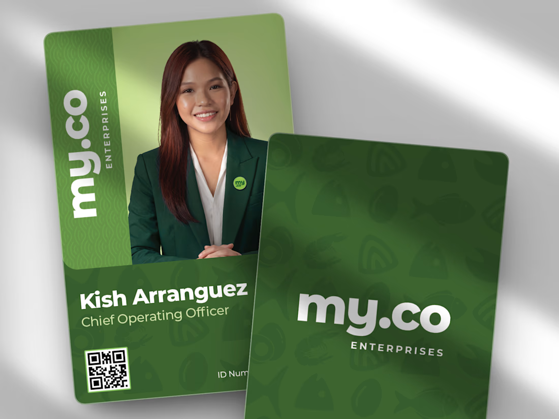
Corporate identity doesn't always have to be stiff. 🌿✨
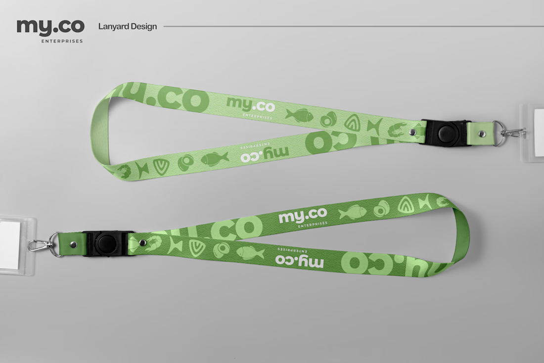
I designed this ID card and lanyard system for My.co Enterprises, leaning into a vibrant, dual-tone green palette. To give the brand some playful personality, I integrated a custom, subtle background pattern featuring stylized seafood elements. The layout itself prioritizes a clean visual hierarchy, using bold typography and functional elements like a scannable QR code to keep things practical but visually engaging.
Applying these flat designs to realistic physical mockups always makes the brand feel instantly tangible and alive.
Do you guys prefer designing digital interfaces or physical print assets? Let me know below. 👇
Hashtags
#BrandIdentity #PrintDesign #CorporateBranding #FreelanceDesigner #GraphicDesign #LanyardDesign #ContraDesign
Brand DesignGraphic DesignLogo DesignAdobe IllustratorAdobe PhotoshopFigmatypographygraphicdesignfreelancer



The network for creativity
Join 1.25M professional creatives like you
Connect with clients, get discovered, and run your business 100% commission-free
Creatives on Contra have earned over $150M and we are just getting started







Related posts

Took a WebGL fabric physics simulation and pushed it to the absolute limit.
Built a complete visual concept for a Peptides brand around it. Pure interaction, zero boring static layouts. Let's go!


Pushing fabric physics that far for a peptides concept is a strong choice. The quiet editorial layout lets the motion carry the brand instead of competing with it.

Luxora Skincare Serum Packaging
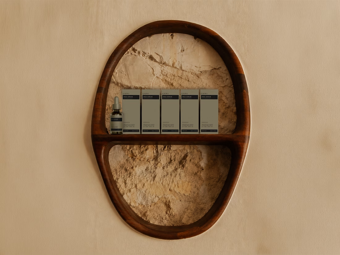
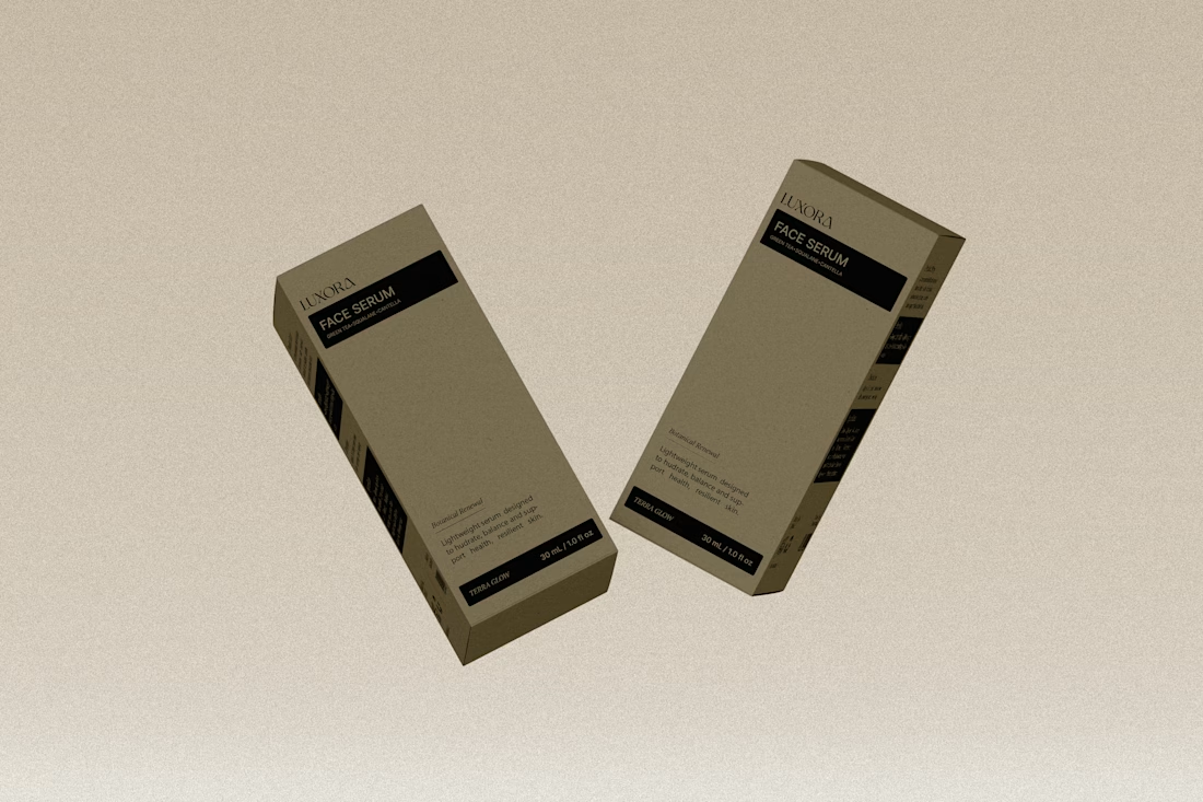
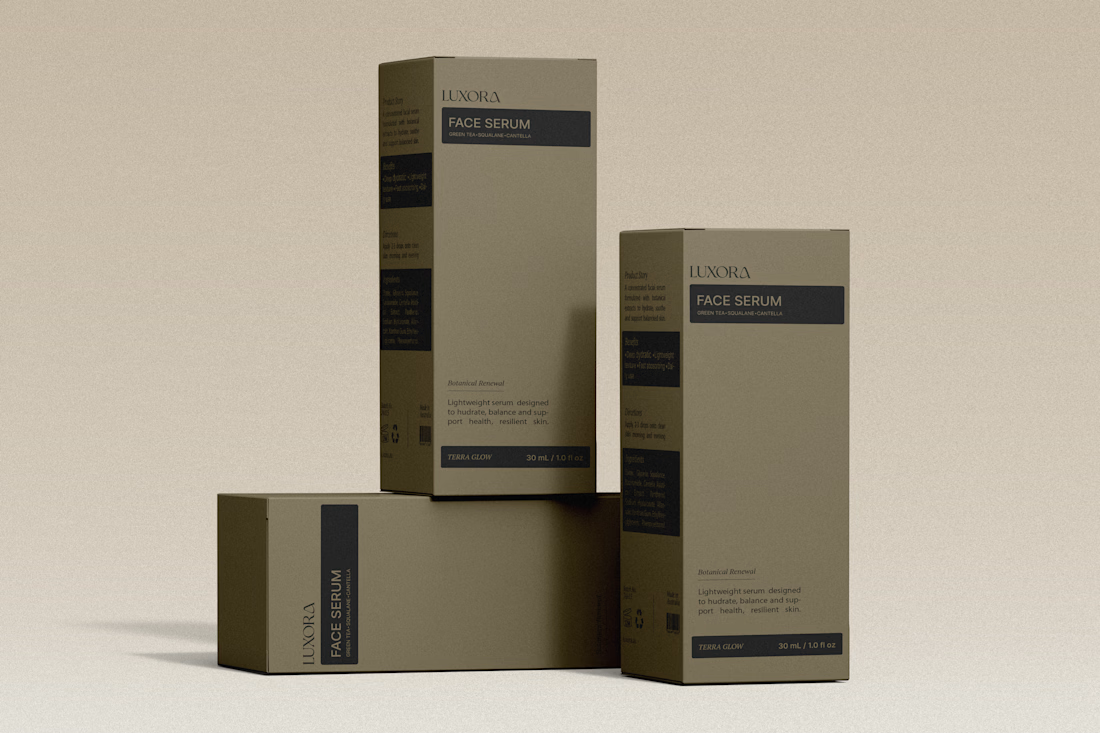
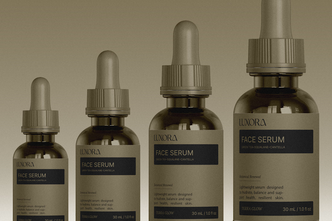
The olive droppers and FACE SERUM label stay in one calm palette, which is what makes the set feel expensive. The powder backdrop keeps it tactile instead of glossy-ad.

Designed the website for Dovora — an agency that builds businesses for creators, not brand deals. "We don't represent brands, we don't split focus" is basically the whole pitch, and I wanted the site to feel just as uncompromising.
So no polished stock creator-economy visuals. The hero is a wall of real streamer/podcast footage arranged in overlapping diamonds and rounded frames — actual creators, mid-stream, mid-laugh — with a glowing gradient orb behind bold "WE BUILD CREATOR BUSINESSES" type. It reads more like a highlight reel than a landing page, which felt right for an audience that lives on camera.
The second section flips the energy completely — dark, minimal, almost aggressive typography ("BUILT EXCLUSIVELY FOR CREATORS. FULL STOP.") paired with huge chrome-and-neon 3D letterforms spelling out CREATORS. It's loud in a completely different way than the hero, and that contrast is intentional — this isn't a buttoned-up agency deck, it's built for people who make content for a living.
Genuinely fun brief to lean all the way into.


