The network for creativity
Join 1.25M professional creatives like you
Connect with clients, get discovered, and run your business 100% commission-free
Creatives on Contra have earned over $150M and we are just getting started
Back to feedPost

As a business owner, your product deserves a packaging system that communicates quality, consistency, and value at every touchpoint.
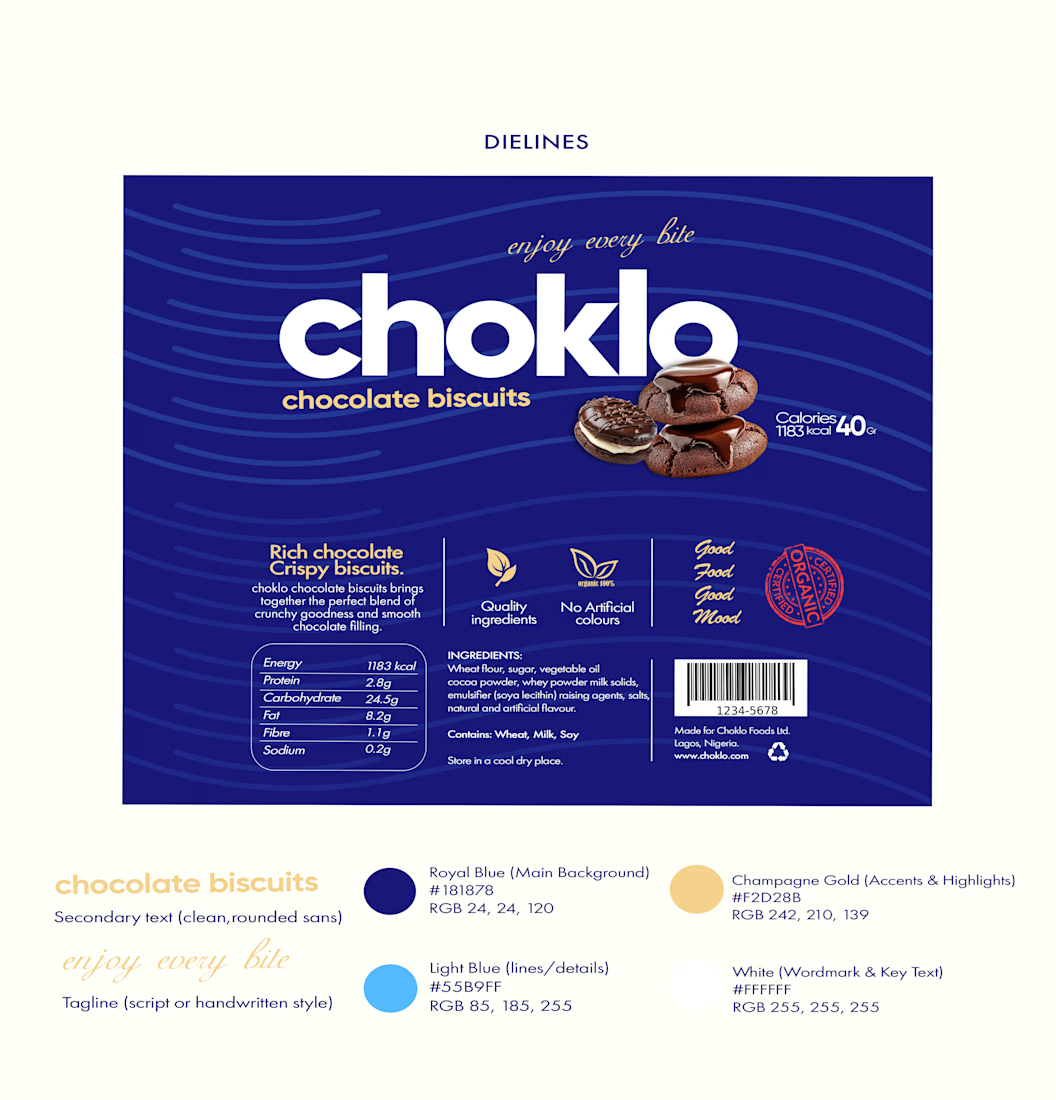
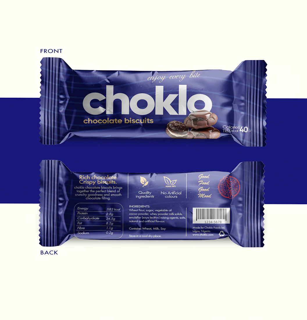
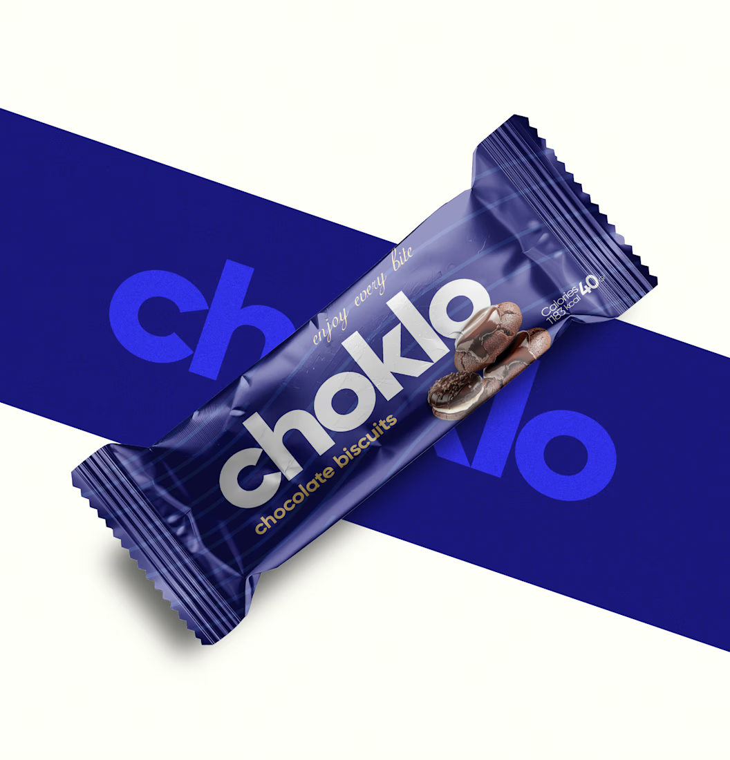
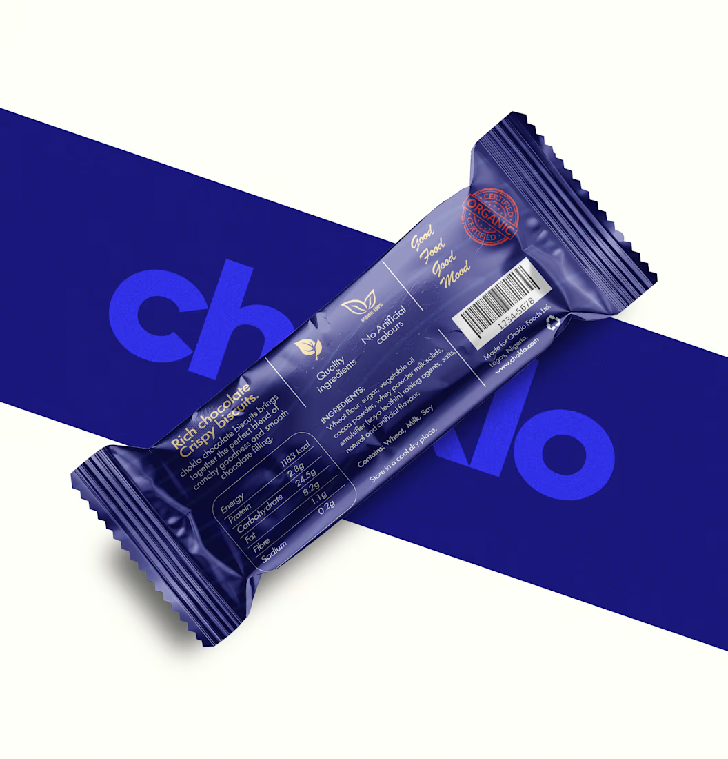
I designed choklo as a premium chocolate biscuit packaging concept built around bold geometric typography, a distinctive royal-blue palette, and a cohesive visual identity.
From the front-of-pack presentation to the back-of-pack information layout, every element is designed to work together as one considered system, balancing shelf appeal with functional clarity.
Because premium packaging isn’t just about making a product look expensive. It’s about building a brand that looks credible, feels intentional, and is ready to compete.
Looking to elevate your product with packaging that reflects the value of your brand? Let’s talk.
#PremiumPackaging #PackagingDesign #BrandIdentity #ProductBranding
The network for creativity
Join 1.25M professional creatives like you
Connect with clients, get discovered, and run your business 100% commission-free
Creatives on Contra have earned over $150M and we are just getting started









Related posts

Not every client comes to me for a brand identity and not all my clients are skincare or cosmetic brands.
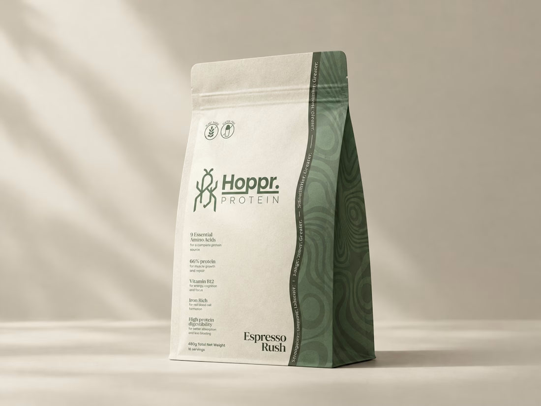
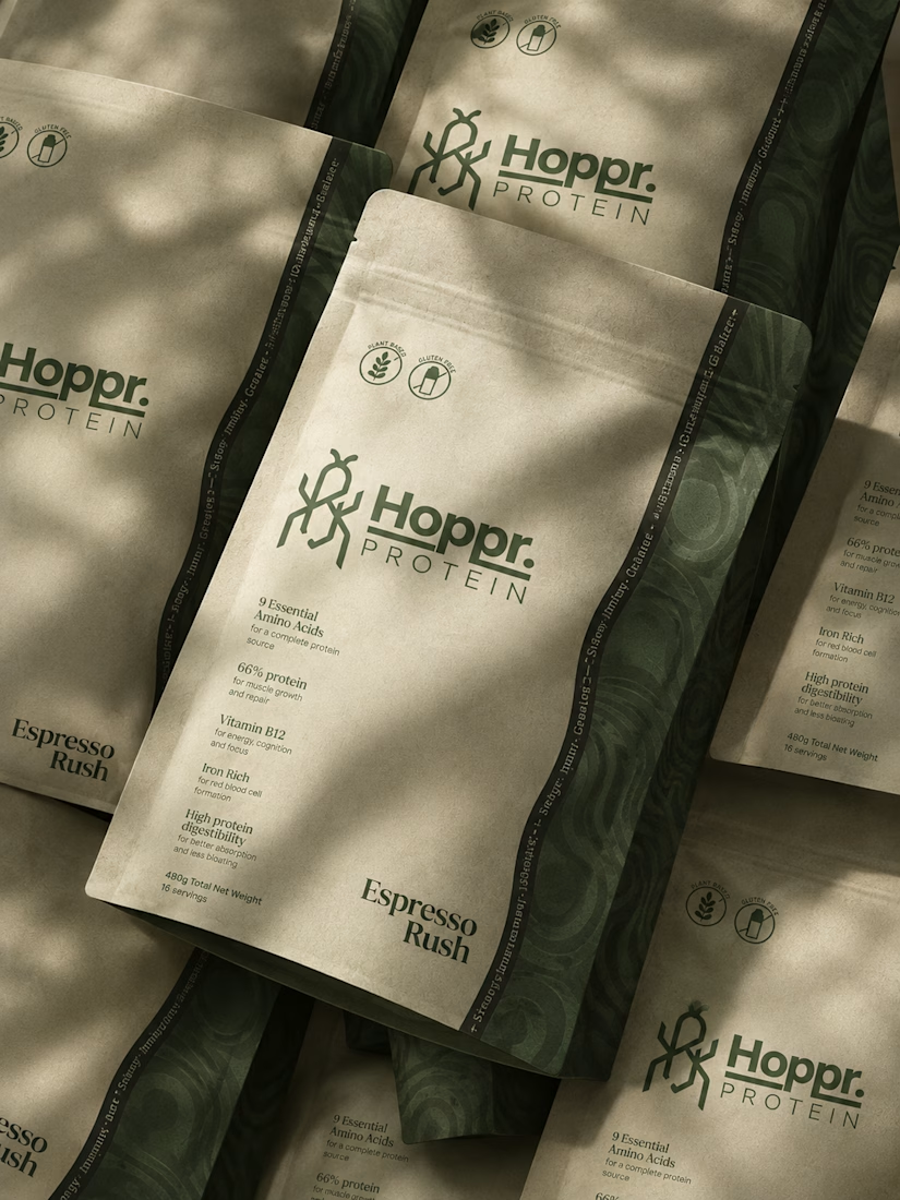
That was the case with Hoppr, a protein powder brand made from crickets. 🦗 YES, CRICKETS!
Sometimes the logo, colors, and visual system are already there and my job is to bring them to life on packaging and see how far I can push them.
I love projects like this because I get to play with typography, layout, and materials while working within an existing identity.
How much freedom do you think a designer should have when working with an established brand?


Great packaging work, nice job
Have you ever designed packaging for a brand that never launched? 👀
Surprisingly, it’s happened to me more times than I expected.
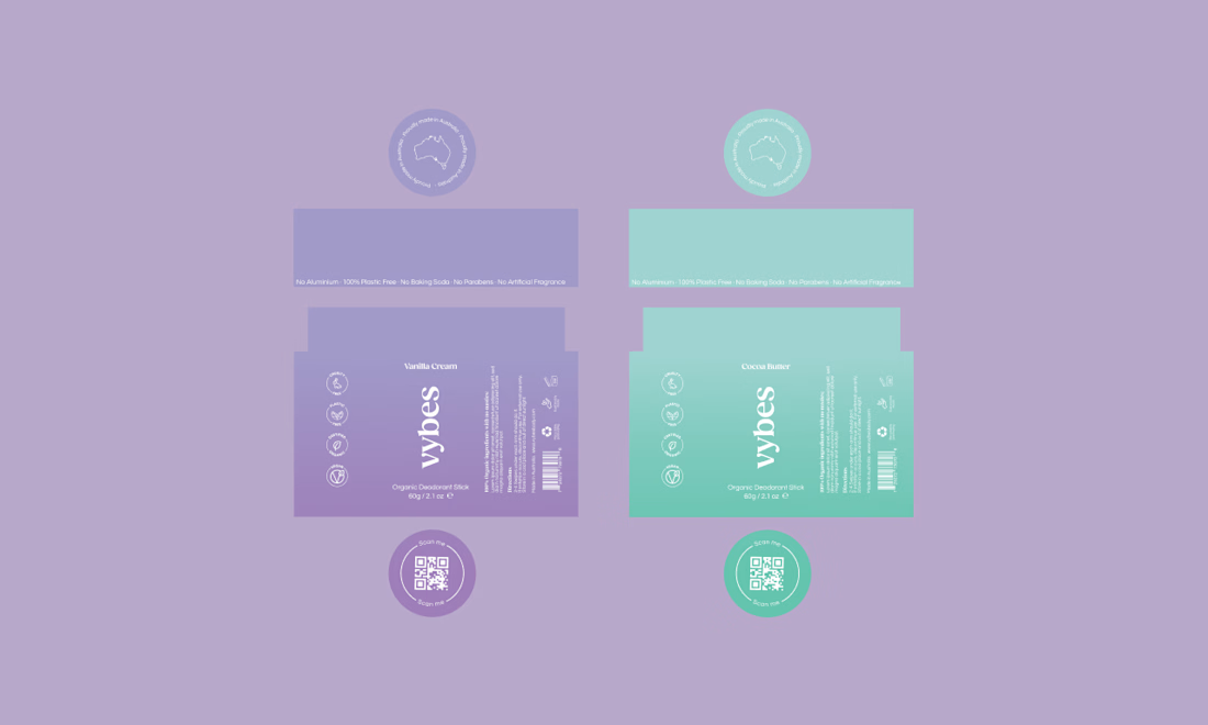
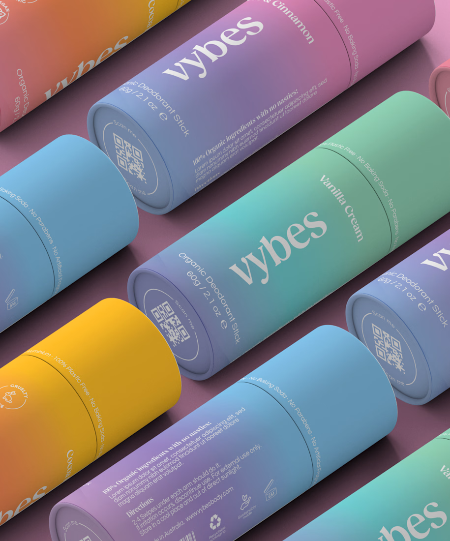
Vybes was an organic deodorant brand from Australia I worked on, designing packaging for a product that, in the end, never made it to market.
It’s a weird feeling putting so much thought into packaging for a product that people will never see on a shelf.
How many unreleased projects are hiding in your folders? 😂



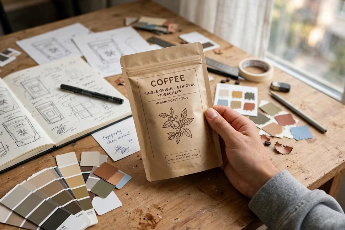
A little peek into the process! ☕ Working on branding and packaging design for a specialty coffee line—from initial sketches and color palettes to the final tactile packaging. Would love to hear your thoughts on this direction! ✨"