The network for creativity
Join 1.25M professional creatives like you
Connect with clients, get discovered, and run your business 100% commission-free
Creatives on Contra have earned over $150M and we are just getting started
Back to feedPost

Project Title: International Women's Day
Project Goal:
Create meaningful Women’s Day visuals tailored to three different brands across real estate, corporate, and nonprofit sectors.
Challenge:
Each brand had a unique audience and message requiring distinct visual tone, emotional appeal, and communication style.
Approach:
I developed custom visual directions aligned with brand identity, using purposeful composition, color psychology, and storytelling-focused layouts.
Solution:
Delivered three tailored campaign designs, each communicating celebration, leadership, and advocacy while maintaining strong brand presence.
Impact:
The designs helped each brand celebrate women meaningfully while strengthening audience connection through purposeful visual storytelling.


The network for creativity
Join 1.25M professional creatives like you
Connect with clients, get discovered, and run your business 100% commission-free
Creatives on Contra have earned over $150M and we are just getting started



Related posts


Great!!

Login page idea design
A playful visual concept where the character literally “arms” himself depending on the strength of the password.
As the user creates a stronger password, the character progressively equips himself with more powerful protection and armor. The stronger the password, the better prepared and more protected he becomes.
The idea turns password security into a simple and engaging visual metaphor , instead of showing abstract security levels, the user can immediately see how their password makes the character stronger and safer.


Very cool, Anna!

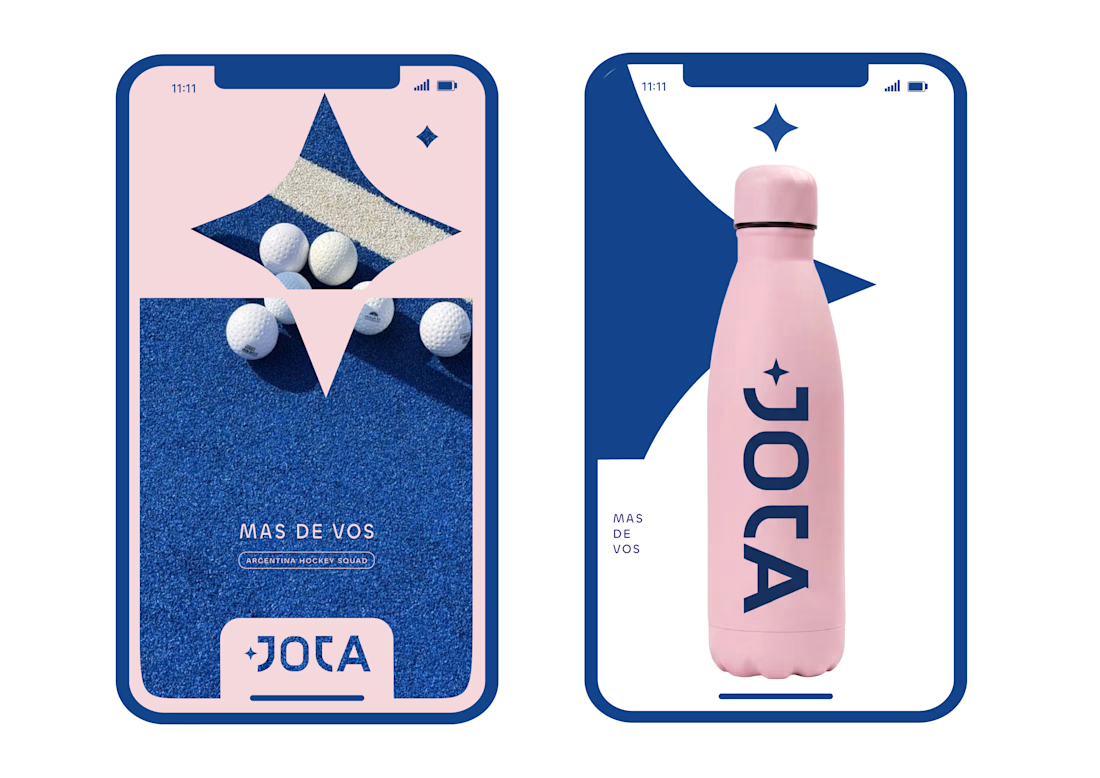
JOTA is an Argentine field hockey brand built for players who play with personality. The founder reached out to rethink how the brand shows up beyond the stick itself.


Wow project