The network for creativity
Join 1.25M professional creatives like you
Connect with clients, get discovered, and run your business 100% commission-free
Creatives on Contra have earned over $150M and we are just getting started
Back to feedPost

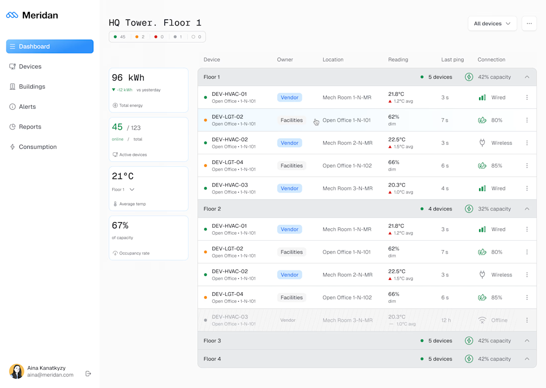
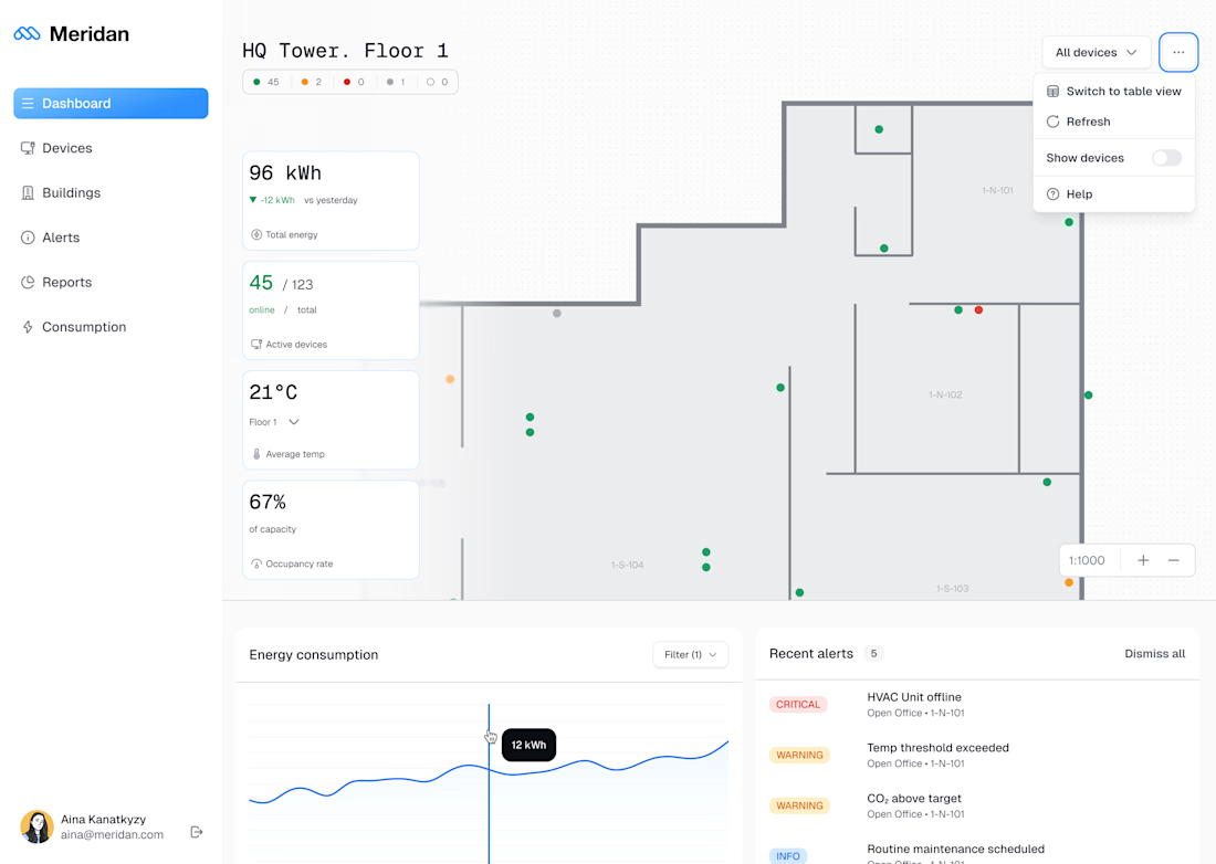
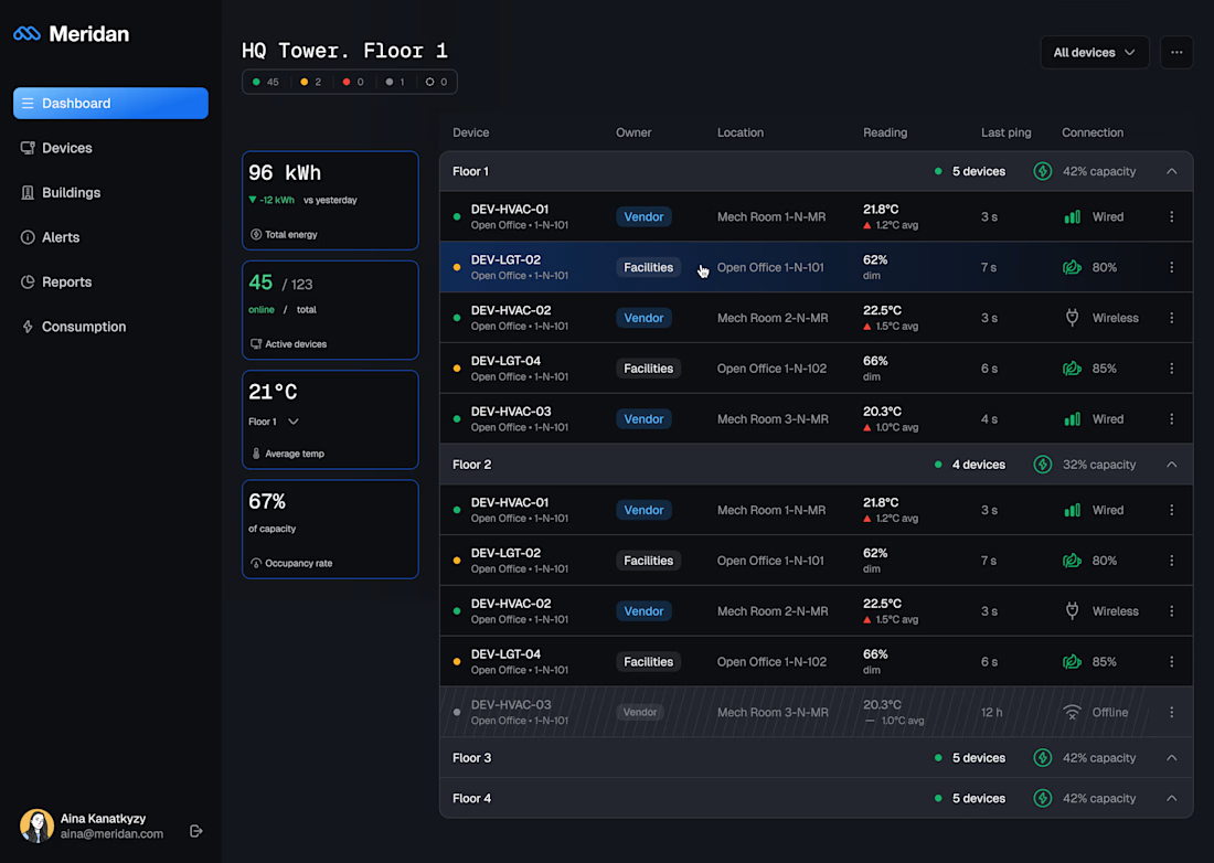
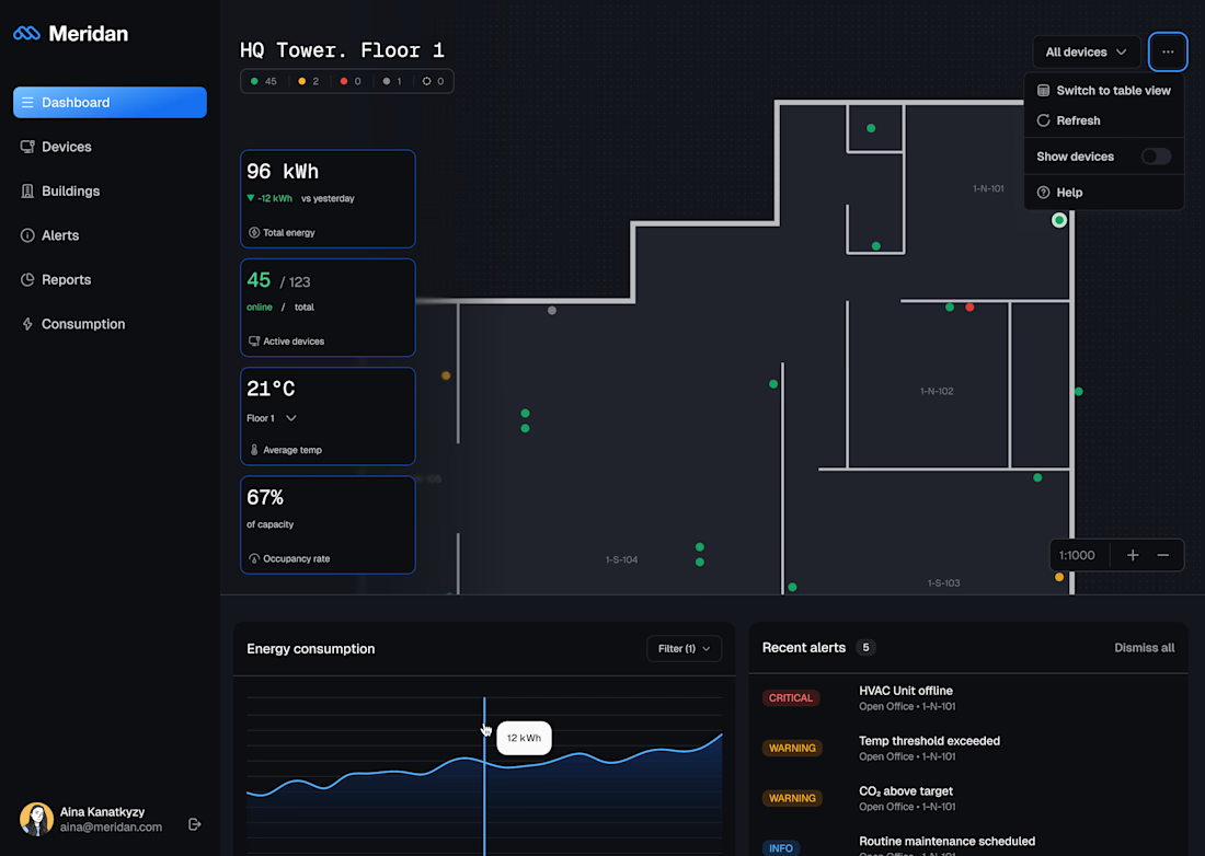
I am prepping a giveaway of the IoT dashboard.
Figma file with 2 variants of the dashbaord - table + floor plan - in two light and dark mode.
Would you be interested?
The network for creativity
Join 1.25M professional creatives like you
Connect with clients, get discovered, and run your business 100% commission-free
Creatives on Contra have earned over $150M and we are just getting started











Related posts

Working on a SaaS dashboard concept in Figma. 🚀
The goal is to make complex business data easier to scan and understand through clear visual hierarchy, structured analytics cards, and organized navigation.
Still refining the details and exploring ways to make the experience more intuitive.
What matters more to you in a dashboard: clean visuals or faster access to insightful?
#Ui designs #Ux design #Saas design #Figma
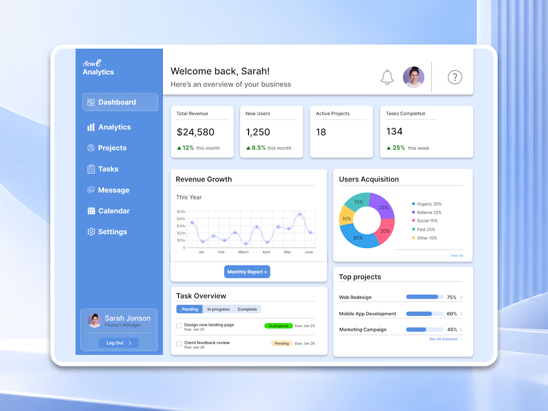

For a dashboard like this, I’d test whether the key action stays visible when the cards are filled with real, uneven data—not just placeholder numbers. What kind of business data are you designing the first view around?

Luxury Real Estate Dashboard, a modern property management dashboard concept designed in Figma.
The idea was to create a premium digital experience that makes managing properties, exploring listings, and tracking performance feel simple and intuitive.
The design combines a soft glassmorphism style, elegant typography, immersive property imagery, and a clean dashboard layout.
Key Features:
Property management dashboard
Luxury property listings
Interactive-style property location map
Property analytics and performance insights
Recent activities and client inquiries
Modern glassmorphism UI
Tool: Figma
Focus: UI/UX Design | Real Estate SaaS | Dashboard Design | Web App Design | Product Design
Have a SaaS platform, dashboard, or digital product in mind?
Open to freelance UI/UX projects and collaborations.


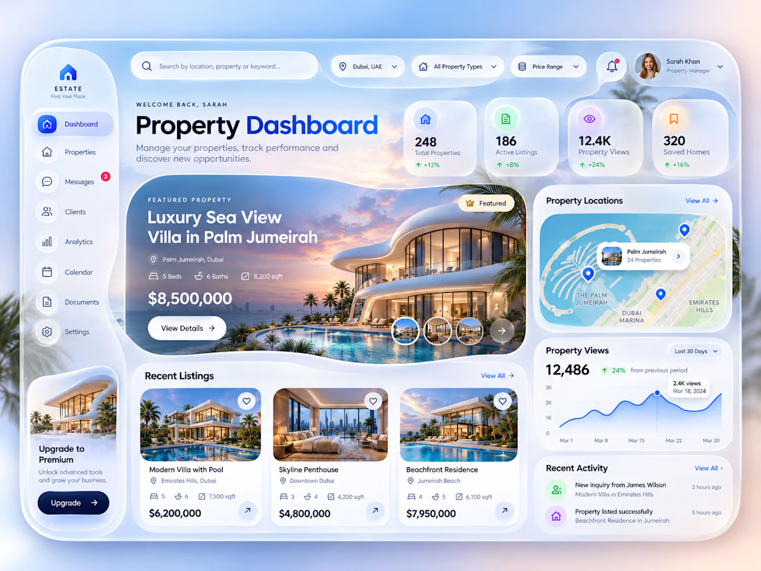

Clean and elegant concept. I like how the analytics and property listings come together in one intuitive dashboard.

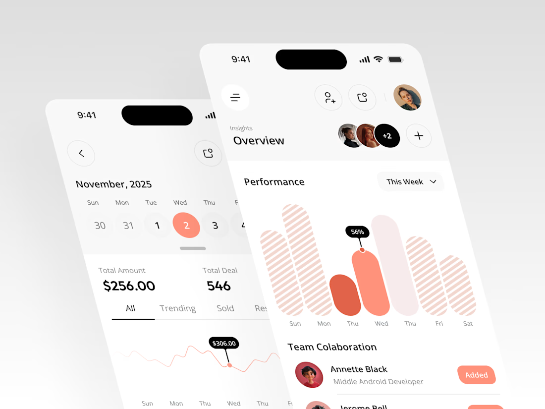
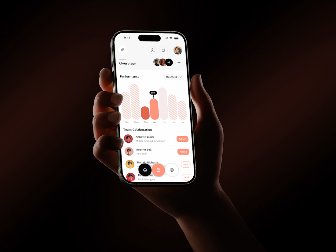
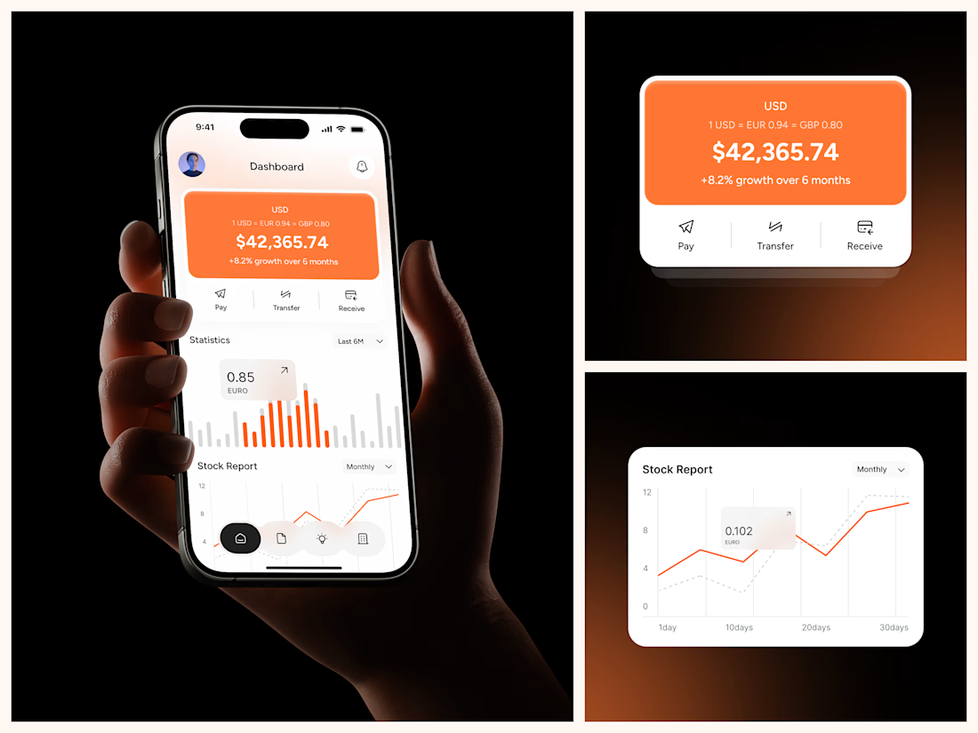

The coral red charts against the dark phone-in-hand shots make this pop, Rakesh. That Performance bar visual with the team collaboration section underneath gives the whole thing a real product feel. Clean mobile dashboard work.