The network for creativity
Join 1.25M professional creatives like you
Connect with clients, get discovered, and run your business 100% commission-free
Creatives on Contra have earned over $150M and we are just getting started
Back to feedPost
Taste Test

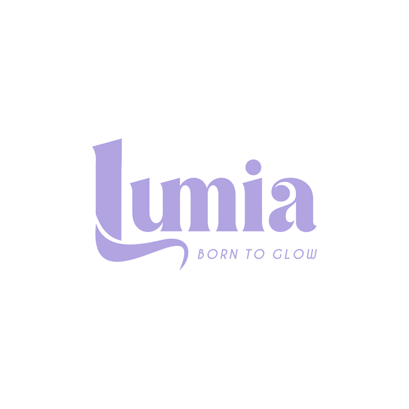
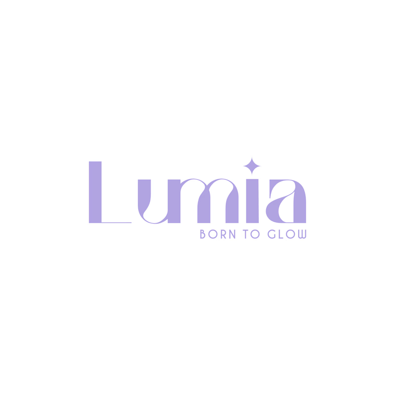

I like the Minimal and Elegant


Thanks for sharing your feedback, Fatima! Really appreciate it. ❤️

Actually the right side is way better cause it's more obvious than the minimal style
Thanks for sharing your feedback, Mena! Really appreciate it. ❤️

Bold is heavy❤️
Thanks for sharing your feedback, Mostafa! Really appreciate it. ❤️
Pardon Prince ❤️
No worries at all! 😊❤️

Bold

This minimal & elegant one hits perfect for Lumia! The soft lavender + BORN TO GLOW tagline with that little star sparkle really sells the glow concept. Super clean in Illustrator!
The network for creativity
Join 1.25M professional creatives like you
Connect with clients, get discovered, and run your business 100% commission-free
Creatives on Contra have earned over $150M and we are just getting started











Related posts


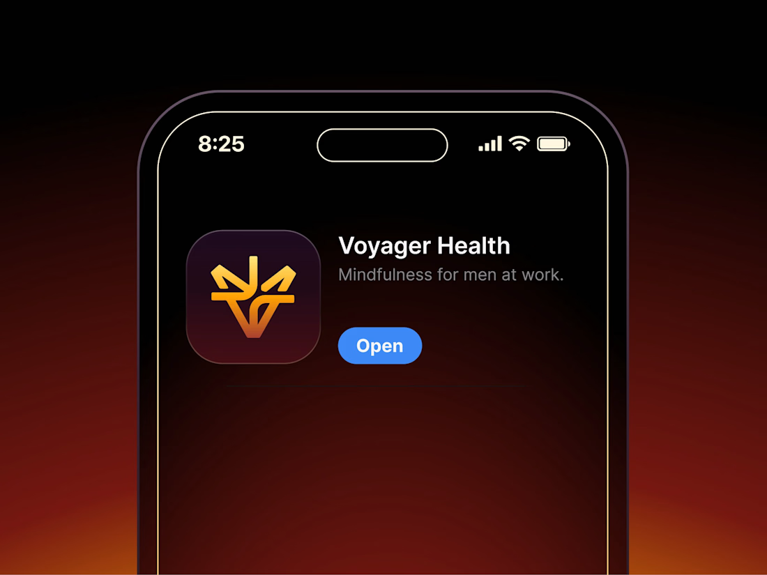

Aryna, that golden symbol pops so nicely against the plum background ✨

The team is cooking
Motion design for the logo we are making for Nation e-commerce


Wou

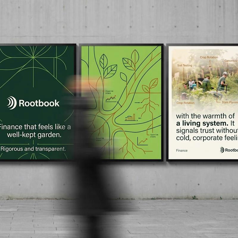
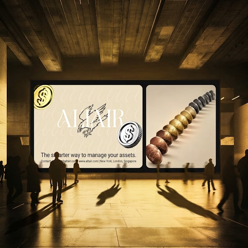
What does trustworthy finance look like to you?
A) Rootbook: Finance that feels like a well-kept garden.
B) Altair: The smarter way to manage your assets.
Two finance brands I’m designing, two completely opposite worlds. Which one gets your money?
28 voted
61%
18 voted
39%
46 votes
Closed

Rootbook wins for me. A finance brand that feels like a well kept garden is such a refreshing idea.