The network for creativity
Join 1.25M professional creatives like you
Connect with clients, get discovered, and run your business 100% commission-free
Creatives on Contra have earned over $150M and we are just getting started
Back to feedPost

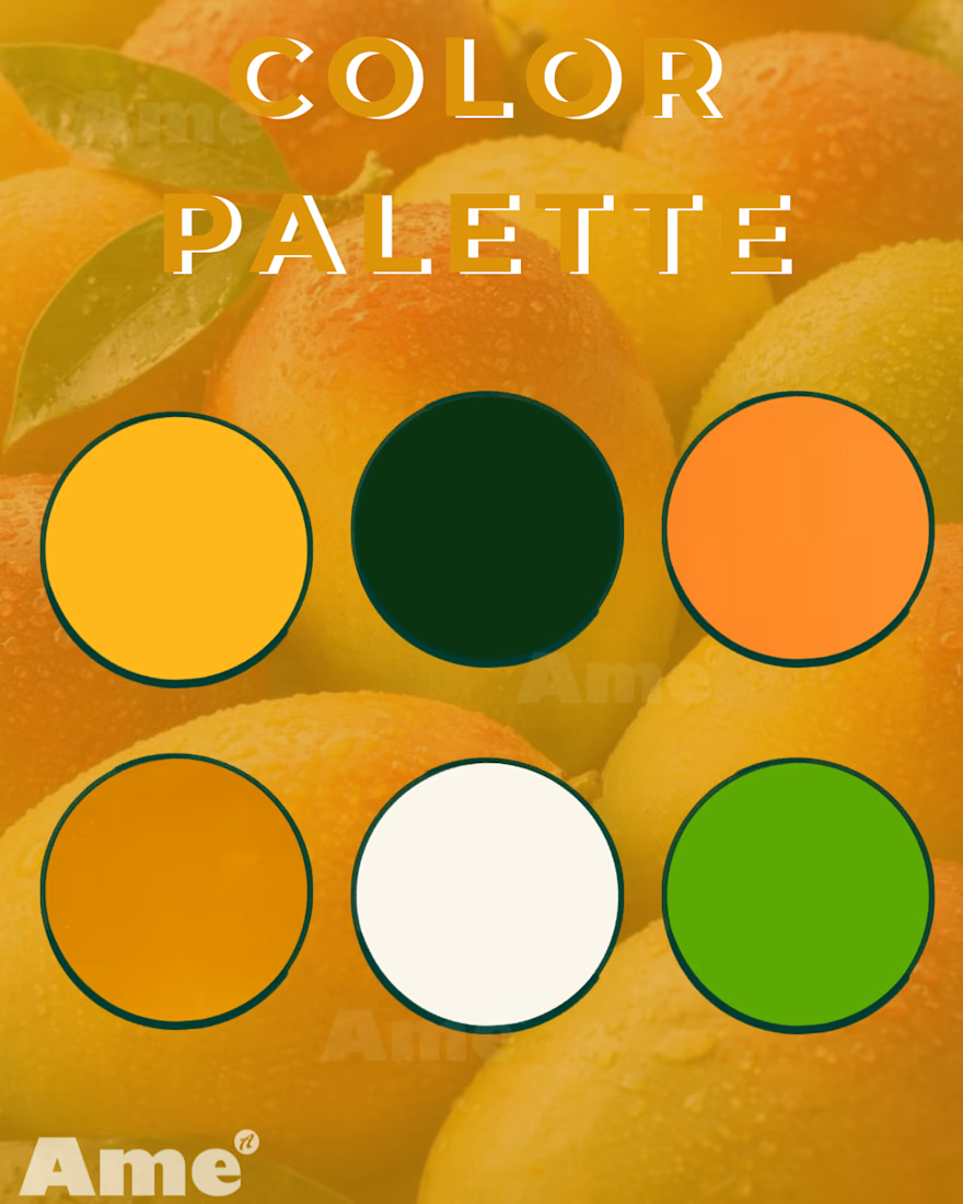
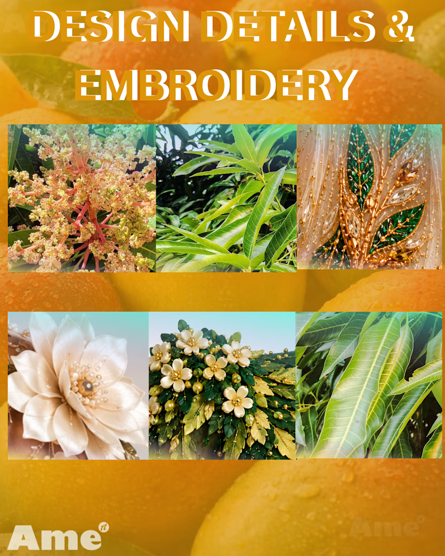
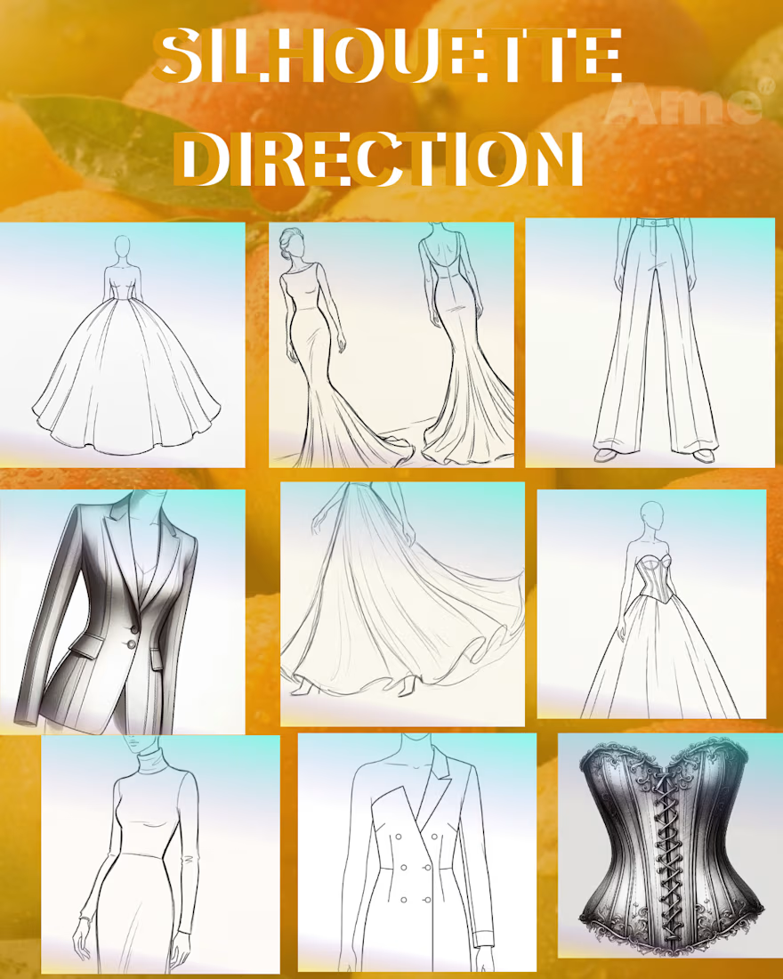
MOODBOARD
continuation
#fashionillustration #fashioncollection #fashionconcept #creative design #aifashion #aifashionillustrator
The network for creativity
Join 1.25M professional creatives like you
Connect with clients, get discovered, and run your business 100% commission-free
Creatives on Contra have earned over $150M and we are just getting started

Challenges
View all


Related posts

Designers, a client is buying into your taste, not just your ability to execute.
This project was about extending an existing brand into a new tech product, without losing the visual DNA that already made it distinctive.
The moodboard became part of the sell: proof that I understood the brand, but also that my own aesthetic judgment was refined enough to carry that legacy forward.
I can’t share the full moodboard yet as the project is not public, but this part of the process reflected an important part of my design philosophy. And I wanted to share it with you.
Because, that’s what I believe moodboards really do in design bussiness. They make taste visible, and show what to preserve, what to evolve, and how far to push.
As execution becomes faster, taste and creative judgment only become more valuable.
#BrandDesign #CreativeDirection #VisualIdentity #BrandStrategy #ArtDirection


The idea of making taste visible through the moodboard really lands here—the restrained type and orange mark feel like a clear bridge between legacy and future. I especially like how the motion piece turns that visual DNA into a living system.

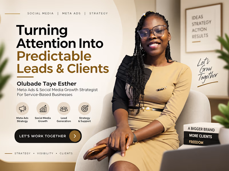
Testing something new 👇
Designed this with ChatGPT + Flora.
Be honest… which one would you trust more?
#SocialMediaManager
#MetaAds
#DigitalMarketing
#AIForBusiness
#AIinMarketing

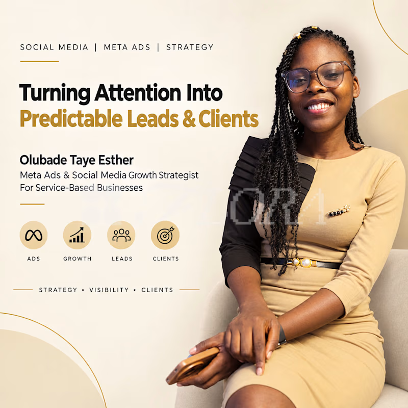
0 votes
Ends in 1d

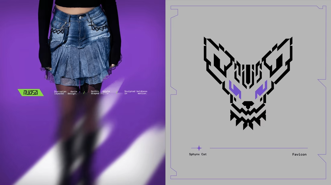
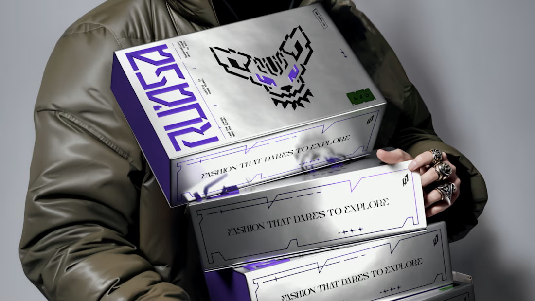
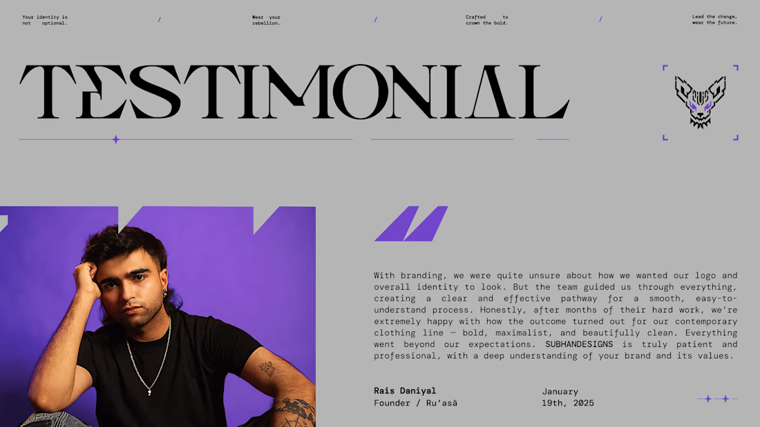
"We weren’t sure what our brand should look like. They gave us a clear path forward.”
That’s how our client described their experience working with us on Ru’asā.
They came to us with a clear ambition: build a premium fashion brand that goes beyond category conventions.
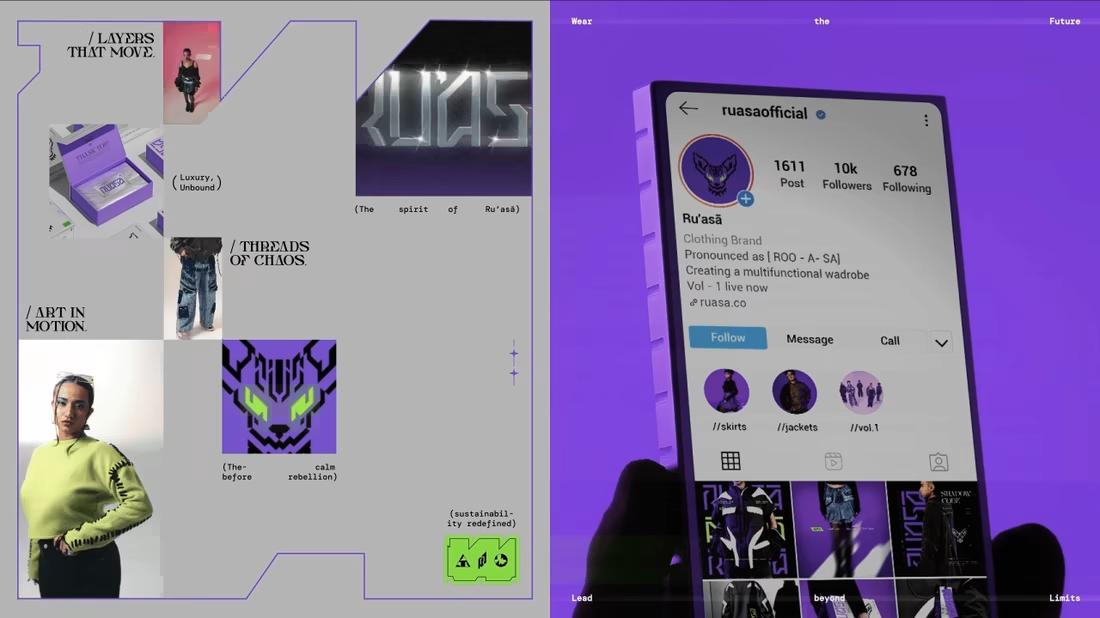
Derived from the Arabic ra’is, meaning chief or leader, Ru’asā celebrates individuality and rebellion against conformity.
We built the complete brand experience across Strategy, Creative Direction, Visual Identity, Packaging Experience and Collaterals.
The full project is live. Take a look at how we brought the brand to life here
Building a brand that aims to set the standard rather than follow one? I’d love to hear from you
Brand DesignPackaging DesignFigmaJitterKittlbrandingvisualidentitydesignFashion DesignBrand Strategy