The network for creativity
Join 1.25M professional creatives like you
Connect with clients, get discovered, and run your business 100% commission-free
Creatives on Contra have earned over $150M and we are just getting started
Back to feedPost

Restaurant Website – Digital Branding & User Experience
Challenge
The client needed a modern, user‑friendly website to represent a restaurant specializing in authentic cuisine. The challenge was to create a design that not only showcased the food but also streamlined the customer journey — from exploring the menu to making reservations.
Solution
I developed a clean, contemporary layout with a white and yellow color scheme that conveys freshness and warmth. Key elements included:
Brand identity: A welcoming hero section with bold typography and a featured dish image to immediately capture attention.
Customer engagement: Prominent buttons for “View Menu” and “Reserve a Table” to guide users toward action.
Navigation design: Intuitive links for Home, About, Menu, Services, Testimonials, and Contact, plus integrated icons for phone, email, and social media.
Food presentation: High‑quality imagery of signature dishes like Pizza Margherita and Spaghetti Carbonara to highlight authenticity.
Service integration: Dedicated sections for takeaway and delivery, ensuring accessibility for different customer needs.
Impact
The final design provided a seamless digital experience that reflects the restaurant’s passion for authentic cuisine. It improved customer engagement by making reservations and menu exploration effortless. This project is featured on my Kajabi portfolio, where I showcase creative work in restaurant branding, digital promotion, and user‑focused web design.


Awesome design
The network for creativity
Join 1.25M professional creatives like you
Connect with clients, get discovered, and run your business 100% commission-free
Creatives on Contra have earned over $150M and we are just getting started






Related posts


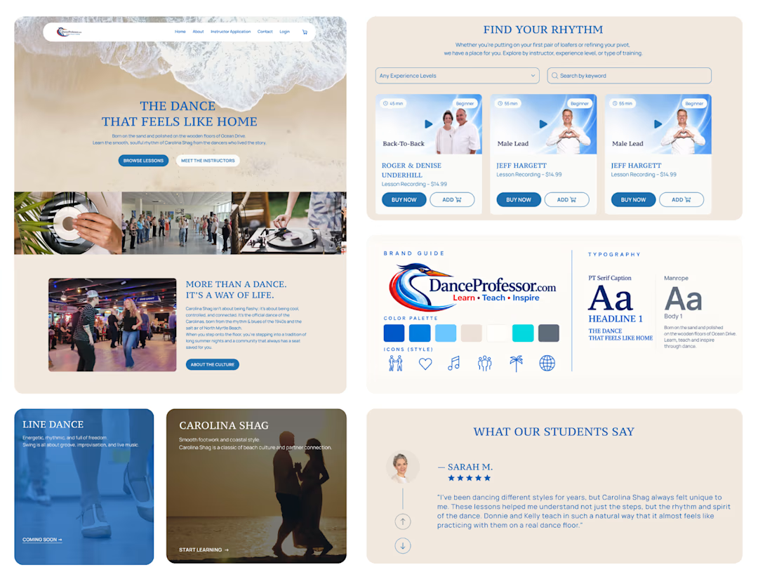
Another Kajabi project wrapped up! 🎉
We've noticed a common challenge across many of our recent projects: clients have a growing number of courses, but making them easy to browse isn't always straightforward.
Kajabi doesn't offer advanced course filtering out of the box, so for DanceProfessor, we built a custom solution.
It took quite a bit of time on both the design and development sides, but the result was worth it. The client is happy, and visitors can now easily find exactly what they're looking for.
Sometimes the most challenging features are the ones that make the experience feel the simplest.


Ramen Brand Identity
Oishii is a self-initiated branding project exploring the visual identity of a modern ramen brand. The concept combines Japanese-inspired aesthetics with a contemporary visual approach, creating a distinctive and cohesive identity across brand applications.
The project explores visual direction, typography, colour, and brand elements to build a memorable identity for a food brand.


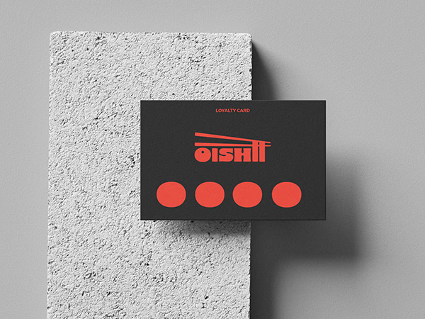
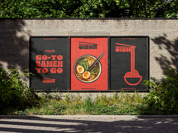
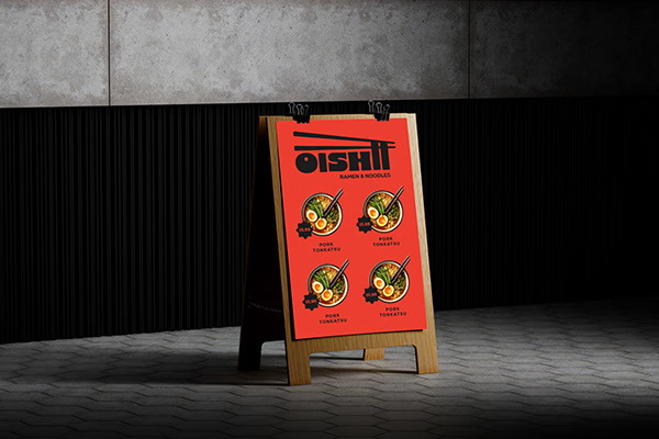
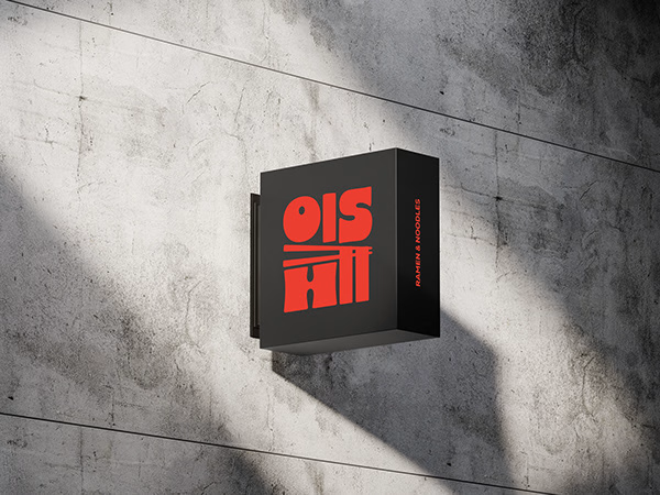


Love the mix of Japanese-inspired style and modern branding. The identity feels cohesive and memorable.
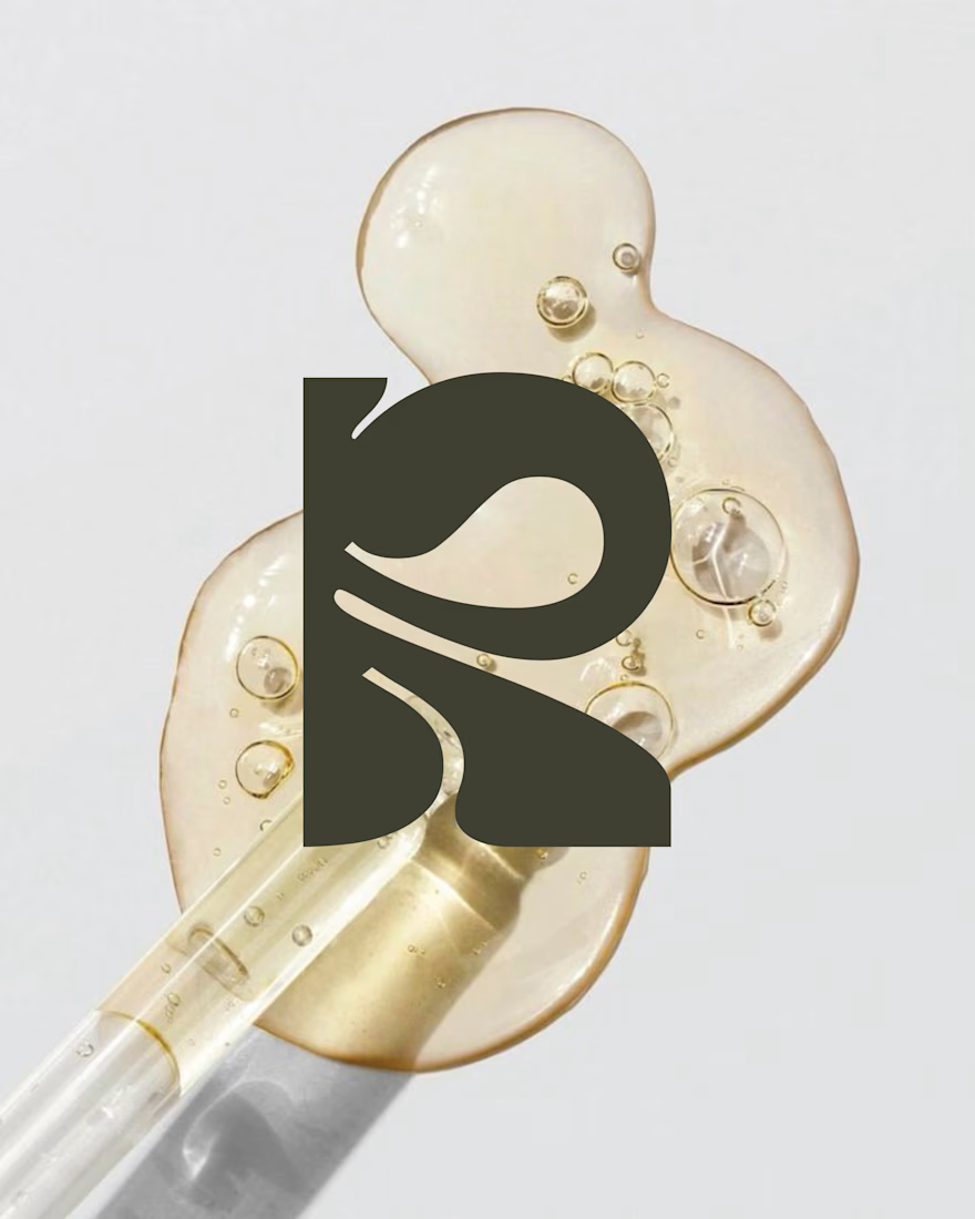
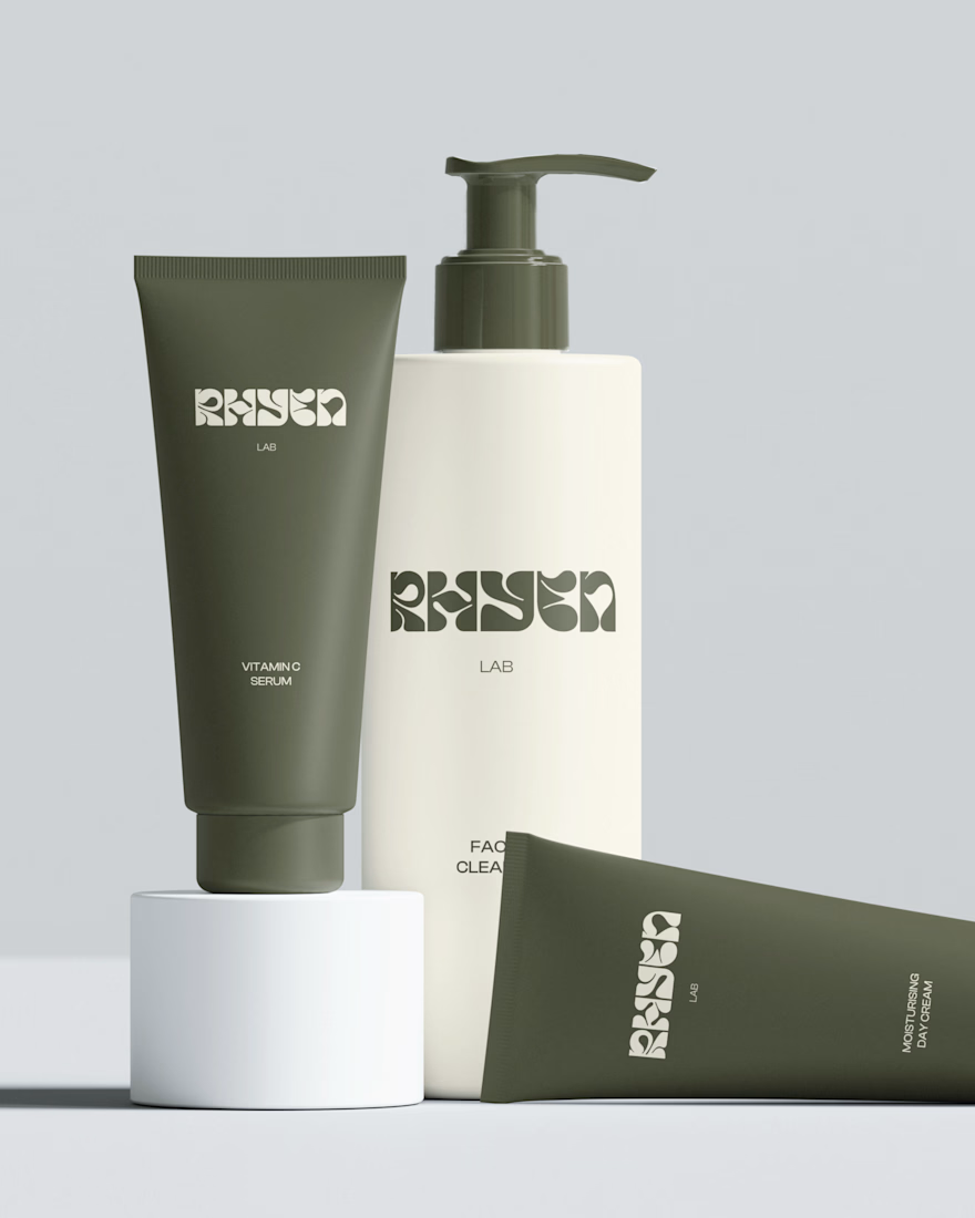
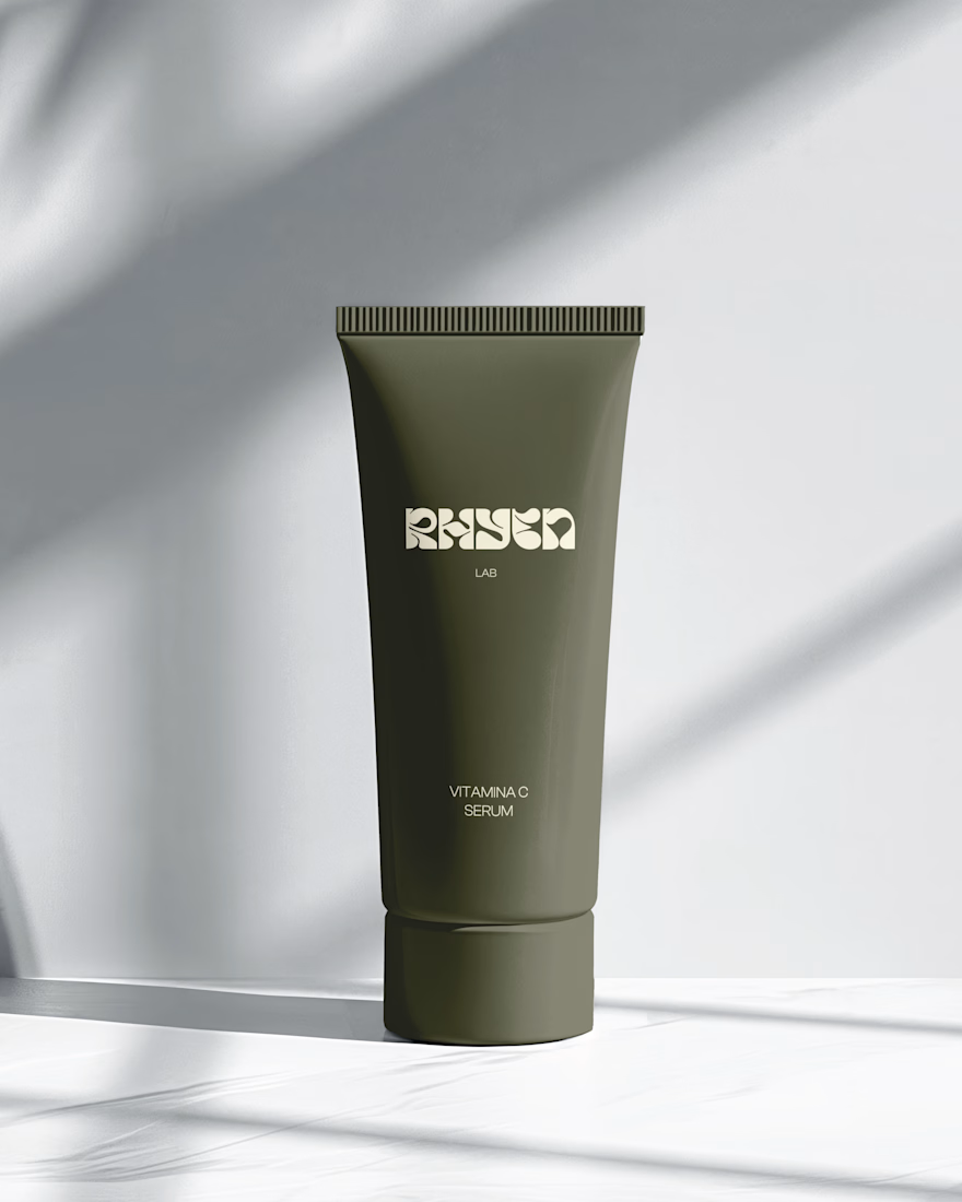
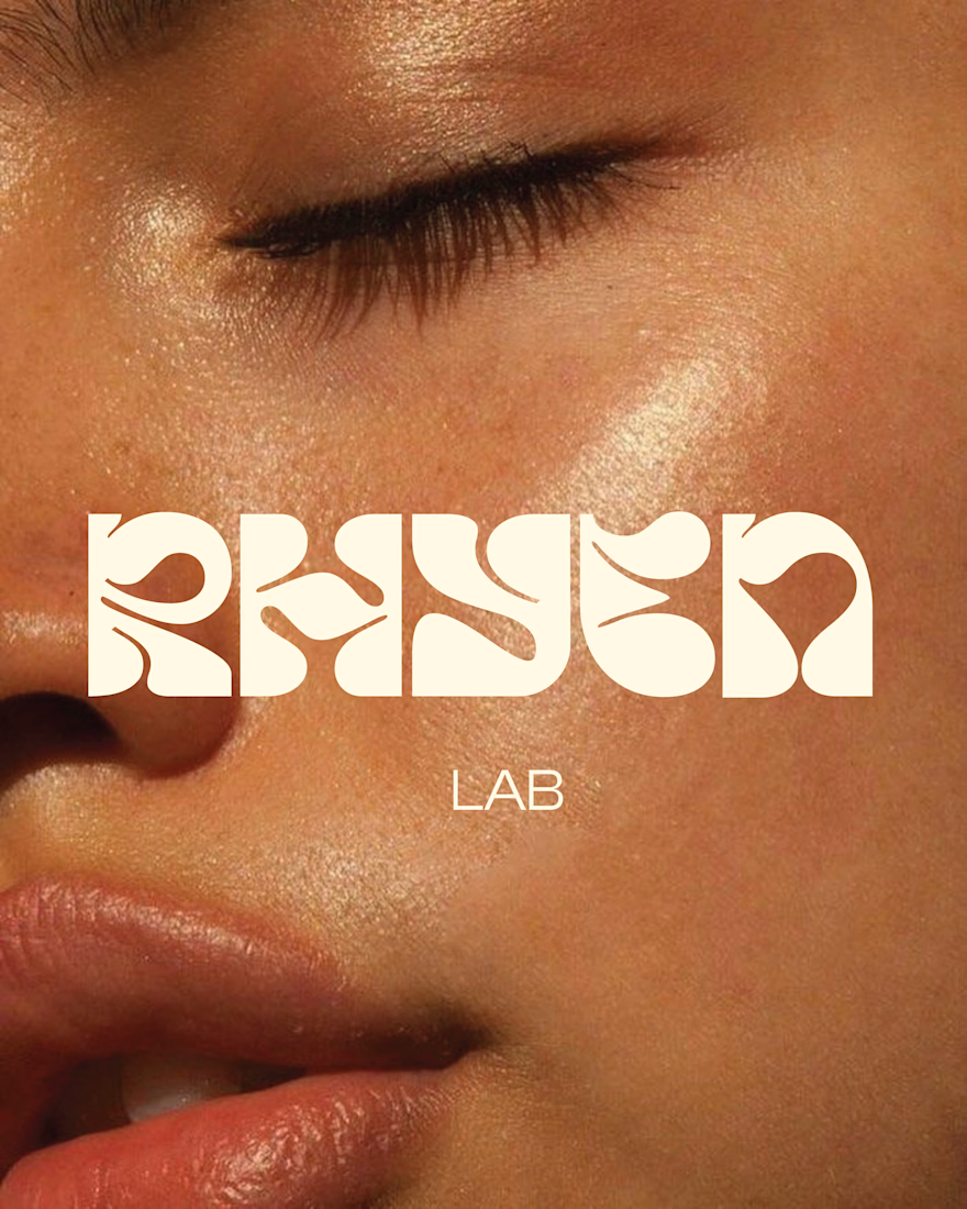
Rhyen Lab: Brand Identity & Packaging for a Skincare Brand
Rhyen Lab is a skincare brand built around science-backed formulas and a sensorial, human approach to beauty. The challenge was to create an identity that feels clinical enough to be trusted, yet warm and expressive enough to stand out in a crowded market.
I designed a custom wordmark with fluid, organic letterforms that echo the texture of serums and oils, paired with a bold monogram “R” for compact applications. A palette of deep olive green and soft cream keeps the brand grounded, natural and premium, while macro photography of skin and product textures reinforces the sensorial tone.
The system was applied across packaging for the Vitamin C Serum, Facial Cleanser and Moisturising Day Cream, ensuring consistency across tubes and bottles.
Deliverables: Logo & monogram · Visual identity · Color palette · Packaging design · Art direction