The network for creativity
Join 1.25M professional creatives like you
Connect with clients, get discovered, and run your business 100% commission-free
Creatives on Contra have earned over $150M and we are just getting started
Back to feedPost

Most fintech brands get the design right and the communication completely wrong.
Your audience doesn’t have the patience for long paragraphs or fancy words.
They’re scanning. They’re deciding in 3 seconds.
That’s why when I design for fintech brands, I never start with colours or layouts.
I start with the story.
〽️ I refine the copy first — making sure it names the real problem your customer faces, then positions your brand as the answer.
〽️ I keep messaging minimal and direct. No jargon. No noise.
〽️ Every design has one clear CTA — so your audience knows exactly what to do next.
〽️ Then I layer in high-quality illustrations and a colour system that actually fits your brand personality.
Because beautiful isn’t enough. Your brand needs to connect, communicate, and convert.
These flyers were commissioned by Crediva this year and every design decision was intentional.
Which slide spoke to you most? Drop it in the comments.
If your fintech brand looks the part but isn’t pulling the numbers that’s a communication problem, not a design problem.
I build monthly design content plans that keep fintech brands visible and converting. If that’s what you need, send me a DM or a mail cthumbs213@gmail.com
fintechdesignfintechappukwebdesignerBrand DesignBrand StrategyGraphic DesignAdobe IllustratorAdobe PhotoshopProcreate


The network for creativity
Join 1.25M professional creatives like you
Connect with clients, get discovered, and run your business 100% commission-free
Creatives on Contra have earned over $150M and we are just getting started
Trending

Claude
Claude has entered the design space. How are you using Claude Design?

Contra University
Learn from expert creatives how to earn more using next-gen AI tools.
creativeaiflow
Creative AI workflows are evolving. What tools do you use, and what are their strengths and weaknesses?
freelancerlife
Freelancer life is wins, pivots, and everything in between. What’s yours right now?












Related posts

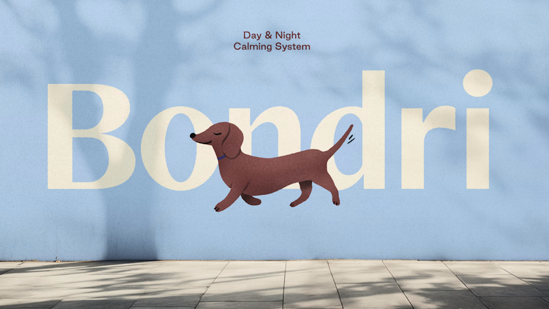
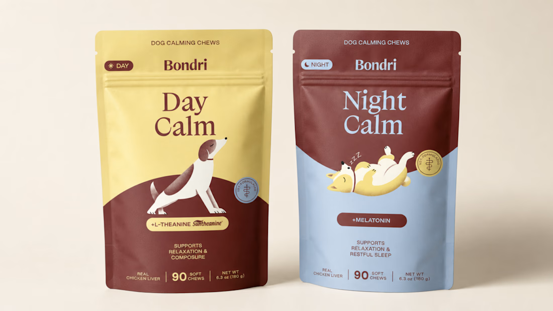
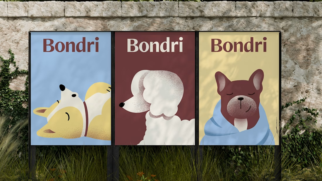
Bondri is live. 🐾
Full brand identity, packaging design, Amazon assets, and custom illustrations for this dog calming chews brand.
One of the main challenges: designing two packaging variants that felt like the same world but communicated different moments. Daytime calm and nighttime calm read very differently.
More coming soon.





Nice one

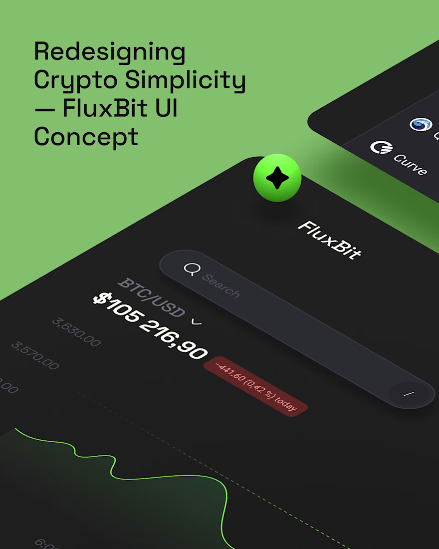
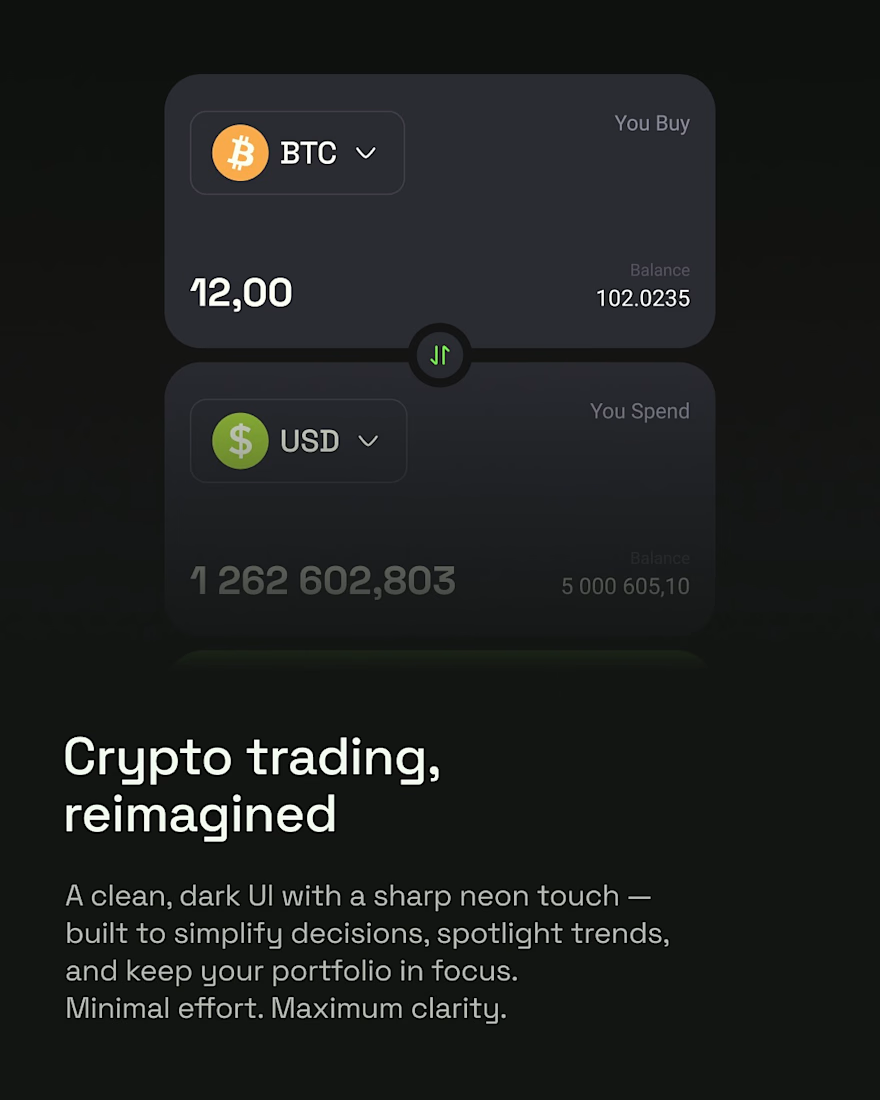
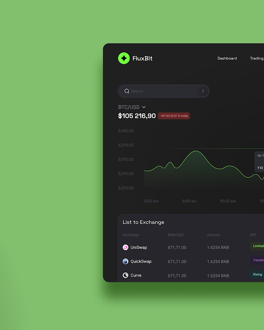
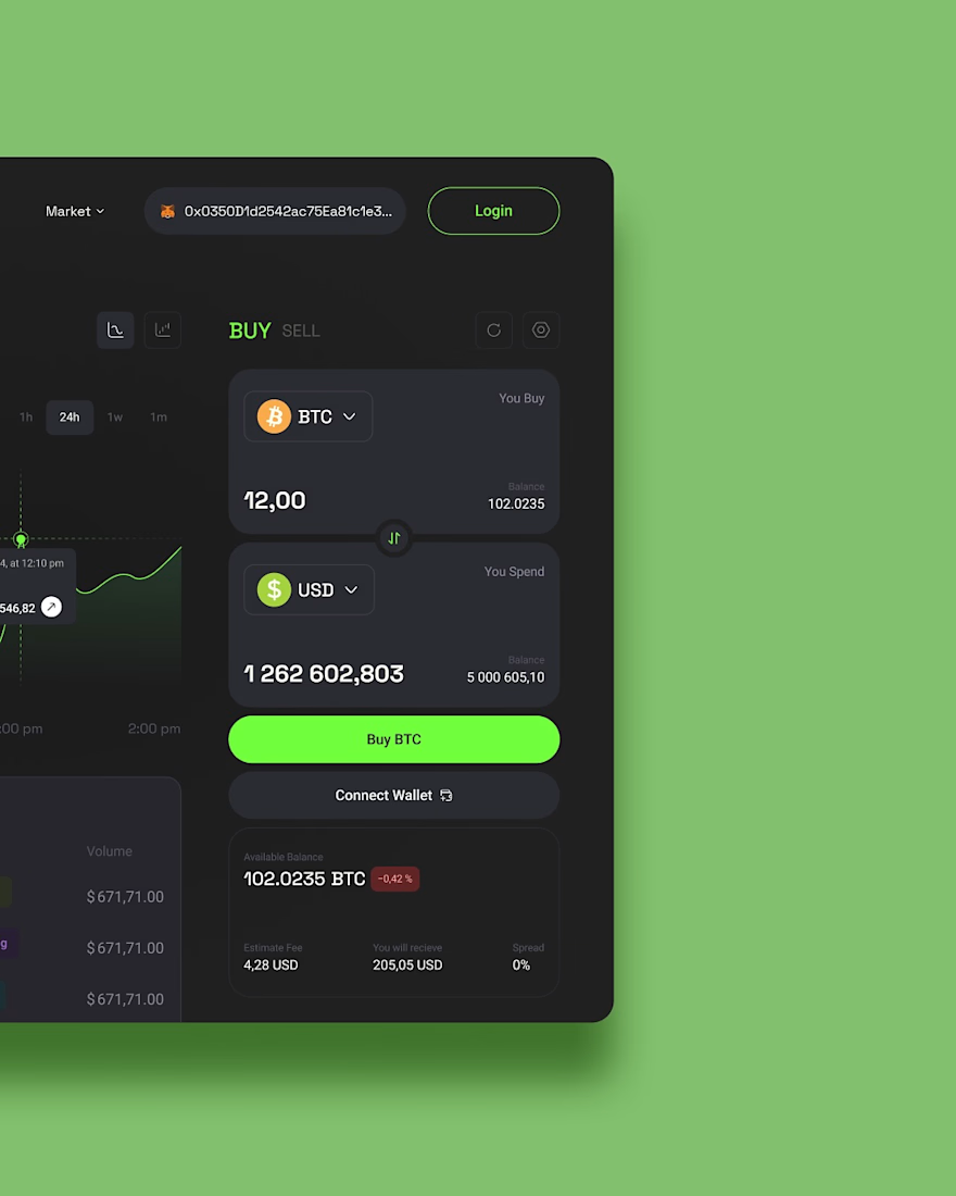
Revisiting one of our earlier UI concepts.
FluxBit was our take on how a crypto trading platform could feel if simplicity came before complexity.
Instead of overwhelming users with endless charts and distractions, we explored a cleaner experience with a focused dark interface, subtle neon accents, and layouts that make market data easier to understand at a glance.
Every screen was designed to reduce visual noise while keeping the tools traders actually need within easy reach, creating an experience that feels modern, confident, and intuitive.
It's always fun looking back at concepts like this and seeing how timeless a clarity-first approach to product design can be.

love the UI

Earlier this year, I redesigned my portfolio site into my own personal digital home! The idea was to infuse personal elements into my professional world, and create something beautiful, functional, and easy to navigate.
I've moved my portfolio site around to different platforms over the years, but this time around I landed on Squarespace. I used their new block transform and block animation features to create some movement and interest, particularly on the home page of the site.
Finish Layer, along with other Squarespace design features, helped me create a site that I'm super proud of and a site that earns me business, all with minimal code.
Click around the full site here: https://www.bytaylorgrosse.com/
