The network for creativity
Join 1.25M professional creatives like you
Connect with clients, get discovered, and run your business 100% commission-free
Creatives on Contra have earned over $150M and we are just getting started
Back to feedPost

Earlier this year, I redesigned my portfolio site into my own personal digital home! The idea was to infuse personal elements into my professional world, and create something beautiful, functional, and easy to navigate.
I've moved my portfolio site around to different platforms over the years, but this time around I landed on Squarespace. I used their new block transform and block animation features to create some movement and interest, particularly on the home page of the site.
Finish Layer, along with other Squarespace design features, helped me create a site that I'm super proud of and a site that earns me business, all with minimal code.
Click around the full site here: https://www.bytaylorgrosse.com/


I liked the vibe of the site... it seems like an "old money" style.

i'm loving the textiles and textures!
The network for creativity
Join 1.25M professional creatives like you
Connect with clients, get discovered, and run your business 100% commission-free
Creatives on Contra have earned over $150M and we are just getting started



Related posts

Does a brand system need more rules or fewer?
Norr & Co. taught me fewer, but unbreakable ones. Two things never change. Everything else is allowed to get weird.
How fast can you tell a brand idea is weak?
Mine went flat the moment I tried it on a bakery and a late-night bar at the same time. Test your idea on your two most different cases first.

've reviewed 50+ startup websites, and I noticed a pattern.
Their hero sections are often simple. They tell you who the product is for and what it does.
While working on this redesign concept for
@Alloovium, I wanted to explore a different direction.
Their original website already explained the product and its audience.
But what if the hero also used visuals that reflected the world their customers work in?
People often scan websites before deciding what to pay attention to.
Relevant visuals can catch their attention and create a connection with the audience before they start reading.
So I explored a few visual directions inspired by the construction industry.
Building a startup? I'd love to help you explore a new direction for your website.

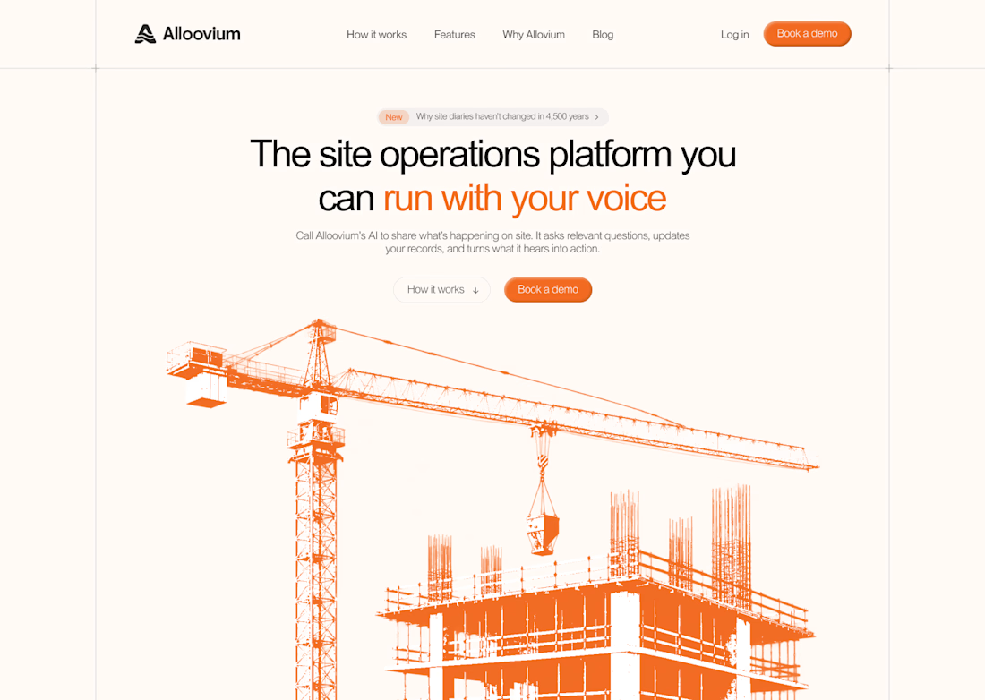
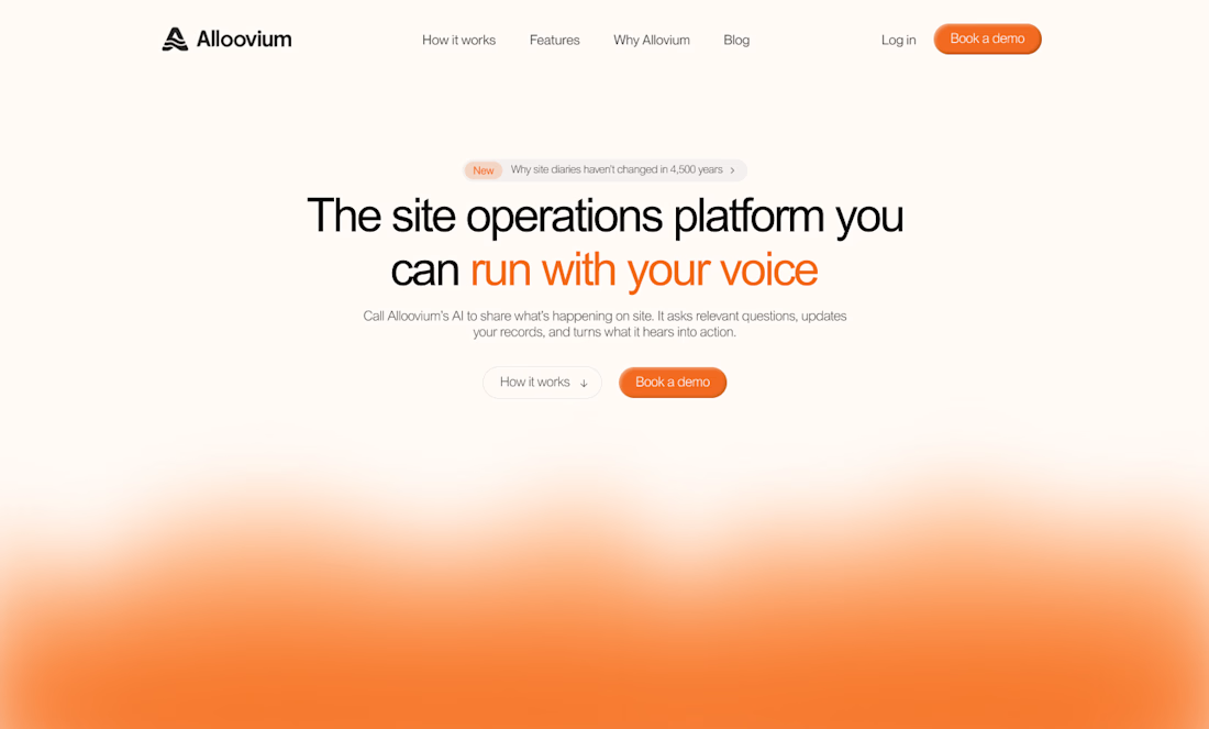
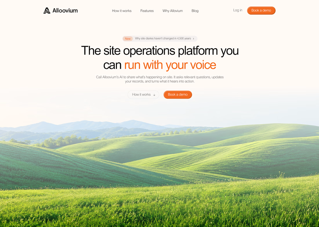

The construction visuals work well.

LOGO vs. BRANDING — What's your take? 🍵
I'm curious...
Which one makes a stronger first impression?
Do you prefer the simplicity of the logo or the personality of the complete branding?
I'd love to hear your thoughts! 💚
0 voted
0%
7 voted
100%
7 votes
Closed

makes me want a matcha haha, cool