The network for creativity
Join 1.25M professional creatives like you
Connect with clients, get discovered, and run your business 100% commission-free
Creatives on Contra have earned over $150M and we are just getting started
Back to feedPost

Give your business a powerful online presence with a modern, responsive and professionally designed website.
📲 WhatsApp: +92 371 9518139
📧 Email: archvizora@gmail.com
Let's build something amazing for your business.
The network for creativity
Join 1.25M professional creatives like you
Connect with clients, get discovered, and run your business 100% commission-free
Creatives on Contra have earned over $150M and we are just getting started



Related posts

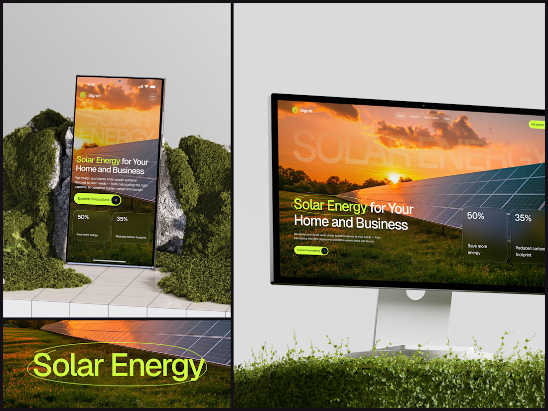
Solar Energy Website
A thin lime circle tells you which two words this page is about.
The headline sits over a sunset photo of a panel field. The "Get started" and "Explore innovations" buttons share the circle's lime, so the eye moves from the circled words straight to the next step.
Large faded capitals repeat those two words across the sky, faint enough to stay inside the photo. On mobile they break onto two lines, and the headline and button stack above two frosted cards.
Only two words of "Solar Energy for Your Home and Business" are lime, and the whole page follows them.
Designed by the Hue & Machine team.
#SolarEnergy #RenewableEnergy #CleanTech #WebDesign #LandingPage #HeroSection #UIDesign #ResponsiveDesign #MobileDesign #FigmaDesign



This is really cool, Nice job Dmytro

Here is what I have designed for Mia's Treats, featuring a cozy customer portal with interactive custom ordering and a digital loyalty stamp system. I specialize in building custom web applications and digital experiences tailored specifically for your business. Watch the video demonstration below to see how this fully responsive digital suite brings the brand to life!


A digital loyalty stamp card is such a good fit for a small bakery, it's the paper card people already know, just impossible to lose. Is Mia's Treats using it with real customers yet?

Halden - Landing Page Concepts
Halden sells to grid operators, and there were two good ways to pitch it: tell them what's coming, or show them everything happening now. Rather than pick one on instinct, I designed the landing page as an A/B test so real traffic decides.
The two pages share one 12-column grid, the same section order, type system and components. Each variant changes only its message, its hero visual and its light color, so any difference in demo requests comes from the pitch and not the layout.
The work was building a system flexible enough to carry two different stories without either one feeling like the backup version.
Forecasting (act before demand spikes) vs metering (see and bill every kilowatt)
Primary metric: Demo requests from the hero CTA
4 voted
57%
3 voted
43%
7 votes
Closed

I'd pick Forecasting. "From meter reading to early action" tells a grid operator what they get in one line. Did you write both hero lines before designing the visuals?