The network for creativity
Join 1.25M professional creatives like you
Connect with clients, get discovered, and run your business 100% commission-free
Creatives on Contra have earned over $150M and we are just getting started
Back to feedPost

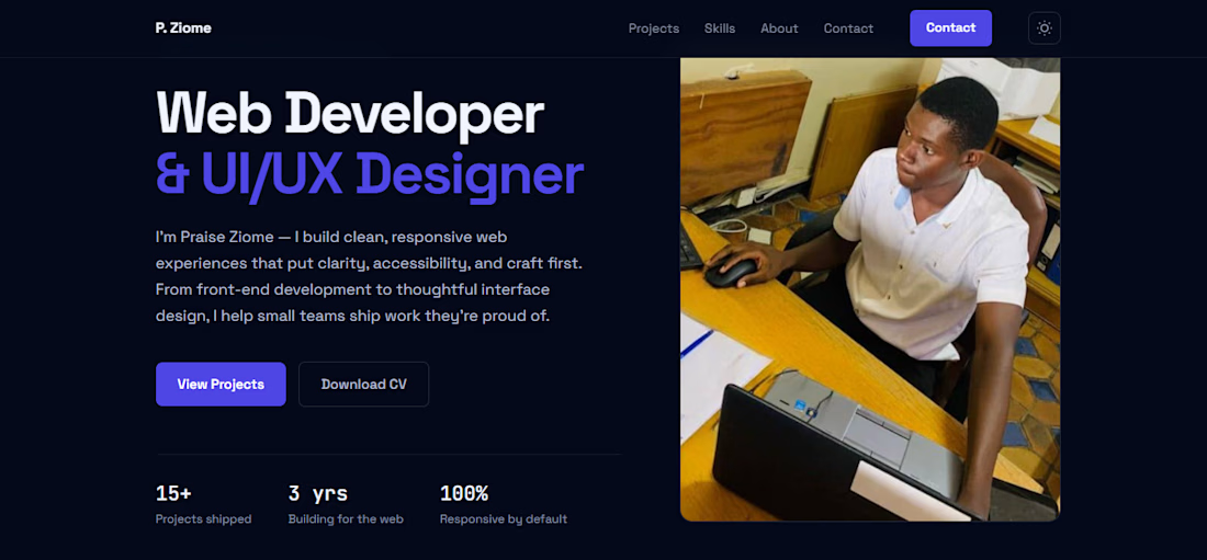
I've just shipped a major update to my portfolio:
• 🌙 Dark mode with seamless theme switching
• 💾 Theme preference is remembered across visits
• ✨ Improved contrast and accessibility
• 🎨 Refined UI consistency across all sections
Small improvements like these make a big difference to user experience.
Feedback is always welcome!


The network for creativity
Join 1.25M professional creatives like you
Connect with clients, get discovered, and run your business 100% commission-free
Creatives on Contra have earned over $150M and we are just getting started




Related posts

What should a creative agency website actually feel like?
For Orvika, we didn't want another agency site built around the same safe layouts and predictable sections.
We pushed the visual direction further with oversized typography, editorial layouts, bold imagery, and stronger contrast, while keeping the experience structured enough to communicate the agency's work and capabilities clearly.
The goal wasn't just to make it look different.
It was to make the agency feel different.
Designed in Figma and built in Framer.
We're sharing more of the websites and digital experiences we've been working on here over the next few weeks.



Very neat man

Some more Midjourney backgrounds.




Title:
VAULT — Personal Finance & Wallet iOS UI
VAULT is a modern personal finance & wallet app designed for iOS, focused on making everyday money management simple, clear, and intuitive.
The complete UI includes:
• Overview / Home
• Transactions
• Transaction Details
• Budgets
• Analytics
• Profile & Settings
Designed in Figma with an iOS-first approach, clean layouts, clear financial data visualization, and a consistent mobile experience.
📱 iOS UI Design
🎨 Figma
💰 Personal Finance App

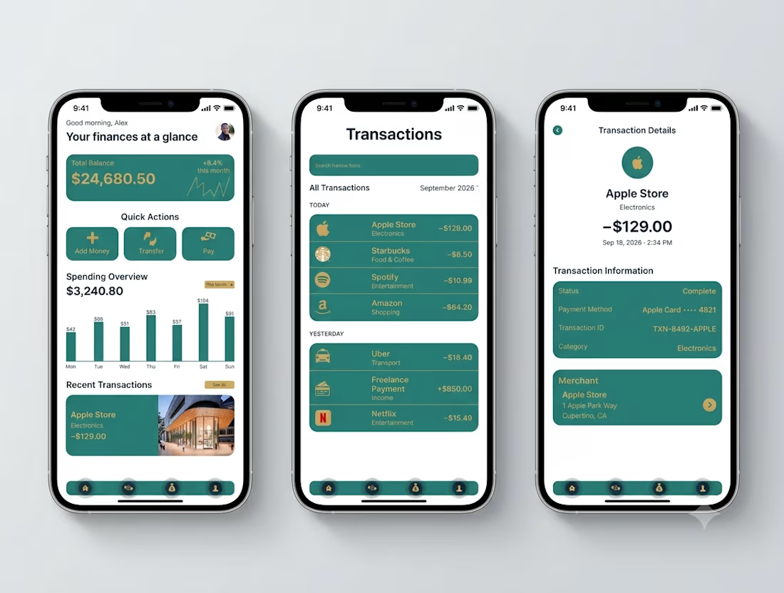

Transaction Details splits the payment record from the merchant card - status, card, transaction ID in one block, the store address in another. That separation is what makes a dispute resolvable.