The network for creativity
Join 1.25M professional creatives like you
Connect with clients, get discovered, and run your business 100% commission-free
Creatives on Contra have earned over $150M and we are just getting started
Back to feedPost
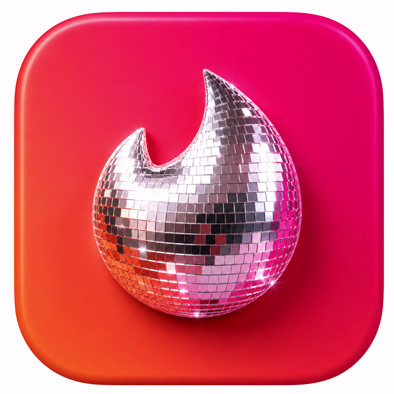
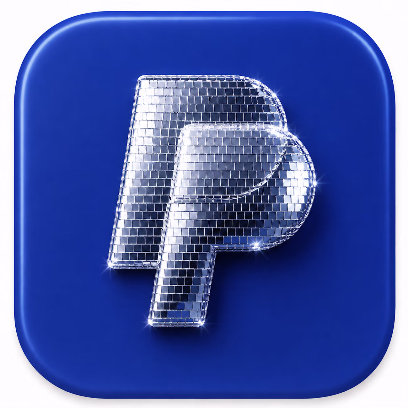
Discomorphism 🪩 yes or no? 👇
Spotify's disco ball made sense to me. The shape, the world of music and nights out, the campaign giving it context. It all held together.
So I tested two more.
Case A / Tinder: the flame, the playful energy, the world of connection and nights out. It just fits. ✅
Case B / PayPal: in my opinion, when your whole promise is trust and security, this kind of treatment works against you. ❌
Same technique. Different story.
And I think this goes beyond the trend. Knowing your brand foundations is what makes this decision obvious. No framework needed.
What's your take? Which brands could pull this off and which ones should never go near it?
PS: asked Claude for the prompts, ChatGPT generated these in a blink. 😉
Try bubblemorphism, I saw figma and Supabase doing so.
First brand that came to my mind with this 👇🏽
Giving a Happy Birthday vibe! 👀
woww
😊
Wow, love this 😍
Thank you!
Visually amazing!
thanks!
The network for creativity
Join 1.25M professional creatives like you
Connect with clients, get discovered, and run your business 100% commission-free
Creatives on Contra have earned over $150M and we are just getting started
Related posts
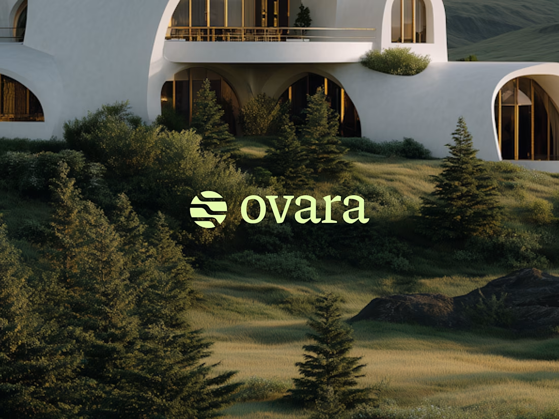
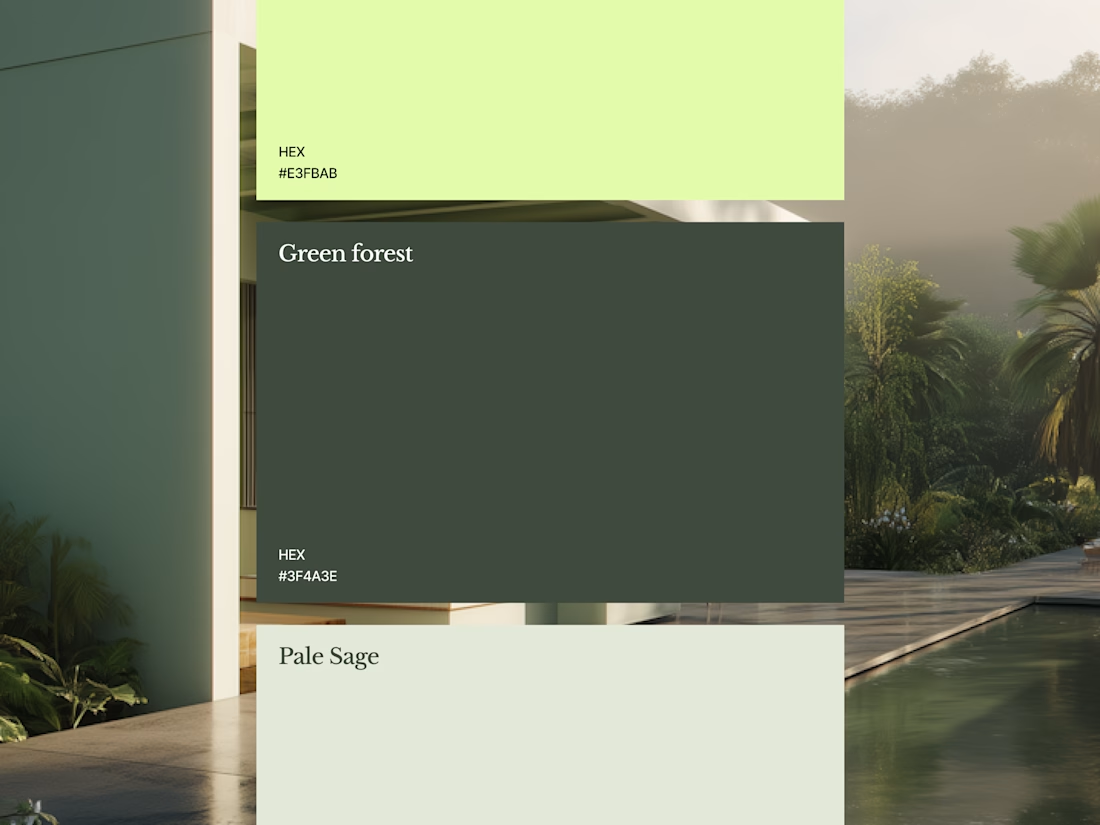
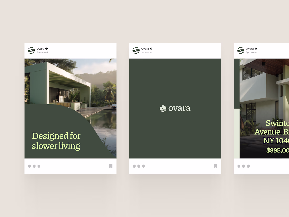
Another work in progress.
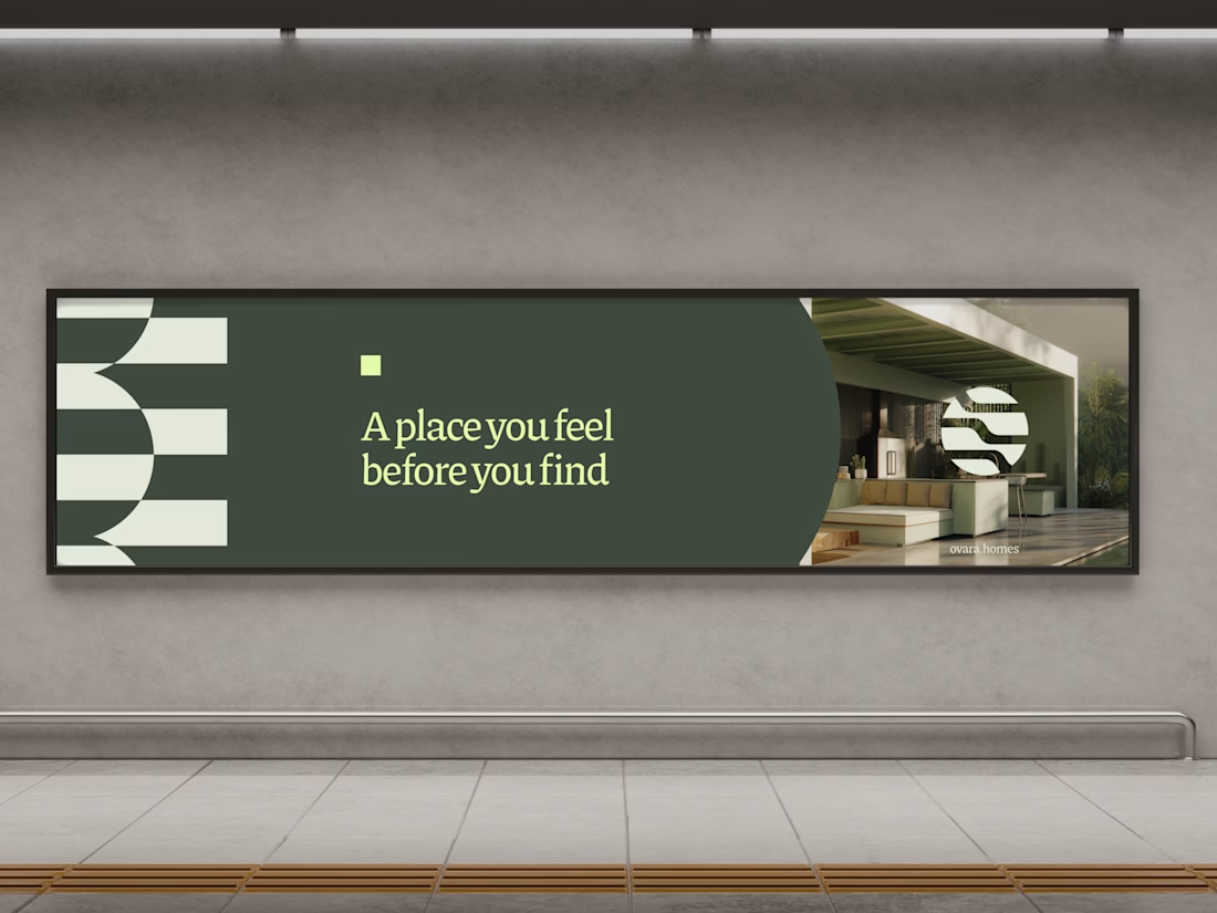
A refined brand identity and visual direction for Ovara, a modern real estate concept focused on emotion, atmosphere and timeless living.
Minimal, architectural and intentionally understated. Built to make people feel something before they even step inside.
If you are building in real estate, hospitality or luxury and feel your brand no longer reflects the level of your vision, let’s talk.
Avoiding the obvious is one of the hardest parts of branding.
If the project is connected to the music industry, the first solution that comes to mind is almost always a note or an instrument.
Everyone understands the category immediately, yes.
But they probably won’t remember the brand.
That symbol won’t tell you if the brand is about discipline, energy, intimacy, underground culture, technical precision, experimentation, or mass entertainment.
A symbol becomes interesting when it’s transformed, reduced, connected with other elements, and brought into a visual system built around a specific problem.
The work becomes interesting when you’re not simply representing the most obvious symbol, but interpreting the experience.
A typographic composition that suggests rhythm.
A grid that feels like timing.
Empty space that makes you feel pause.
A visual system that behaves like a composition, instead of simply showing a note.
When design is too literal, it leaves you at the first level and becomes intellectually thin.
Good branding goes deeper and becomes memorable.
100% 😊
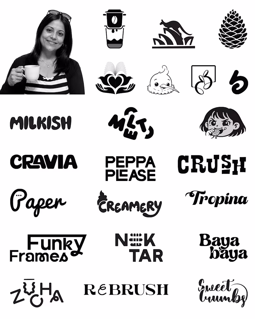
Logos aren’t just visuals to me they’re snapshots of ideas, risks, sleepless nights, and creative evolution.
It’s honestly so fun seeing all these logos together in one place because every single one represents a different story, challenge, late-night design session, experiment, and creative phase.
One thing I’ve realized while designing brands is that the strongest identities are never just “good looking.” The brands people truly remember are the ones that feel alive, expressive, and full of personality.
I never want the work I create to feel generic or forgettable. Whether it’s a wordmark, mascot, symbol, or packaging system, I always try to build something that feels unique to the brand and emotionally connects with people.
Looking back at these logos also reminds me how much I’ve evolved creatively over the years from my earlier projects to the more bold and experimental work I love creating now.
Which logo style do you personally connect with the most minimal, bold, playful, mascot-based, or experimental? Would genuinely love to know.
And if you’re building a brand and want an identity that feels distinctive, expressive, and memorable, let’s connect. Always excited to collaborate on bold ideas.
Nice work.
Trending
Claude
Claude has entered the design space. How are you using Claude Design?
Contra University
Learn from expert creatives how to earn more using next-gen AI tools.
creativeaiflow
Creative AI workflows are evolving. What tools do you use, and what are their strengths and weaknesses?
portfolioreview
The best portfolios tell a story, not just show a grid. Share yours for feedback.
freelancerlife
Freelancer life is wins, pivots, and everything in between. What’s yours right now?