The network for creativity
Join 1.25M professional creatives like you
Connect with clients, get discovered, and run your business 100% commission-free
Creatives on Contra have earned over $150M and we are just getting started
Back to feedPost

The project I made this design for is a crypto memecoin project. This project lacked motion design and quality visual designs on its social media pages, so I felt the need to make something that'll elevate the project's perception by the public.
The motion design was properly executed, and this was a kind that the project never had on its timeline, it added more reputation and even more life to the project's visual appearance.

The network for creativity
Join 1.25M professional creatives like you
Connect with clients, get discovered, and run your business 100% commission-free
Creatives on Contra have earned over $150M and we are just getting started




Related posts

A sound-making app“VarySound”concept video.
Really love the motion process and build a concept from 0 to 1 with creativity.


Sick 🙌

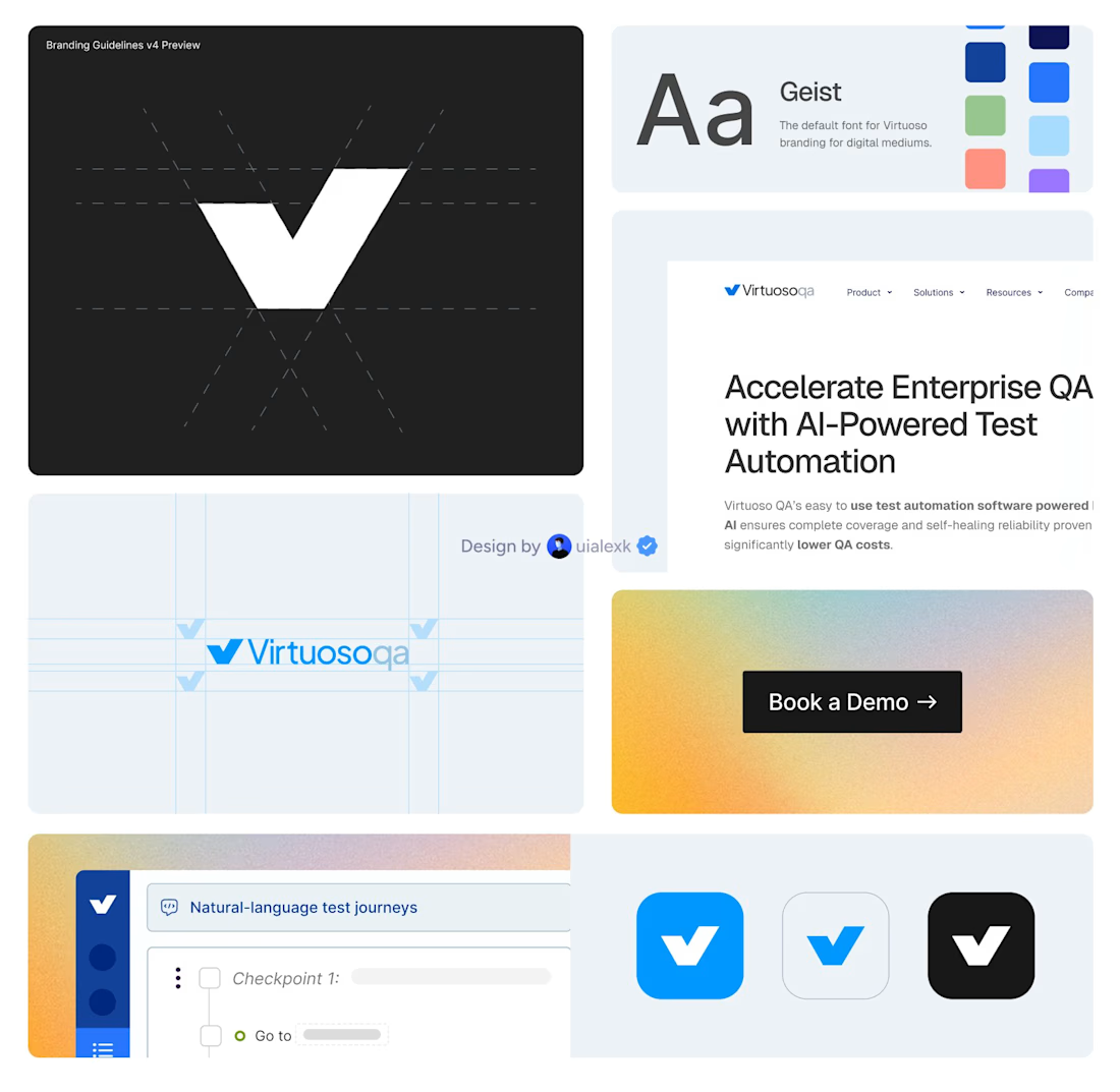
I just finalised a brand evolution and website migration for Virtuoso.
500+ CMS items and 150+ static pages moved from Webflow to Framer.
Alongside that, I helped shape the brand across web, campaigns, product and motion.
The impact:
• Helped shift 80% outbound to 80% inbound
• Built a clearer and more consistent brand presence
• Made a complex AI product easier to understand, trust and buy
I’ve been working with Virtuoso as their design partner on a monthly retainer, helping the brand evolve as the company grows.


500+ CMS items is not a small migration, that's the kind of project that eats weeks just in QA. What almost went wrong during the Webflow to Framer move?

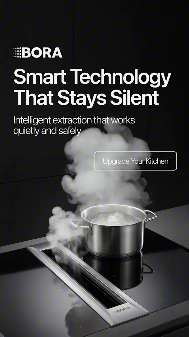
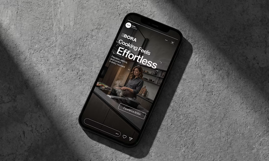
BORA – Ad Creative Concept
Most kitchen appliance ads sell you the warm family dinner. I wanted to try the opposite.
Built this BORA concept as a portfolio piece, treating the product like architecture instead of tech – dark marble, concrete, no hands, no food styling. Just a pot, steam, and silence.
The steam does all the movement in the motion piece. Typography stays out of the way – one line, low CTA, nothing fighting the composition. Turns out when you strip out the lifestyle, the price point sells itself.



Treating the appliance like architecture is a strong direction.