The network for creativity
Join 1.25M professional creatives like you
Connect with clients, get discovered, and run your business 100% commission-free
Creatives on Contra have earned over $150M and we are just getting started
Back to feedPost
Taste Test


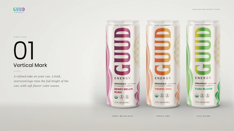
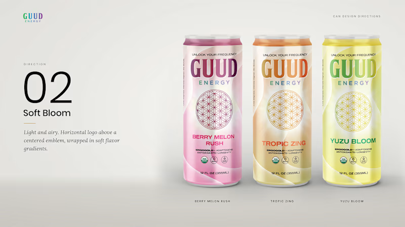
Which can would you have picked?
Guud Energy is an organic, zero-sugar energy drink from San Diego. Good product, but the can wasn’t helping it: white type on bright gradients, too many messages competing, and the hero ingredient buried in a list.
We presented three directions, each across the full flavor range:
But I'm sharing two here, as the system allows me to share only two
The client picked one. Which would you have gone with, and why? I’ll share their choice in the comments.
2 votes
Ends in 1d

Idk like the vertical since your typography is strong enough (unique)
The network for creativity
Join 1.25M professional creatives like you
Connect with clients, get discovered, and run your business 100% commission-free
Creatives on Contra have earned over $150M and we are just getting started



Related posts

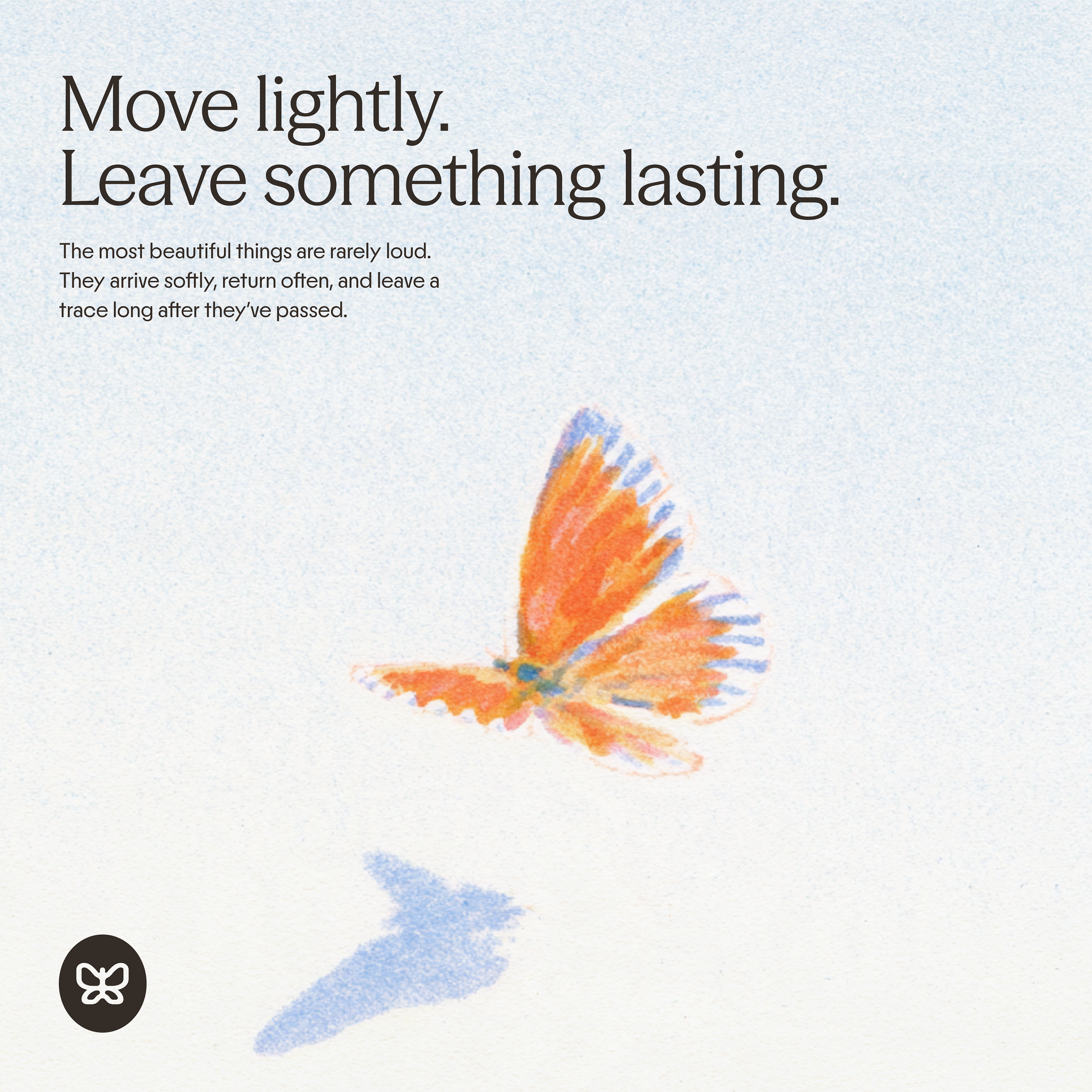
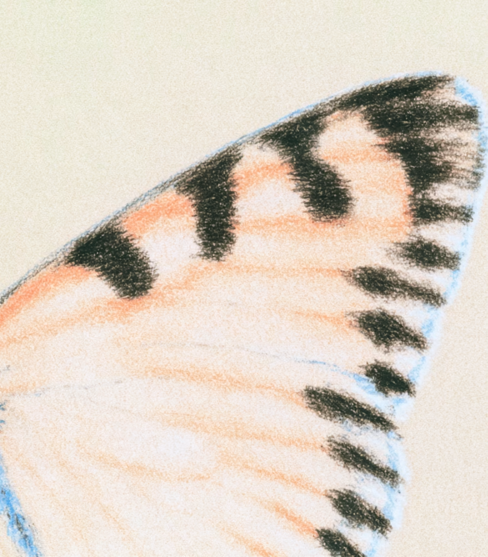
generated these little fellas for a concept and now i want to build a whole brand around them.
if you're making something that helps people dream and aspire, they're looking for a home:)



adorable!🥹

Two ad designs, same offer, very different vibes. Which one would make you stop scrolling and tap “Start Today”?
Drop your pick below and tell me why. I’m collecting honest feedback on layout, colors, and what feels most clickable.
Option A: bold, dark gradient with a glowing neon feel.
Option B: clean, bright, and playful with a white background.

5 voted
38%
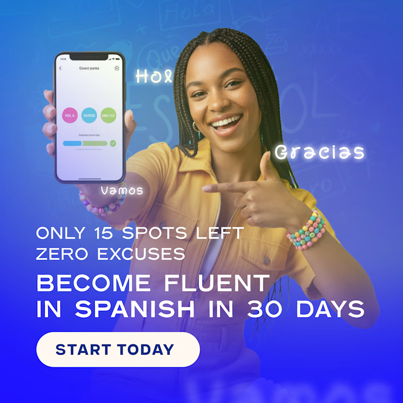
8 voted
62%
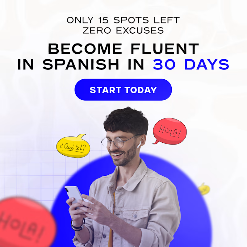
13 votes
Closed

Option A for me. The dark neon version pops harder in a busy feed and the headline reads faster. B feels friendlier but blends in a bit more.




Dark makes the logo pop out more