The network for creativity
Join 1.25M professional creatives like you
Connect with clients, get discovered, and run your business 100% commission-free
Creatives on Contra have earned over $150M and we are just getting started
Back to feedPost


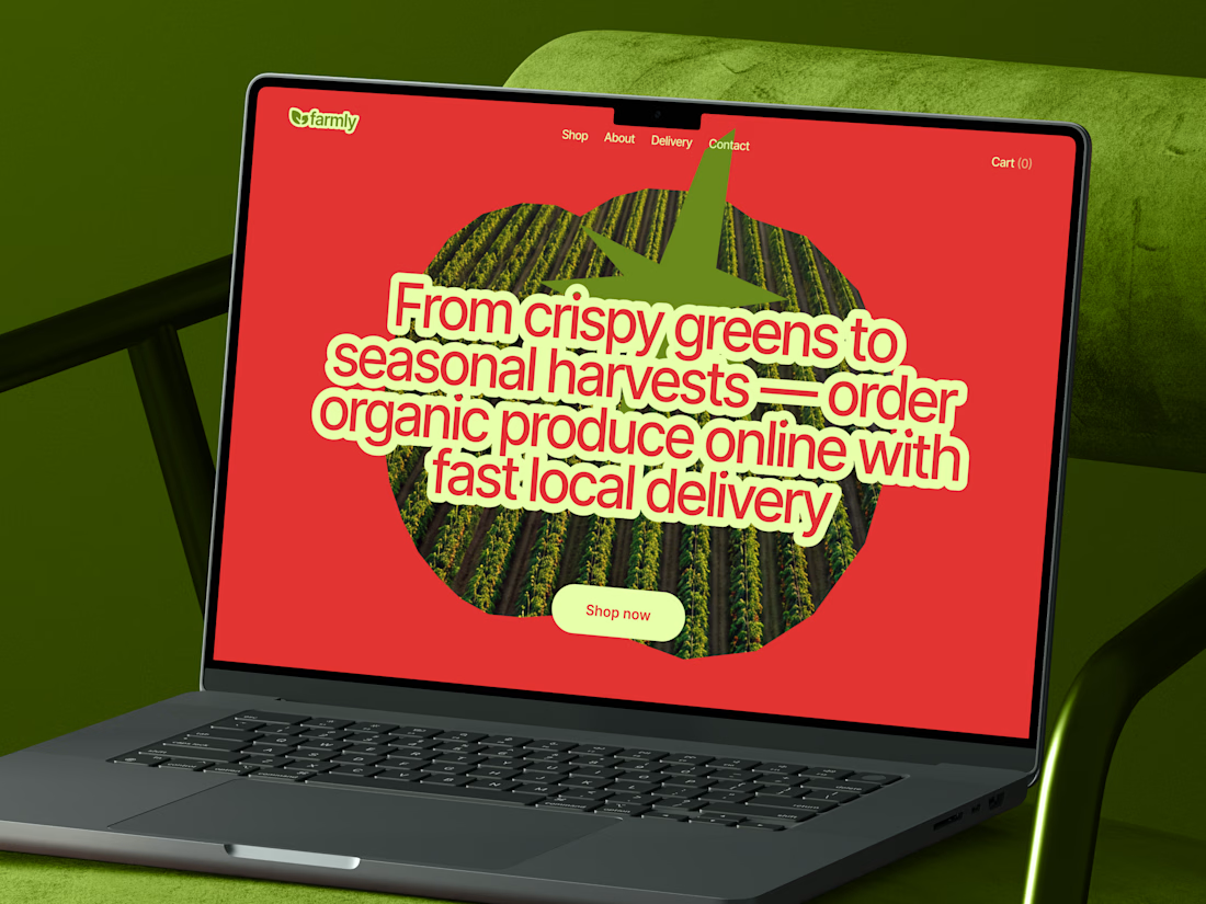
New concept of grocery store website. Excited to hear your feedback! 🚀



This is so fresh and juicy! Awesome 🔥
I fell in love with these colors


Nice concept

Such a vibrant and refreshing take on grocery e-commerce! The bold color choice, heavy typography, and clever tomato image mask create an incredibly memorable hero section. Love this! 🥦🍅

🔥🔥🚀 looks awesome 😎

Lovely concept

Looks great

The art direction is fantastic! Everything feels cohesive, from the color palette to the micro-details. I'd definitely enjoy browsing a store like this.🙌 😍

top notch

Beautifully executed.

Love this direction

Professional work! 🔥

I like the direction 👏

Exceptional onboarding flow UX. Minimizes user effort and gets them straight to the core product value.

That red is doing exactly what it's supposed to do! Great job, Oleksandra 💯


The tomato shaped text block is a clever way to work produce into the copy itself instead of just using a product photo. Curious how that headline reads on mobile though, it looks like it needs the full laptop width to breathe.

There's something really satisfying about the balance in this design

pretty bold color palette for a site like this

Nice
wait, this looks sick

This is so refreshing! Nice work.

The tomato image-mask on the headline is such a smart way to bring in the "organic" theme without just slapping on a leaf icon like everyone does. Curious how you picked the color pairing though, red and that acid green is bold for grocery — was that a client ask or your...
The network for creativity
Join 1.25M professional creatives like you
Connect with clients, get discovered, and run your business 100% commission-free
Creatives on Contra have earned over $150M and we are just getting started


Related posts

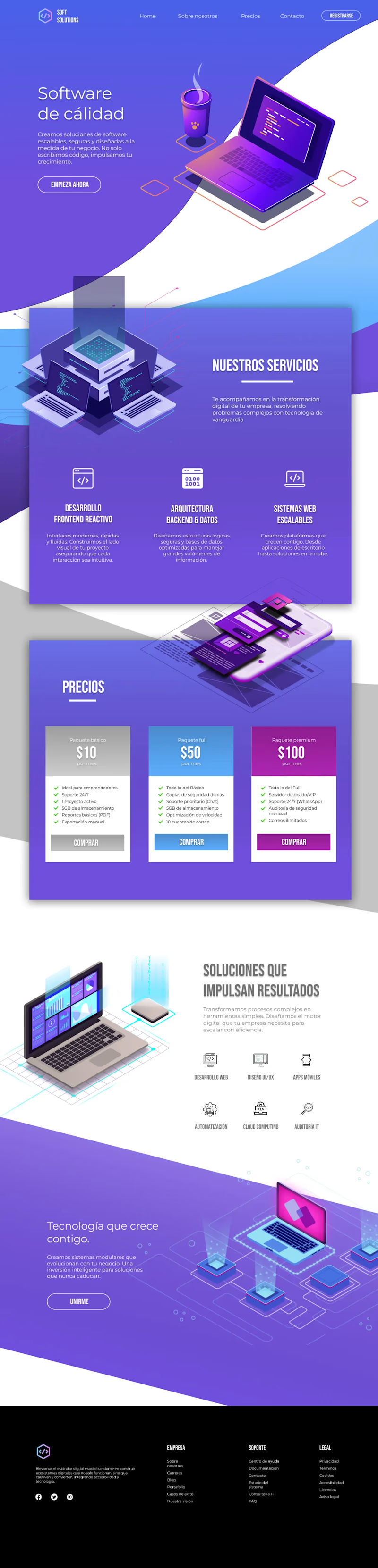
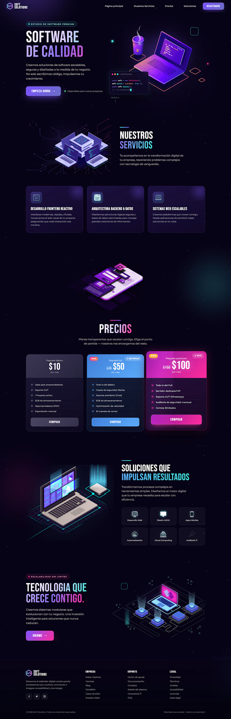
I redesigned the website for this project, keeping its core elements while making it more modern and techy with dark mode by default, eye-catching floating animations, and improved color contrast.
Do you think the redesign I made in Figma is better? Or is the original version better?
19 voted
40%
28 voted
60%
47 votes
Closed

Both of them looks nice but I can clearly see a big mistake on the footer the orig light page footer should be white or blue in color. @Grecia Valero that's why everyone's voted on the dark mode

Retro Reel Timer — Minimal Cartoon UI
A playful reinterpretation of a classic reel-to-reel timer, redesigned with a softer colour palette, simplified shapes and a clean cartoon-inspired visual style. The interface keeps the nostalgic character of analogue recording equipment while presenting the controls in a modern, friendly and easy-to-understand layout.
The design focuses on strong visual hierarchy, balanced spacing and clear interaction states. Bold timer typography, rounded controls and subtle depth help the interface feel approachable without becoming visually cluttered, creating a distinctive concept suitable for a mobile timer, audio recorder or productivity application.


The reel spools doubling as eyes is a smart way to add character without adding extra elements, keeps the layout clean while still being playful. Nice fit for a productivity tool that doesn't want to feel sterile.


🚀 Excited to submit my entry for the #SquarespaceChallenge!
SkyTrail — Every Journey Becomes a Story
SkyTrail is a concept for a premium travel brand designed to inspire people to explore extraordinary destinations through immersive storytelling and elegant design.
For this project, my goal wasn't just to create a travel website—it was to create an experience that makes visitors feel like they're already on the journey.
Using Squarespace, I focused on building a clean, modern, and visually immersive website with thoughtful layouts, smooth interactions, and a mobile-friendly experience.
✨ Highlights:
• Cinematic full-screen hero section
• Premium editorial-inspired layout
• Curated destination showcases
• Interactive travel experience sections
• Elegant typography and visual hierarchy
• Responsive design for desktop and mobile
• Built with Squarespace's modern design capabilities
Every detail was designed around the challenge theme: "A Website Makes It Real."
🔗 Website: https://id-preview--62df7b1a-4e5b-4034-a433-cef3c350bbd4.lovable.app/#journal
🔐 Password (if required): Markturn
I'd love to hear your thoughts and feedback!
#SquarespaceChallenge #Squarespace #WebDesign #TravelWebsite #UIDesign #UXDesign #CreativeDesign #DesignChallenge

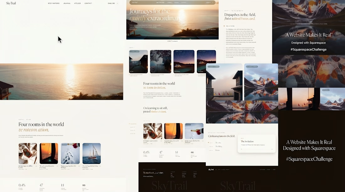

The golden hour travel shots paired with that serif logo really nail the premium storytelling angle. Good luck with the challenge! Are you building this out as a full case study or keeping it more of a concept exploration?










Trending

Claude
Claude has entered the design space. How are you using Claude Design?

Contra University
Learn from expert creatives how to earn more using next-gen AI tools.
creativeaiflow
Creative AI workflows are evolving. What tools do you use, and what are their strengths and weaknesses?
freelancerlife
Freelancer life is wins, pivots, and everything in between. What’s yours right now?