The network for creativity
Join 1.25M professional creatives like you
Connect with clients, get discovered, and run your business 100% commission-free
Creatives on Contra have earned over $150M and we are just getting started
Back to feedPost
Taste Test

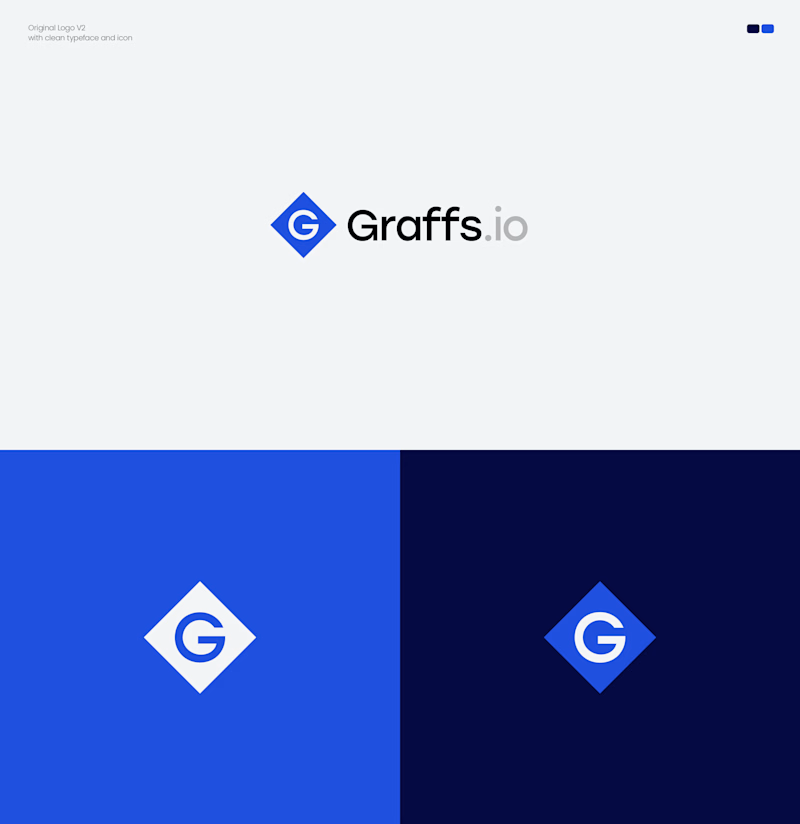
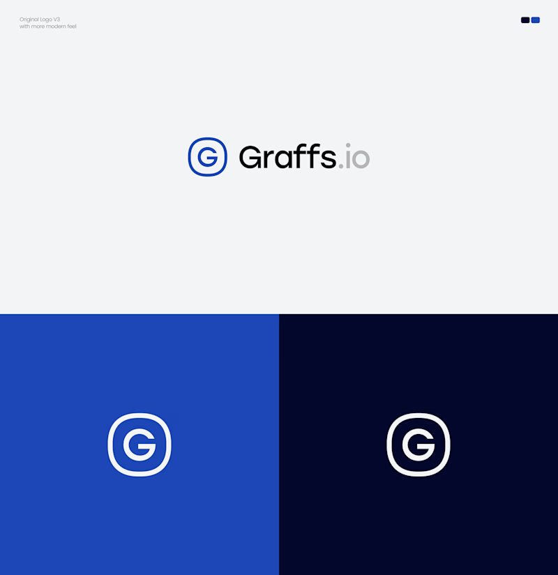
Two directions. One brand. Which Graffs logo would you choose?
I explored two approaches for Graffs, one bold and recognizable, the other clean, modern & minimal.
🔷 Option 1 — Bold & Iconic
⭕ Option 2 — Modern & Minimal
Which one feels stronger to you? 👀
Vote below! 🗳️👇

11 voted
39%
17 voted
61%
28 votes
Closed

The split makes the exploration easy to scan—the bold mark feels more ownable at small sizes, while the minimal route has a calmer system feel. I’d test both at favicon scale before locking it.


Option 2 feels stronger to me, it holds up better at small sizes. Did you test both at favicon size before narrowing it down, or was this more of a gut call?

option 2

Option 2 sells better

Option 2 is a standout for me. The clean, minimal execution feels like it would scale beautifully across a digital product interface or a SaaS website.

2 is perfect match text to icon and colors also

Option 2 does it for me, it's more human & approachable iMO, great job!! 👍
The network for creativity
Join 1.25M professional creatives like you
Connect with clients, get discovered, and run your business 100% commission-free
Creatives on Contra have earned over $150M and we are just getting started

Challenges
View all


Related posts

Working on the homepage for Still Blooming, a wedding and floral studio, I explored two different layout directions for the hero section. Same brand, same copy, just a different structure and visual rhythm.
Option 1 : Left Aligned. Text sits on the left with supporting content beside it, giving an editorial, asymmetrical feel.
Option 2 : Centered. Everything is stacked and centered, giving a clean, balanced, more classic hero layout.
Would love your honest UX/UI take which direction feels more elegant, functional, and true to a wedding/floral brand, and why?
22 voted
41%
32 voted
59%
54 votes
Closed

Great Design :)

More visuals from the rejected brand direction I shared earlier.
Really good to see this direction resonating with so many of you. It was one of our favourite explorations to build, from the narrative behind it to the visual world that brought it to life.
Great work doesn’t always make the final cut, and sometimes the reason has little to do with the quality of the direction.
Curious why this one was rejected? I’ve shared the story in the first comment✨


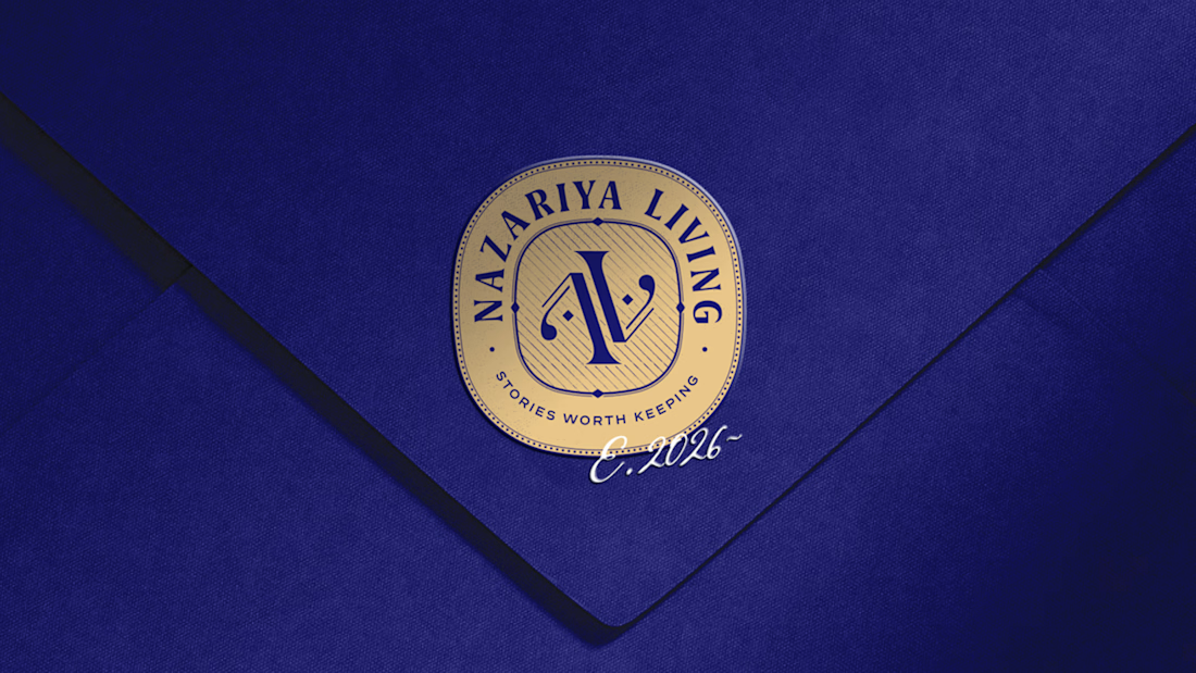
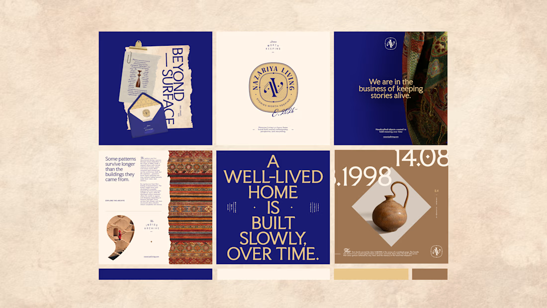
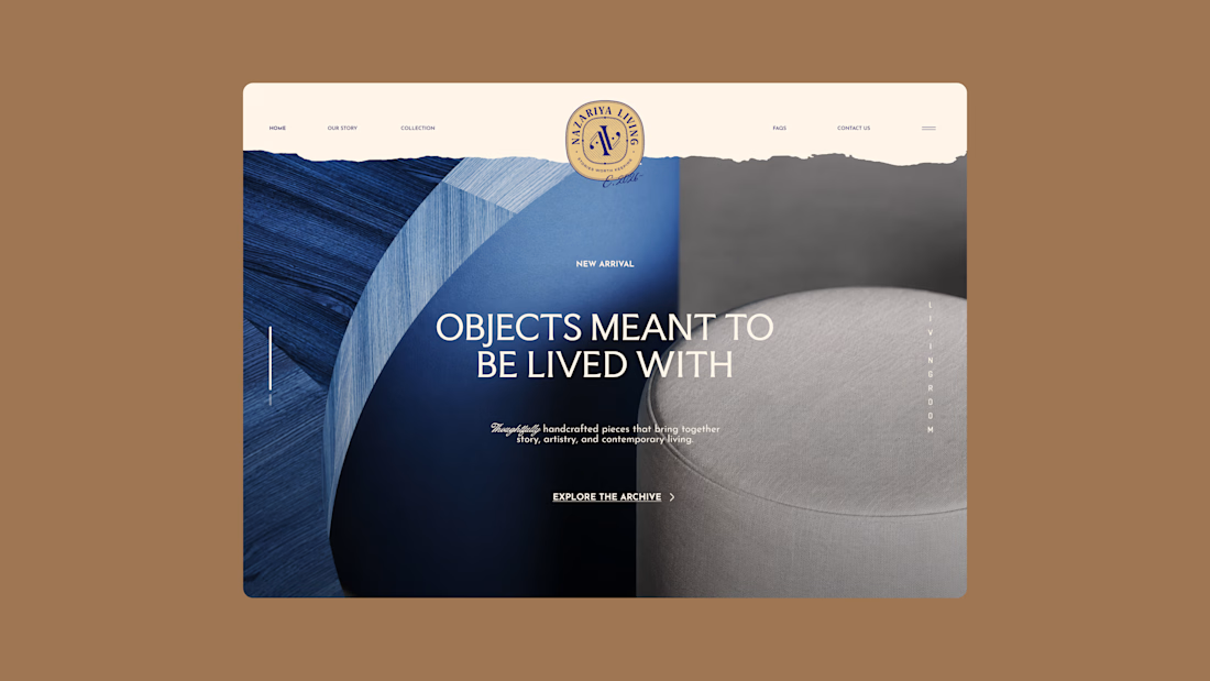
Nazariya Living is a premium carpet and home décor brand shaped by craftsmanship, culture and the stories objects carry into our homes.
This direction brought that idea to life through a seal-inspired logo, archival textures, unexpected colours and editorial typography, creating...

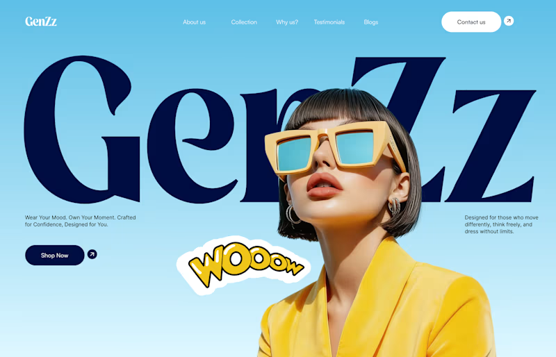
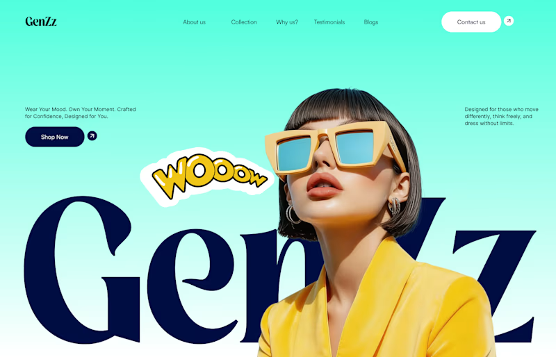
Working on a hero section for GenZz, a bold Gen Z eyewear and fashion brand. Testing two color directions for the landing page and honestly torn between them.
Version 2 has a mint to teal gradient background. Version 1 shifts it to a sky blue gradient. Same layout, same typography, same energy, just a different mood in the backdrop.
Which one pulls you in more and why. Curious if the mint feels more playful and on brand for Gen Z, or if the blue reads cleaner and more premium.
Would love your honest take before I lock this in with the client.

10 voted
59%
7 voted
41%
17 votes
Closed


cool, dmytro stands out. how long did this take?