The network for creativity
Join 1.25M professional creatives like you
Connect with clients, get discovered, and run your business 100% commission-free
Creatives on Contra have earned over $150M and we are just getting started
Back to feedPost
Taste Test

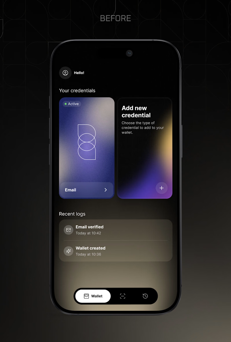
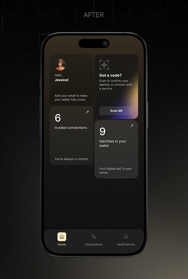
Two home screens for the same digital identity wallet, before and after the alongID brand styleguide.
The old one showed your actual credentials. You saw the card, you tapped it, done. It also showed a log of what just happened.
The new one replaced the cards with counts, 9 identities and 6 trusted connections, and moved Scan QR to the top, because scanning a code is what people open this app to do.
That is the real trade, and I still argue with myself about it. Cards you can touch, or numbers plus the primary action first.
You are opening this app for the tenth time this month. Which home screen do you want?
Vote below. I will post the reasoning behind the decision either way.
11 voted
92%
1 voted
8%
12 votes
Closed

The new version does a better job of prioritizing the main job people open the app for. Scan QR is immediately visible, the hierarchy is cleaner, and the dashboard gives a quick sense of what exists in the wallet.
But the old version has one UX advantage I would not completely...
That is exactly the tension, and you named the cost correctly. It is one more step.
The reason I took it: the card row only works while the wallet is small. Once someone is carrying twenty or thirty documents, a horizontal swipe on the home screen stops being access and turns...

Cards up front look great!


Cards up front

Honestly, the cards up front just pulled me in! Even though the counts and scanner layout makes perfect sense for usability, those card visuals are just too nice.
Ha! I get it, and honestly I miss them a little too. They did not disappear, they moved one level down into the wallet list. What I gave up is that you no longer see one the moment you open the app 😊

The "tenth time this month" framing is what sells it for me. Once you think about actual usage instead of first impression, counts and QR upfront just makes sense. Curious how real users reacted when you tested it, did the numbers-first version feel cold to anyone?
We could not test with real users, the product is under NDA in a regulated space. What we had was internal testing plus live demos at industry events, where 88% of partners and investors picked the counts first version and kept using the word premium. I would not oversell that...

Great work

Cards up front feels much more intuitive👍
The network for creativity
Join 1.25M professional creatives like you
Connect with clients, get discovered, and run your business 100% commission-free
Creatives on Contra have earned over $150M and we are just getting started











Related posts

Exploring Two Branding Concepts
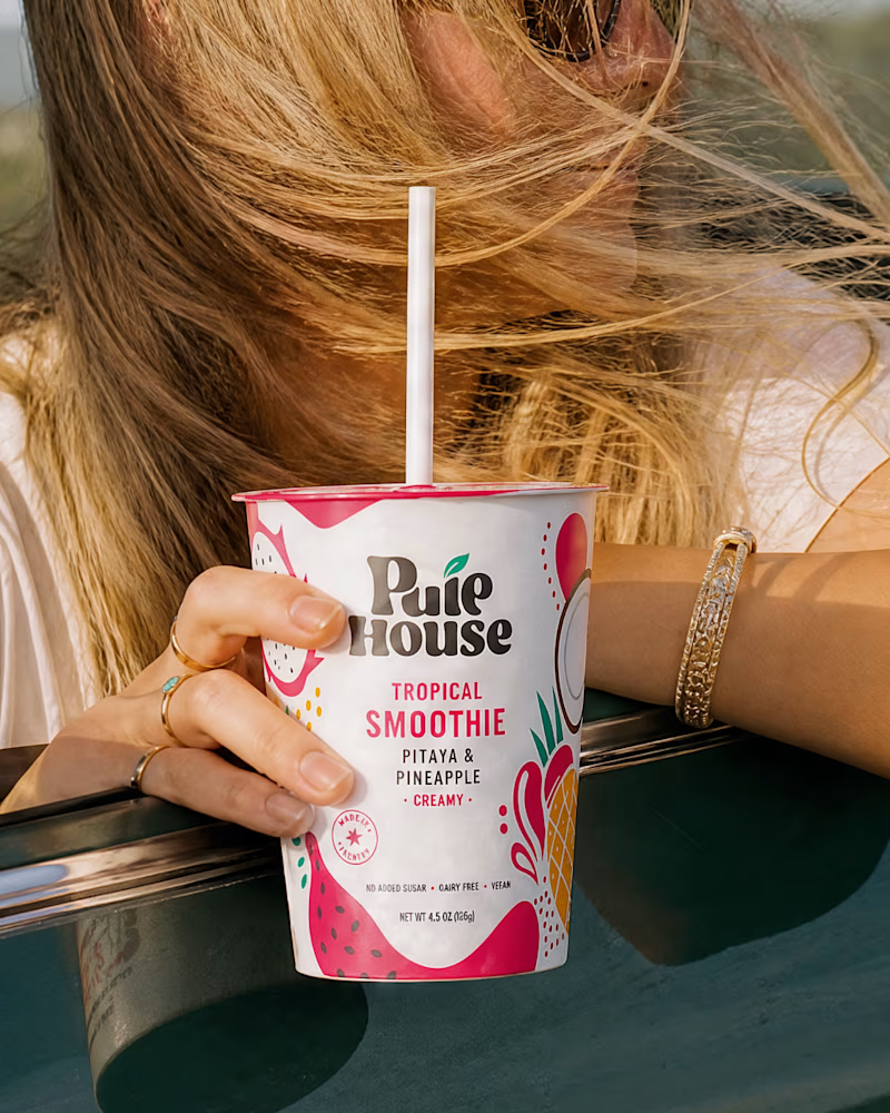
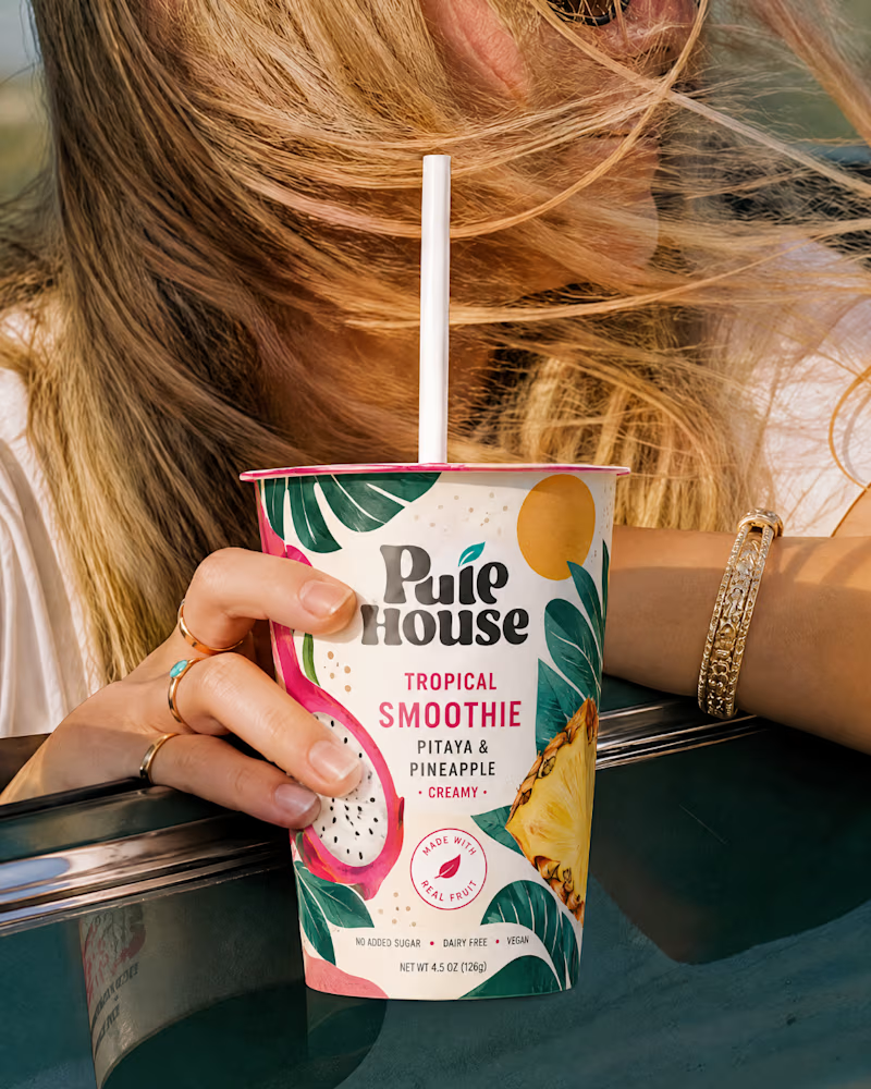
I explored two distinct visual directions for Pulp House, focusing on how color, composition, and design elements can shape a brand's identity.
This comparison reflects my approach to creating thoughtful, cohesive visuals that help businesses present their brands with confidence.
1 voted
5%
20 voted
95%
21 votes
Closed

Fun concepts, Mati!

Two Ads, Two Designs but Different Vibes:
Using the hours and the rest day, I came with these ads using the
software of SVGator combined with the transitions from Adobe After Effects.
Vote and let me know your opinions on which one and why?


12 voted
57%
9 voted
43%
21 votes
Closed


Same content, different experience. A few thoughtful design choices can completely change how a presentation feels, flows, and communicates. Which version would you choose?

11 voted
31%
24 voted
69%
35 votes
Closed

Verde Vista 1 is more modern and futuristic specially with blue colors and robotic hand❤️
Great job Rasid🎉🎉🔥🔥