The network for creativity
Join 1.25M professional creatives like you
Connect with clients, get discovered, and run your business 100% commission-free
Creatives on Contra have earned over $150M and we are just getting started
Back to feedPost

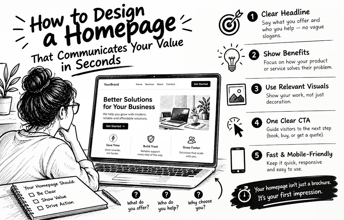
How to Design a Homepage That Communicates Your Value in Seconds
Imagine a potential customer visits your website but still can't figure out what you offer. What happens next? They may leave without exploring your services.
According to Nielsen Norman Group's homepage design research, visitors should quickly understand who you are, what you do, and why it matters to them.
Here are 5 ways to make your homepage clearer:
1. Write a clear headline. Explain what you offer and who you help. Avoid vague slogans that sound impressive but say nothing.
2. Lead with benefits. Show visitors how your product or service solves their problem.
3. Use relevant visuals. Choose images that demonstrate your work instead of adding decoration without purpose.
4. Add one clear call-to-action. Guide visitors toward the next step: book a call, request a quote, or shop now.
5. Make it fast and mobile-friendly. Your message means little if visitors struggle to read or use your website.
Remember, your homepage isn't just a digital brochure. It's your opportunity to show the right people why they should care.
💬 Quick challenge: Can a stranger understand what your business offers within 5 seconds of visiting your homepage? Be honest in the comments!


The network for creativity
Join 1.25M professional creatives like you
Connect with clients, get discovered, and run your business 100% commission-free
Creatives on Contra have earned over $150M and we are just getting started











Related posts

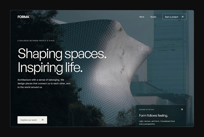
Design Exploration: Hero Section of Architecture Website. Which one do you think much better?


12 voted
43%
16 voted
57%
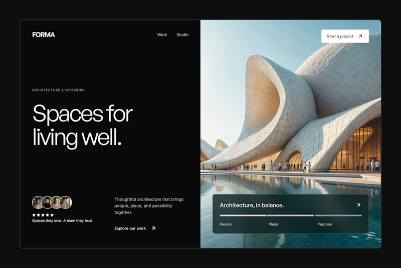
28 votes
Closed


A few years ago I had the chance to take a course where one of the modules was taught by a designer I really admire, Joseph Berry.
The goal was to create a website for a product, in this case, a speaker. We went through the entire process, from receiving the brief to the very last detail, even modeling the product ourselves in 3D using Spline.
I learned so much, and also got to meet great designers. It’s amazing to see how each one has a different process, and having the chance to observe that and take a bit from each way of doing things to make it your own and develop a unique result really helps you grow a lot as a professional.
I’m sharing some frames from the project, hope you like them!

Great website design visuals I like the color palette ❤️❤️
Great job Ivan🎉🎉

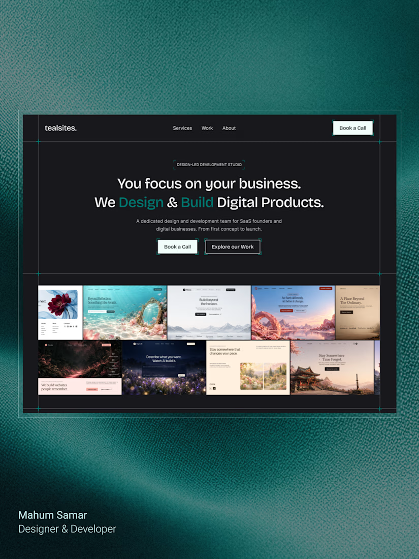
Final hero section for TealSites, a web design & development agency.
Designed in Figma.
The thinking behind the design was simple:
Clear messaging that communicates the agency's value right away.
A project showcase directly below the headline, letting the work speak for itself.
Subtle grid lines, corner brackets, and teal accents to create a distinct visual identity.
Two clear CTAs, one for potential clients ready to connect and another for those who want to explore the work.
The goal was to balance visual appeal with clarity, structure, and usability.
Clean design, thoughtful details, and a clear purpose behind every element.
What do you think?


Excellent