The network for creativity
Join 1.25M professional creatives like you
Connect with clients, get discovered, and run your business 100% commission-free
Creatives on Contra have earned over $150M and we are just getting started
Back to feedPost


thanks, Madi :P

Nice! I love the character!
Thanksss

The rive tool is just too cool
Yup! Can do a lot with it

We need more work like this on Rive!
We need more character animaaaation! :))


thanks, Dennis! Nope, just some good ol' keyframes :)

The character animation is so playful! Lower frame rates can add such a unique charm to Rive animations. Great work!
I agree, Stephanie! Thankss

😂 😂 Cool
Thanks, dude ha ha

this animation is so fun to watch!! lower frame rates really do add character to animations
Thanks Faith, happy you liked it!

this is rlly good!
thankssss :D

OMG ! That's cool🙌
thanks Mishaal!!

It's so cute I love it!
little bit goofy, I know haha thanks Chanmol!
The network for creativity
Join 1.25M professional creatives like you
Connect with clients, get discovered, and run your business 100% commission-free
Creatives on Contra have earned over $150M and we are just getting started



Related posts

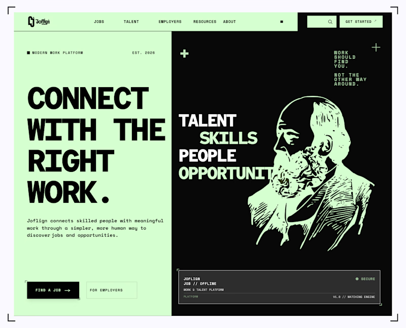
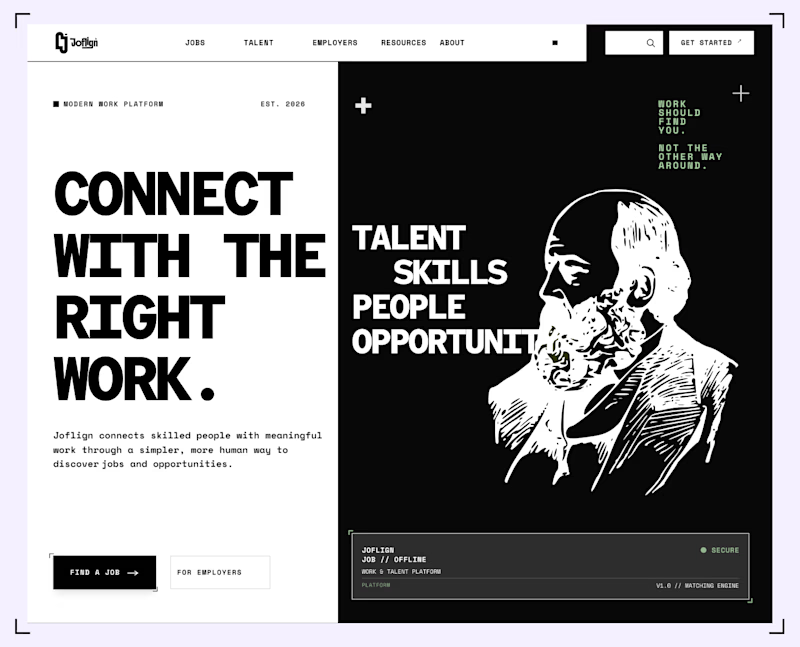

I lean light green because it carries through both the copy panel and the illustration, making the two halves feel connected. I’d keep “Find a job” clearly stronger than “For employers” if jobseekers are the main audience. That hierarchy matters more than the background preference alone.

I built a a horror-inspired escape game.


From static footer to motion.
It's crazy how adding motion can take something from OK to premium in an instant.


The footer is the most underrated spot for this. People who scroll all the way down are already interested, so a small moment of motion there feels like a reward, not a distraction. Did you build it in Framer or code it?