The network for creativity
Join 1.25M professional creatives like you
Connect with clients, get discovered, and run your business 100% commission-free
Creatives on Contra have earned over $150M and we are just getting started
Back to feedPost

Thank you to everyone who voted on these two directions.
Although Option 1 was visually more striking, we ultimately chose Option 2. It felt more aligned with Elpida Solutions’ existing logo, brand identity, and the impression the company should create from the very first screen.
Sometimes the strongest design isn’t the loudest one—it’s the one that represents the brand most honestly.
See the final website:
https://elpidasolutions.rs/sr

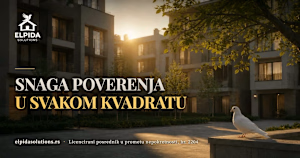
elpidasolutions.rs
Elpida Solutions — agencija za nekretnine u Srbiji
Licencirana agencija za promet nekretnina. Kupovina, prodaja i izdavanje, podrška pri preseljenju i saradnja sa kompanijama u centralnoj i južnoj Srbiji.

Two directions for the same real-estate hero. Same headline, same logo — two very different ideas of what a first screen should do.
A plays on its own: one cinematic shot, gold serif, a single call to action.
B stays still until you scroll — then the camera walks you into the property.
Which one would you keep? 👇
19 voted
90%
2 voted
10%
21 votes
Closed
The network for creativity
Join 1.25M professional creatives like you
Connect with clients, get discovered, and run your business 100% commission-free
Creatives on Contra have earned over $150M and we are just getting started



Related posts

Which mockup would you choose?


6 voted
25%
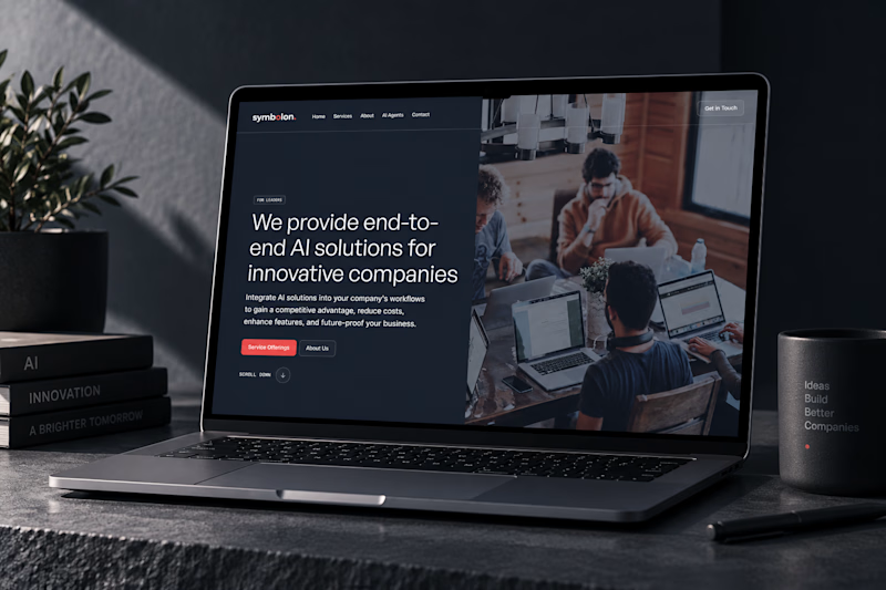
18 voted
75%
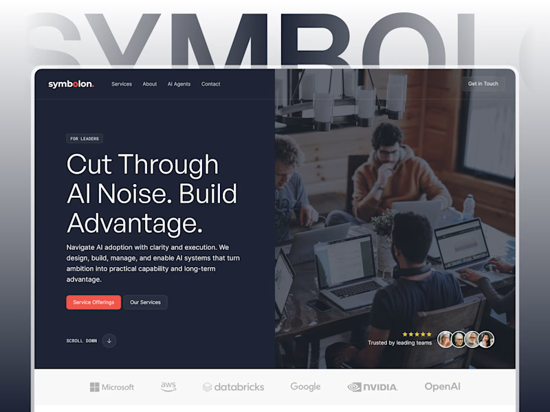
24 votes
Closed

Custom Figma showcases design better for sure! 👍

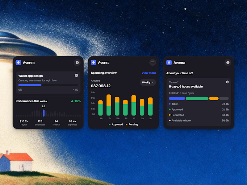
Which style wins for you? 🤔
We’re testing out two theme directions for Avenra’s dashboard component cards; featuring real-time spending breakdowns, project progress metrics, and time-off tracking.
Curious to hear your thoughts! 💬
8 voted
42%
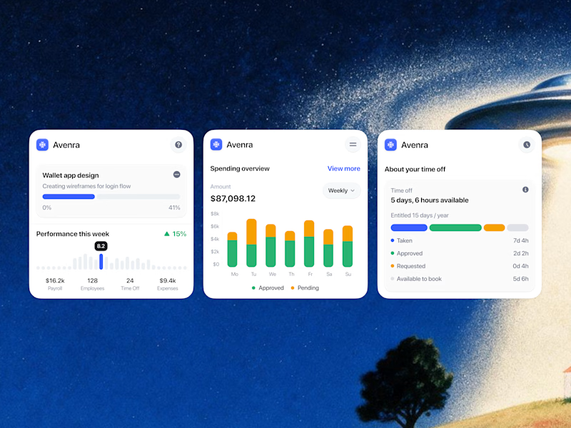
11 voted
58%
19 votes
Closed

Designed and built this for Haunted Boulder City, a ghost and UFO tour just outside Vegas.
Had a lot of fun playing with the night photography, fog, and scroll effects on this one. Pretty happy with how it all came together.
Check it out: https://www.hauntedbouldercity.com/ 👻 👽 🛸

Really nailed the atmosphere here. The night photography, fog, and scroll effects make the site feel like part of the tour experience rather than just a booking page. 👻 Which effect took the most experimenting to get right?