The network for creativity
Join 1.25M professional creatives like you
Connect with clients, get discovered, and run your business 100% commission-free
Creatives on Contra have earned over $150M and we are just getting started
Back to feedPost

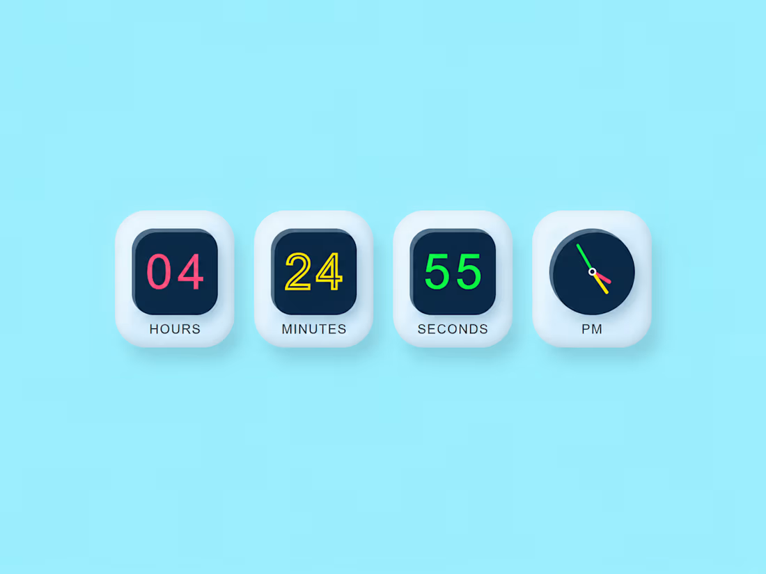
Minimal Floating Clock Widget
Sometimes the simplest interfaces are the most effective.
This concept focuses on:
• Compact footprint
• Clear time visibility
• Floating card design
• Soft neomorphism shadows
• Minimal distractions
The challenge was creating something functional while keeping the visual design lightweight and approachable.
Small details often make the biggest difference in user experience.
#MinimalDesign #FrontendEngineering #UIComponents #WebDesign #TypeScript #ReactJS


The network for creativity
Join 1.25M professional creatives like you
Connect with clients, get discovered, and run your business 100% commission-free
Creatives on Contra have earned over $150M and we are just getting started







Related posts


A look at my design work for Tithe, an app built around being more deliberate with your attention.
That idea carries into the design too. Soft blue and warm neutrals give the screens a quiet feel, while direct copy makes the next step clear.
There’s a lot happening across the product, from choosing what deserves your focus to earning your way back into blocked apps. The challenge is making each of those moments feel simple – @BrightStudios®


Amazing work Daniel🙌

: One of my favorite recent builds ✦
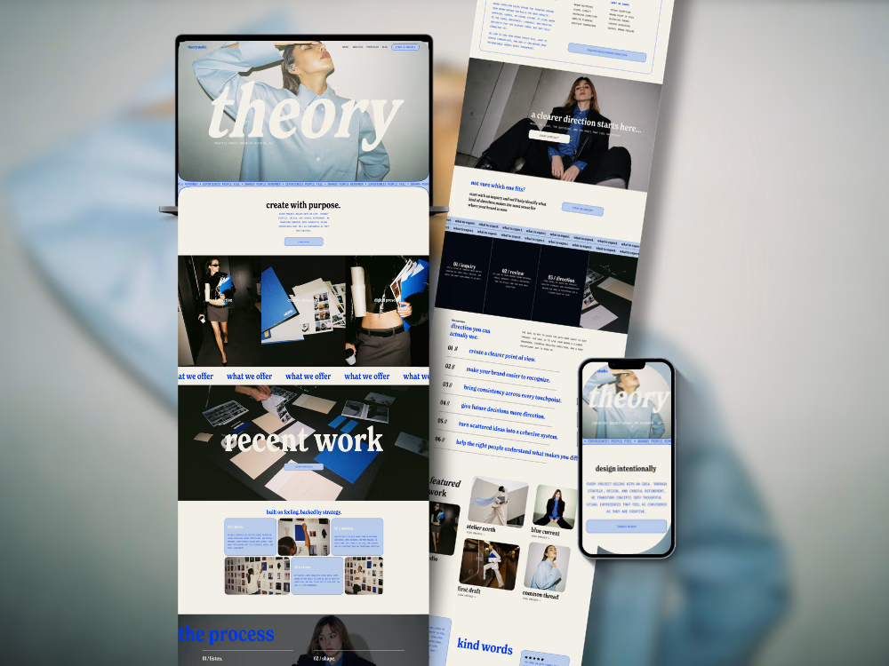
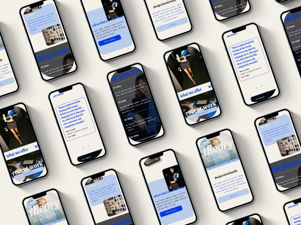
Theory was designed for a creative studio that needed something bold and editorial without losing clarity or usability.
The part I loved most was figuring out how to make the site feel visually expressive while still giving the portfolio work room to breathe. Lots of strong type, intentional movement, and little custom details throughout.
Designed + developed in Squarespace 7.1 with custom CSS and JavaScript.


The oversized “recent work” type over the project imagery is a lovely touch. Gives the portfolio a real editorial feel.


Do you ever try breaking the site you're interacting with?
I'm always thinking "what will people try to do" and then coming up with a solution for it. If I saw a card like this I'd try to pick it up. Then once I discovered it was draggable, I'd try seeing what happens if I throw it outside the browser.
What do you think?


Hot design