The network for creativity
Join 1.25M professional creatives like you
Connect with clients, get discovered, and run your business 100% commission-free
Creatives on Contra have earned over $150M and we are just getting started
Back to feedPost
Courtsy makes it easier to find and book sports courts from your phone. Explore nearby venues on a map, choose a sport, check court details and availability, then reserve a time slot.
The personal dashboard keeps upcoming bookings, spending, and savings in one place. A bold purple and yellow visual identity, expressive typography, and playful sports elements bring energy to the experience.


Love this! 🔥 Booking sports courts via map + time slot is such a clean flow.
The Pick Your Game UI looks super fun and bold - great work Emote Agency!
The network for creativity
Join 1.25M professional creatives like you
Connect with clients, get discovered, and run your business 100% commission-free
Creatives on Contra have earned over $150M and we are just getting started
Related posts

Tennis league organizers coordinate seasons, tournaments, teams, match results, and rankings. When those workflows are spread across different tools, it can be difficult to keep information organized.
Fragstat brings league management into one SaaS dashboard. Organizers can navigate between seasons, brackets, teams, analytics, and moderation, while the overview surfaces tournament activity, match status, and team performance.
The visual direction pairs tennis photography and vivid green accents with structured dashboard components to make complex information easier to scan.
Super clean solution! Tennis league ops is such a messy workflow - consolidating seasons, teams, rankings into one SaaS dashboard is smart. Match Central UI looks sleek too!


Check it out
New case study: Industrial IoT platform redesign with AI integration ⚡
Spent 5 weeks redesigning Lumicent’s industrial IoT platform. The headline change: cut alarm resolution from 4 taps to 1.
Started with a design audit that uncovered three UX failures burying the information operators actually needed to act. Mapped 3 personas (Technician, Risk Manager, Site Executive) and rebuilt the alarm, investigation, and home flows around how they actually make decisions under pressure.
AI assistant woven in at the right moments: contextual chat during investigation, daily brief on the home page, remedy suggestions at the point of alarm.

Putting the AI assistant at specific decision points, like remedy suggestions right at the alarm and a daily brief on the home page, feels much more useful than a generic chat box. Cutting alarm resolution from 4 taps to 1 is a strong result for operators working under pressure.

The full landing page design is complete.
I designed this website for a web design and development agency, with founders and growing businesses in mind.
Clear services, selected work, straightforward pricing and answers to common questions. Each section helps visitors understand the offer and take the next step.
Visually, I kept it consistent with teal accents, structured grids and corner details throughout.
Good to see all the sections come together.
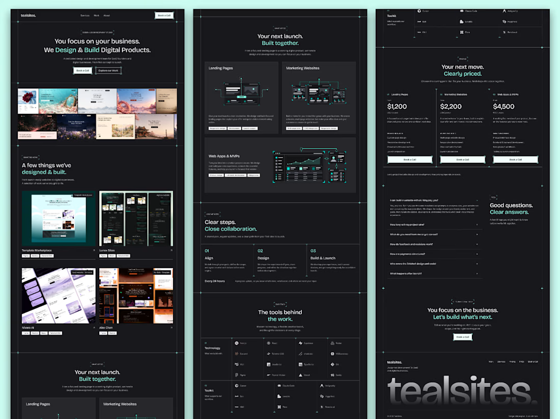

Love how you’ve focused on clarity and consistency! The clear services and pricing make it easier for visitors to understand the offer and take the next step. 👏✨





