The network for creativity
Join 1.25M professional creatives like you
Connect with clients, get discovered, and run your business 100% commission-free
Creatives on Contra have earned over $150M and we are just getting started
Back to feedPost

The SaaS triangle - more leads, better quality, same budget
As a marketer, this is frustrating to explain to clients that its almost impossible to achieve and is contradicting in nature.
Qualified leads will always cost you more than unqualified ones.
The math is simple: More qualified leads = Lower total lead volume (at the same budget)
Therefore cost per lead & cost per ICP lead are almost always inversely proportional
Marketing teams get measured on SQL and pipeline numbers. That's sales territory, plain and simple.
So what do we actually have control over?
Cost per ICP lead
This is a true north metric I've found. Optimize for this relentlessly.

The network for creativity
Join 1.25M professional creatives like you
Connect with clients, get discovered, and run your business 100% commission-free
Creatives on Contra have earned over $150M and we are just getting started





Related posts

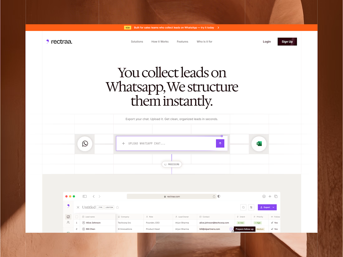
Rectraa helps sales teams extract, classify and organize leads collected through WhatsApp. I designed and developed its marketing website to explain the product clearly, demonstrate its workflow and encourage visitors to try it.
Project information:
Role: Website Designer & Framer Developer
Scope: Website strategy, UI design, responsive design and development
Tools: Figma and Framer
Deliverable: Responsive SaaS marketing website


High end design

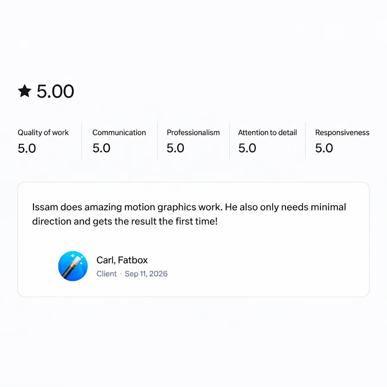
Got a review last week that made my day.
Wrapped a motion graphics project recently and the client said it only needed minimal direction and came out right the first time.
That's the part I'm grateful for. Not the compliment on the work itself, but the fact that the process actually worked the way it's supposed to. One clear brief, one round, done.
And that never happens because of me alone. It happens when the client writes a brief that makes sense, trusts you enough to let you run with it, and gives feedback that actually helps instead of feedback that just moves things around.
So thank you for that. Projects like this are the reason I still enjoy this work.


I am happy about you my brother keep it up!

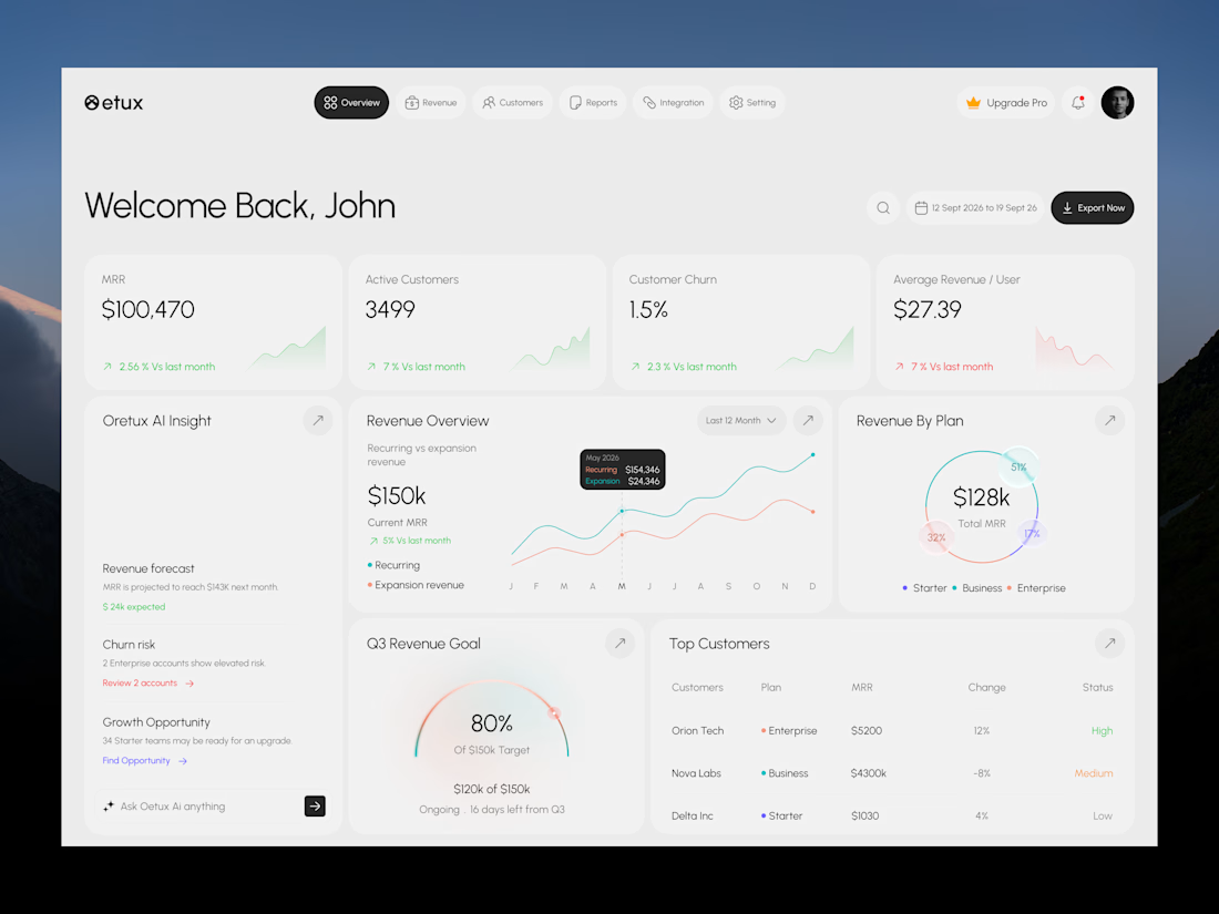
Oetux – SaaS Revenue Analytics Dashboard
The client had a lot of data, but the real problem was making sense of it.
MRR, revenue, churn, active customers, growth, customer performance, goals. Every metric was important, but when everything gets the same attention, users don’t know where to look first.
The existing experience made users spend too much time switching between information and trying to connect the numbers.
So we focused on how SaaS teams actually read their business data. We structured Oetux around the questions that matter most.
How is revenue performing?
Are we growing?
Are customers staying?
Where are we losing revenue?
What needs attention right now?
Then we organized KPIs, revenue trends, customer performance, churn insights, goals, and AI powered insights into one clear experience.
The goal wasn’t to remove data.
It was to organize the data so users could understand it faster.
That’s what we solved with Oetux.
Turning a data heavy SaaS dashboard into an experience that helps teams see their business clearly and make better decisions.


Love the clean layout.