The network for creativity
Join 1.25M professional creatives like you
Connect with clients, get discovered, and run your business 100% commission-free
Creatives on Contra have earned over $150M and we are just getting started
Back to feedPost
Oetux – SaaS Revenue Analytics Dashboard
The client had a lot of data, but the real problem was making sense of it.
MRR, revenue, churn, active customers, growth, customer performance, goals. Every metric was important, but when everything gets the same attention, users don’t know where to look first.
The existing experience made users spend too much time switching between information and trying to connect the numbers.
So we focused on how SaaS teams actually read their business data. We structured Oetux around the questions that matter most.
How is revenue performing?
Are we growing?
Are customers staying?
Where are we losing revenue?
What needs attention right now?
Then we organized KPIs, revenue trends, customer performance, churn insights, goals, and AI powered insights into one clear experience.
The goal wasn’t to remove data.
It was to organize the data so users could understand it faster.
That’s what we solved with Oetux.
Turning a data heavy SaaS dashboard into an experience that helps teams see their business clearly and make better decisions.


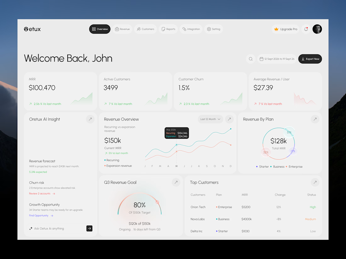

Love the clean layout.

Thanks man!
The network for creativity
Join 1.25M professional creatives like you
Connect with clients, get discovered, and run your business 100% commission-free
Creatives on Contra have earned over $150M and we are just getting started





Related posts

As a freelancer, keeping everything that runs your business organized gets harder as the business grows. Money coming in and going out, client details, project files, new leads, job applications. It adds up fast, and it gets overwhelming.
So I built Rendr, a personal AI-powered macOS app that keeps my whole business in one place, so I spend less time managing and more time designing.
What it does:
• Command Center: a daily briefing of what needs my attention, and why
• Pipeline: tracks leads from first contact to signed work, with AI-drafted proposals and follow-ups
• Clients: every client's history, files and notes in one hub
• Money: payments, open invoices and payouts, synced from Contra
• Job search: Contra jobs plus open job boards, matched to my skills and rate
• Applications: tailored resumes, cover letters and pitches, written only from my real experience
• Site audits: reviews a prospect's website and turns the findings into a pitch email in one click
• Work library: tagged portfolio files, with the best samples suggested for each pitch
• Backups: automatic, every day, to Dropbox
It runs on my Mac, and it never sends an email, invoice or message on its own. I review everything first.
Still building, with more to come.

Looks amazing..is it a native app ?


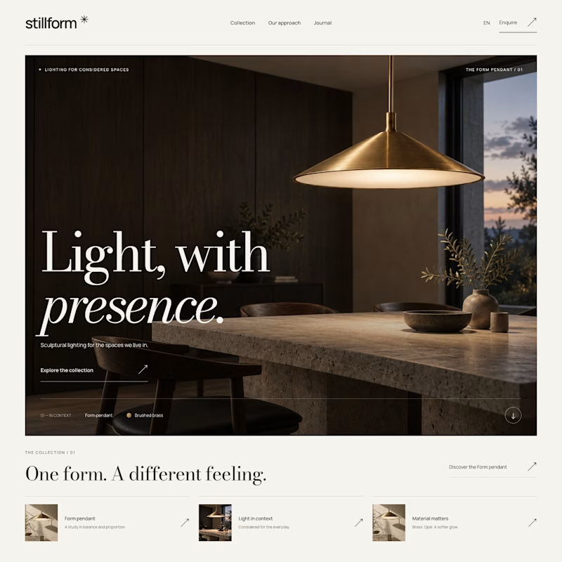
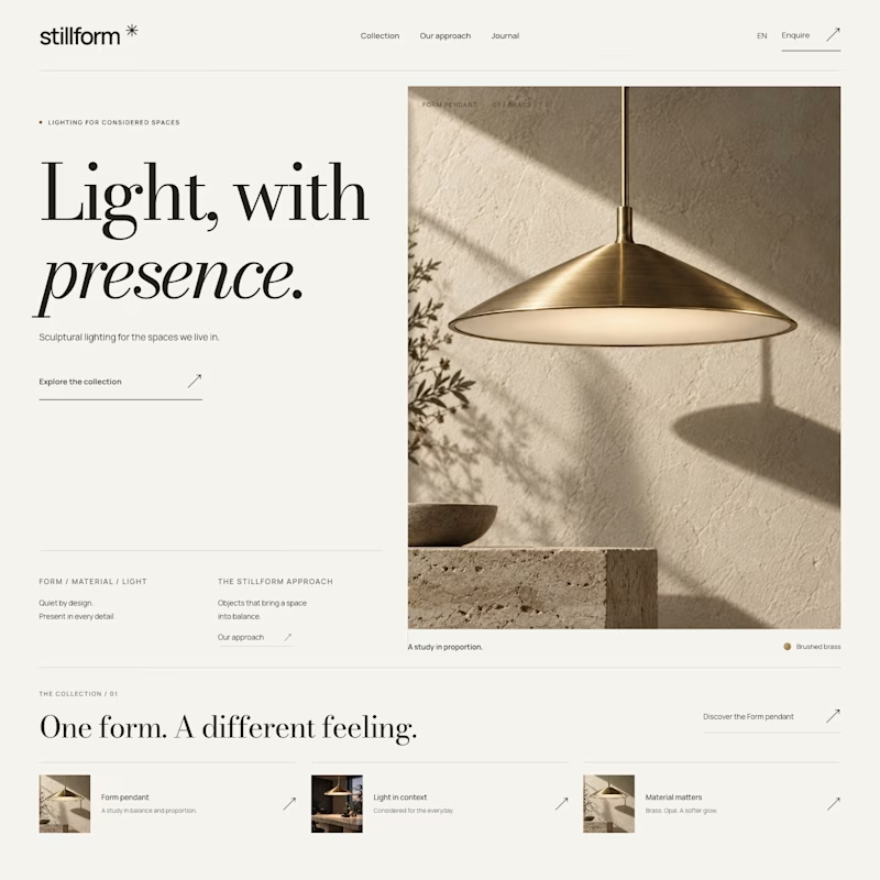

Atmospheric, and it was the photography that decided it. A lamp is a product you buy for what it does to a room, so seeing the warm glow pooling across a dark surface sells the feeling before the layout even registers. Sculptural is gorgeous but shows the object, Atmospheric shows the outcome.


Well done !