The network for creativity
Join 1.25M professional creatives like you
Connect with clients, get discovered, and run your business 100% commission-free
Creatives on Contra have earned over $150M and we are just getting started
Back to feedPost



The network for creativity
Join 1.25M professional creatives like you
Connect with clients, get discovered, and run your business 100% commission-free
Creatives on Contra have earned over $150M and we are just getting started





Related posts

Brand identity work for WesoftAI




A new visual direction for Friedrich Naumann Foundation - Jordan.
I developed a visual sub-identity for the “Nau Media” project, a media training initiative focused on digital communication, human rights-sensitive media, and combating misinformation.
The goal was to build a distinct visual system that could stand on its own while remaining connected to the broader FNF Jordan identity.
This is an initial look at the project. The full visual identity and its applications will be shared soon.


Great visual identity I like the way you show the brand that's unique 🎉❤️

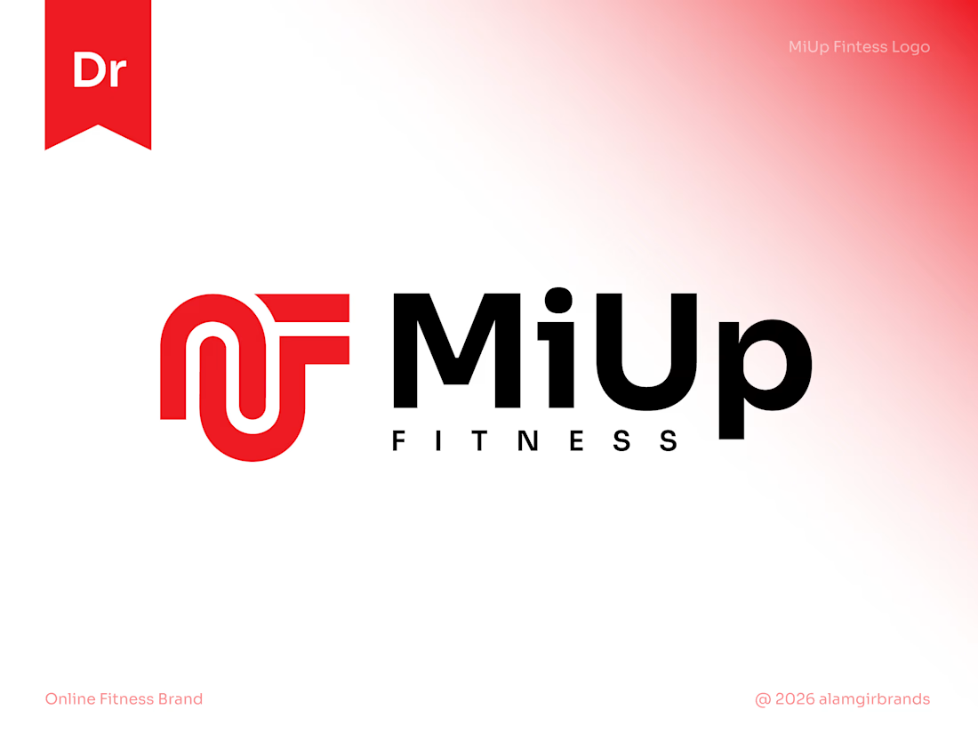
MiUp Fitness: Logo Design
I built the symbol from the letters M, U and F, drawn as one continuous line. The M's arches flow into the U and the F's arms reach out to the right, giving a sense of upward movement that fits the "Up" in the name.
Bold red adds energy, and black keeps it strong and grounded. The result is a simple, scalable mark that works at any size.
It really has a strong identity great design 🎉🎉🔥🔥