The network for creativity
Join 1.25M professional creatives like you
Connect with clients, get discovered, and run your business 100% commission-free
Creatives on Contra have earned over $150M and we are just getting started
Back to feedPost

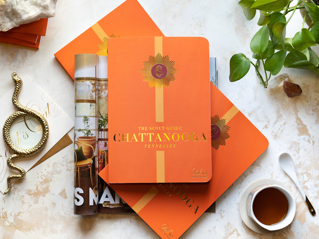
Print City Guide 🧡
Marketing/Editorial/Brand Design
The Scout Guide • 2023


The network for creativity
Join 1.25M professional creatives like you
Connect with clients, get discovered, and run your business 100% commission-free
Creatives on Contra have earned over $150M and we are just getting started











Related posts

Title / Headline:
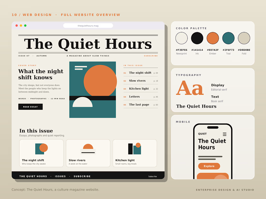
The Quiet Hours — Cultural Magazine Web Design & Brand Identity
Description
Overview:
The Quiet Hours is an editorial-driven digital magazine concept focused on slow living, culture, and thoughtful essays, designed with a sophisticated print-inspired digital aesthetic.
Design Highlights:
Print-Inspired Editorial Layout: Engineered a structured grid system blending classic editorial serif display typography with clean body text for an immersive reading experience.
Calm & Earthy Color Palette: Curated a muted, harmonious color scheme (Pampad, Ink, Ember, Teal, and Pod) to evoke a sense of quiet and reflection.
Content Architecture: Structured clear content hierarchies, including issue highlights, article previews, and category navigation.
Mobile Responsive Layout: Designed a seamless mobile reading interface tailored for on-the-go content consumption.
Tools & Stack:
Figma, Adobe Illustrator, Editorial Typography, Web Design, UI/UX Layouts.



The Pampad, Ink, Ember, Teal and Pod palette names alone tell me this is a thoughtfully built system. Print-inspired editorial grids are so satisfying when they respect the reading experience, and this clearly does.

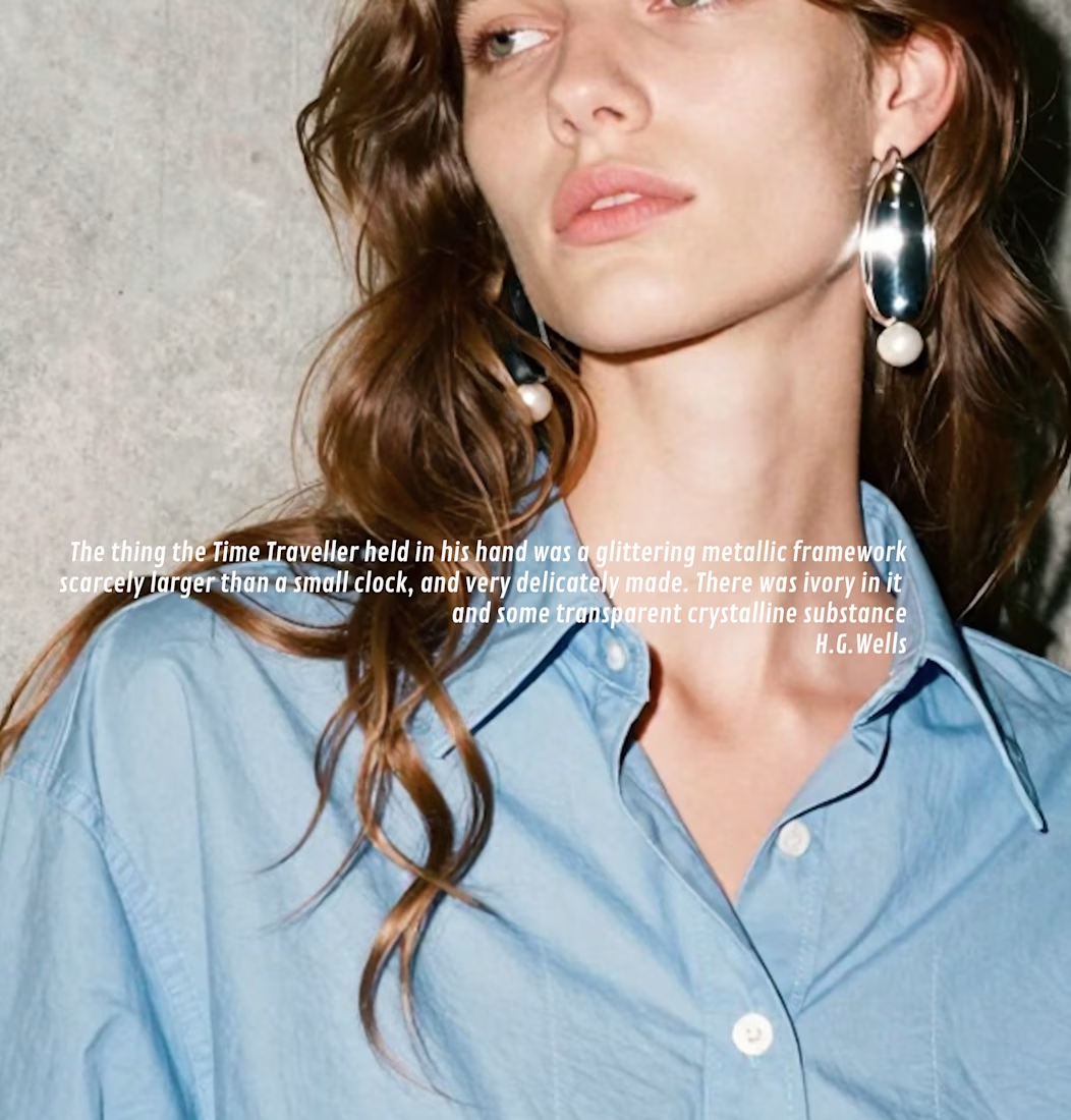
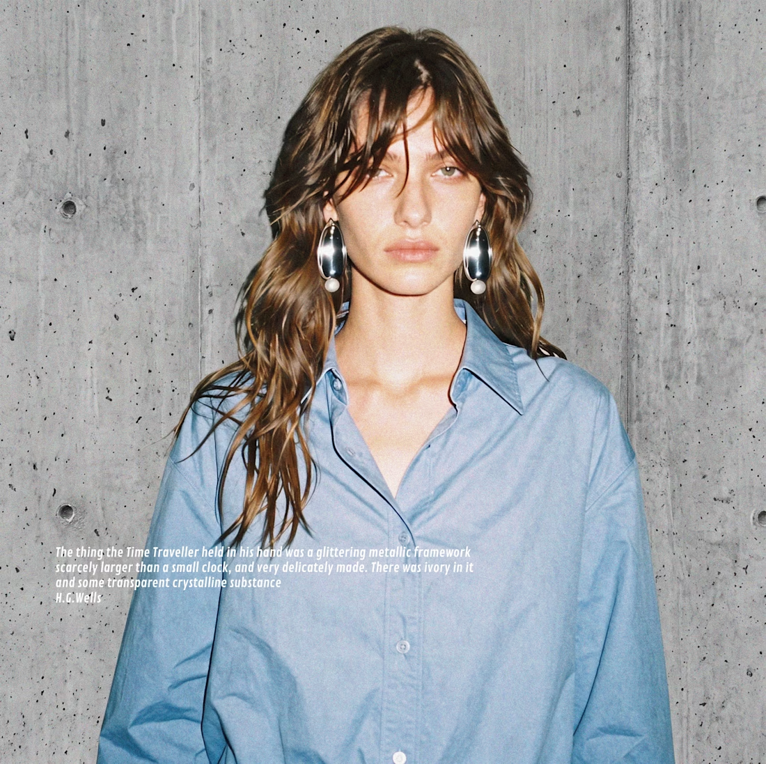
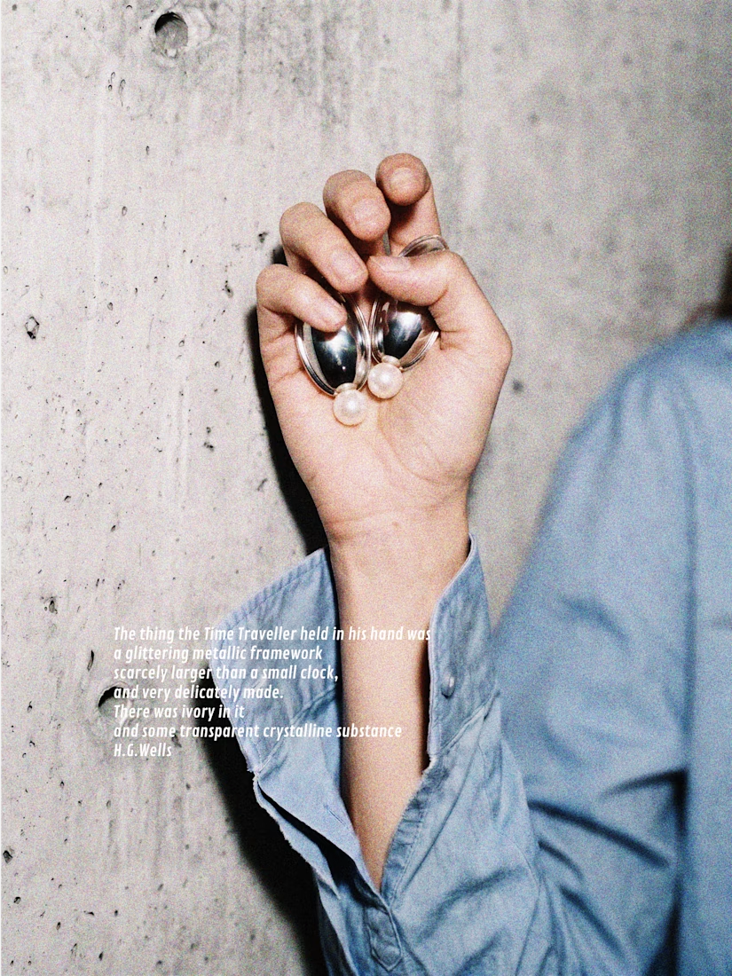
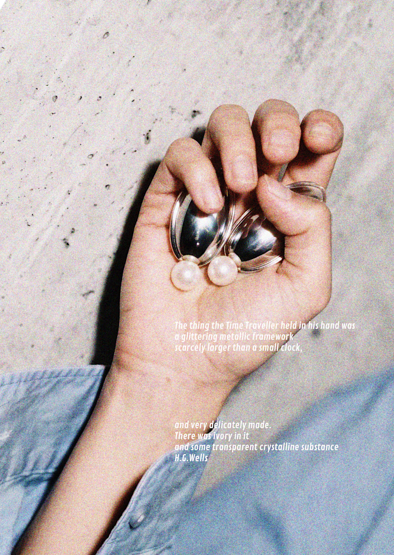
Jewelry Brand Editorial Campaign Concept | Visual Design


Nice!
Title / Headline
Noir Essence — Luxury Perfume E-Commerce & Brand Identity
Description
Overview:
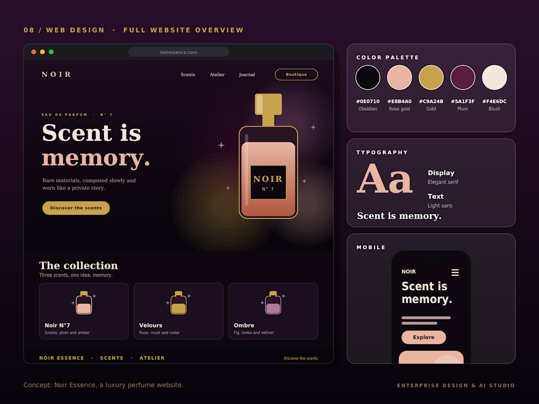
Noir Essence is an immersive, high-end e-commerce and brand concept designed for luxury fragrances, blending sensory storytelling with sophisticated digital aesthetics.
Design Highlights:
Dark Mode Luxury Aesthetics:
Engineered a deep, atmospheric dark theme utilizing Obsidian, Rose-Gold, and Gold accents to evoke an exclusive, high-end sensory experience.
Typography & Hierarchy: Paired sophisticated Elegant Serif display fonts with ultra-clean sans-serif body copy for refined readability.
Product Architecture & Mobile Layout: Integrated fluid product showcases ("The collection") with a seamless mobile-responsive interface for optimal user engagement.
Brand Color System: Defined a precise custom color palette (Obsidian, Rose-Gold, Gold, Plum, and Blush) tailored for high-end retail branding.
Tools & Stack:
Figma, Adobe Illustrator, Brand Identity, UI/UX Web Design, E-Commerce Layouts.
The Obsidian, Rose-Gold and Gold palette is such a confident naming of the color system, it already tells you the whole mood. Pairing the elegant serif display with an ultra-clean sans body is exactly the right call for luxury fragrance.