The network for creativity
Join 1.25M professional creatives like you
Connect with clients, get discovered, and run your business 100% commission-free
Creatives on Contra have earned over $150M and we are just getting started
Back to feedPost

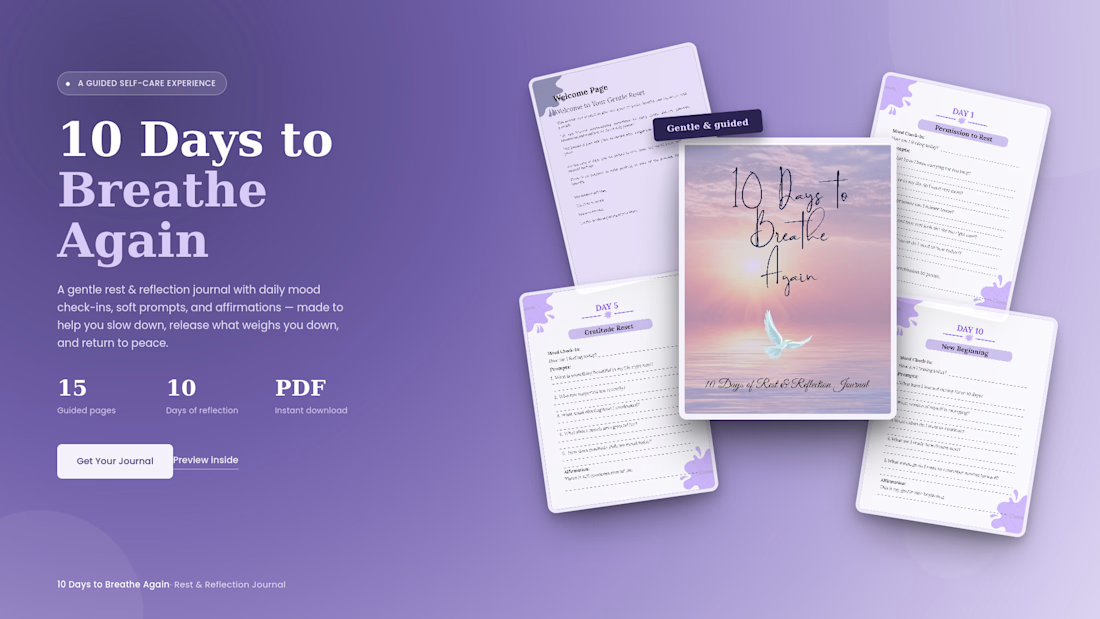
10 days to breathe again is a digital self care and reflection journal designed to create a gentle calming experience for users. the final presentation showcases the journal in a polished product mockup designed to communicate the feeling and purpose of the digital product

The network for creativity
Join 1.25M professional creatives like you
Connect with clients, get discovered, and run your business 100% commission-free
Creatives on Contra have earned over $150M and we are just getting started











Related posts

Second Serve Club — Exploring Visual Identity Through AI & Design.
For this branding challenge, I created a series of original logo marks in Adobe Illustrator, inspired by vintage tennis culture.
I then explored how these designs could come to life by combining my own typography, monograms and colour identity with AI-generated visuals using ChatGPT.
From the texture of a clay court to embroidered details on tennis balls, the goal was to bring the brand identity into a more tangible, realistic setting.
An exploration of how traditional graphic design and AI can work together to create a cohesive visual world.
Designed by me. Visualised with AI. 🎾
Full brand identity case study coming soon.
#BrandIdentity #VisualIdentity #GraphicDesign #AIDesign #ChatGPT

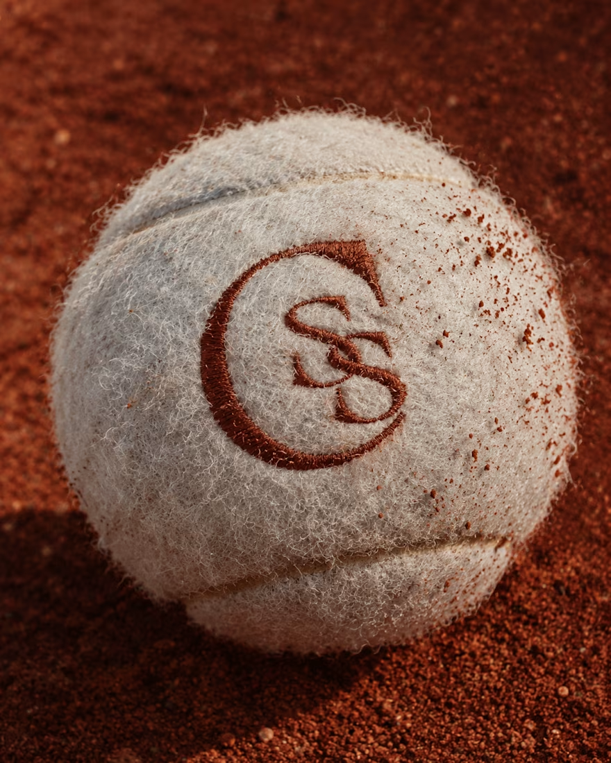
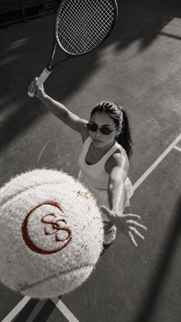
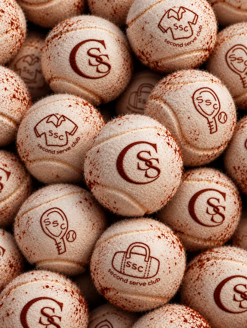

The SS mark stamped into the tennis ball felt is a great detail. Looks very real on the clay court.

i've been making my business card today, which version do you prefer? what do you think about it?
2 voted
18%
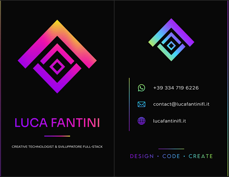
9 voted
82%
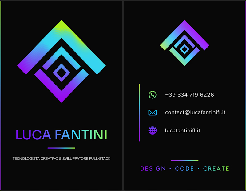
11 votes
Closed

I'd lean toward the single palette. The cooler gradient keeps the contact icons readable, while the magenta in the second one starts competing with the logo mark. Worth proofing the neon on paper too, since it can shift a lot in CMYK.

Title / Headline:
The Quiet Hours — Cultural Magazine Web Design & Brand Identity
Description
Overview:
The Quiet Hours is an editorial-driven digital magazine concept focused on slow living, culture, and thoughtful essays, designed with a sophisticated print-inspired digital aesthetic.
Design Highlights:
Print-Inspired Editorial Layout: Engineered a structured grid system blending classic editorial serif display typography with clean body text for an immersive reading experience.
Calm & Earthy Color Palette: Curated a muted, harmonious color scheme (Pampad, Ink, Ember, Teal, and Pod) to evoke a sense of quiet and reflection.
Content Architecture: Structured clear content hierarchies, including issue highlights, article previews, and category navigation.
Mobile Responsive Layout: Designed a seamless mobile reading interface tailored for on-the-go content consumption.
Tools & Stack:
Figma, Adobe Illustrator, Editorial Typography, Web Design, UI/UX Layouts.


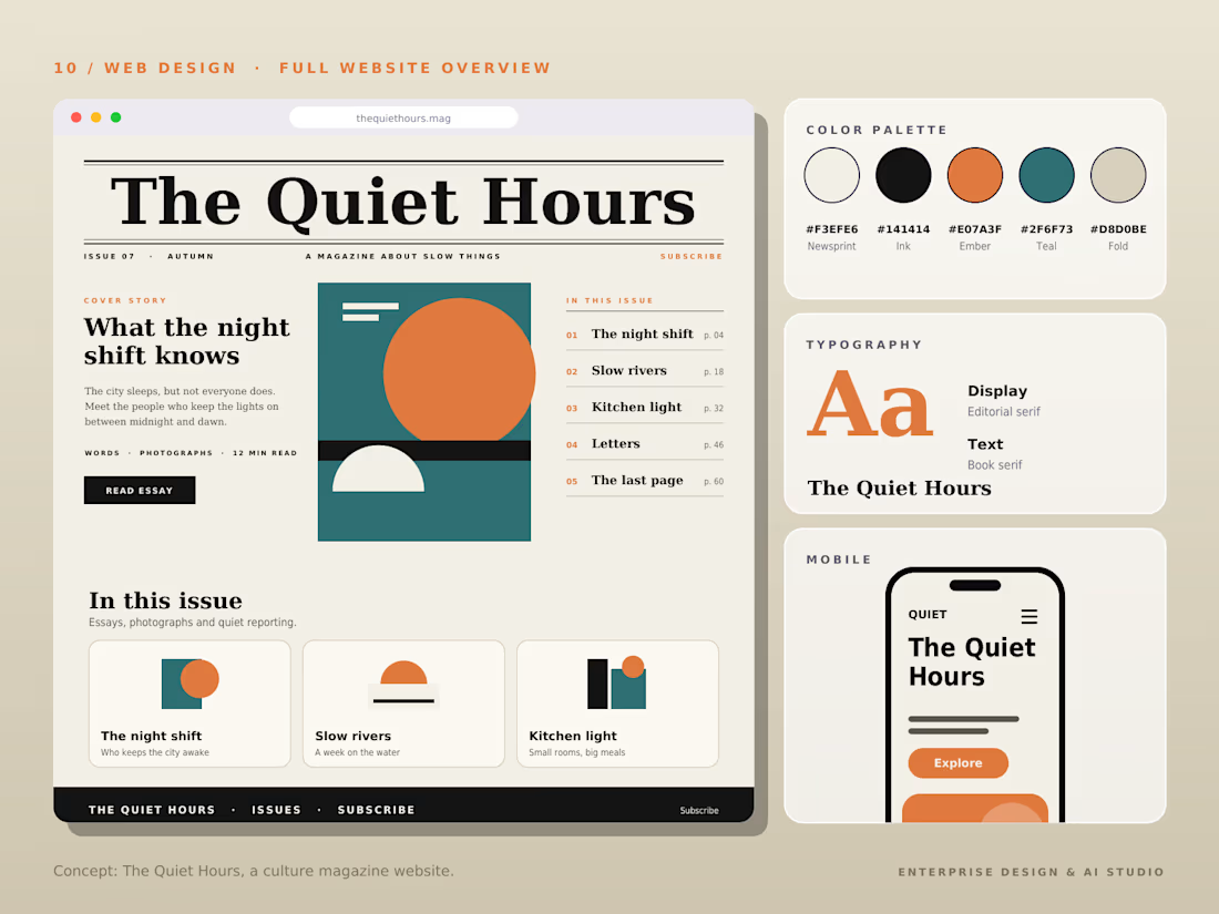

The Pampad, Ink, Ember, Teal and Pod palette names alone tell me this is a thoughtfully built system. Print-inspired editorial grids are so satisfying when they respect the reading experience, and this clearly does.