The network for creativity
Join 1.25M professional creatives like you
Connect with clients, get discovered, and run your business 100% commission-free
Creatives on Contra have earned over $150M and we are just getting started
Back to feedPost
Taste Test


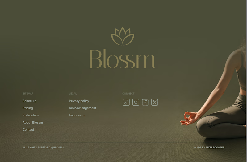
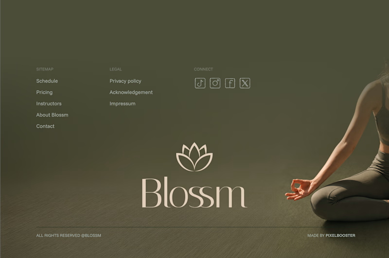

First one is better as it grabs attention to brands name better 💯


the bold logo all the way!

I'd choose bold.

Def the bold one. Light one gets a bit lost due to lack of contrast

Bold logo
The network for creativity
Join 1.25M professional creatives like you
Connect with clients, get discovered, and run your business 100% commission-free
Creatives on Contra have earned over $150M and we are just getting started



Related posts

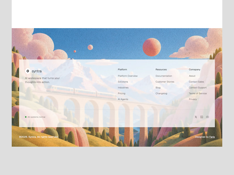
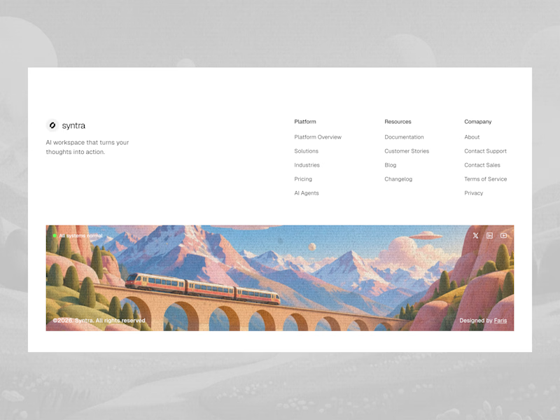
Footer explorations.
Which one do you like it?
7 voted
32%
15 voted
68%
22 votes
Closed

Love these explorations! The first one really stands out to me, the illustrated train scene makes the footer feel so memorable instead of just links at the bottom. It's such a clever way to end the page on a beautiful, branded note. Really great work!

Which logo + Wordmark looks more organic/reliable/premium and why?
5 voted
71%
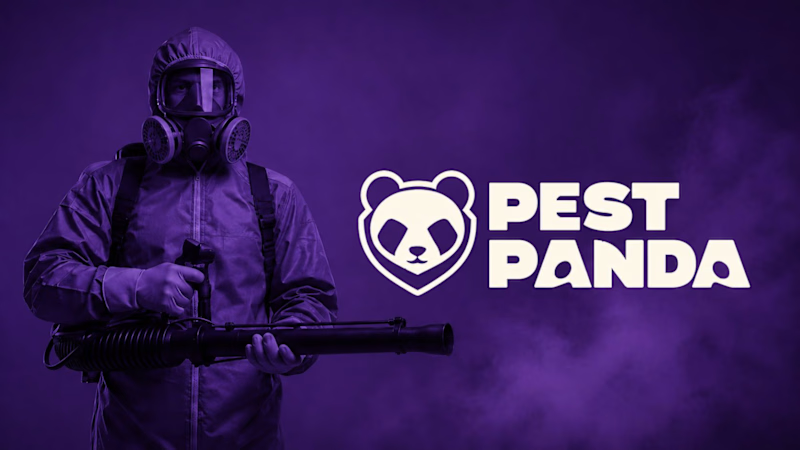
2 voted
29%
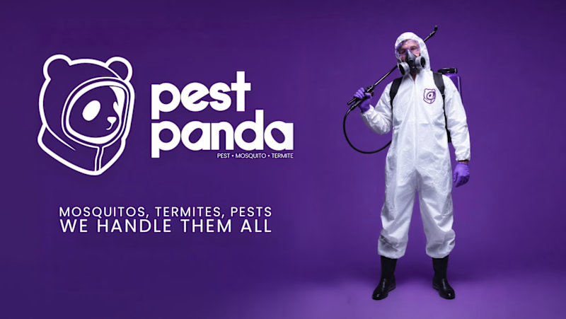
7 votes
Closed

Option 2 for me: the rounded lowercase wordmark and the panda in a hazmat hood feel friendlier and more premium, while the heavy caps next to the gas-mask photo in option 1 read a bit aggressive for a home service. I'd only give the tagline in option 2 more weight, at that size it gets lost on the purple.

Working on a Contra project - which one is your go to?
90 voted
52%
82 voted
48%
172 votes
Closed

I will go for A - Spiral