The network for creativity
Join 1.25M professional creatives like you
Connect with clients, get discovered, and run your business 100% commission-free
Creatives on Contra have earned over $150M and we are just getting started
Back to feedPost
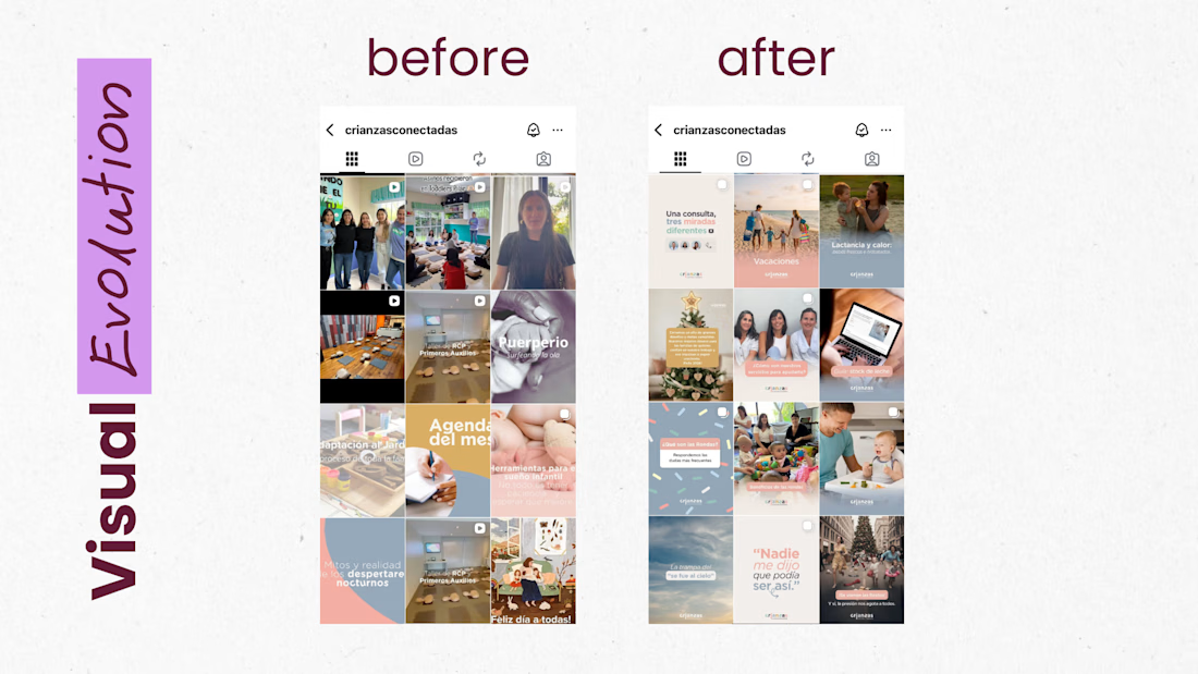
What I did for CrianzasConectadas
I was the lead social media strategist and brand guardian for Crianzas, focusing on solidifying the brand as a top authority in the health and education sector. My role went beyond content creation; I oversaw a complete visual and communication redesign, ensuring that every touchpoint reflected professionalism and trustworthiness. I managed the social media ecosystem from start to finish, from high-level strategy and graphic design to community management and performance analysis, ensuring that the brand message resonated with a sophisticated and discerning audience.



About Crianzas
Crianzas is an Argentina-based opening to platform dedicated to providing evidence-based parenting resources and expert-led guidance. The brand distinguishes itself through its commitment to academic rigor and empathetic communication, offering digital courses,...
How I Onboarded Them
I implemented a structured onboarding process designed to align creative output with business integrity:
Deep-Dive Consultation: Conducted a comprehensive debriefing to align on brand values, ethical considerations, and long-term authority-building goals.
...
Revamp Of Their Social Presence
Aesthetic & Messaging Audit: Identified and removed legacy content that diluted the brand’s professional standing.
Profile Optimization: Streamlined the bio for clarity and SEO, and curated Highlight Stories that serve as an evergreen FAQ and...
Strategy Implementation:
Data-Driven Calendar: Prepared monthly schedules highlighting key educational events, product launches, and expert insights.
Collaborative Approval: Maintained a transparent feedback loop with the client to ensure technical accuracy in all communications.
...
IMPACT & KEY RESULTS
Sold-Out Workshops: Achieved a 100% occupancy rate for live workshops through targeted organic funnels.
Course Sales Growth: Consistently increased digital course conversions by aligning educational content with the brand’s product ecosystem.
High-Intent...
The network for creativity
Join 1.25M professional creatives like you
Connect with clients, get discovered, and run your business 100% commission-free
Creatives on Contra have earned over $150M and we are just getting started

Challenges
View all


Related posts

Wonder -- Visual Expressions


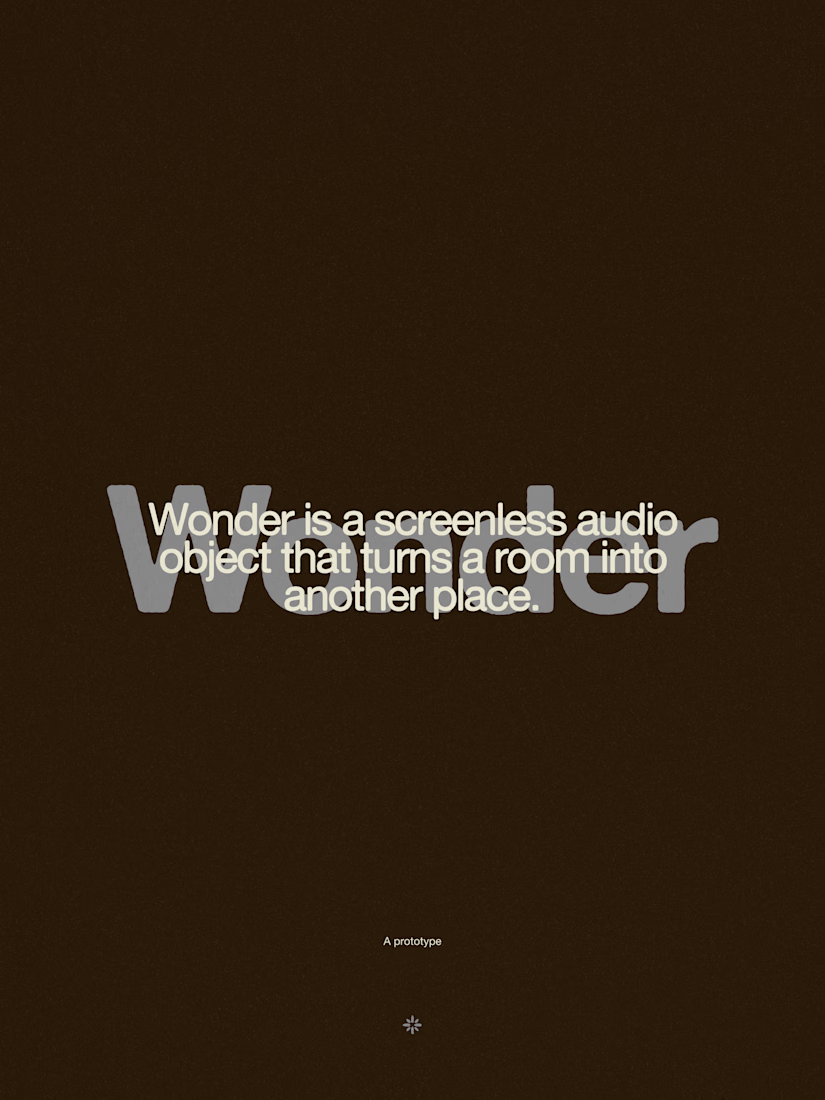


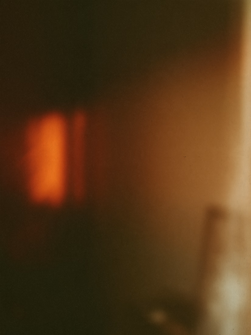

The restraint in the warm palette really lets the sound-object concept breathe—especially that shift from readable type to atmosphere.

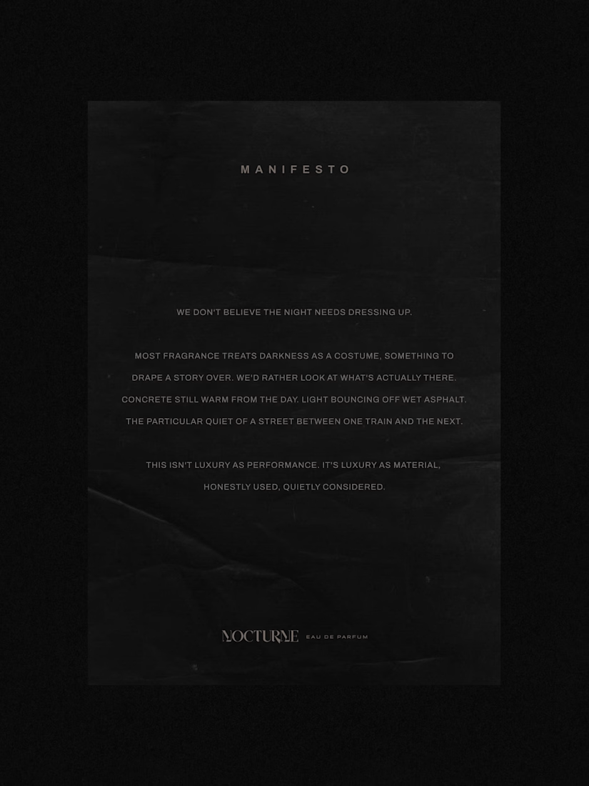
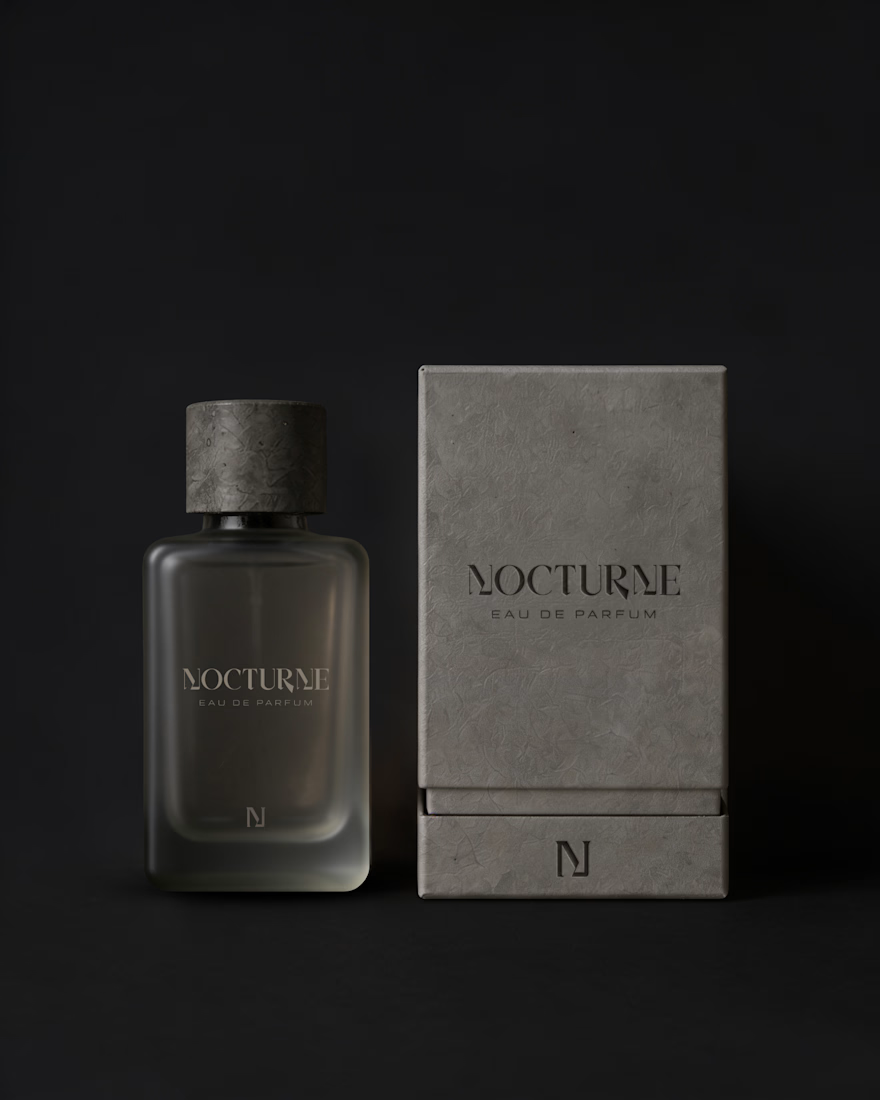
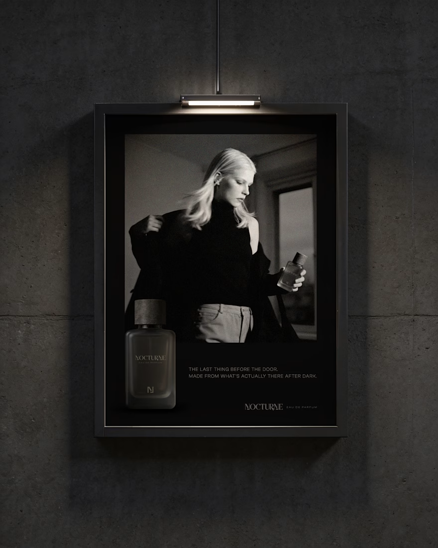
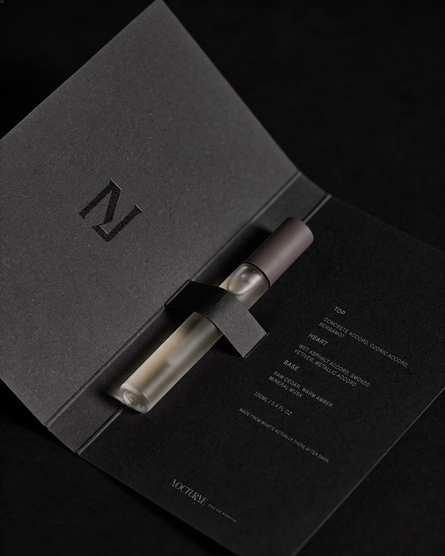
Nocturne is a self-initiated fragrance house I built from the ground up, treated with the same process I'd bring to any client: strategy first, then design.
The brief was familiar: a fragrance inspired by the city after dark. Most fragrance branding solves that with common approaches such as moonlight, mystery, or gold foil details. I wanted to solve it with something more specific: what does after dark actually look like in an urban environment? Concrete, streetlight, wet pavement, the quiet stretch between one train and the next.
That question shaped everything downstream. An archetype chosen deliberately against category convention, Creator and Explorer rather than the more expected Lover or Magician. A material-first approach to the bottle and packaging. Sandblasted glass, a textured concrete-like cap, no gold, no ornament. And a running checklist I held every decision against throughout the project.
The case study covers the strategy behind Nocturne, not just the finished system: positioning, personality, the reasoning behind each material and typography choice, and how those decisions translated into the bottle, packaging, and campaign work.
I'd love to hear what you think, especially if you enjoy seeing the thinking behind a visual identity as much as the final result.


Good Work!

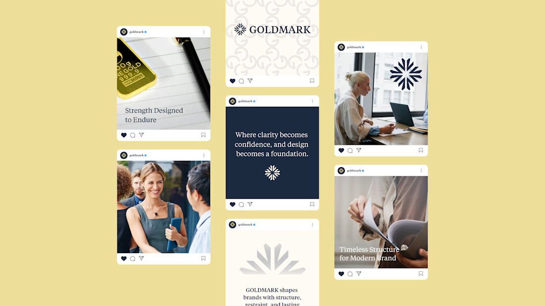
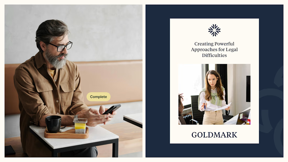
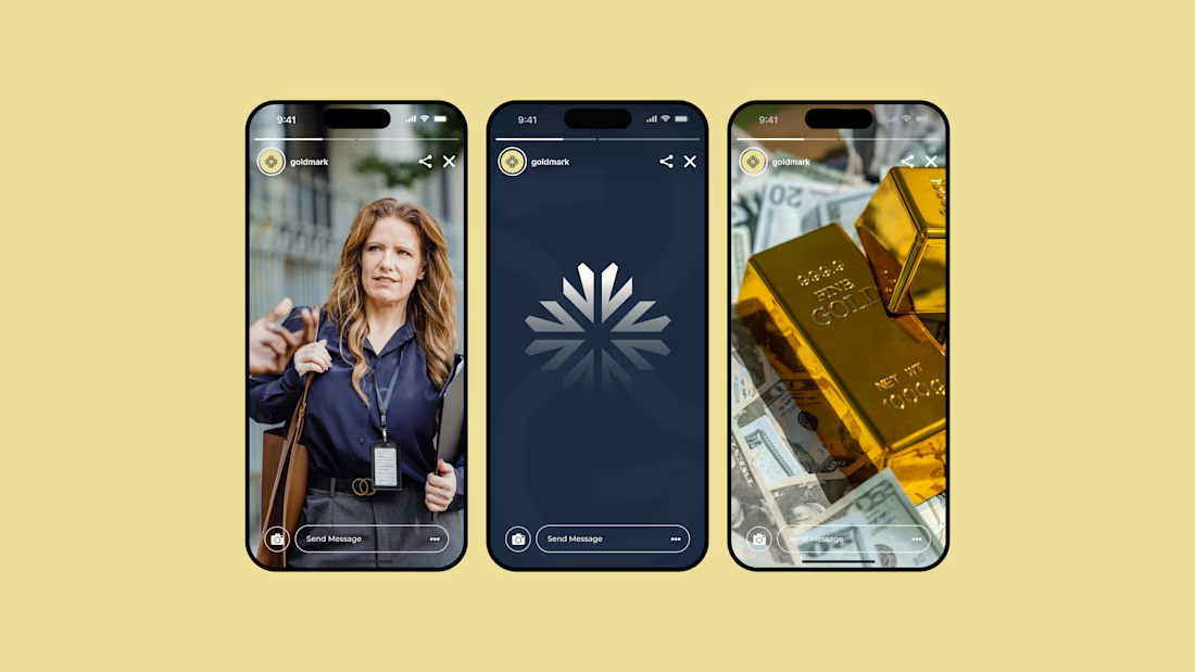
GOLDMARK - A refined identity for modern legal expertise. ✦
A complete branding exploration focused on building a visual language that feels premium, trustworthy, timeless, and confident.
The identity combines a distinctive symbol, elegant typography, and a deep navy + warm gold palette to create a sophisticated presence across digital and print applications.
Services: Brand Identity • Logo Design • Art Direction • Visual System
#BrandIdentity #BrandDesign #LogoDesign #VisualIdentity #Branding #GraphicDesign #ContraPortfolio