The network for creativity
Join 1.25M professional creatives like you
Connect with clients, get discovered, and run your business 100% commission-free
Creatives on Contra have earned over $150M and we are just getting started
Back to feedPost

Wave Ape 🏄♂️
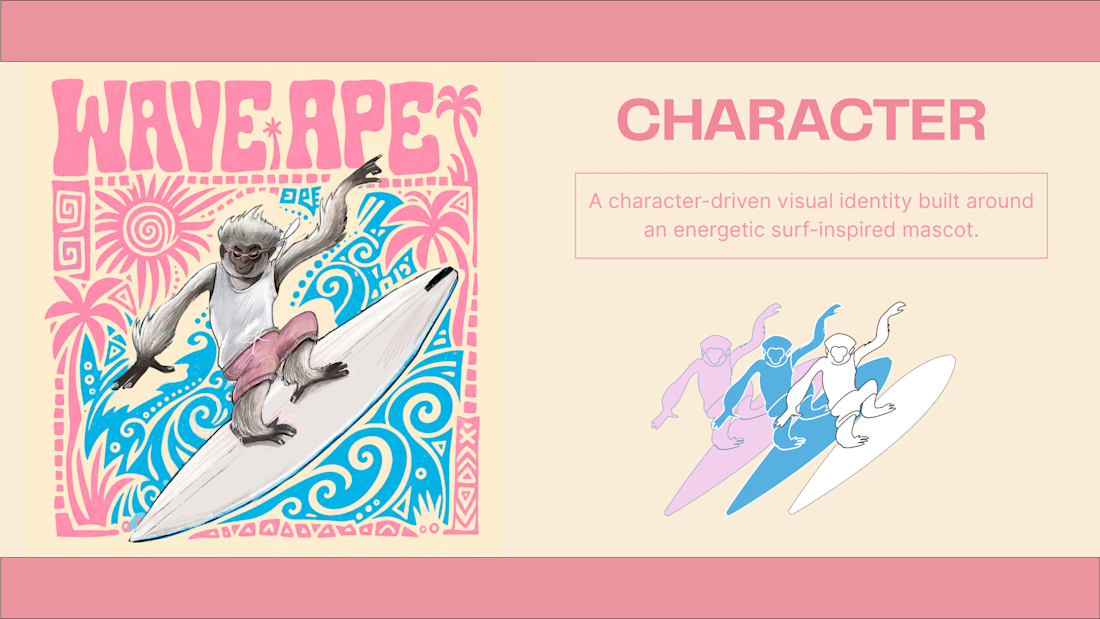
A character-driven brand concept built around an energetic, surf-inspired mascot.
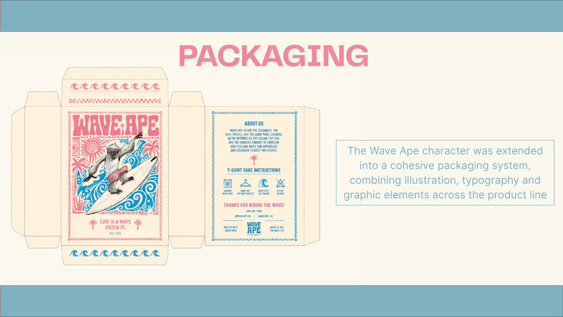
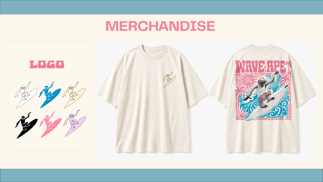
For this project, I developed the character and extended the visual direction across packaging and merchandise, creating a consistent illustration and graphic language for the brand.
The goal was to create a character with a strong personality that could work beyond a single illustration - becoming a recognizable part of the overall brand identity.
I enjoy projects where character design becomes part of something bigger: packaging, merchandise, branding and other visual applications


The network for creativity
Join 1.25M professional creatives like you
Connect with clients, get discovered, and run your business 100% commission-free
Creatives on Contra have earned over $150M and we are just getting started

Challenges
View all


Related posts

Logo design for StocksWithJosh, a prominent online trading mentor with 195K YouTube subscribers.
The concept was simple: blend the initials SWJ with a subtle nod to his status as the "GOAT" (Greatest Of All Time), a moniker earned from his community.
The result is a bold, recognizable brand mark that fits his business perfectly.
What do you think of the end result?


The mark reads instantly at thumbnail size, and the framed SWJ lockup gives it a strong YouTube-avatar presence. The subtle crown/GOAT cue is a nice detail without overpowering the initials.

NEXOR — Creative Digital Agency Website 🔥
NEXOR is a futuristic website concept for a creative digital studio focused on digital products, brand systems, and bold digital experiences.
The goal was to create a memorable first impression while keeping the agency’s services and next steps clear.
Special attention was given to:
• a bold hero composition with oversized typography and futuristic imagery;
• a vibrant orange and black palette that creates a distinctive visual identity 🟠;
• a strong visual hierarchy that balances creative expression with usability;
• clear CTAs for starting a project or booking a call;
• a contact form integrated directly into the hero section;
• responsive mobile layouts that preserve the visual impact 📱;
• a full-screen mobile menu with intuitive navigation and prominent contact options.
The result is an expressive digital experience that combines bold visual storytelling with a clear path to conversion.
Looking to create a distinctive website for your creative agency, digital studio, or technology brand? Let’s build something extraordinary together ⚡

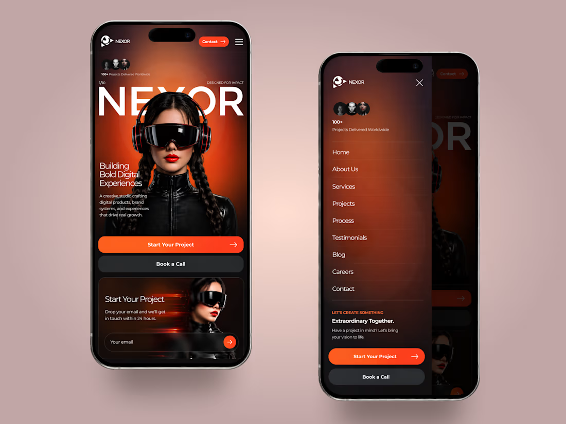
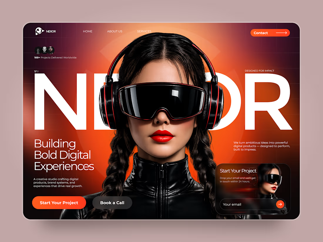
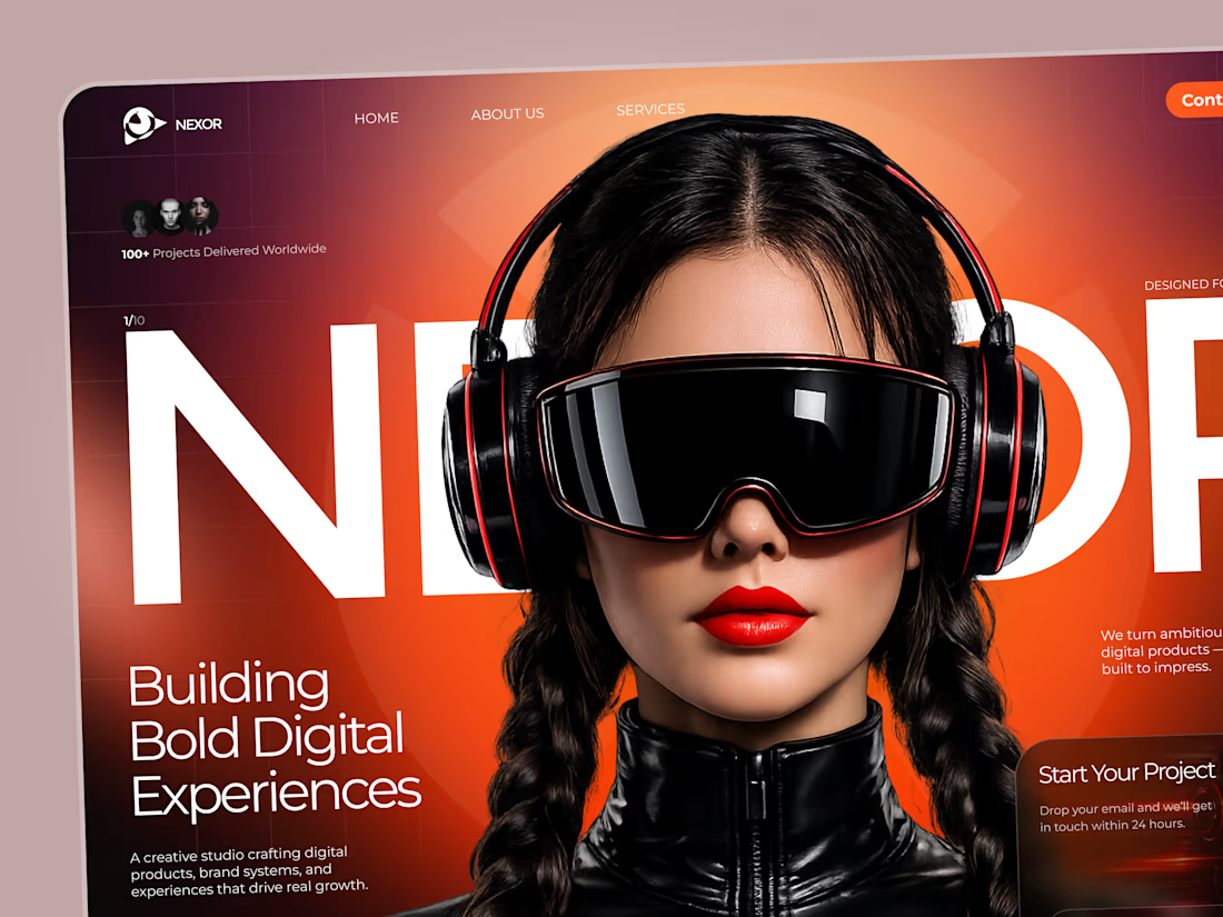
The orange-and-black system has real presence, and the mobile frames show the hierarchy holding together rather than just shrinking. The clear CTA placement is a smart counterweight to the oversized hero type.


Color palette exploration for an Australian company, rooted in calmness, warmth, mental health and professionalism
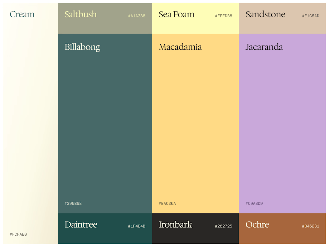

These tones are stunning. I can instantly picture this color system translating beautifully into soft, flowing motion graphics for a brand reveal video. Great exploration!