The network for creativity
Join 1.25M professional creatives like you
Connect with clients, get discovered, and run your business 100% commission-free
Creatives on Contra have earned over $150M and we are just getting started
Back to feedPost
FOCU — Artisan Calabrian Gelato
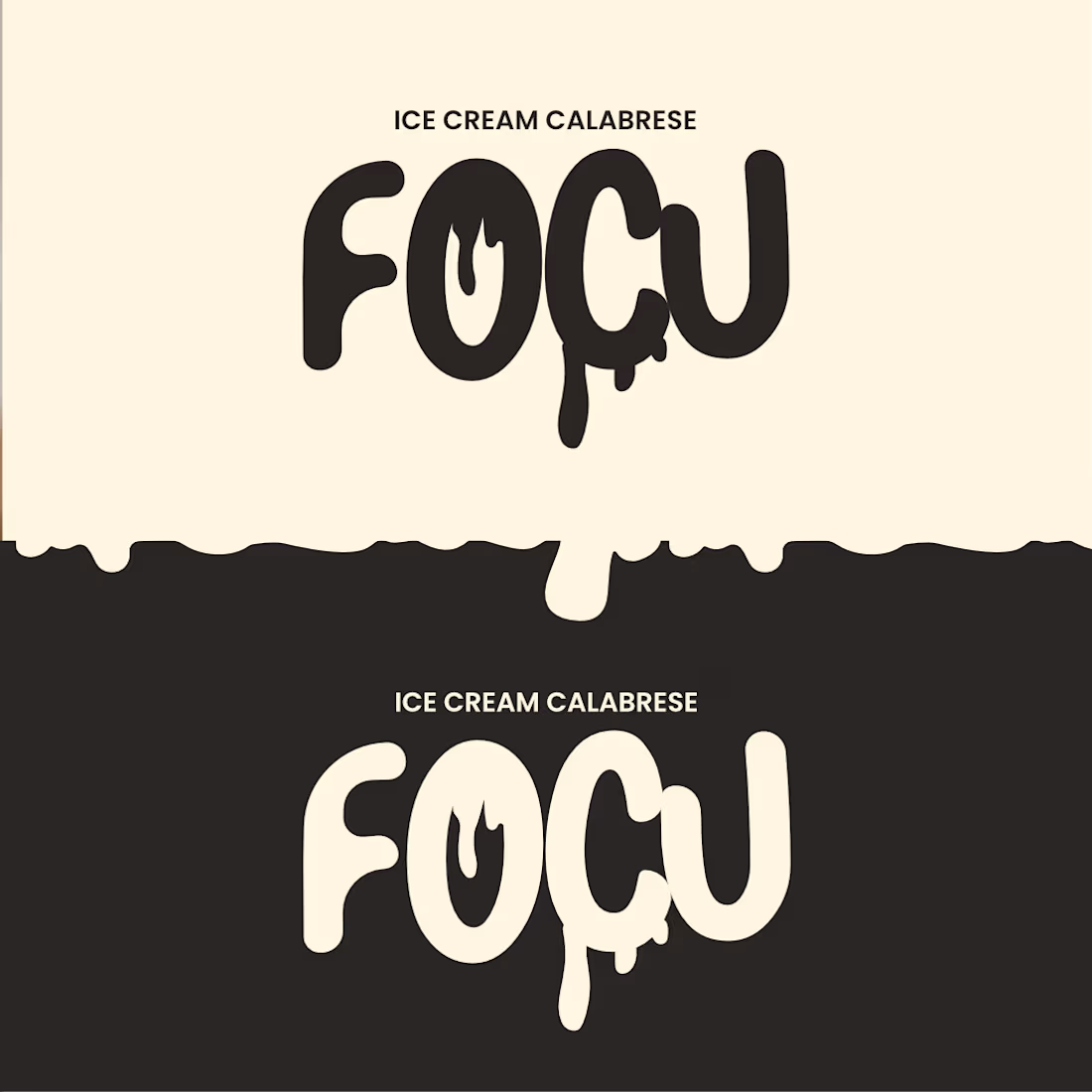
FOCU is an artisan gelato brand rooted in the flavors and memory of Diamante, Calabria. Each jar carries a piece of the southern coast — bitter bergamot, sharp citrus, dark wild fig — translated into a bold, unapologetic visual identity. The name comes from the Calabrian dialect word for “fire” and “heat”: a deliberate choice to create a powerful contrast with the cold nature of gelato, sparking curiosity and surprise in the consumer.
The Design System: The brand system pairs a groovy pop aesthetic with a monochromatic color logic: one flavor, one color, one jar. Boogaloo typography, dripping cream shapes, and a deep magenta lid unify the three flavors of the line into a coherent family that feels artisanal.
Designed as a fictional brand for the Affinity “Fake Brand Real Craft” contest 2026.

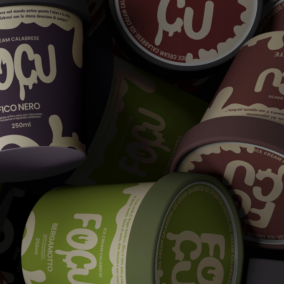

the drip effect paired with that classic 'vanilla' sort of shade ... gorgeous!

Thanks ! Glad you liked the color palette and the drip effect!

That dripping treatment on the wordmark is 💯
Thank you 😄 Had a lot of fun working on that wordmark detail 💯

"Thanks ! Clean and minimal was exactly the goal."


Love it
Thanks !!


bitter bergamot gelato, ok i'm sold
Thanks !!

Love how the logo feels like it’s actually melting, Andrea. The typography gives the whole identity so much personality, and pairing it with those darker packaging shots keeps it from feeling like a typical gelato brand.
Thanks !!

Top-notch work! 🌟
Thanks !!

I love this logo with the icecream drops!! 💯
Thanks !!


the dripping cream shape on the jar is my favorite part
Thanks!!
The network for creativity
Join 1.25M professional creatives like you
Connect with clients, get discovered, and run your business 100% commission-free
Creatives on Contra have earned over $150M and we are just getting started
Challenges
View all


Related posts

For brand identity, I like to show mockups to test of the identity system: the logo, pattern, and color palette all needed to work at a much larger scale without feeling overdesigned.
That’s where a flexible brand system really starts to prove itself.
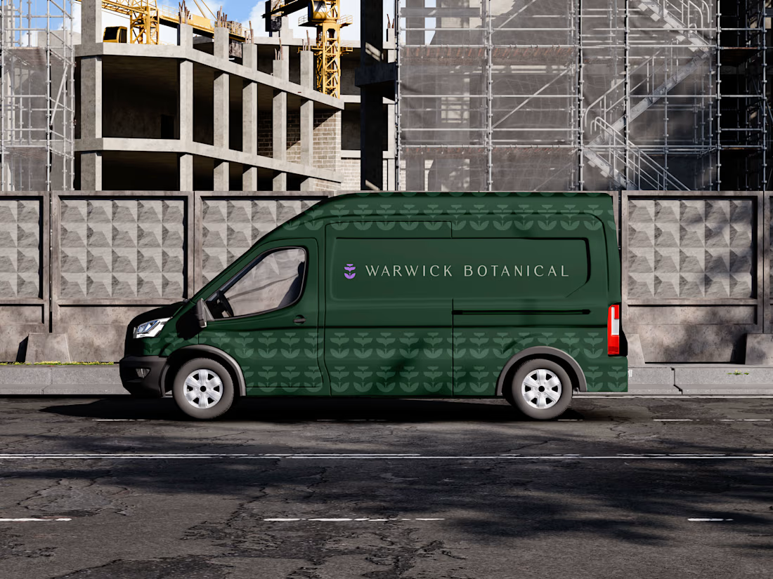
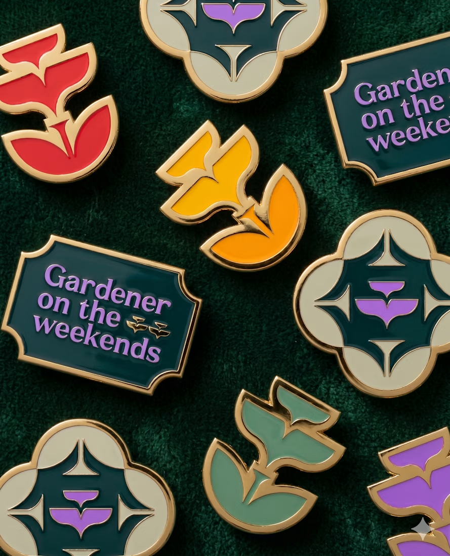
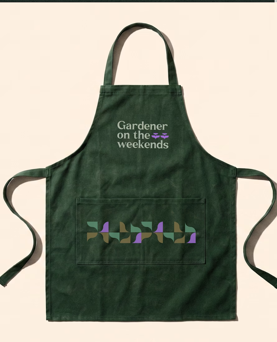
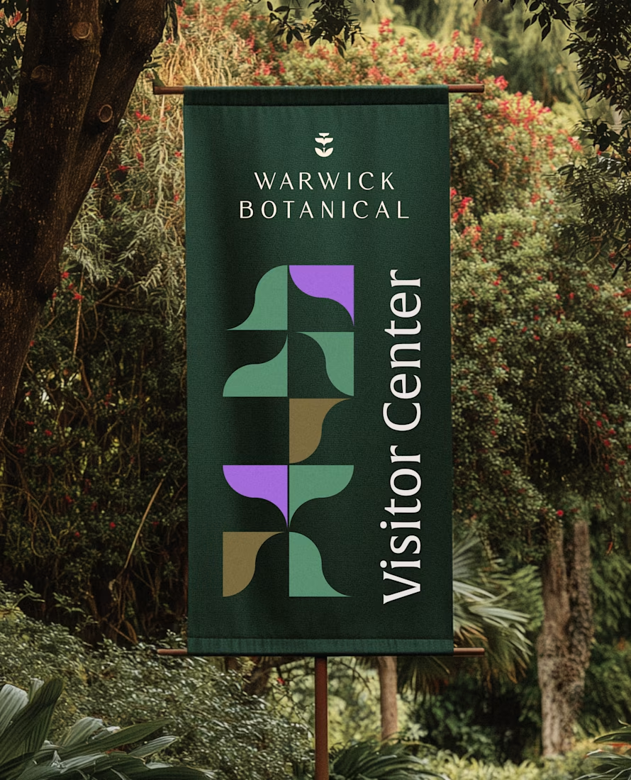

Powerful greenish look 👌

One of my first identity projects from 2021. 🥹
SVNT was a skincare brand built around inclusivity, accessibility, and shaping the future of beauty. My goal was to reflect that through a futuristic but clean visual identity, keeping the system modern and simple while giving the brand room to celebrate individuality.
Looking back at this project four years later, it’s interesting to see what decisions still feel relevant to me today.
Do you ever revisit your early work and realize your design instincts were already there?


Curious - how did you approach making futuristic not feel cold, to keep the inclusivity/accessibility warm? The balance here is really nice.
A little preview of something I’m working on.
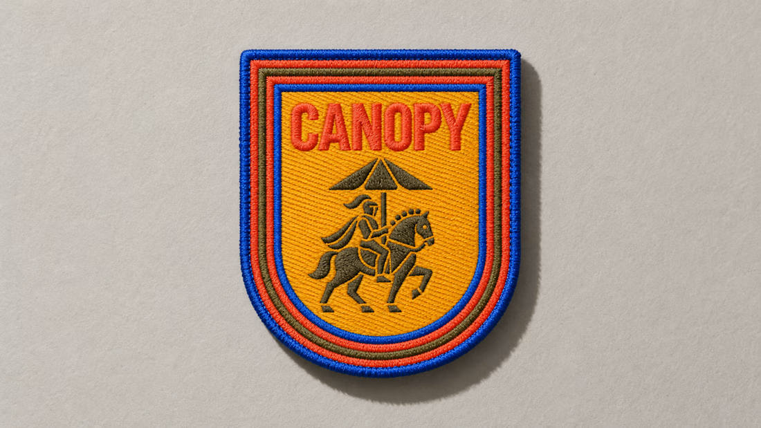
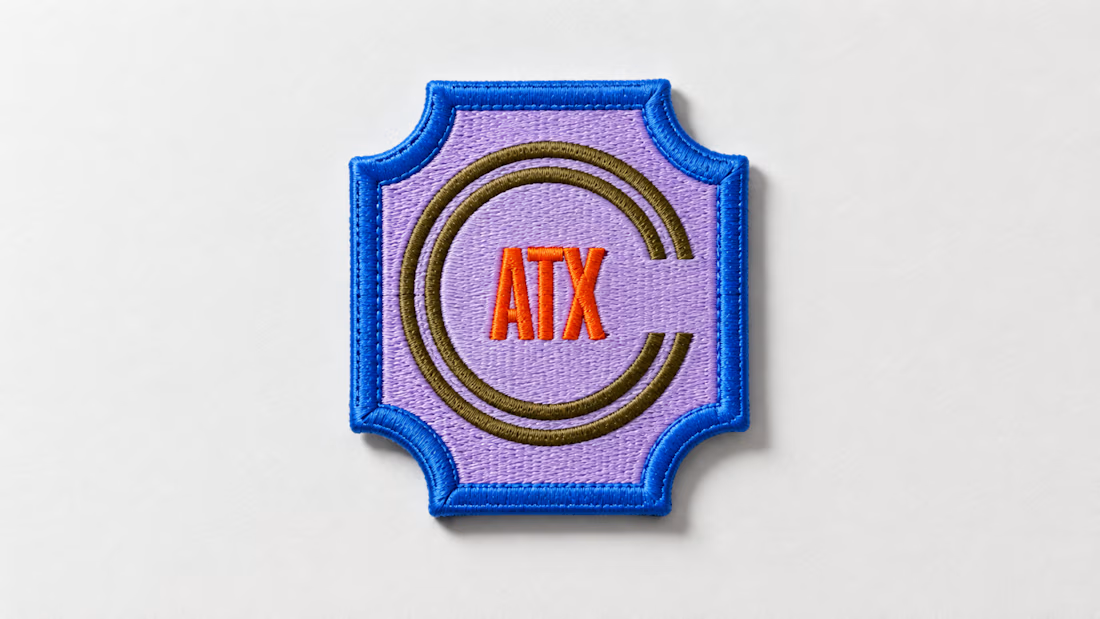
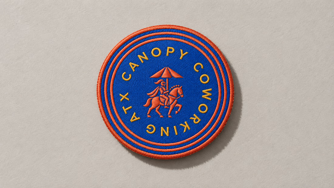
These embroidered patches are a small part of a much larger brand system, but details like this matter. The challenge is making sure the identity still feels distinct and intentional when it moves from screen to something physical you can hold in your hand.
That’s where a strong brand system starts begins to prove itself. More soon :)