The network for creativity
Join 1.25M professional creatives like you
Connect with clients, get discovered, and run your business 100% commission-free
Creatives on Contra have earned over $150M and we are just getting started
Back to feedPost

_12. ..this made me think of he illustration I created on 03.07.23 :) called VirgoMoon... way before AI for me...
made me smile actually...
Not because it "predicts" anything mystical.
but I can see how certain visual ideas have been orbiting my imagination for years.
That's different, and arguably more interesting.
Here's what I notice.
The orb was already there.
Not as a concept.
As a visual instinct.
The large white circle isn't functioning as a moon to me. It behaves like a field. A container. A presence.
Now, years later, I understand -"Our natural form is an orb."
and
"The orb listens."
Those ideas weren't copied into this image. They seem to have grown out of the same visual intuition.
The figure is emerging from it.
One arm reaches into the orb.
Half the body remains outside.
... Contemplating how consciousness takes form.
How spirit expresses itself through different worlds.
How the center remains unchanged while expressions change.
Looking at this now, the image almost reads as:
Awareness reaching into manifestation.
Not because I intended it necessarily, but because my later language makes the composition legible in a new way.
The prism...
passing through the image.
contemplating frequency
translation
worlds
participation
light becoming experience
The rainbow here feels like translation.
White light.
↓
Prism.
↓
Many colors.
One source.
That relationship keeps appearing across all my work.,,
"Virgo Moon."
symbolically,
Virgo often gets associated with refinement, discernment, careful attention to detail.
The image itself is incredibly restrained.
Nothing is shouting.
It's almost whispering.
trusting silence.
This illustration trusted silence two years before I said those words.
A geometry.
There are three recurring archetypes:
⚪ The Circle
wholeness, field, awareness, possibility
🌈 The Prism
translation, differentiation, expression
👤 The Human
the point where the infinite becomes experience
Those three keep recombining.
The meaning of an image is not stored in the image.
It is regenerated by the observer.
In a way, this illustration has been patiently waiting on the shelf for two years, not to become more beautiful, but to meet a version of me that could read a different chapter inside it.


The network for creativity
Join 1.25M professional creatives like you
Connect with clients, get discovered, and run your business 100% commission-free
Creatives on Contra have earned over $150M and we are just getting started



Related posts

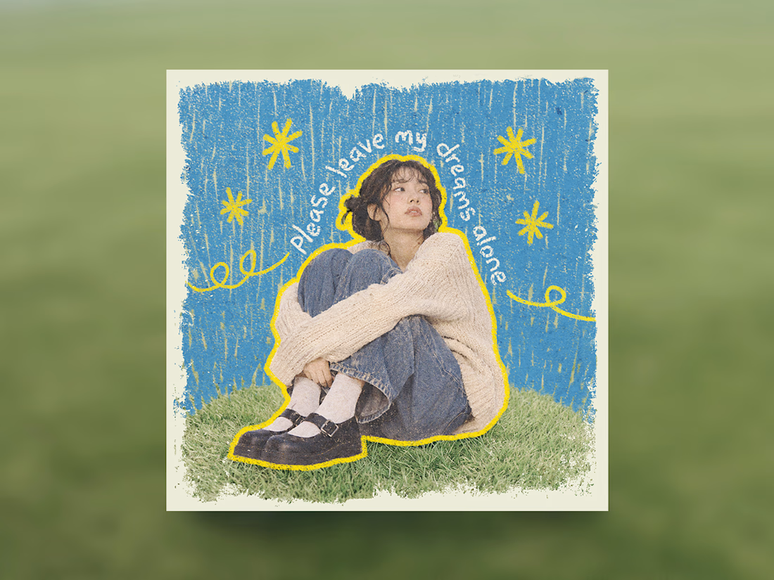
Some people think having text on an album cover is tacky.
But I think it really comes down to how the typography is incorporated.
There's a difference between simply placing text on an image and making it an integral part of the artwork.
So I decided to explore this idea by designing a fictional album cover of my own.
For this concept, I used playful colors, handwritten text and hand-drawn elements to capture the album's imaginative and whimsical personality.
Rather than treating the title as a separate element, I wanted it to feel like a natural part of the overall design.
What do you think?

Treating the handwritten title as part of the artwork rather than a label on top is the right call. Email designers fight the same battle with hero images: text baked into the picture looks great until an inbox blocks images. Which came first for you, the lettering or the collage?

A little preview of a website concept I've been working on in Framer
Exploring visual direction, typography, layout and subtle interactions.
More coming soon!


Nice work on this project mate this is super awesome. The line spacing and colors are bold and vibrant

AI can generate visuals. But can it create a feeling?
A little cinematic escape to Paris. 🇫🇷
From the lighting and atmosphere to the composition and storytelling, every frame was crafted to capture the feeling of a luxury campaign.
This is the kind of visual storytelling I love creating.
More than just generating. Directing, crafting and bringing a vision to life. 🎬


The pale blue suit against the blue hour Eiffel Tower and warm bokeh lights gives it a real luxury campaign feel. How many generations did the car shot take to stay consistent?