The network for creativity
Join 1.25M professional creatives like you
Connect with clients, get discovered, and run your business 100% commission-free
Creatives on Contra have earned over $150M and we are just getting started
Back to feedPost
Title / Headline
Noir Essence — Luxury Perfume E-Commerce & Brand Identity
Description
Overview:
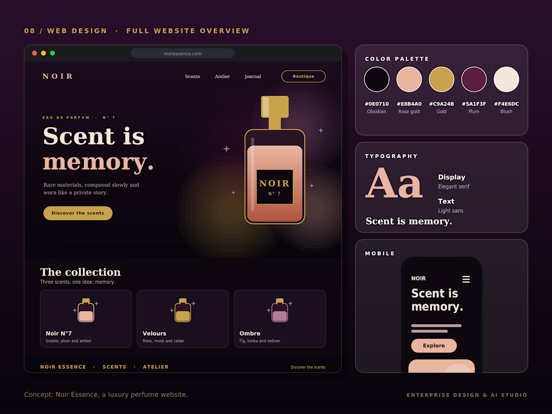
Noir Essence is an immersive, high-end e-commerce and brand concept designed for luxury fragrances, blending sensory storytelling with sophisticated digital aesthetics.
Design Highlights:
Dark Mode Luxury Aesthetics:
Engineered a deep, atmospheric dark theme utilizing Obsidian, Rose-Gold, and Gold accents to evoke an exclusive, high-end sensory experience.
Typography & Hierarchy: Paired sophisticated Elegant Serif display fonts with ultra-clean sans-serif body copy for refined readability.
Product Architecture & Mobile Layout: Integrated fluid product showcases ("The collection") with a seamless mobile-responsive interface for optimal user engagement.
Brand Color System: Defined a precise custom color palette (Obsidian, Rose-Gold, Gold, Plum, and Blush) tailored for high-end retail branding.
Tools & Stack:
Figma, Adobe Illustrator, Brand Identity, UI/UX Web Design, E-Commerce Layouts.




Thanks! Wanted to make sure the fragrance feel matched the digital depth." 🚀

The Obsidian, Rose-Gold and Gold palette is such a confident naming of the color system, it already tells you the whole mood. Pairing the elegant serif display with an ultra-clean sans body is exactly the right call for luxury fragrance.
Thanks Timothy! Premium brand identities rely heavily on atmospheric contrast and typographic balance. Pairing high-contrast serifs with strict geometric tokens was key for this luxury aesthetic."
The network for creativity
Join 1.25M professional creatives like you
Connect with clients, get discovered, and run your business 100% commission-free
Creatives on Contra have earned over $150M and we are just getting started








Related posts

How can branding make people feel part of a community?
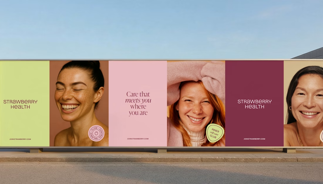
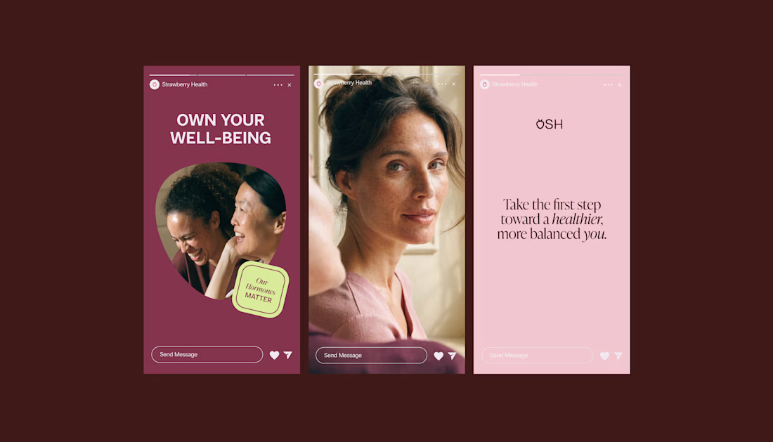
When working on Strawberry Health, we explored how visual identity could make women’s health feel more approachable and collective.
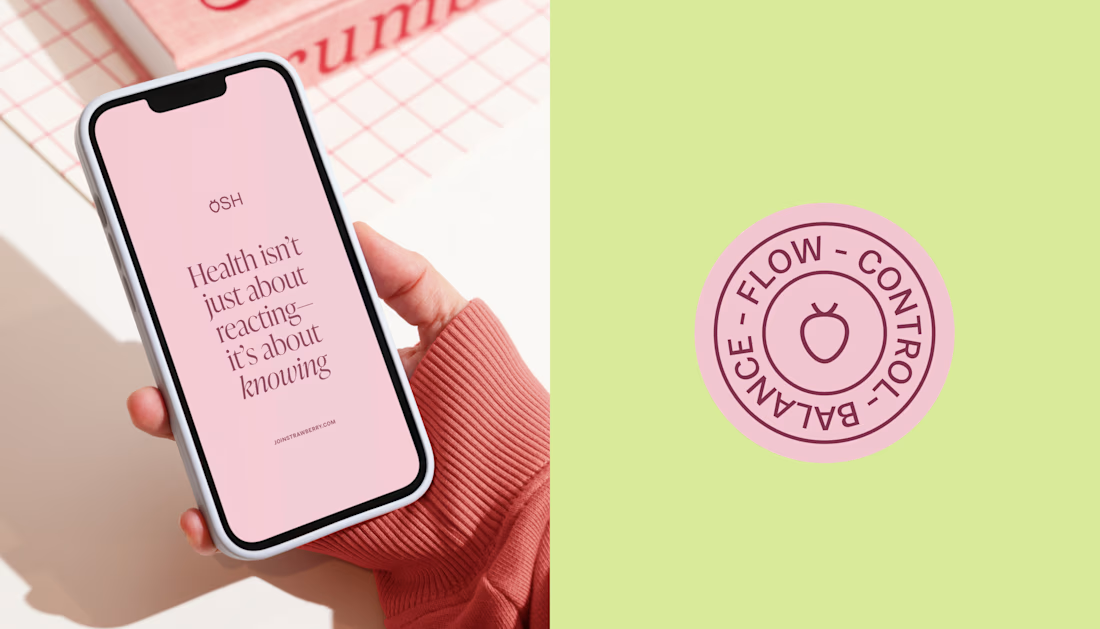
One of the ways was through supporting brand elements: stickers, badges and phrases that could live beyond the logo and become expressions of belonging.
These elements turned the identity into something people could interact with, share and make their own.
It’s a small detail, but I think it’s an important part of building brands around communities: the identity shouldn’t only identify the brand. It should give people something to identify with.
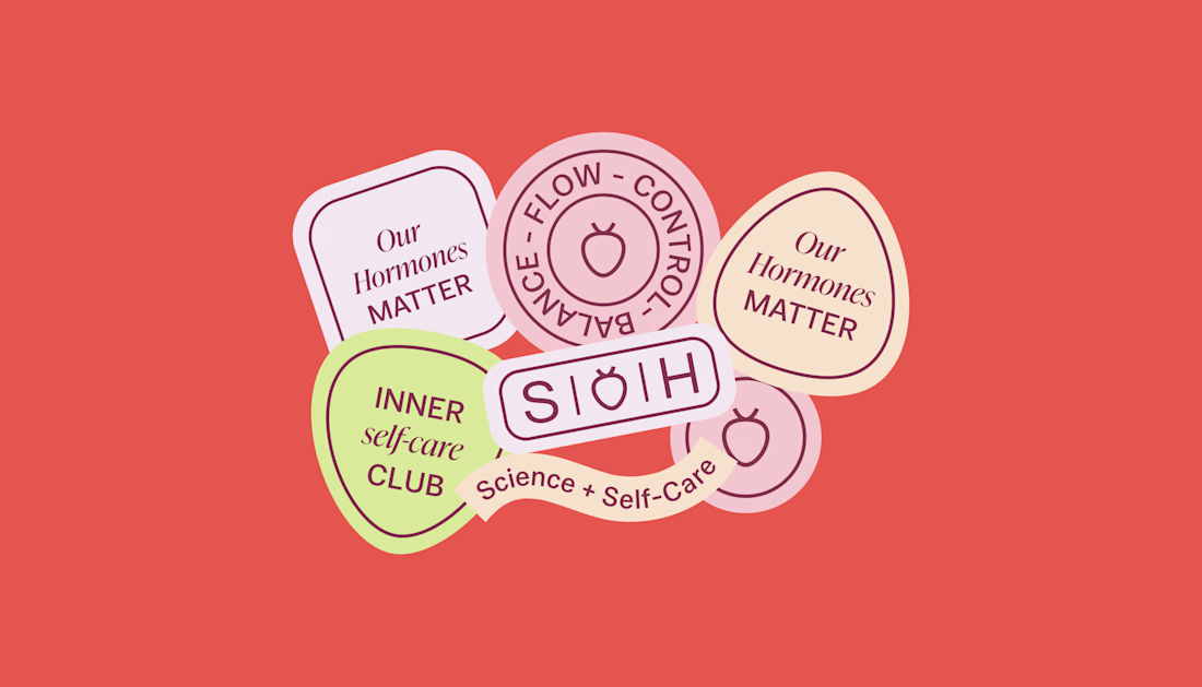

Love, love, love the colors. My mind goes: Rose Cream, Lime Mousse and Plum, hmmmm, which Plum... Plum Jelly. And of course, Strawberry Sorbet.
Let me match the vibe using my delicious swatches 😊
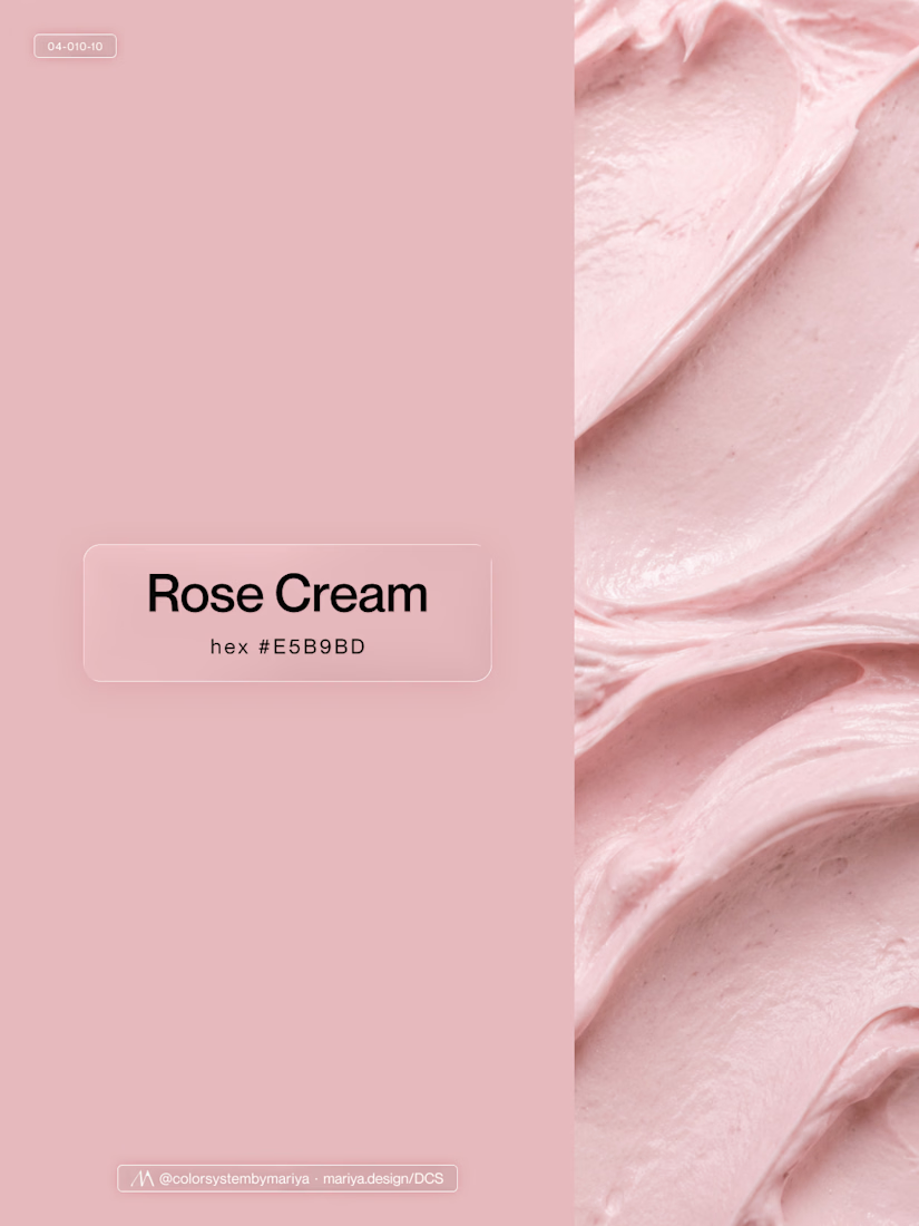
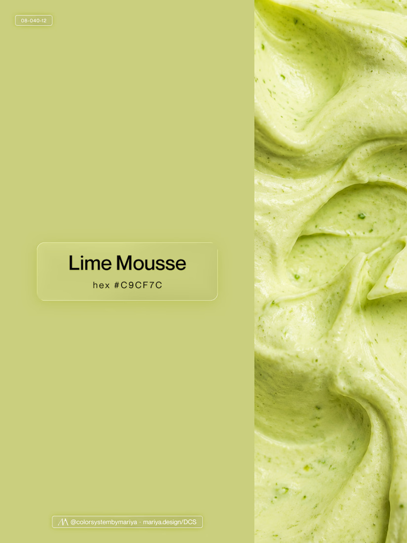
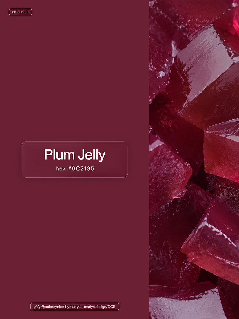
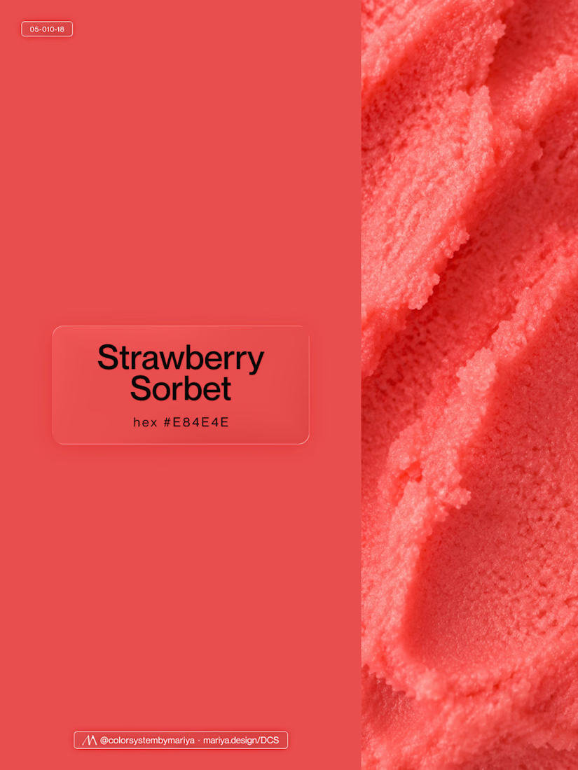


Gorgeous 😍


Your Hero Section Has One Job: Be Clear.
You don’t need huge headlines or long explanations. You need the right image + short headline + clear offer.
For the first version, we worked on the branding, the image and the copy together, so at first glance it’s clear: this is a makeup course, and here’s what you’ll get.
The second version is still beautiful and still feels like beauty. But what are you actually getting? A makeup course? Products? A store? That’s the problem with a Hero that looks good but isn’t thought through.
Your first screen doesn’t need to say everything. It just needs to say the right thing.

22 voted
61%
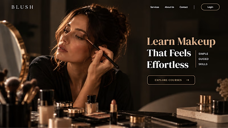
14 voted
39%
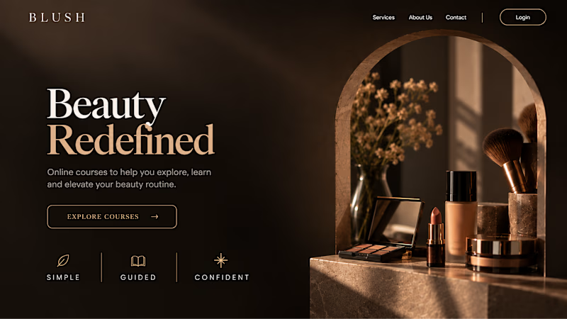
36 votes
Closed
