The network for creativity
Join 1.25M professional creatives like you
Connect with clients, get discovered, and run your business 100% commission-free
Creatives on Contra have earned over $150M and we are just getting started
Back to feedPost

Light mode. Dark mode. What about a blue-light filter?:
Most apps stop at two themes, but screen fatigue is real — especially for users reading or working for hours. So I explored what a third theme could look like: warm, reduced-blue, easy on the eyes.
Sketched the concept first, then built it out in Figma and refined the visual in Adobe Express.
Small idea, but the best accessibility decisions often are.

The network for creativity
Join 1.25M professional creatives like you
Connect with clients, get discovered, and run your business 100% commission-free
Creatives on Contra have earned over $150M and we are just getting started

Challenges
View all


Related posts


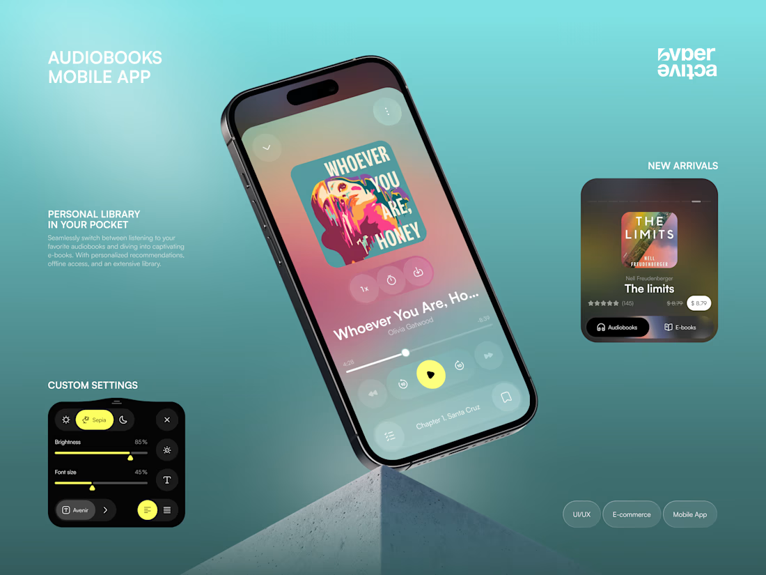
Meet new concept for audiobooks mobile app 🎧 Share your feedback


beautiful, i love the color you've incorporated here!


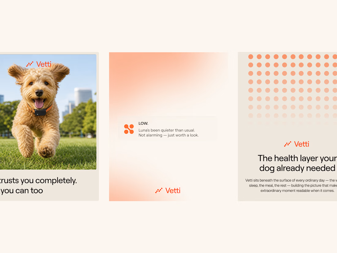
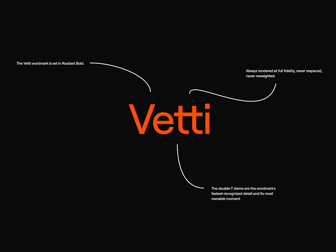
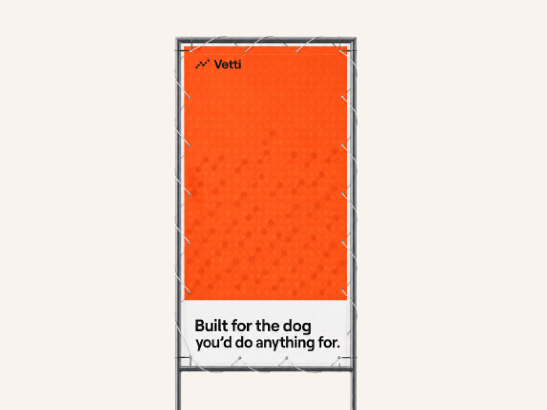
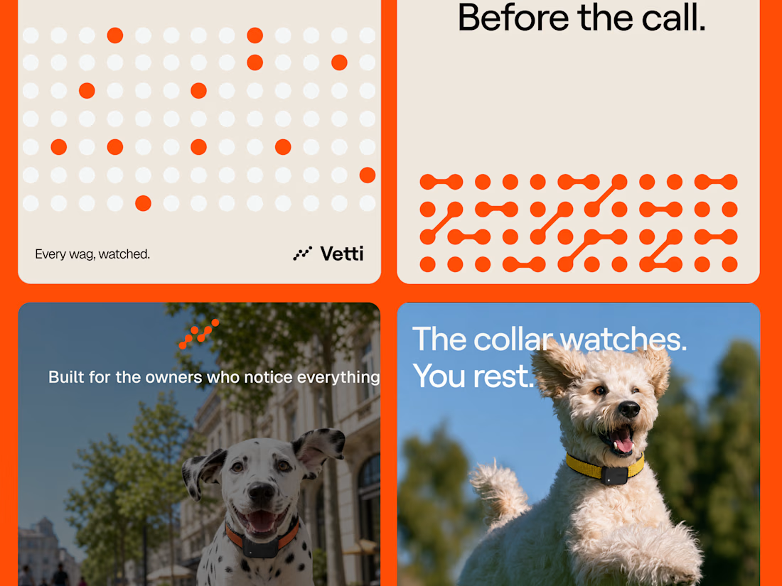
A fuller look at the brand identity work we for Vetti, a dog health monitoring brand.
The connected dots carry through the whole identity. They form the mark, expand into patterns and give the campaign a recognisable language of its own. Sometimes they fill the layout.
Paired with warm orange and cream the system has room for both the technology and the dogs it’s there for.

Looks very nice welldone

An experiment exploring how to visually communicate design impact through a draggable before/after slider. Built to test the interaction and motion feel of scrubbing between two states of a design, it uses a small format to show transformation at a glance 😊


The compact format is doing a lot of work—the draggable reveal makes the improvement immediately legible, while the consistent card rhythm keeps the comparison easy to scan.