The network for creativity
Join 1.25M professional creatives like you
Connect with clients, get discovered, and run your business 100% commission-free
Creatives on Contra have earned over $150M and we are just getting started
Back to feedPost
When the ambition of a brand changes, its identity has to evolve with it.
The original identity had a clear starting point, but as the company prepared to launch its product and enter conversations with investors, it became clear that the visual language no longer reflected the brand’s ambition.
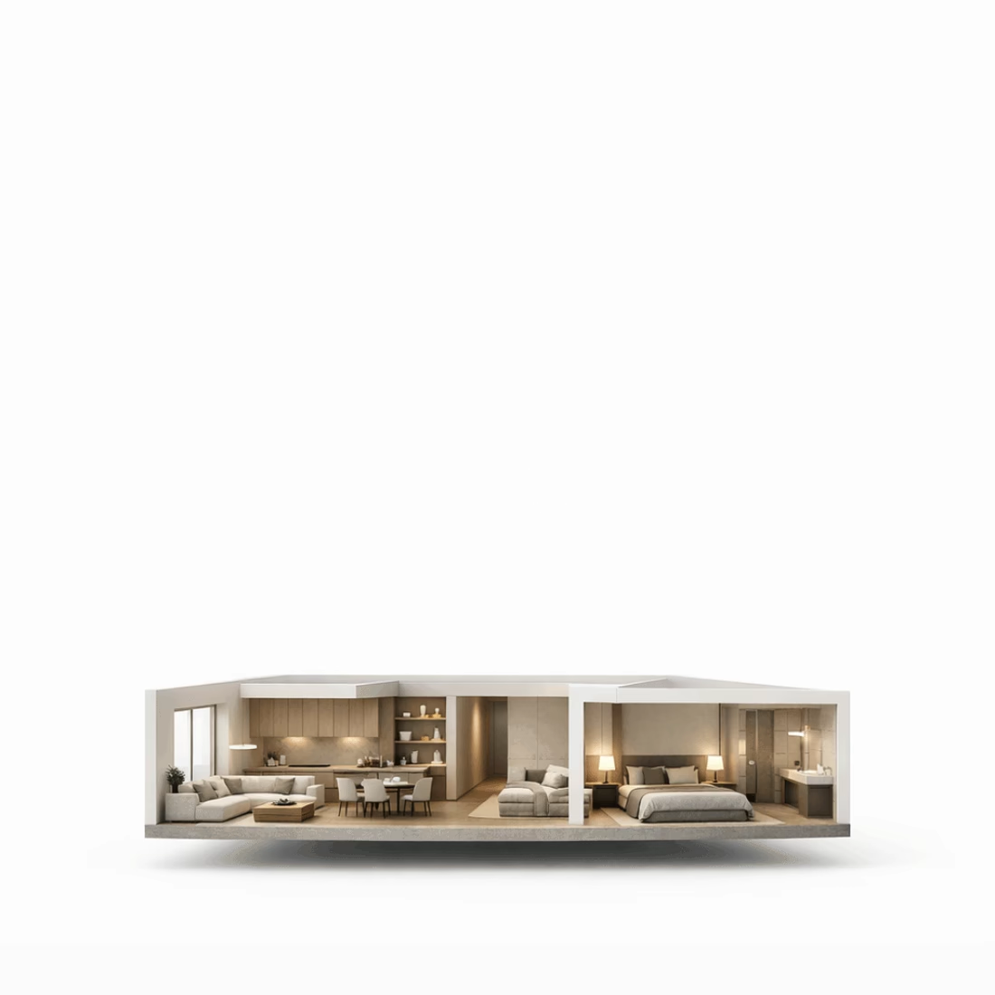
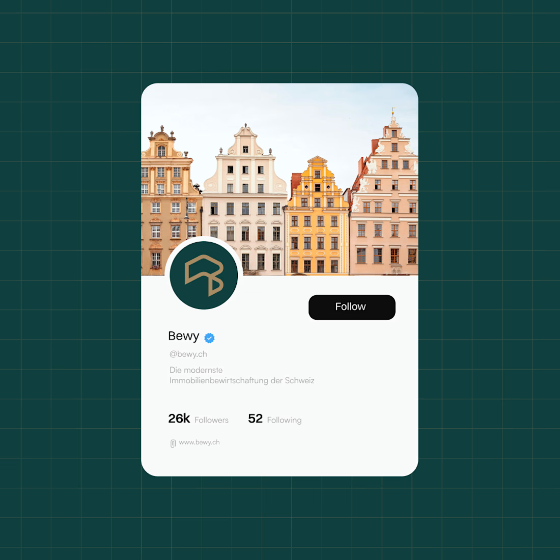
For Bewy, we moved away from a literal and playful visual language toward something more refined, credible and future-oriented.
The new identity is built around three ideas: space, letter B, and progress.
A visual identity designed to reflect where Bewy is going, not where it started.
Brand DesignLogo DesignMotion DesignAdobe After EffectsAdobe IllustratorAdobe Photoshopbrandingrebrandinglogo




Thanks Samuel.


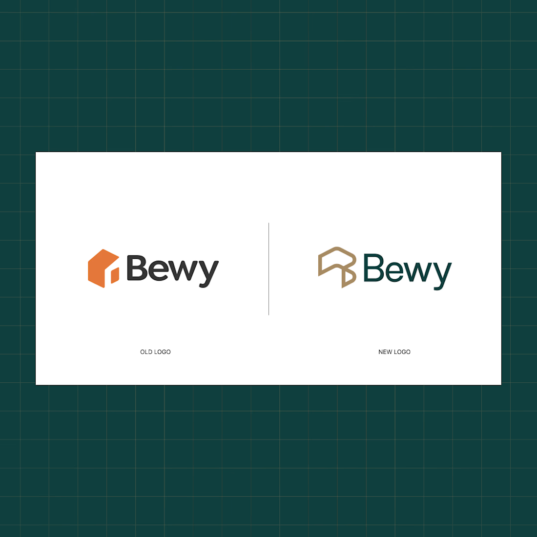
the green background looks good. which bewy logo do you like?
Thank you, Benjamin. I’d go with the new logo. In my opinion, it’s a stronger option both visually and functionally. We built the brand story around it, and it does what it needs to do, position the brand clearly and precisely in the market.
The old logo is a great logo in its...

the green is such an upgrade on the orange. was that an easy sell to them?
Actually, that particular shade of orange was one of the key reasons the rebrand happened in the first place. It felt a little too dated and didn’t support the more premium, modern positioning we wanted for the brand.
The alternative palettes I presented were much more aligned...

Very cool and thoughtful logo work Alex! 🙌
Thank you, Tan 🙌

Love it 😍
Glad to hear that 🙌

awesome !
Thanks Mohamed 😊

Cool stroke trim animation! 👌
Thanks Vijay 🙌

Love this logomark, Esepcially the transition from basic to a more contemporary idea is worth stating💯
Thank you 🙌 We tended to make more significant improvements.
You guys trully an amazing job!

Wow so cool bro. Love it the animation is insane
Thank you, Girum 🙌

Love how much more refined the new identity feels🔥
Thanks man 🙌

Great work, Alek!
Thanks, Olakunle 🙌

The two Bewy logo options side by side tells me the shift wasn't just cosmetic, you were actually testing how much weight the mark could carry in an investor deck versus on a product screen. Which one ended up winning internally?
Exactly. It was never meant to be just a cosmetic change. We wanted a mark that could carry the brand across different touchpoints, from investor decks to the product itself.

very impressive design
Thanks man 🙌

Great work🔥
Thanks Yaroslav 🙌

Vibes🔥

this is beautiful!
Thanks Saheed 🙌


Really Nice work🔥👏👏
Thank you so much 🙌

This is amazing
Thank you so much 😊

Nice work!
Thank you, Emmanuel 🙌

Incredible creativity! 🙌🙌
Thank you 🙌

Great example of how a brand identity should evolve with the business. Moving from a playful, literal direction to a more refined and future-focused system makes the new ambition feel much more tangible. The connection between space, the letter B, and progress is especially strong.
Exactly. The business had evolved quite a bit, so the identity needed to catch up with it. The challenge was turning that shift into something that felt clear and meaningful rather than just making it look more polished.

“Designed to reflect where it’s going, not where it started” is such a powerful way to look at brand identity. The best rebrands don’t erase the past, they give the future a clearer visual direction.
That was really the thinking behind it. I’ve always felt that a rebrand shouldn’t be about making something look newer for the sake of it. It should help the brand communicate where it’s going. That was definitely the case here.

Wow nice work Alex 😍 👍
The network for creativity
Join 1.25M professional creatives like you
Connect with clients, get discovered, and run your business 100% commission-free
Creatives on Contra have earned over $150M and we are just getting started







Related posts

Still finding little moments from this project that I want to share
A few more favorites from the launch video 💜


great work..


Choose the best to use as logo
3 voted
33%

6 voted
67%
9 votes
Closed

A2 is best