The network for creativity
Join 1.25M professional creatives like you
Connect with clients, get discovered, and run your business 100% commission-free
Creatives on Contra have earned over $150M and we are just getting started
Back to feedPost

🥔 Twin Snack | FMCG Packaging & Macro Product Visual Design
A vibrant product packaging design and high-detail macro close-up concept created for Twin Snack, a premium crinkle-cut potato chips brand targeting Gen-Z and snack enthusiasts.
Key Design Highlights:
Custom Packaging Design: Dynamic warm orange & cream color scheme paired with bold custom logo typography (Twin Snack), crisp ridges, and fresh ingredient visuals.
Macro Texture Close-Up: Ultra-detailed macro product shot emphasizing the signature crinkle ridges, golden crispy texture, and fine seasoning to highlight product crunch & quality.
Branded Consistency: Seamless brand integration across product packaging and promotional visual assets.
Market-Ready Visuals: Designed specifically for social media ad campaigns, FMCG retail branding, and e-commerce product listings.
Ideal For: FMCG Branding, Product Packaging Showcase, Food & Beverage Marketing, and Portfolio Showcase.
Hashtags:
#GraphicDesign #PackagingDesign #FMCGBranding #TwinSnack #ProductDesign #FoodPackaging #BrandIdentity #VisualDesign #ContraDesigner #FreelanceDesigner #PortfolioShowcase

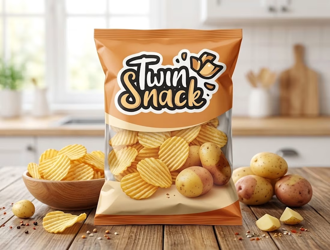
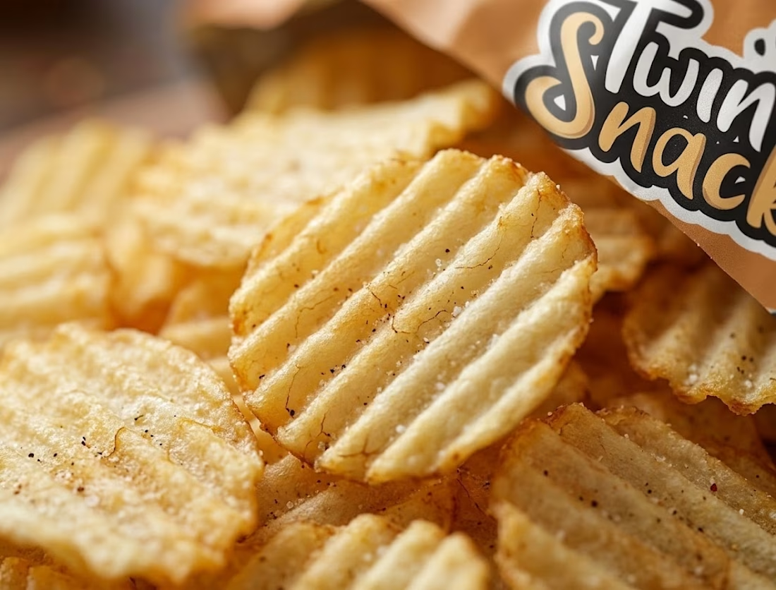

the close up of the chips made me hungry lol. was the macro shot done in photoshop?

Saved this for inspiration! Beautiful work.
The network for creativity
Join 1.25M professional creatives like you
Connect with clients, get discovered, and run your business 100% commission-free
Creatives on Contra have earned over $150M and we are just getting started







Related posts

Inspiration design of the day 🔥

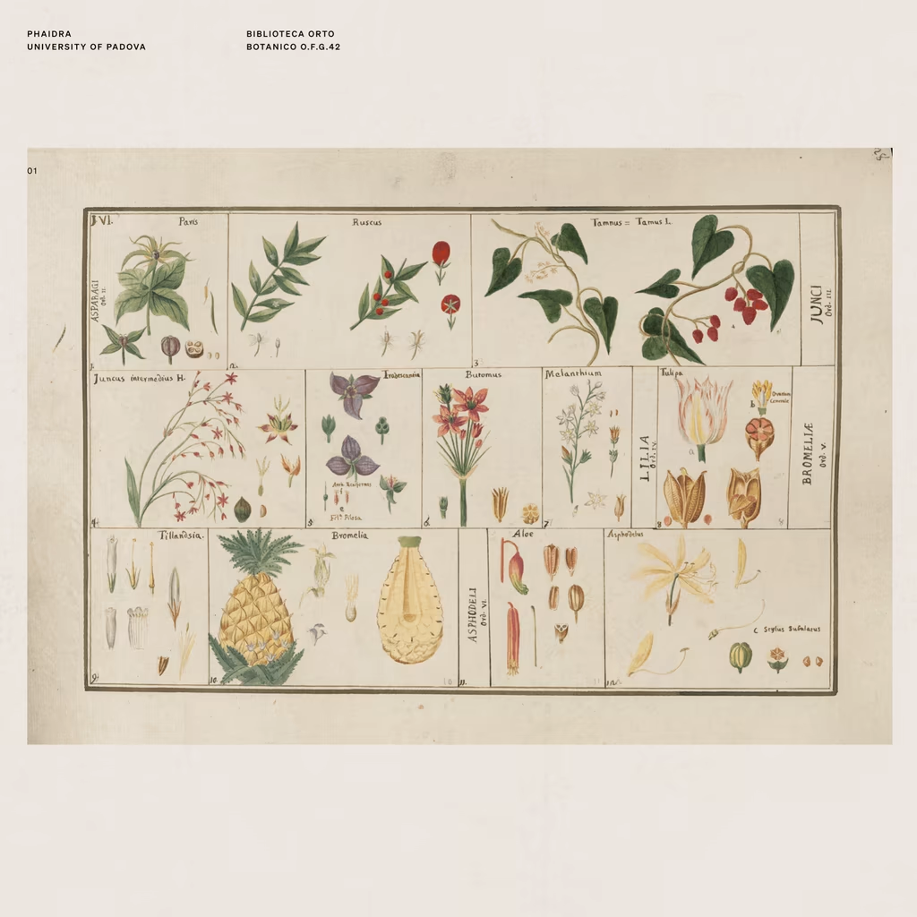
There's a shop in Barcelona that sells vintage prints from artists long gone.
On one of my visits, I found myself completely drawn to the way they used to illustrate flowers, fruits, objects, animals. A real exercise in consistent observation, one that's been lost in a generation...


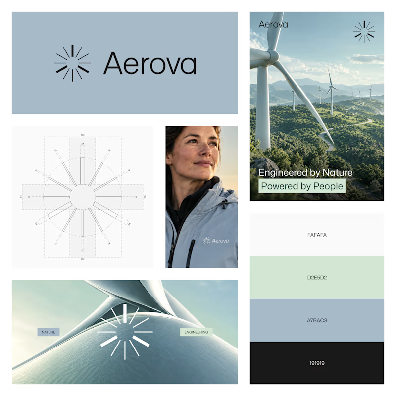
AEROVA - Brand Direction
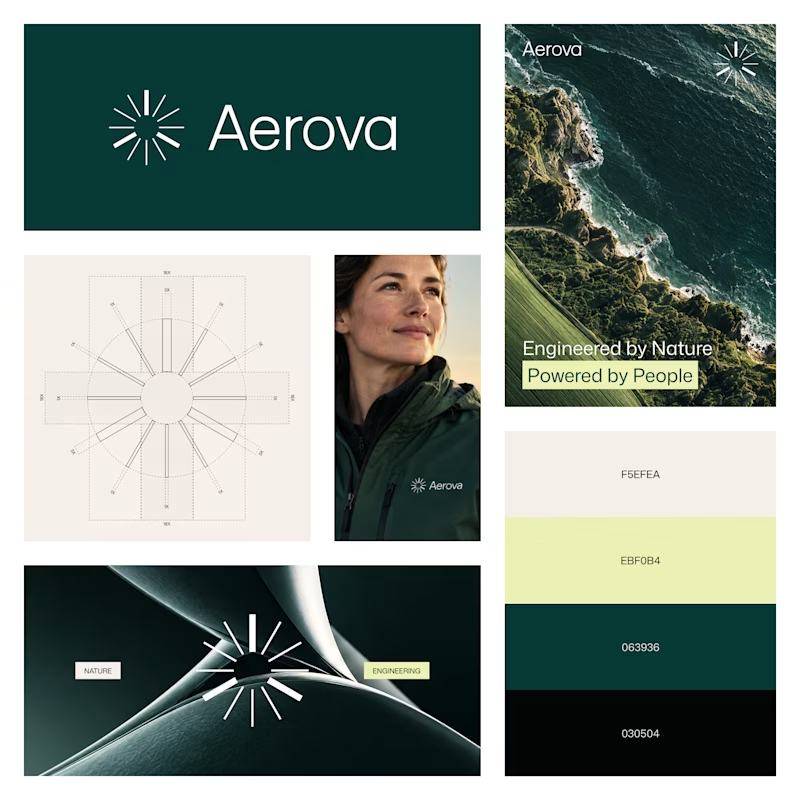
Exploring two visual directions for AEROVA, a wind-energy brand built around the idea of “Invisible force. Visible progress.”
Both directions use the same identity system, but create a different feeling:
Option A - Deep Green
Option B - Soft Blue
Which direction feels stronger for AEROVA?
27 voted
77%
8 voted
23%
35 votes
Closed

The soft blue palette feels more airy and closer to wind energy! Deep green is so overused in the energy industry so definitely option B.

Libra season is here, and so is spring (in my side of the world)!
🌸🍃 ☀️🌈
I'm using this blooming moment to rebuild my personal brand from the ground up: re-evaluating, brainstorming, and bringing my whole toolset to the table. 💻🧠⚡️
As a multipotential creator, making everything I do fit into one clear story isn't always easy. So I'm giving it the time it deserves, and I'm curious to see where it leads.
STAY TUNED! 😊

