The network for creativity
Join 1.25M professional creatives like you
Connect with clients, get discovered, and run your business 100% commission-free
Creatives on Contra have earned over $150M and we are just getting started
Back to feedPost

Mobile Application Data Visualization Platform
A mobile platform that visualizes real-time user activity and business health metrics via interactive charts (line, bar, dashboard, heatmap) with paginated loading and multi-level caching. Includes a configurable container for remote H5/GIF content and private customization.

The network for creativity
Join 1.25M professional creatives like you
Connect with clients, get discovered, and run your business 100% commission-free
Creatives on Contra have earned over $150M and we are just getting started



Related posts

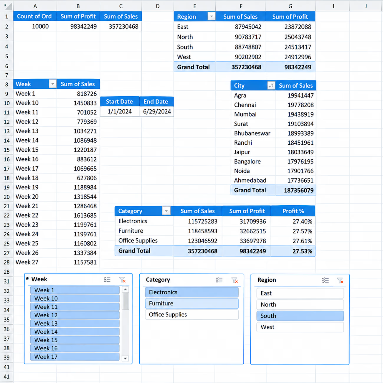
📊 Interactive Sales Analytics Dashboard in Excel
I created an interactive Excel dashboard to analyze sales performance across different business dimensions.
Key Insights & Features:
• Total Orders, Sales & Profit KPIs
• Sales & Profit by Region
• Sales by City
• Category-wise Sales, Profit & Profit %
• Weekly Sales Analysis
• Interactive Slicers for Week, Category & Region
• Start Date & End Date tracking
• PivotTable-based analysis
This dashboard is designed to turn raw sales data into clear and actionable business insights using Excel.


Hello.
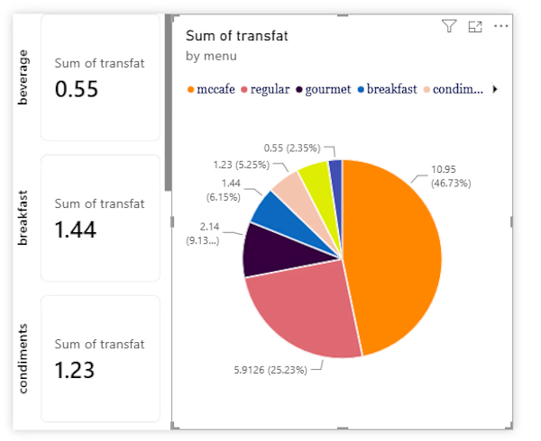
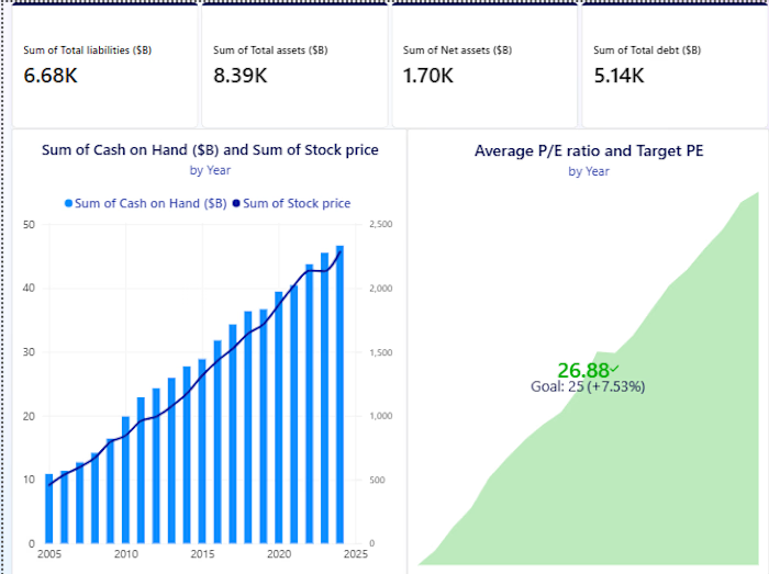
I guess we're in the same page about data analysis and visualization

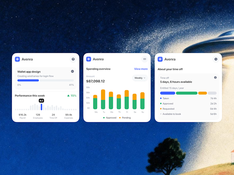
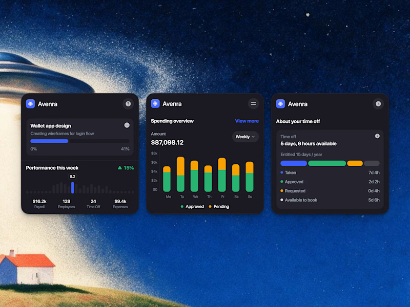
Which style wins for you? 🤔
We’re testing out two theme directions for Avenra’s dashboard component cards; featuring real-time spending breakdowns, project progress metrics, and time-off tracking.
Curious to hear your thoughts! 💬

8 voted
42%
11 voted
58%
19 votes
Closed

Energy communities need to manage a lot at once: consumption, generation, members, billing, reports, alerts, and operational changes.
Wattbank explores a clearer SaaS dashboard experience for energy community operators. The interface brings key metrics, energy balancing, participant distribution, billing, reporting, and insights into one workspace that is easy to scan and act on.
The goal was to move away from heavy energy software and create something more visual, human, and operationally useful.