The network for creativity
Join 1.25M professional creatives like you
Connect with clients, get discovered, and run your business 100% commission-free
Creatives on Contra have earned over $150M and we are just getting started
Back to feedPost

Day 3 of trying to find a client on Contra.
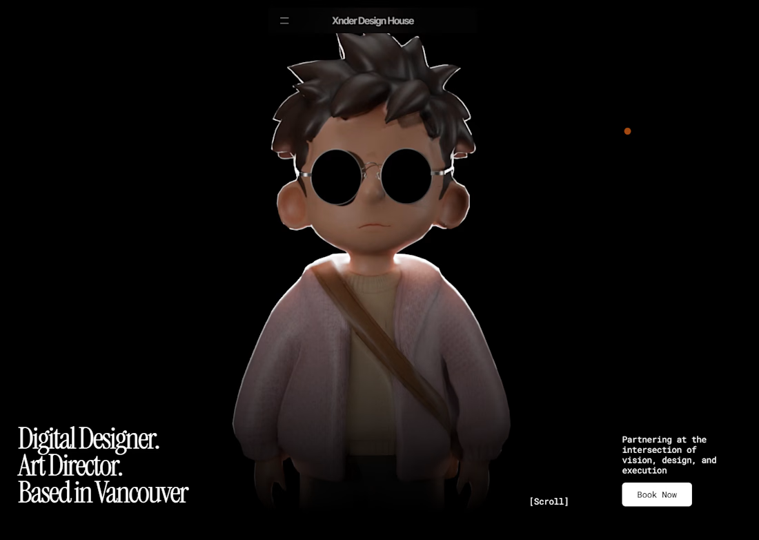
I built my portfolio (finally!) - and what a ride it’s been.
Plan: Build on Framer. Model my character in Blender. Mode = Easy.
Reality: High on caffeine. Countless crashes. Occasional procrastination disguised as “creative process.”
Between 3D modeling, rendering, and optimizing performance so the site didn’t turn my computer (or anyone else’s) into a space heater, I learned a lot about patience and site optimization.
It’s still a work in progress, but seeing everything live feels incredible - like a real snapshot of the designer I’m growing into.
Next step: Connecting with clients who need designs that look good and load fast.
Portfolio: hasanuzzaman-design.framer.media




The network for creativity
Join 1.25M professional creatives like you
Connect with clients, get discovered, and run your business 100% commission-free
Creatives on Contra have earned over $150M and we are just getting started





Related posts

The best part of this website might be the page nobody is supposed to see.
About 4 months ago, we launched the new website for STORY Design Amsterdam.
STORY is all about giving homes personality, so we wanted the website to have some too.
Including their 404 page.
Naturally, I put the owner's dog on it.
If you end up on the wrong page, you might as well enjoy it.
But the fun details only work if the website itself does too.
Before the launch, most of their website traffic came through Instagram.
Today, around 60% comes from Google.
And now we've taken the next step by adding a little shop, so people can buy their kitchen handles directly from the site.
Next up: a great about us page; photoshoots are already planned.
I don't design websites that often.
But when I do, I don't want to create something that could belong to any business.
It should feel like their business. Do you think I achieved that?

Great work, Bram


Clover makes Spotify playlists from your mood. We designed and built its landing page in Framer, with a calm, dreamy look that matches the product. Visitors understand it in seconds, and the team can update the page themselves.
Check it out


The sky photo behind that serif headline sets the mood right away. Smart that the team can edit it themselves.

Just created a playful footer to add personality to your website! Check it here
If you want this for free, just lemme know and i will DM you with the link!

I like the playful design. This is a high-quality footer, the best one I have seen today.


