The network for creativity
Join 1.25M professional creatives like you
Connect with clients, get discovered, and run your business 100% commission-free
Creatives on Contra have earned over $150M and we are just getting started
Back to feedPost
Taste Test
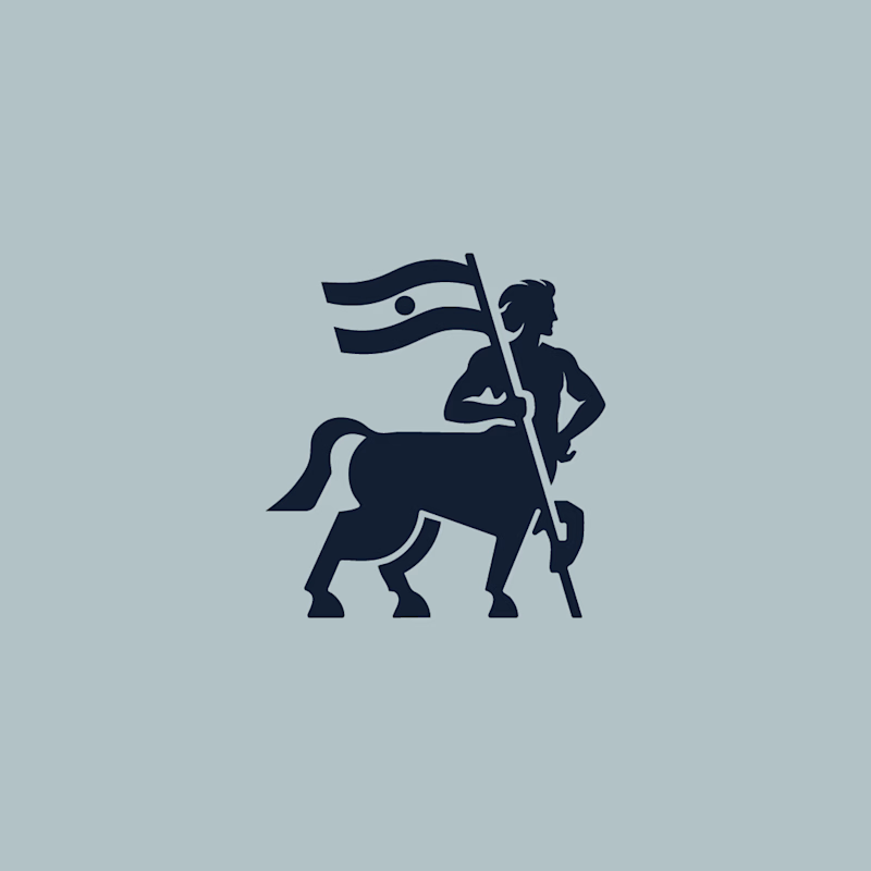
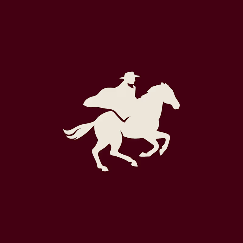
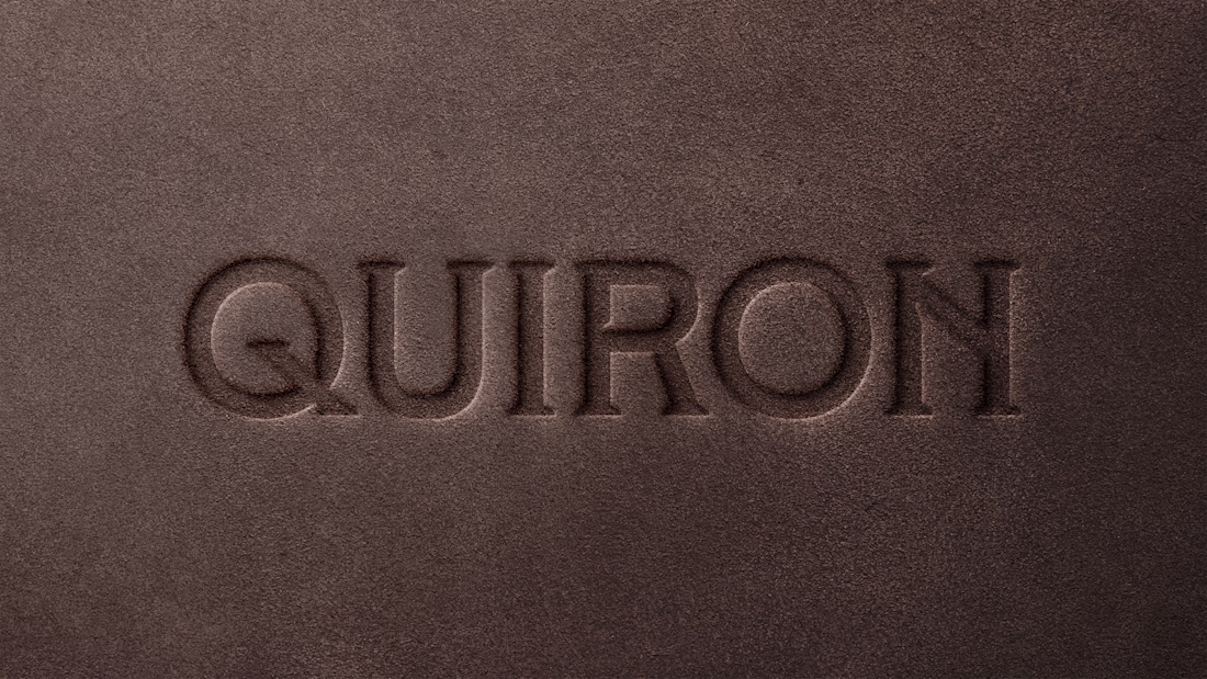
Visual Explorations for QUIRON.
Same strategic foundation, two distinct visual journeys for a high-end workwear brand. I’d love to hear the community's take: Option A or Option B?
48 voted
57%
36 voted
43%
84 votes
Closed
Option B, feels more unique and distinguishable, but need to test in smaller scale, some details could be lost. Using alternative icon on mobile/smaller sizes could be a good alternative. Good luck with the project!
Totally agree, Toms. A simplified reduction for favicons and small assets is already in the works to solve those legibility challenges. Good catch! 🦾
I prefer option A. I feel that the details and curves are better stylized. I also prefer the balance of the negative space. It feels well-balanced.
Wow, each provides a completely different message. I don't think it's an A or B question, more like a question of which fits the brand best.
Spot on, Virginia! You hit the nail on the head. The brief centers on the 'Union of Entities', inspired by the ancestral bond where man and horse become one. These paths are exploring how to visually represent that 'fusion': one leans more into the raw durability of the work,...
I like the detail of the centaur's leg holding the flag pole in the first option, that's a nice touch. Personally I think the tail is a little awkward? But that's an easy fix.
Second one reminds me a bit of Zoro 🤷🏻♂️
Does it need to be suitable for embroidery? Seeing as...
1 for sure, the flag provides an important mystique.
I would go with the First one although second one is also good
Animated GIF logo, Hope you like it

The first Option looks clean and detailed but curious to know more about the brand so I can give an appropriate take on this.
Option A is insanely good, kudos 🙌
Option B for me looks good...works perfectly for a luxury workwear brand
Prefer left
Both logo are very good, but that I will depend completely on the storytelling of the brand hahahahah
Love a good design debate! It’s interesting to see the community lean towards one path while the brand strategy pointed us in another direction. That’s the beauty of this process. Check out the final result and the full case study here:
QUIRON | Visual identity
OptioN B
The network for creativity
Join 1.25M professional creatives like you
Connect with clients, get discovered, and run your business 100% commission-free
Creatives on Contra have earned over $150M and we are just getting started
Related posts
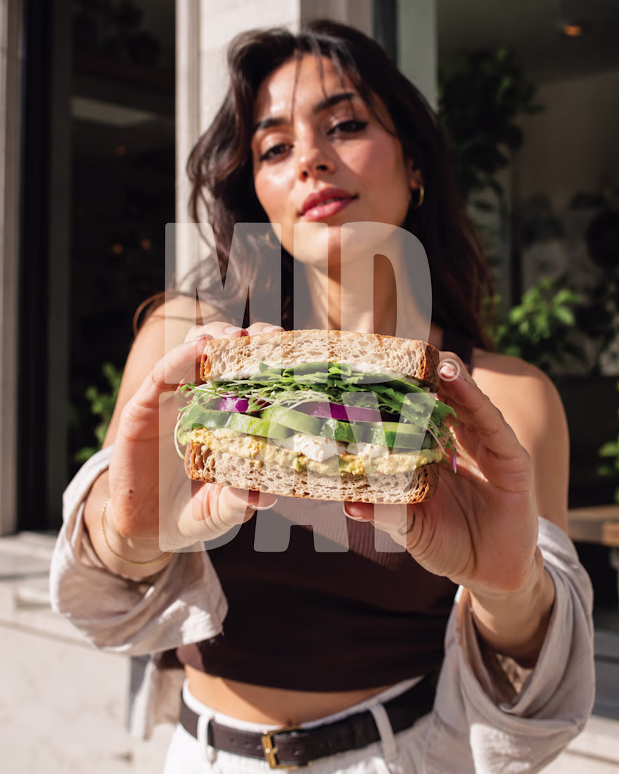
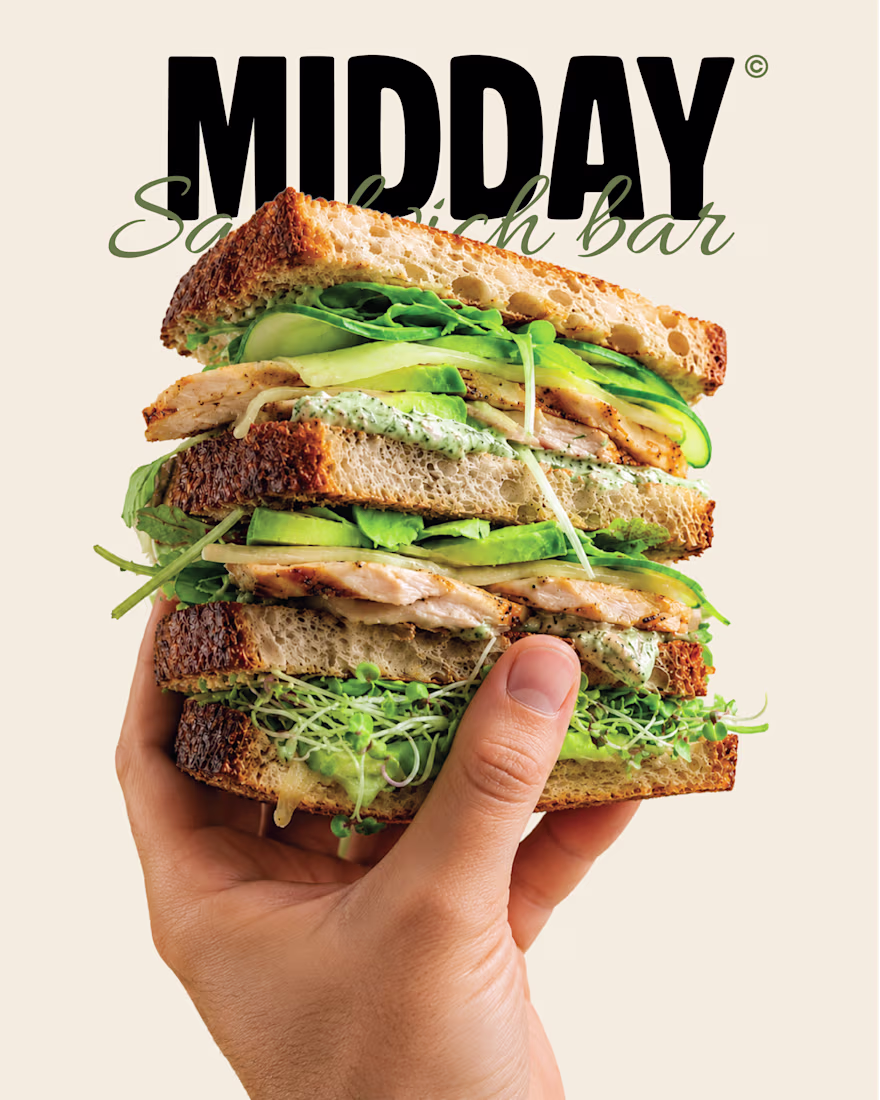
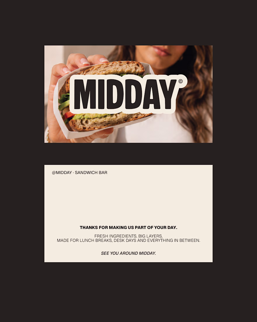
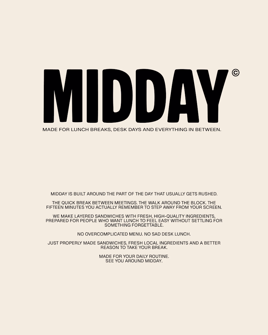
MIDDAY | Sandwich Bar Brand Identity
A self-initiated brand identity for MIDDAY, a contemporary sandwich bar built around one simple idea: everyday lunch should still feel worth looking forward to.
The identity combines bold editorial typography, warm lifestyle photography and familiar deli-inspired details to create something considered, approachable and easy to return to.
Your 12:30 deserves better.
more posts on this one in the upcoming days!
Amazing work!
Clean!
Without knowing what it's for, here's a very uniformed critique:
I really like how it looks as a whole, the lowercase vibe makes it feel modern and approachable, I'm assuming is for some sort of tech brand, like a digital app or something. Something feels off on the...
Web concept for bem. The product turns messy documents into structured data, so the brand does the same thing visually. Every image dissolves into pixels, every layout resolves back into grid.
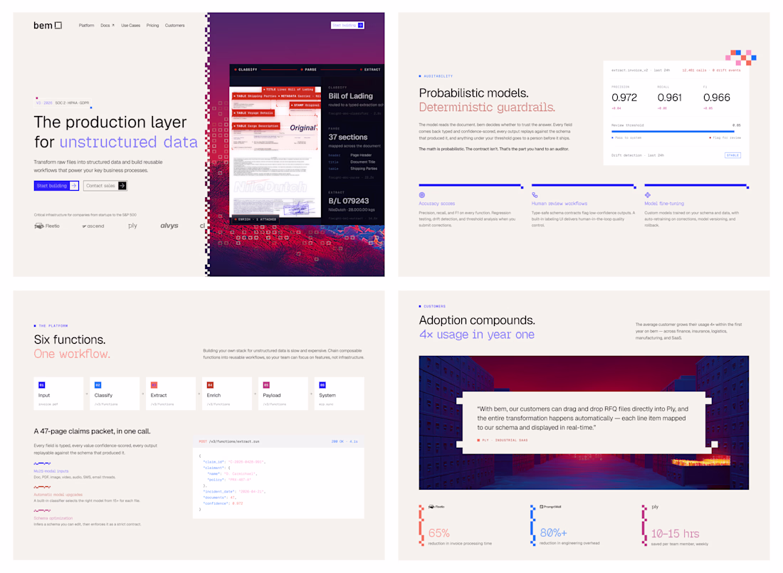
How did you first come up with the idea to use pixel dissolution to represent unstructured data? Did you explore any other visual metaphors before landing on this one?
Trending
Claude
Claude has entered the design space. How are you using Claude Design?
Contra University
Learn from expert creatives how to earn more using next-gen AI tools.
creativeaiflow
Creative AI workflows are evolving. What tools do you use, and what are their strengths and weaknesses?
freelancerlife
Freelancer life is wins, pivots, and everything in between. What’s yours right now?