
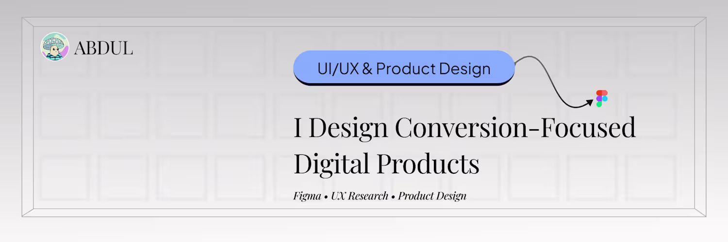
Abdul Jcg
Product & UI/UX Designer | Mobile Apps, SaaS & AI Interfaces
Ready for work
Abdul is ready for their next project!
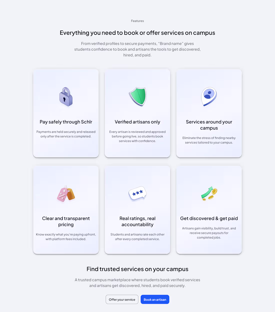
Redesigned a feature section for a campus marketplace platform.
The goal: improve clarity, usability, and conversion.
Key improvements:
• Simplified layout
Reduced visual weight to make features easier to scan
• More intentional CTAs
Clear paths for both students and artisans
→ Better user direction
• Enhanced visual presentation
Added depth to improve engagement without sacrificing clarity
Result:
A cleaner interface that communicates value faster and guides users more effectively.
Open to feedback and collaboration.
2
0
20
Day 19 of sharing my designs
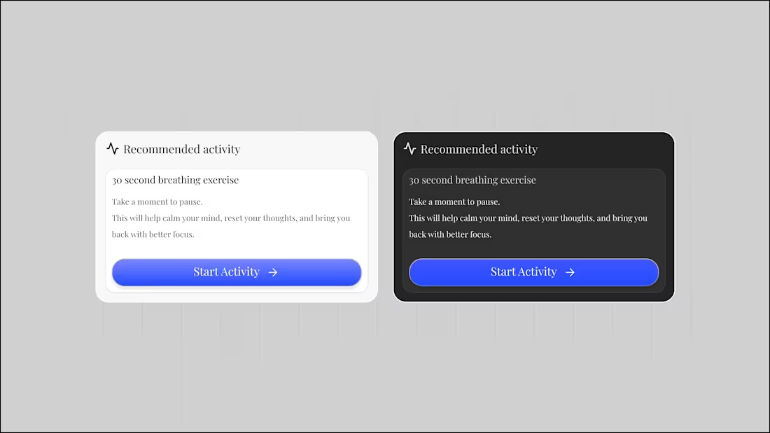
// Keep it simple always and accessible
0
14
Day 18 of sharing my design
It's the first day of Q2
Let's make some good designs with result-driven metrics.
What started as an experiment
turned into something meaningful
• Stayed consistent
• Built new connections
• Improved my design workflow
Most importantly, real progress.
Next phase:
More execution. More results
2
1
28
Day 16 of sharing my design.
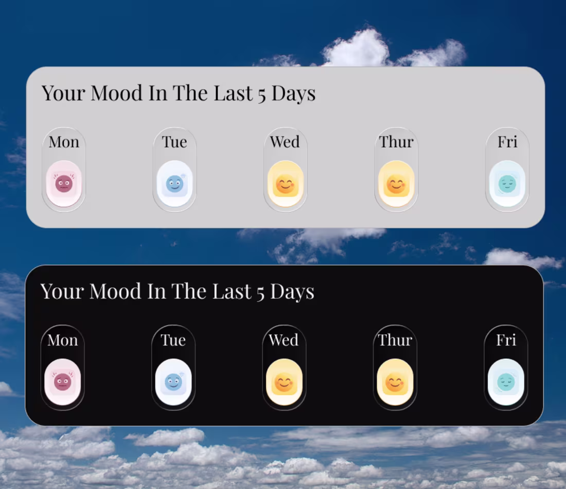
I generated these custom mood icons using AI tools to better resonate with students’ emotions while keeping them visually clean.
It took about 3 iterations to get here. Worth it.
This made me realize the following:
AI isn’t here to replace the process.
It amplifies it.
It helps you explore faster, iterate quicker,
and refine ideas without losing quality.
For early-stage products and startups,
this changes everything.
You can move faster, test more ideas,
and still maintain a strong design standard.
The advantage now isn’t just skill
It's how well you use AI to speed up your thinking.
0
13
Day 15 of sharing my design.
Clarity without ambiguity.
If a user can interpret your design in multiple ways,
then it’s not clear enough.
Buttons should say exactly what they do.
Messages should be direct.
Flows should feel obvious.
No guessing.
Good design leaves no room for confusion.
Because when things are clear,
users move faster and with confidence.
0
19
Day 12 of sharing my design on Contra.
Honestly today, just a reminder to be grateful.
It’s easy to get caught up in growth, numbers, and what’s next.
But even having the chance to learn, design, and build
is a privilege many people don’t have.
Access to tools.
Internet.
Time to improve.
Not everyone has that.
So while chasing more,
Don't forget to appreciate where you are.
Just remind me of the ability to stay grounded regardless.
1
76
Day 11 of sharing my design.
Clarity is not optional.
If users have to stop and think,
You've already lost them.
Good design removes confusion before it happens.
Clear labels.
Clear actions.
Clear flow.
No guessing.
Because users don’t reward beauty,
They reward ease they remember beauty.
That's how you retain them.
Design should feel obvious.
If you have ideas you want to build, I'm available for collaboration and exploration
0
13
Day 8 of sharing my design.
Quick tip for today:
If your design needs too much explanation…
It's probably not clear enough.
Good design should guide users naturally
without making them think too much.
Anyway, it’s been a productive day.
Hope you had a good one too
have a calm and restful evening.
0
25
Day 7 of sharing my design
One thing I keep noticing while designing:
Clarity vs Aesthetics
A design can look beautiful, but if users don’t understand what to do next… the design has failed.
Clean visuals are important.
Nice colors and layouts matter.
But clarity should always come first.
Users should instantly know:
• what this screen is about
• what action they can take
• where to click
Aesthetic makes people stay.
Clarity helps them move.
Good design finds the balance between both.
Got a product idea you want to build?
Or a website that isn’t converting or retaining users?
Let’s fix that.
Send me a DM — I help founders design products that attract users, convert better, and scale faster with AI-powered workflows.
1
26
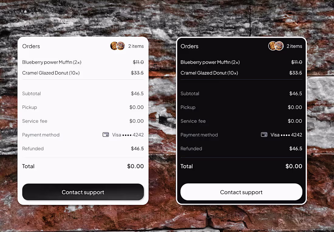
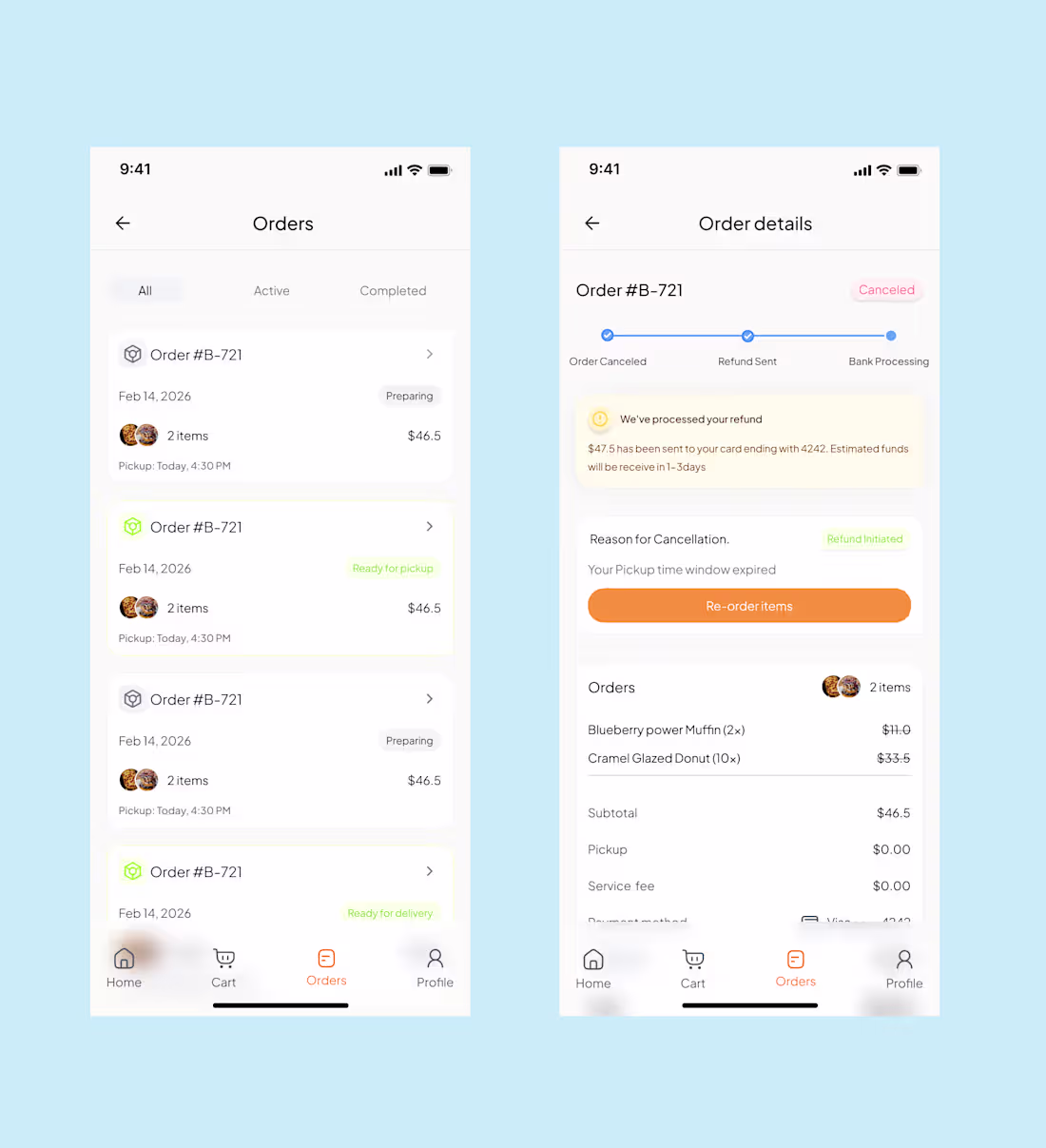
Day 4 of sharing my design work.
// Payment refund card
When payments and refunds happen, users need clarity.
They should instantly understand what happened to their money.
So this card focuses on a few simple things:
• Clear refund status
• Transaction amount
• A quick summary of the transaction
The goal is to remove confusion and make financial interactions feel transparent and easy to track.
2
2
29
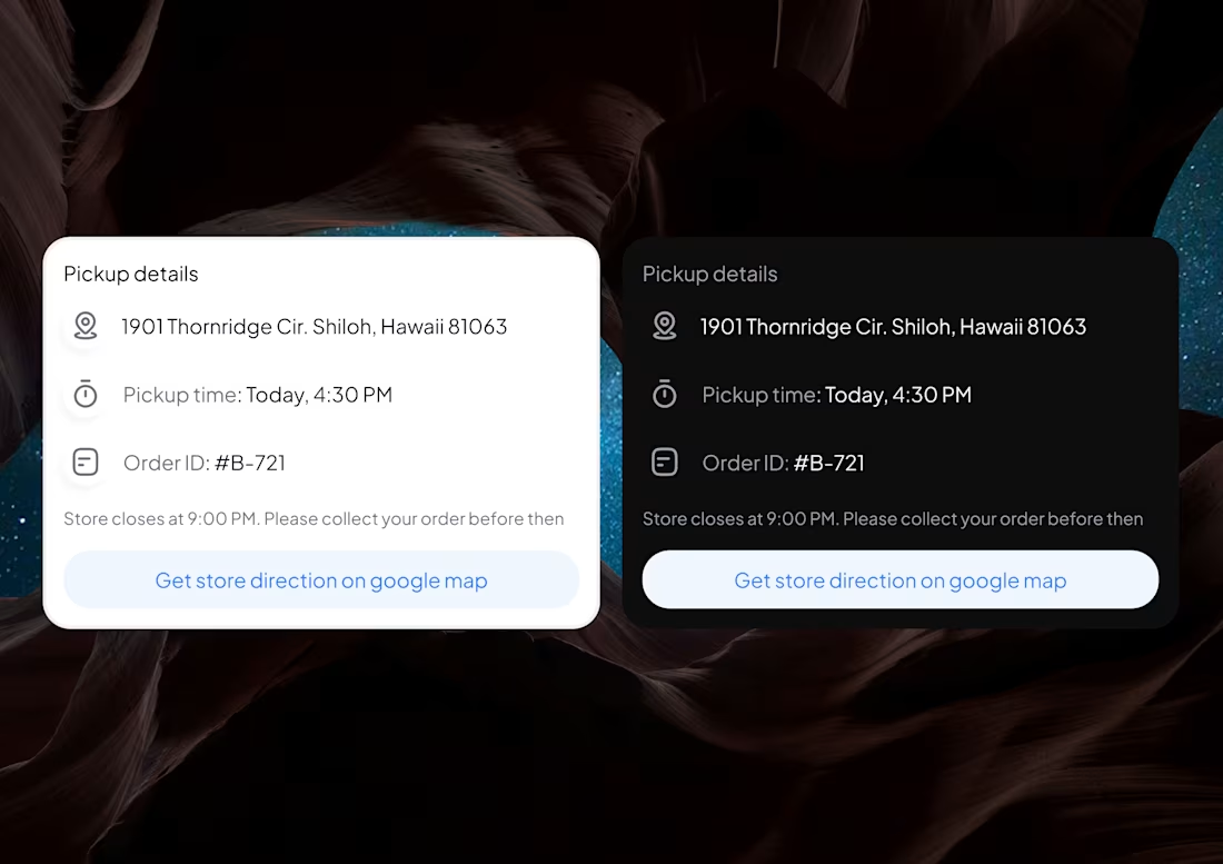
// Day 3 sharing my design on contra
Gen Z don't read long detailed text, they scan & skim through it.
Quick summary of order details screen that build trust and retain your customers.
0
11
Just finished designing a grocery delivery mobile app.
The goal was to make grocery shopping faster and easier for users while helping stores manage orders more smoothly.
I focused on improving product discovery, simplifying the checkout flow, and making order tracking clear. This helps users find items quickly and complete purchases with less friction.
For businesses, the design improves product visibility and supports a smoother order process, helping increase completed orders and reduce cart abandonment.
Designed in Figma.
Project Prototype link below 👇
https://www.figma.com/proto/4iCwi8dcrHUAMnGlWOoM0d/Gocery-store-mobile-app?node-id=3567-7773&t=C1UzcVgAwXDUqJhk-0&scaling=min-zoom&content-scaling=fixed&page-id=3567%3A7771&starting-point-node-id=3567%3A7773
0
11
When I made my post last year, I was surprised by the level of support I received as a starter.
I later stopped posting but I never stopped designing.
I stepped back to properly optimize my profile, work on new projects ready for shipping, and intentionally build the soft skills that are essential but often ignored.
That meant learning the business side of products understanding the why:
Why should a user take any action, even on a well-refined UI?
Since then, I’ve been studying and still learning more about UX, documentation, and developer/stakeholder handoffs—making sure designs don’t just look good but work clearly across teams.
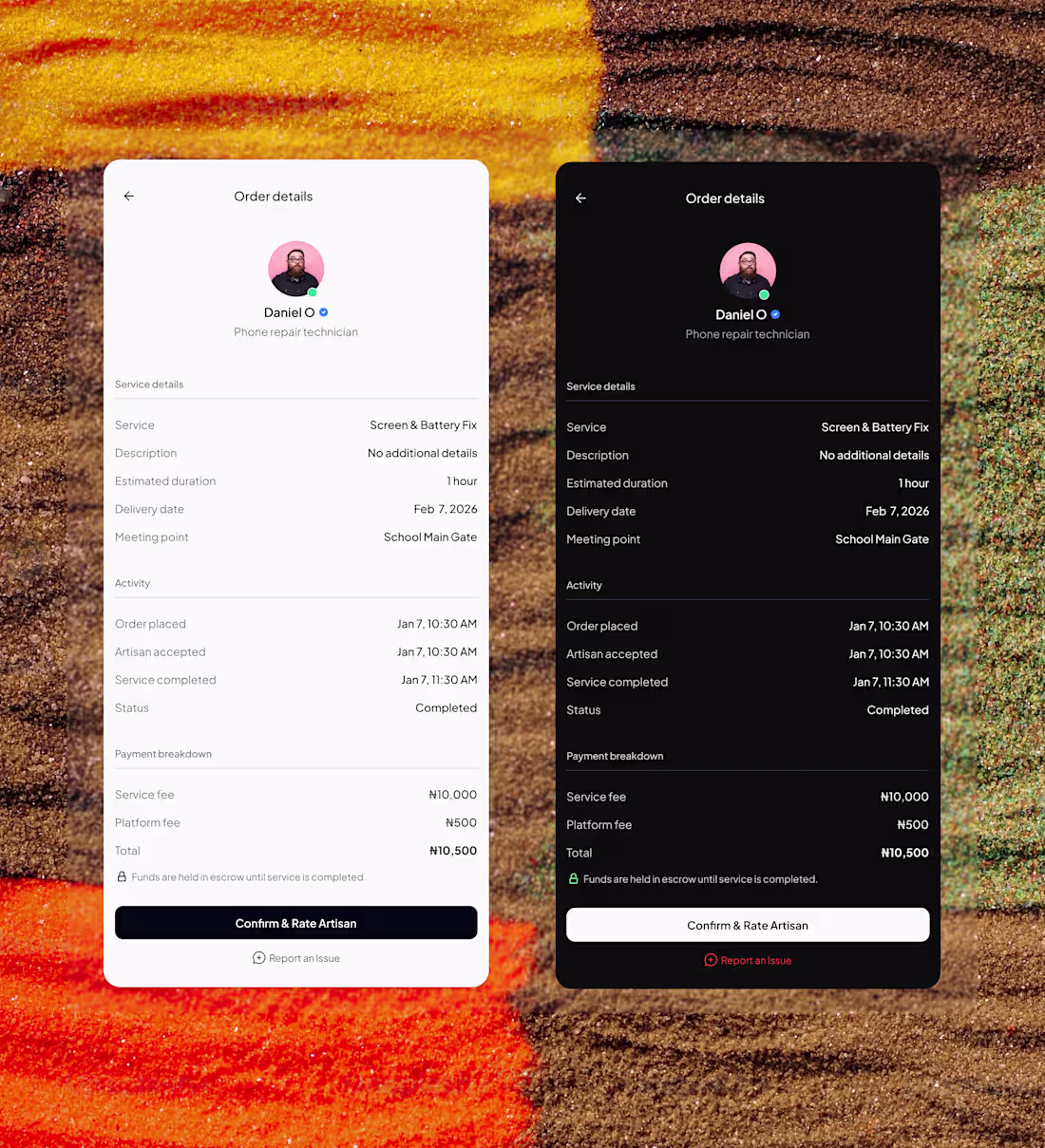
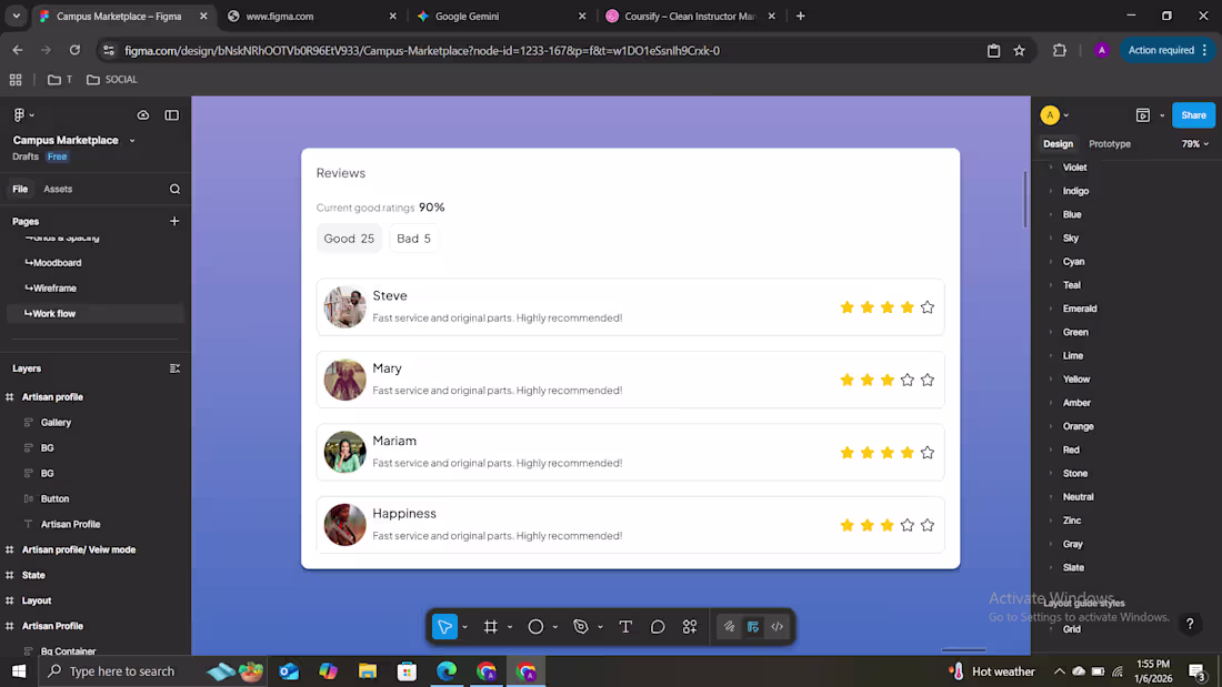
Here’s a recent session I’m working on: a review flow for a campus marketplace—simple, clear, minimal, and scannable.
0
36
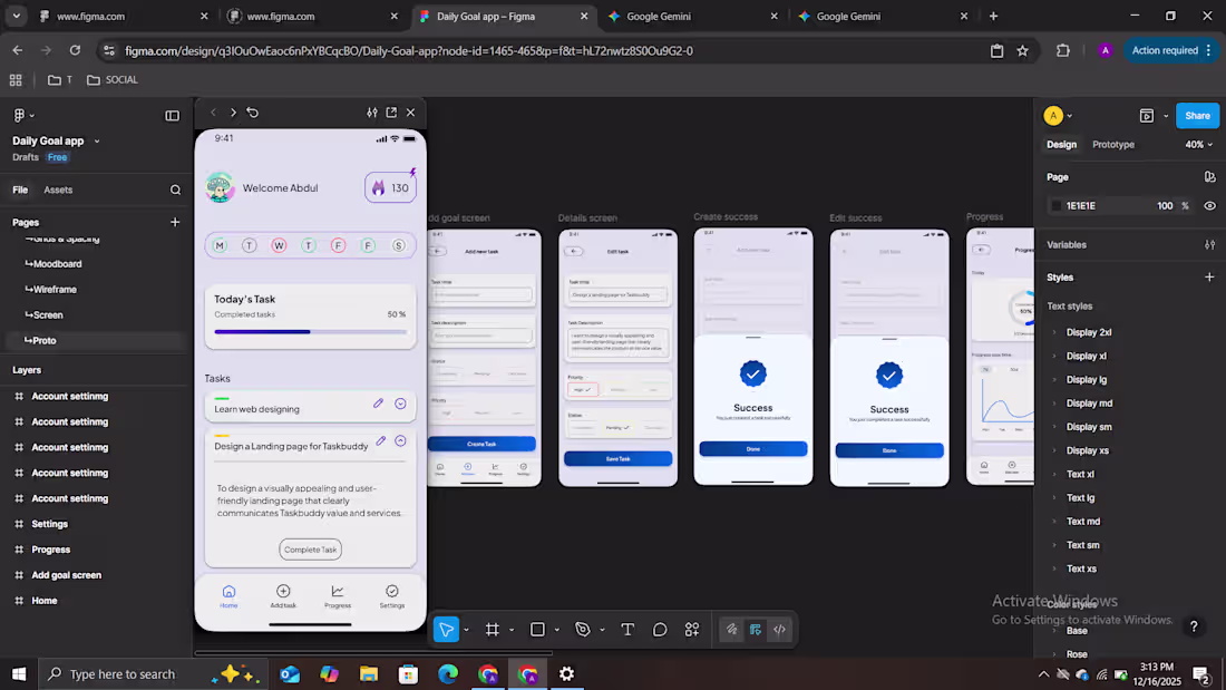
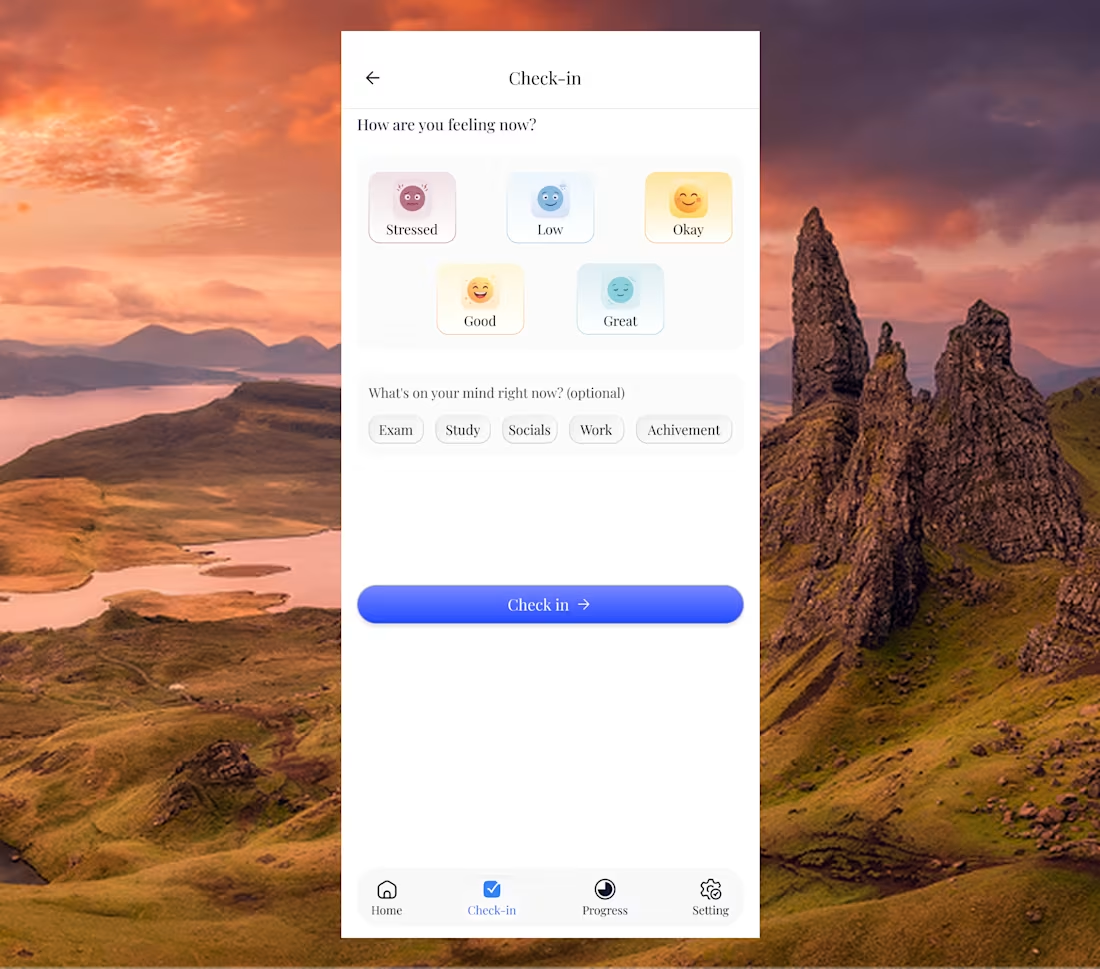
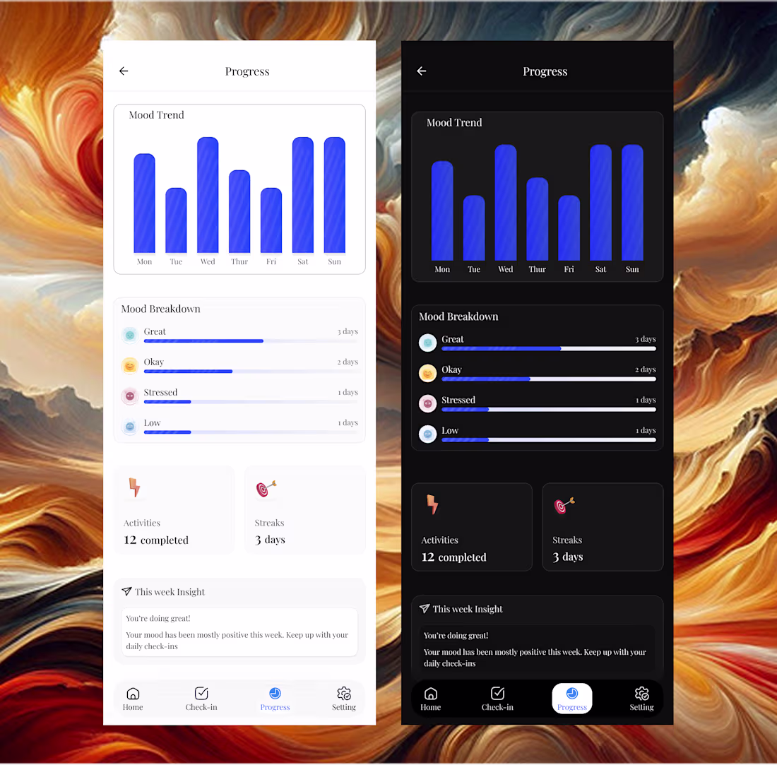
I'm designing a goal-tracking app designed to act as a digital accountability partner. The concept was born from a simple need: a way to stay committed to daily intentions without the clutter of traditional productivity tools.
How it Works The app is intentionally minimal. Users add their daily goals and "check in" as they complete them. The home screen provides an immediate snapshot of your progress:
Consistency at a Glance: A streak icon in the top right tracks your daily check in
Right below, you can see your completed days and missed days or days where no action was taken.
Deep Insights beyond daily tracking, the app features a Progress Screen. This session allows users to monitor their procrastination levels and consistency stats over time offering weekly, monthly, and yearly breakdowns to help track long-term habits.
26
213