The network for creativity
Join 1.25M professional creatives like you
Connect with clients, get discovered, and run your business 100% commission-free
Creatives on Contra have earned over $150M and we are just getting started
Back to feedPost

I Design High-Converting E-Commerce Visuals for Your Brand



The network for creativity
Join 1.25M professional creatives like you
Connect with clients, get discovered, and run your business 100% commission-free
Creatives on Contra have earned over $150M and we are just getting started






Related posts

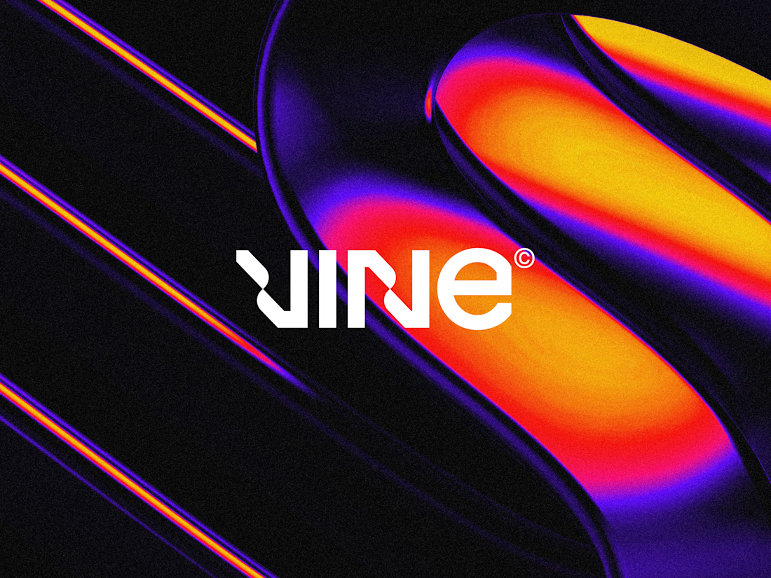

The sharp V pops against that vivid gradient.

One of the hardest things in branding is knowing what not to change.
Nubank recently worked with Koto to evolve its visual identity as the company expands internationally.
They kept the recognizable logo but rebuilt the wider system around typography, colour, illustration, photography, and motion.
The interesting part for me is how much of this work happens inside the actual product.
Animations built in Rive, a more consistent interface language, and an identity that needs to work across different markets without losing its personality.
I think that's where branding is heading, especially for digital-first companies.
A good identity shouldn't just look great in a presentation. It needs to work just as well inside the product people use every day.

Top-notch branding/rebranding

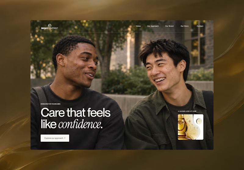
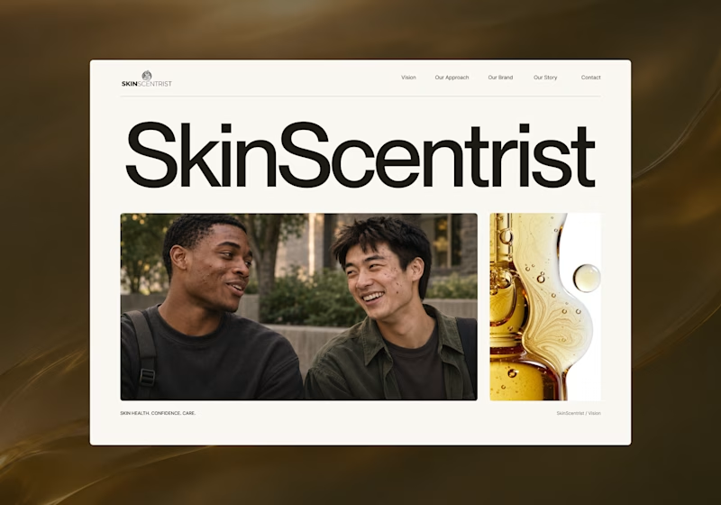
I’m exploring two homepage hero directions for SkinScentrist, a skincare brand focused on helping young men feel more confident in their skin.
Both concepts use the same imagery but take very different approaches to storytelling and visual hierarchy.
Direction 1 feels more emotional, immersive, and lifestyle-driven. The full-screen photography and bold messaging create a stronger connection to confidence and self-care.
Direction 2 feels more minimal, editorial, and brand-focused. The oversized typography, clean layout, and product imagery give it a more refined, contemporary skincare feel.
Direction 1: immersive, personal, emotional
Direction 2: minimal, editorial, premium
Which direction feels stronger for a modern skincare brand?

14 voted
93%
1 voted
7%
15 votes
Closed
Direction one — the full-screen photo feels warmer.