The network for creativity
Join 1.25M professional creatives like you
Connect with clients, get discovered, and run your business 100% commission-free
Creatives on Contra have earned over $150M and we are just getting started
Back to feedPost
Found some old design work from the archive 🔓 I design so many things over time I lose track of what I've even done sometimes lol
What do you think?


Really nice visual direction — the contrast + atmosphere feel very polished.
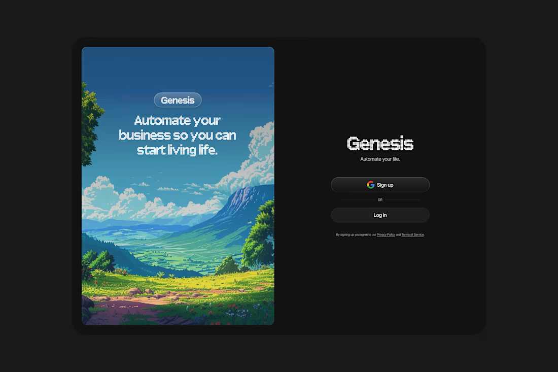
From a UX perspective, I especially like how the onboarding screen feels calm instead of “system heavy”. Curious — was the goal more emotional branding or conversion optimization?

Thanks Abhiram! Great call, the onboarding screen should feel "calm," it's asking the user for a big commitment
Asking them to sign in and provide their personal info is not a small thing so screens like this should squash any nerves for the user to continue
To be honest, the goal...
Completely agree. Calm onboarding is underrated — reducing cognitive friction at that stage directly impacts completion rates.
Yeah, if a user has made it to your onboarding screen, don't get in your own way and make it overcomplicated for them haha

The Genesis splash screen with the valley illustration is such a striking way to open an automation app. Pairing that painterly fantasy landscape with a clean black auth screen creates a really memorable contrast. The "automate your business so you can start living life" copy lands perfectly with that visual too.
Thanks Stephanie! You nailed it haha I tried to create a visual of technical automation combined with a natural scene that's also digitized
In a way combining two opposite ideas into one

Very clean. Well done! Congrats.
Thanks Vera!

Cool

Awesome combination of artistic illustration & a sleek UI!

Clean and thoughtful 😍

Clean UI. The imaged used came ou well on the black background, typography is on point.
If i was to see this as a first time use, would definitely click it.
Thanks man!

Good Work🙌
Thanks!

All of it blends in so nicely! great work🤝
Appreciate it! Thanks for the follow too!

This is amazing
Thank you!
The network for creativity
Join 1.25M professional creatives like you
Connect with clients, get discovered, and run your business 100% commission-free
Creatives on Contra have earned over $150M and we are just getting started




Related posts

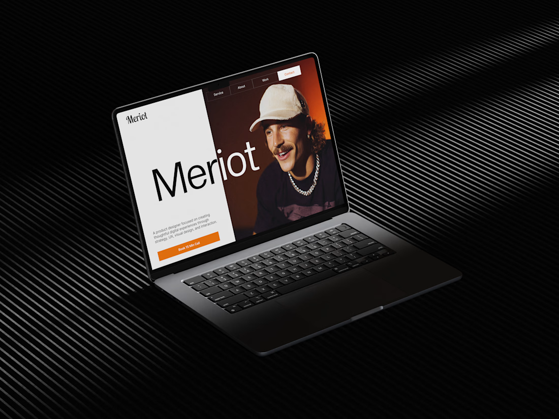
Meriot Netherlands-based product designer portfolio
I explored a portfolio website for Meriot, a product designer based in the Netherlands who wanted a digital presence that felt more personal, editorial, and design-focused.
The challenge was to avoid the typical portfolio formula and create something that communicates personality within the first few seconds.
The direction
→ Bold editorial typography
→ Strong personal photography
→ Minimal black-and-white foundation
→ Warm orange accent for CTAs
→ Simple, structured navigation
→ Clear positioning as a product designer
→ A portfolio experience that feels like a personal brand
The idea was to make the website feel confident without being complicated.
Rather than leading with a long introduction, the hero immediately communicates who Meriot is, what he does, and where the visitor should go next.


Nice design broooo

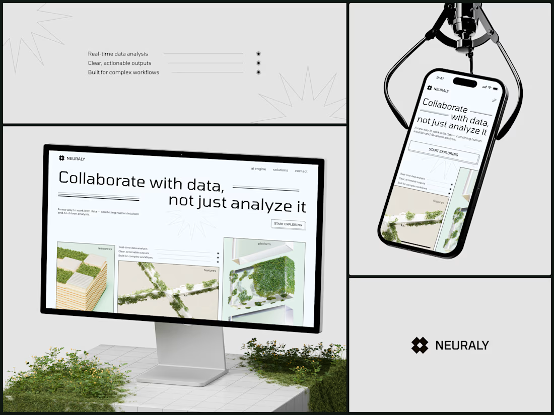
Neuraly - AI Data Analytics Platform
The headline says "Collaborate with data, not just analyze it" and the entire visual system is reinforcing that exact position. Data isn't cold infrastructure you feed queries into. It's something alive that grows when humans interact with it. The moss on architecture is literally that metaphor made visual: natural intelligence layered on top of built systems.
#AIDesign #WebDesign #B2BTech #BrandDesign #EditorialDesign
This one looks quite great honestly