The network for creativity
Join 1.25M professional creatives like you
Connect with clients, get discovered, and run your business 100% commission-free
Creatives on Contra have earned over $150M and we are just getting started
Back to feedPost

Every development studio says they build digital products.
I wanted Double Brackets to look like they do.
The identity is inspired by one of the most familiar symbols in programming, transformed into a brand system that's simple, recognizable, and built to scale across every touchpoint.
Sometimes the strongest ideas come from the simplest symbols.
Let us know your feedback !


The network for creativity
Join 1.25M professional creatives like you
Connect with clients, get discovered, and run your business 100% commission-free
Creatives on Contra have earned over $150M and we are just getting started







Related posts

Recent work on MAE - Visual identity

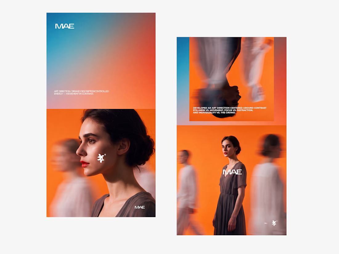

The motion blur on the figures gives the orange-to-blue gradient a reason to be there, and the small star mark stays readable on both the cheek and the shirt. Did the star come first as a standalone mark, or did it grow out of the photography direction?

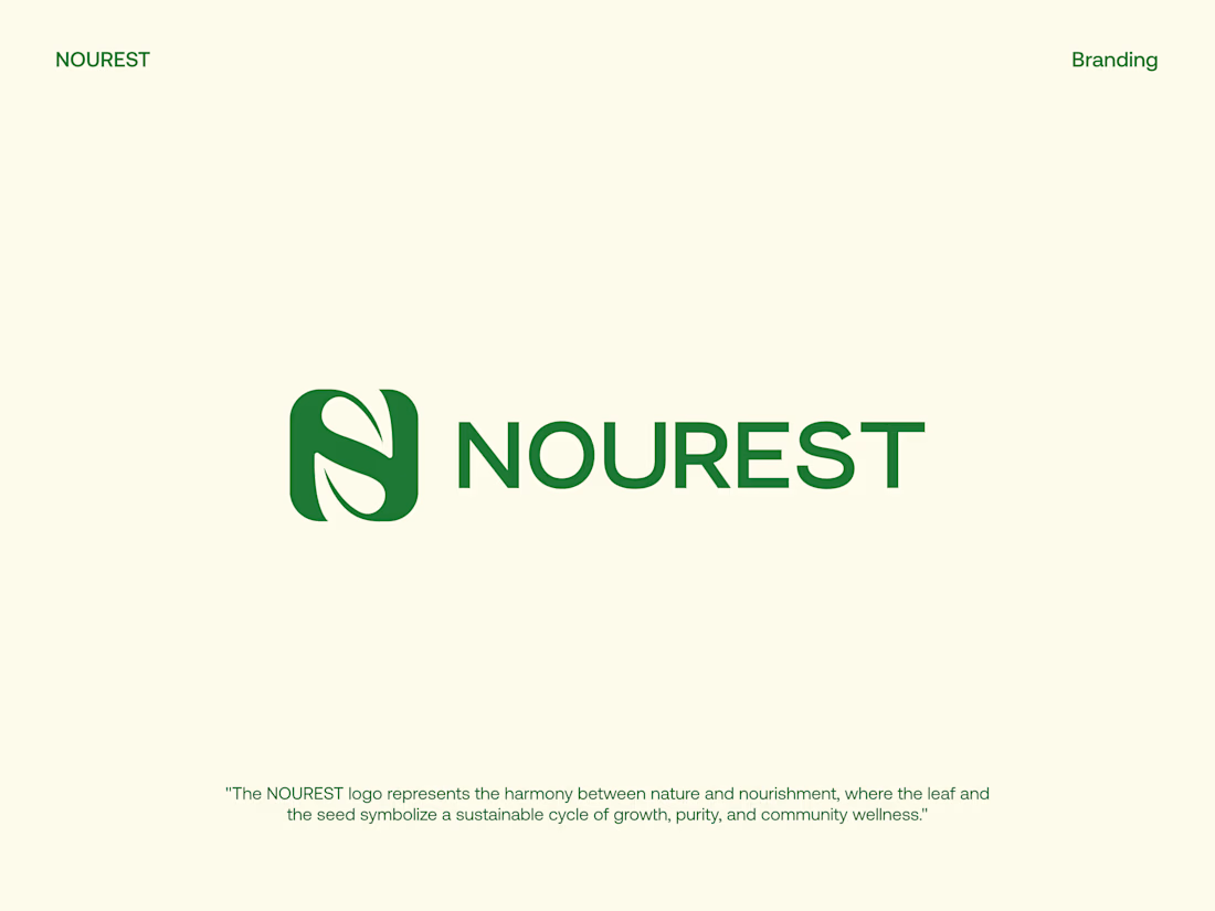
NOUREST — Nature-Led Brand Identity Design.
A brand about nature should feel natural at every touchpoint. 🌿
That's the idea behind NOUREST from its leaf-inspired monogram and green-led palette to packaging and brand materials.
One identity.
A consistent experience.
🏀 Full Design Showcase – Better View on Dribbble.
✅ https://dribbble.com/shots/27799268-NOUREST-Sustainable-Brand-Identity

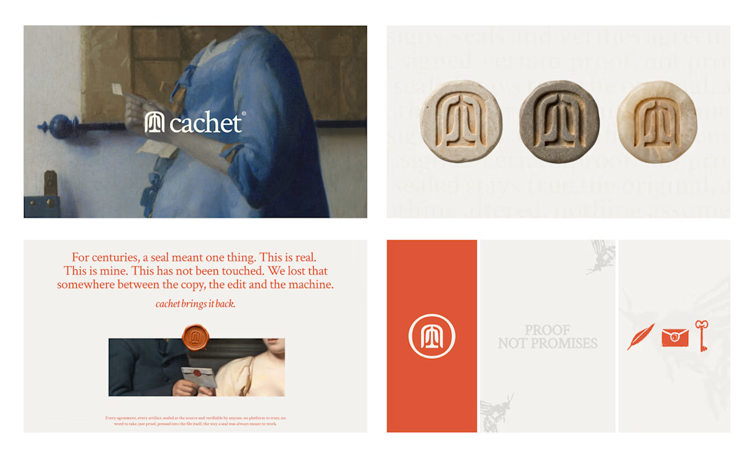
Cachet brand exploration.
Exploring patterns, textures, materials and hand-drawn illustrations

That's interesting I like it that's really unique ❤️❤️🎉🎉