The network for creativity
Join 1.25M professional creatives like you
Connect with clients, get discovered, and run your business 100% commission-free
Creatives on Contra have earned over $150M and we are just getting started
Back to feedPost
Taste Test

Hey everyone! 👋 Working on two wordmark directions for a client and would love a quick typographic gut check from fellow designers.
Which of these two options feels more readable to you? Drop your vote and let me know your thoughts below.
Thanks
8 voted
73%

3 voted
27%

11 votes
Closed

One

Two is unique great job Dumitru🎉🎉🔥🔥

Went with one. The letters read clearer at a glance, and the second one makes me pause on the r.
The network for creativity
Join 1.25M professional creatives like you
Connect with clients, get discovered, and run your business 100% commission-free
Creatives on Contra have earned over $150M and we are just getting started





Related posts

Same lettering, two color directions. Which one would you pick?
I got nostalgic this week looking at this lettering design. About 8 years ago I was deep into it and drew every day. Little by little I lost that rhythm, and now I only do it once in a while for gifts and small things.
Back then I could spend a lot of time choosing colors and comparing options. A taste test like this would have saved me so much time. 😅 I keep wondering how much I would have improved if I had never stopped practicing.
Is there something you used to practice a lot and would love to get back to? I had my lettering, illustration AND tufting phase.
37 voted
61%
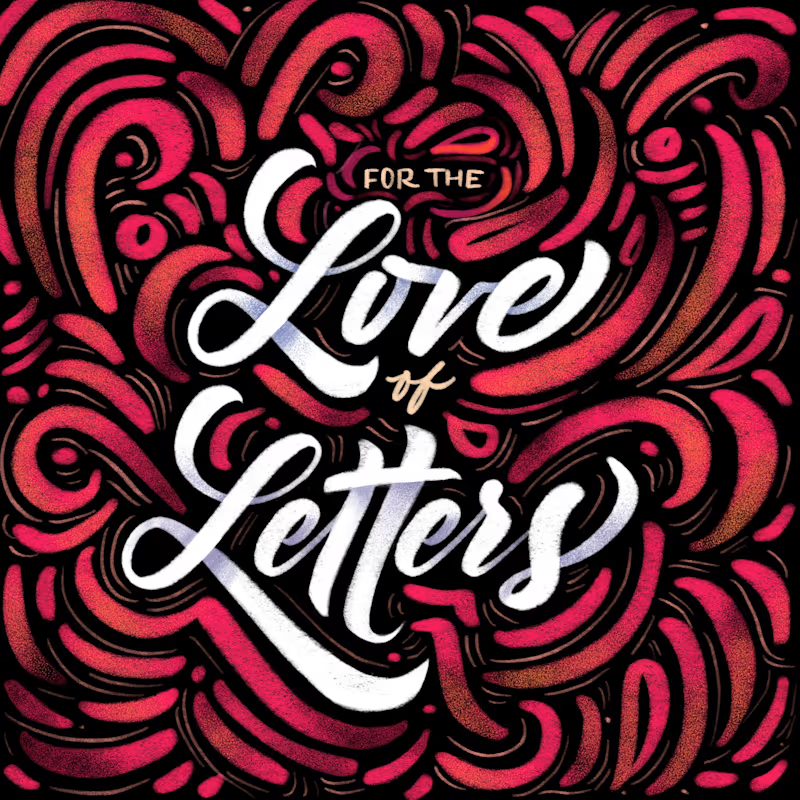
24 voted
39%
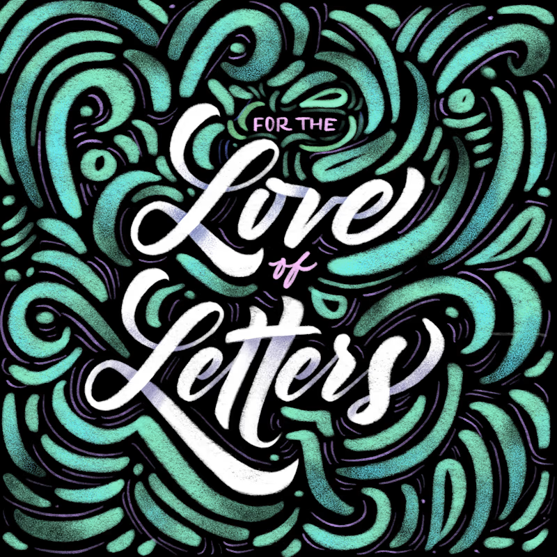
61 votes
Closed


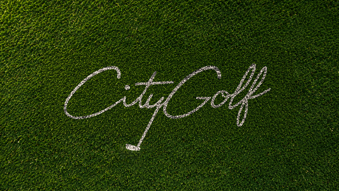
8 years later and the lettering still holds up

A closer look at the CityGolf wordmark, featuring custom script lettering inspired by the game.


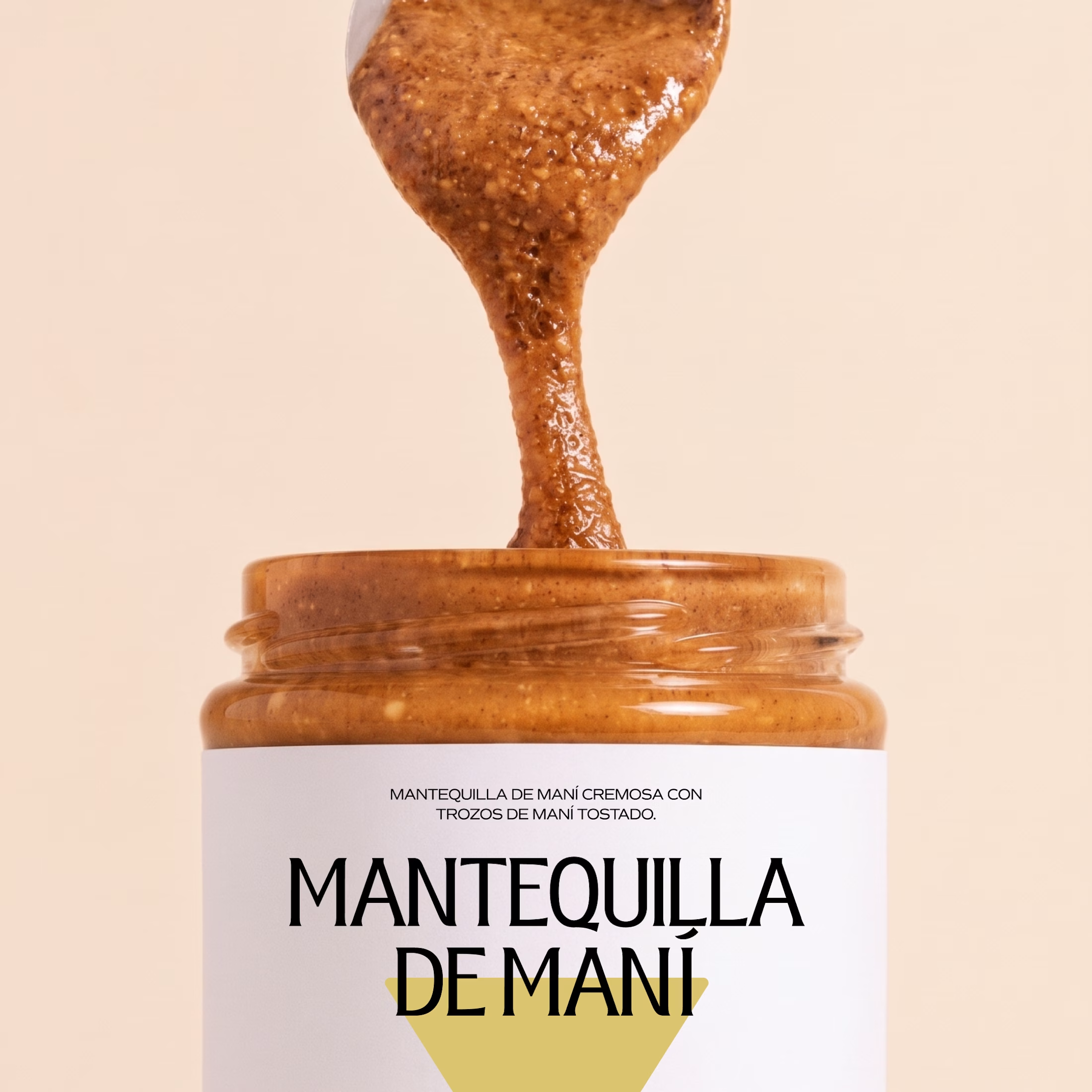
Minimal packaging is not less work. It’s MORE decisions 🤍
On a recent project, I spent a whole day on one thing: the spacing between two phrases in a label. Nobody will ever notice it. But everyone will feel it.
When there is nothing else on the label, every small adjustment has to carry the brand.
Do you also lose hours on details no client will ever mention? 😅
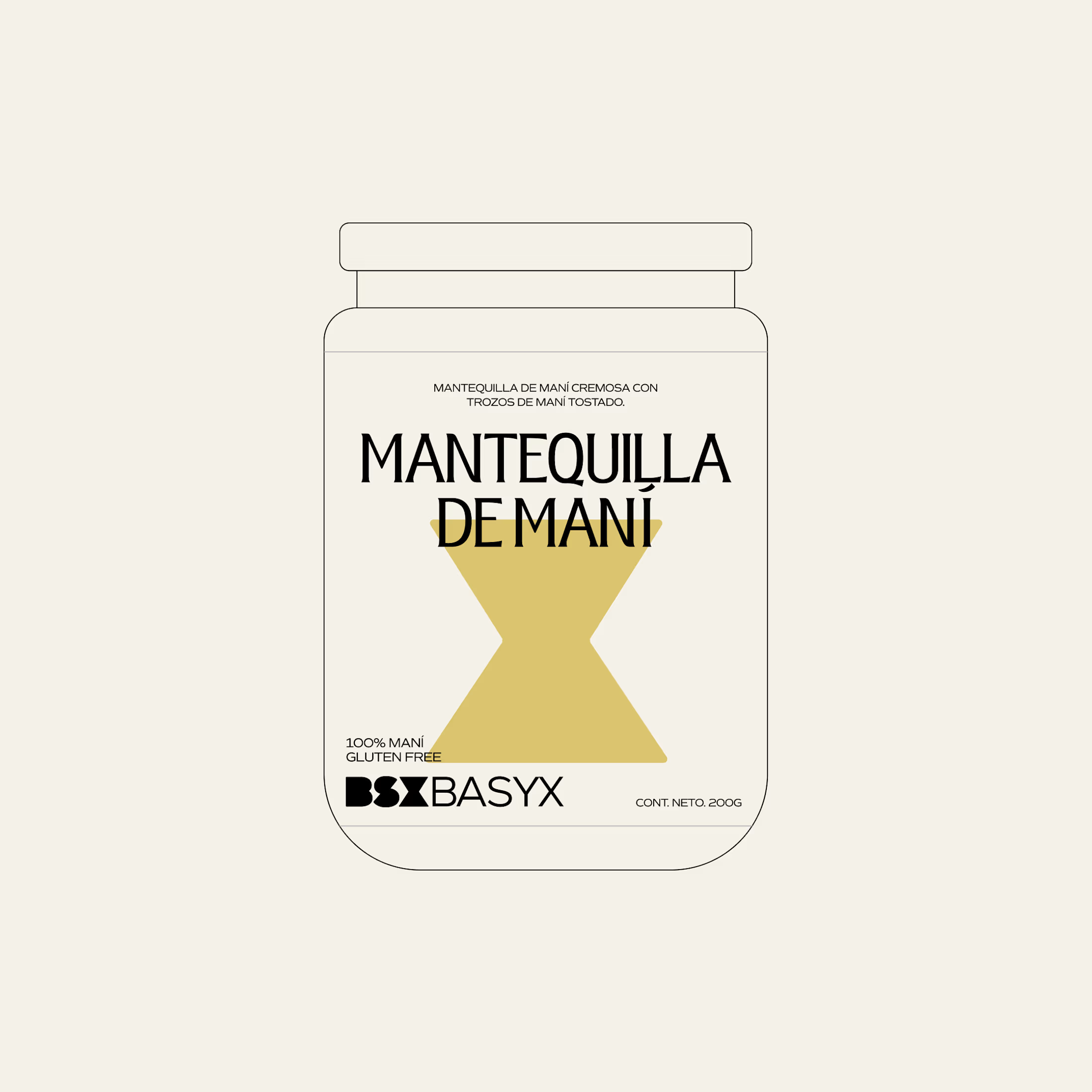

So true. A whole day on the spacing between two phrases sounds about right, and it's exactly why good packaging just feels right.